¶ Omni Statistics
¶ Agent Statistics
The Agent Statistics section provides a detailed overview of how agents are interacting with customers across different channels and queues. This section helps you monitor agent performance, identify areas for improvement, and better allocate resources.
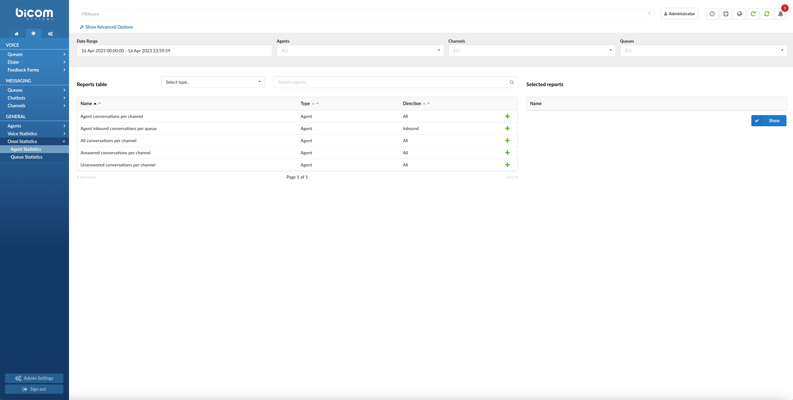
The Agent Statistics page provides a comprehensive and customizable view of the various agent-related metrics. With multiple filters, adjustable time formats, and report generation capabilities, this page allows you to analyze and optimize agent performance effectively. Here is an overview of the features and options available on the Agent Statistics landing page.
Filters
This page offers several filters to help you refine the data displayed:
- Date Range Filter: Select a custom date range to view data specific to that period.
- Agent Name Filter: Filter results by individual agents to assess their performance and identify opportunities for improvement.
- Channel Filter: Choose specific communication channels to evaluate agent performance within different mediums.
- Queue Name Filter: Filter data by specific queues to analyze agent activity and performance in managing particular queues.
- Speed to Answer: Measure the time from when a call starts ringing until an agent answers, reflecting response efficiency.
- Activity Time: Track the duration an agent spends handling requests, from assignment until closure or transfer. This includes talk time for voice channels and handling time for messaging channels.
- Time Format Customization: Adjust the time display format to show durations in days, hours, minutes, or seconds based on reporting needs.
Report Type Selection
Currently, the landing page supports generating Agent reports. Choose the "Agent" report type to generate and view metrics related to agent performance and their interactions across different channels and queues.
Search for Reports
The search feature allows you to quickly find specific reports based on keywords or phrases. Simply enter your search term, and the system will display relevant reports in the results.
Adding Reports to the Show List
To create a customized report, you can add specific reports to your generation list by clicking the green plus button next to each report. This allows you to select only the metrics you're interested in, creating a focused and tailored report.
Once you have added the desired reports to your list, click the "Generate Report" button to create a report based on your selected metrics. The generated report can then be viewed, printed, or exported for further analysis.
With its versatile filters, customization options, and report generation capabilities, the Agent Statistics landing page offers a powerful tool for analyzing and optimizing your organization's agent performance and resource allocation.
¶ Agent Availability
The Agent Availability Report is a tool that helps supervisors keep a close eye on how their customer service agents are performing. The report gives different info about how much time each agent spends on conversations, how many conversations are answered or unanswered, and how much time agents spend on actual customer calls/conversations versus how much time they spend waiting for calls/conversations or taking breaks.
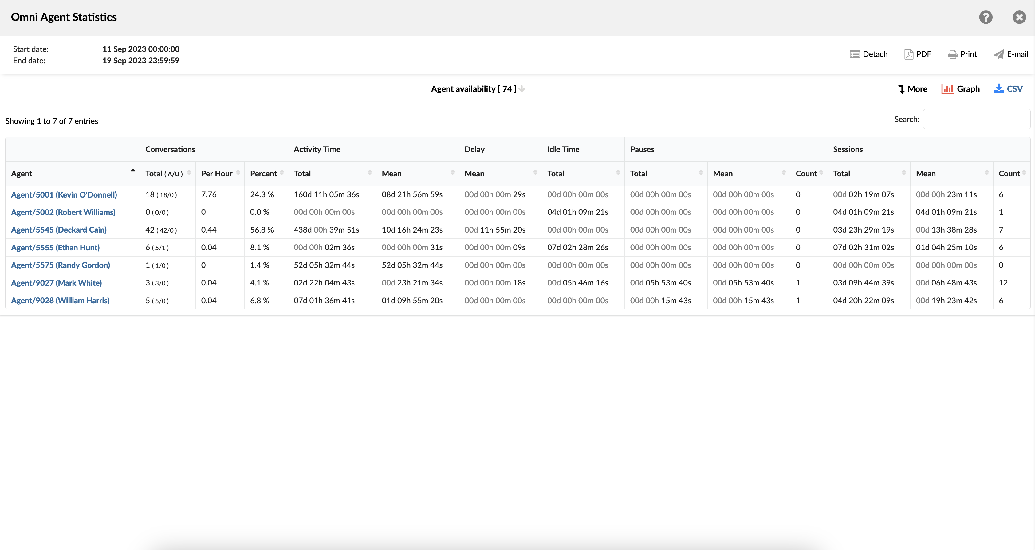
Example:
Imagine you're overseeing a team of customer service agents at a busy insurance company. The Agent Availability Report allows you to monitor how much time each agent spends actively assisting customers on calls versus waiting for calls or on breaks. For example, you notice that Agent Smith consistently has a high percentage of time spent in active calls compared to Agent Jones, who often has longer periods of waiting time. This insight prompts you to adjust Agent Jones's schedule to align better with peak call hours, ensuring more consistent customer service coverage.
¶ Agent Availability Breakdown
The table consists of fourteen columns, each offering specific insights about the conversations.
- Conversation ID - this column displays unique identifiers assigned to individual conversations.
- Date - this column indicates the date on which each conversation occurred.
- Channel - this column specifies the mode of communication used for each conversation, such as voice, chat, email, or messaging.
- Customer - this column lists the individuals involved in each conversation as customers.
- Queue - this column shows the specific line of support in which each conversation was managed.
- Campaign - this column denotes the associated campaign linked with each conversation.
- Assignee - this column provides details about the agent who was tasked with handling each conversation.
- Activity Time - this column represents the total time duration an agent devoted to each conversation.
- Delay - the amount of time it takes for each agent to respond to a conversation in each channel.
- Entry - this column notes the time each conversation entered the support queue.
- Exit - this column records the time each conversation departed from the support queue.
- Transferred - this column indicates whether a conversation was transferred to another agent or queue.
- Last Action By - this column shows the previous contributor to the conversation, the agent, or the customer.
- Ended - this column specifies the conclusion status of each conversation.
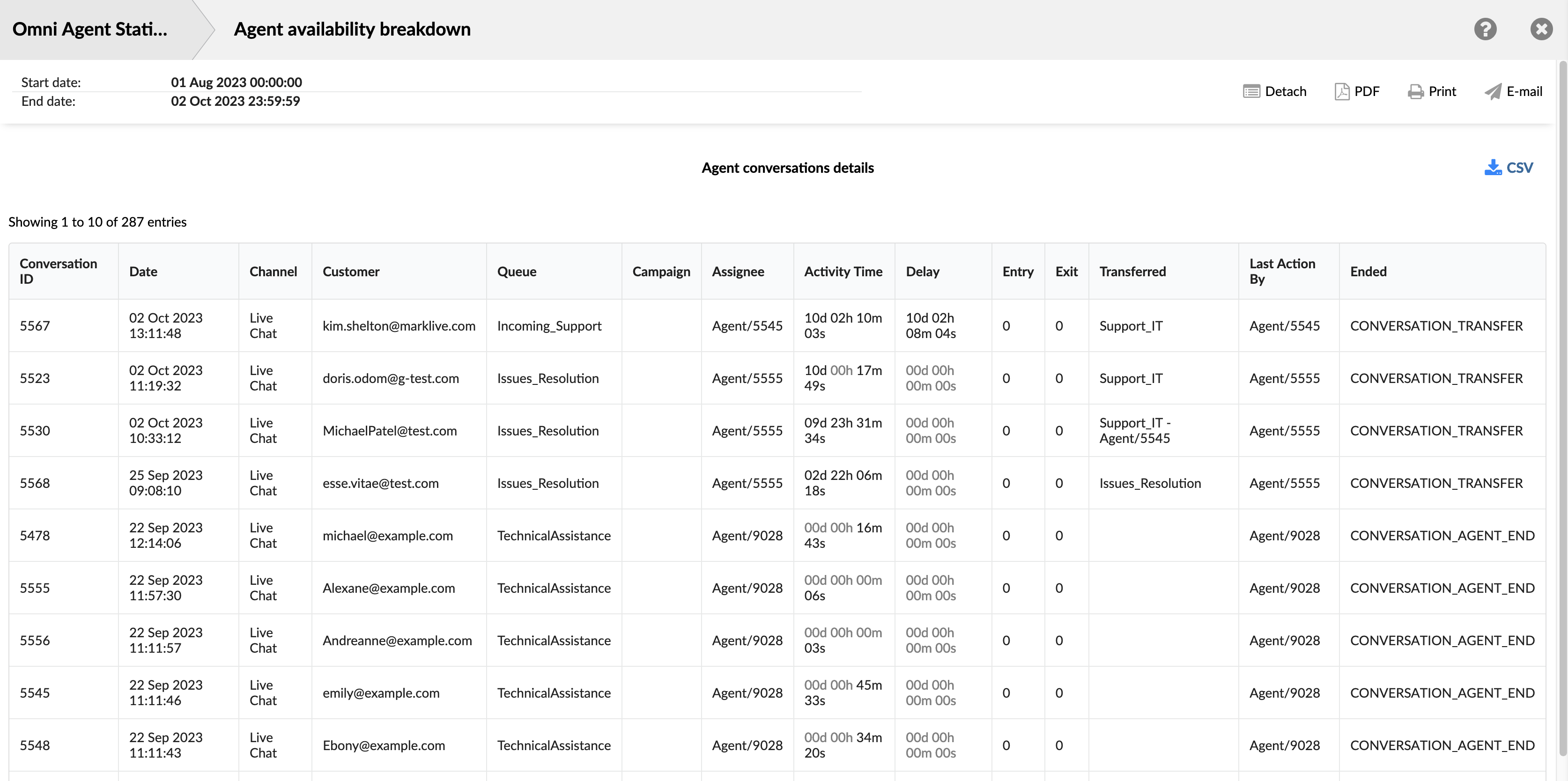
Within the report breakdown, there are two icons associated with the ConversationID field. The first icon allows users to view the transcripts of selected conversations directly. The second icon enables them to download the transcripts of selected conversations for further review or analysis. These features provide users with convenient access to detailed records of customer interactions, facilitating thorough monitoring and assessment of agent performance and customer service quality.
¶ Agent Calls per Direction
The "Agent Calls per Direction" report provides a detailed overview of each agent’s activity, broken down by call direction (Inbound, Outbound, Direct In, Direct Out). This enables supervisors to assess how agents perform across various call types, compare efficiency, and evaluate workload distribution.
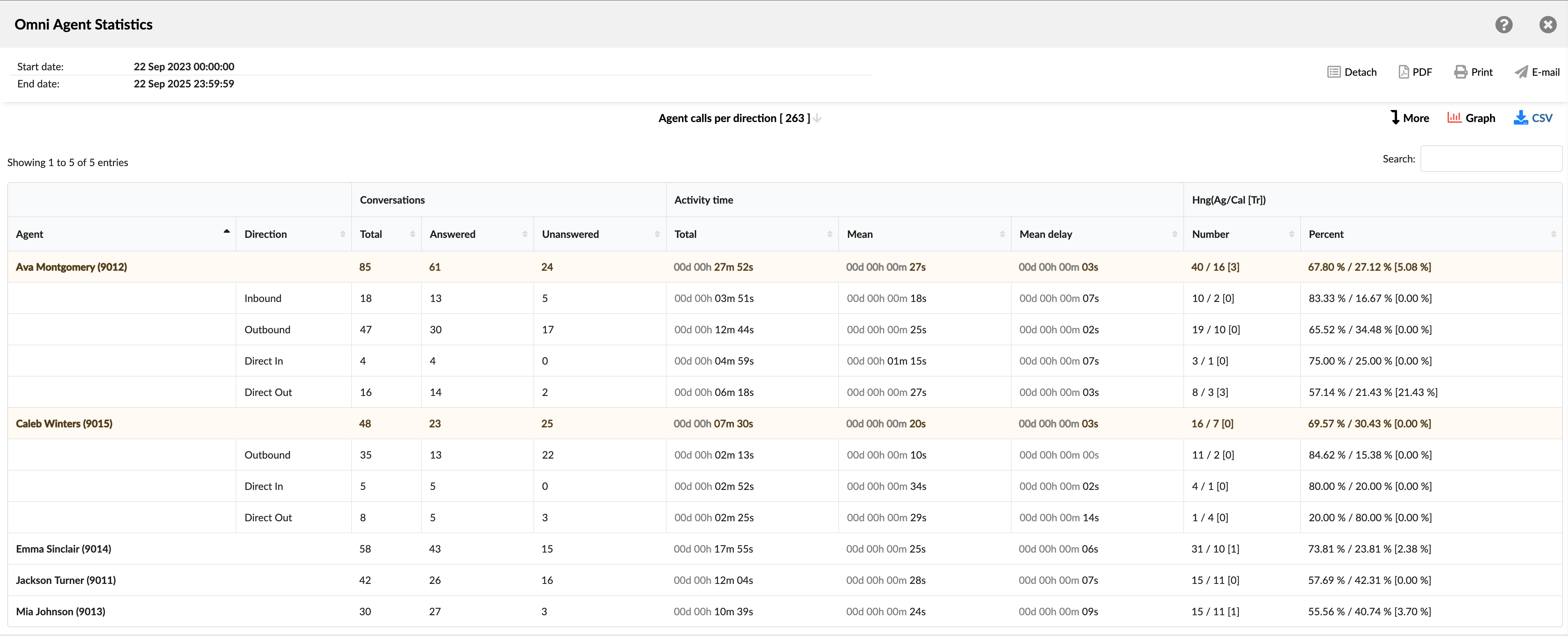
Each row corresponds either to a total summary per agent or to a specific call direction for that agent.
- Agent: Shows the full name and internal ID of the agent.
- Direction: Identifies the type of call handled by the agent:
- Inbound: The total number of calls received from queues.
- Outbound: The total number of calls initiated by a dialer campaign.
- Direct In: The total number of calls that arrived directly to an agent.
- Direct Out: The total number of calls manually placed by an agent.
- Conversations: Divided into three columns:
- Total: Total number of calls handled by the agent in specific direction.
- Answered: Total number of calls successfully answered.
- Unanswered: Total number of calls that went unanswered.
- Activity time: Divided into three columns:
- Total: The sum of talk time for all calls and calls per direction.
- Mean: The average duration of all calls and calls per direction.
- Mean delay: The average waiting time before the agent connected to the call.
- Hng (Ag/Cal [Tr]): Provides a breakdown of how calls ended (Hang-ups), categorized by Agent, Callee, and Transfers. It is divided into two columns:
- Number: Total number of all calls ended by Agent/Callee [Transferred] and calls per direction.
- Percent: Displays the distribution of call endings as percentages of the total, in the format: Agent Hang-ups % / Caller Hang-ups % [Transferred %]
The Agent Calls per Direction report is designed to provide supervisors with a comprehensive view of agent activity by direction, showing not only the number of calls answered/unanswered but also the duration, response time, and outcome of each call. This helps balance workloads, evaluate agent effectiveness, and optimize call-handling strategies.
¶ Agent Calls per Direction Breakdown
The "Agent Calls per Direction Breakdown" table provides a detailed, row-by-row log of every call handled by agents, categorized by direction (Inbound, Outbound, Direct In, Direct Out). Each row represents a single call event, recording identifying details, timing information, routing data, and the outcome of the call.
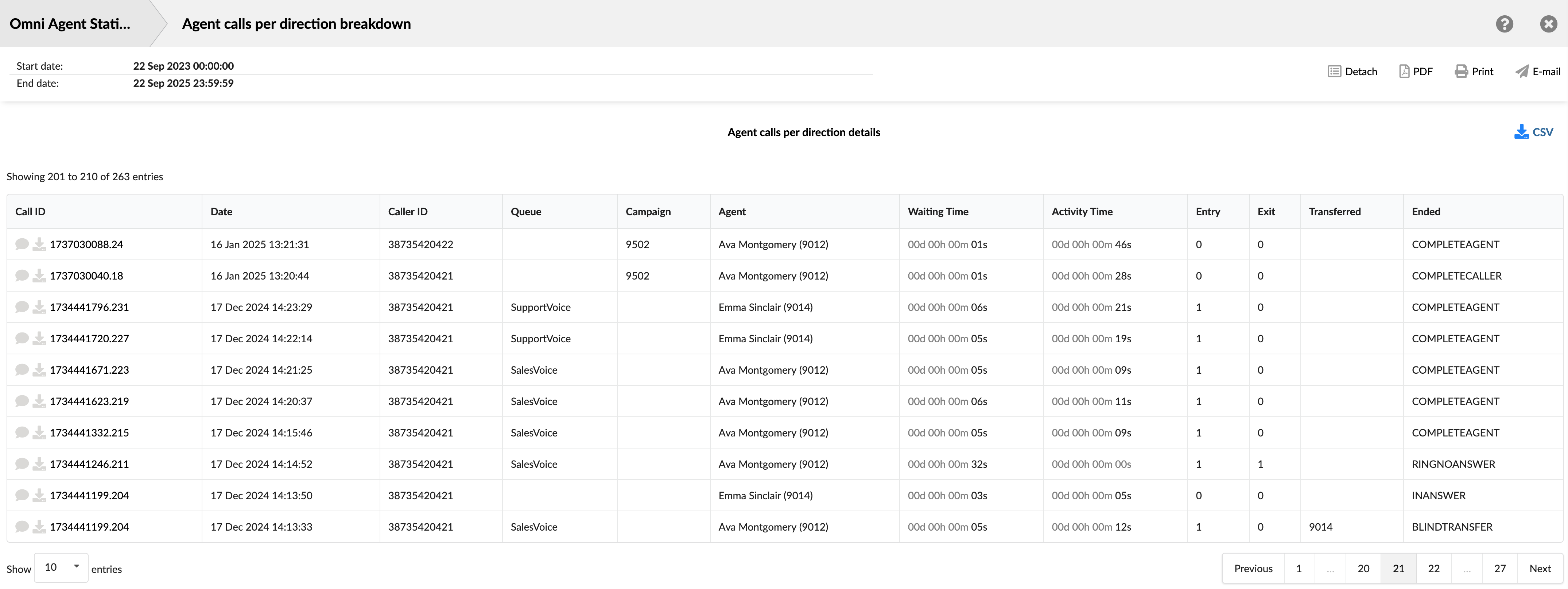
This view is especially useful for auditing specific calls, troubleshooting unusual outcomes, or cross-referencing calls with recordings and system logs.
- Call ID: Shows the unique identifier for each call. This ID can be used to search for and track a specific call.
- Date: Shows the date and time when each call occurred. This allows you to view and sort calls based on the time they occurred.
- Caller ID: Shows the phone/extension number of the caller/callee involved in the call.
- Queue: Shows the queue through which the call entered, if applicable.
- Campaign: Shows the campaign associated with the call if it was part of an Outbound dialer campaign.
- Agent: Shows the agent who handled the specific call.
- Waiting Time: Shows the amount of time the call spent ringing or waiting before being answered.
- Activity Time: Shows the total duration the agent was engaged with the call.
- Entry: Shows the position each conversation entered the queue.
- Exit: Shows the position each conversation exited the queue.
- Transferred: Indicates whether each conversation was transferred to another agent or queue.
- Ended: Indicates how each conversation was ended.
The breakdown table enhances the Agent Calls per Direction report by providing detailed call-level records, facilitating easier analysis, audit, and optimization of agent call handling across various call directions.
¶ Agent Calls per Direction Graph
The "Agent Calls per Direction Graph" offers a powerful visual comparison of agent call volumes, categorized by call type and outcome. This stacked bar chart makes it easy to quickly identify top performers, analyze workload distribution, and spot trends across the team.
The graph is interactive, allowing you to switch between two different views to analyze the data.
- Calls per direction View:
When the Calls per direction option is selected, the graph focuses on the primary call types. This view is ideal for quickly assessing each agent's primary workload and the mix of calls they handle.
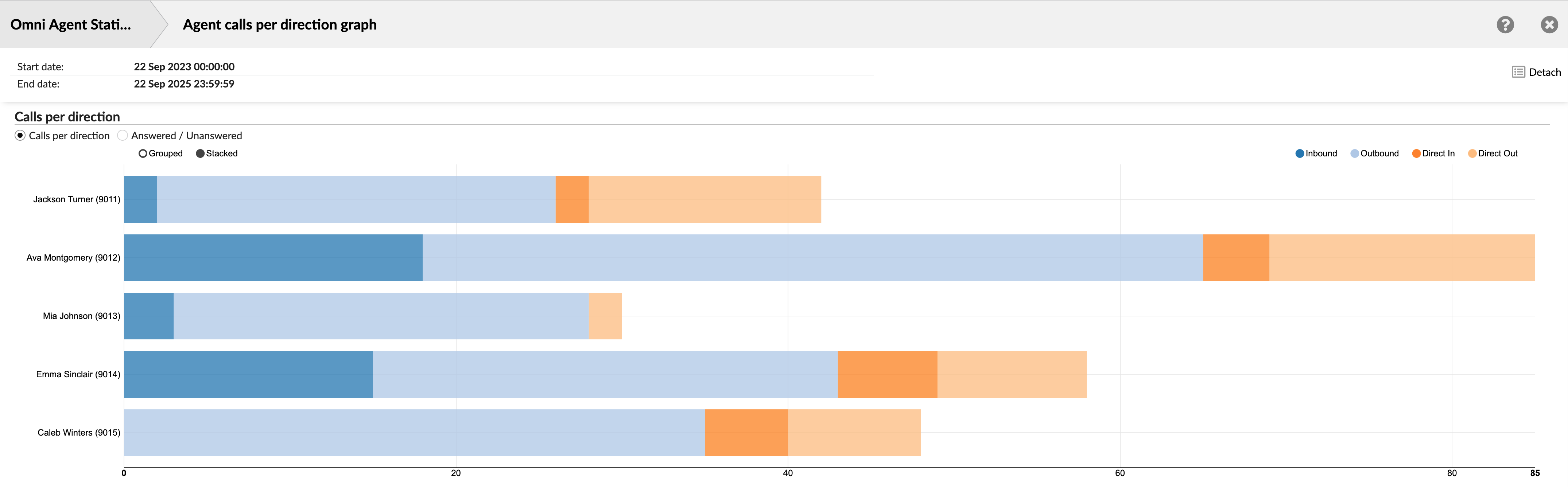
Each agent's bar is composed of colored segments representing the total number of calls for each main direction: Inbound, Outbound, Direct In, and Direct Out. The length of the bar represents the total volume of all calls handled by that agent.
- Answered/Unanswered View:
Selecting the Answered/Unanswered option provides a more granular analysis by breaking down each call direction by its outcome. This view enables supervisors to analyze not only call volume but also agent performance and effectiveness within each call type.
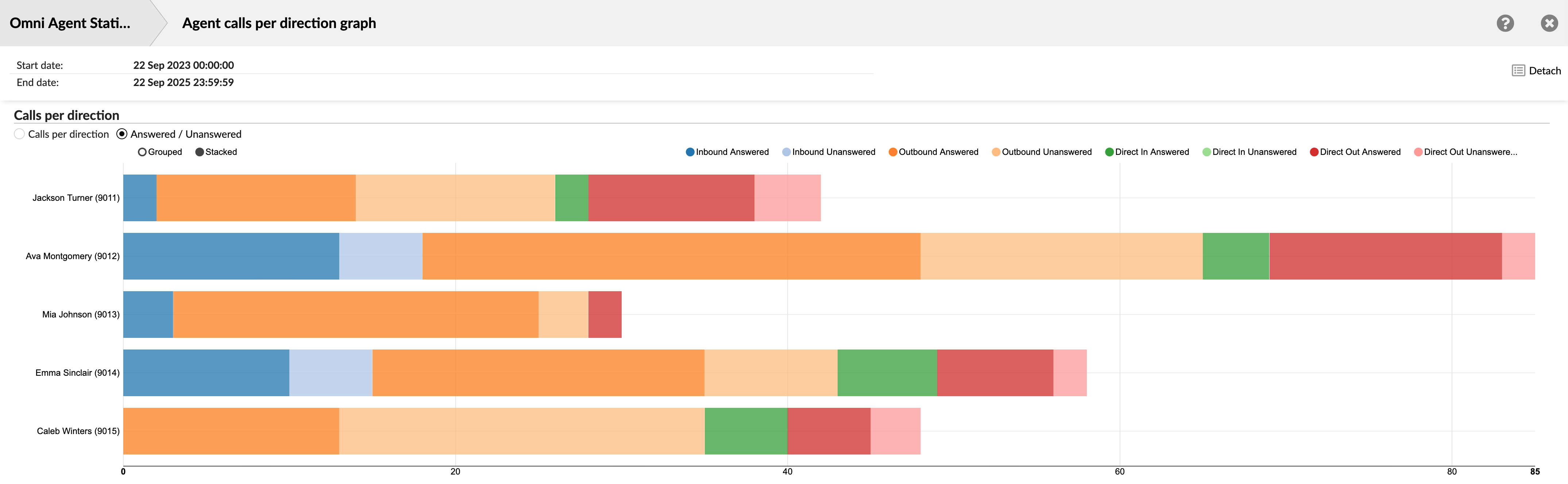
The legend expands to show both answered and unanswered metrics for each direction (e.g., Inbound Answered, Inbound Unanswered). This allows you to see, for example, if an agent is missing a high number of Direct In calls or successfully handling all their Outbound campaign calls.
¶ Agent Conversations per Campaign
The "Agent Conversations per Campaign" report provides a detailed analysis of agent performance within specific Dialer campaigns. This view allows supervisors and managers to measure agent effectiveness, compare productivity across different campaigns, and understand how each agent contributes to the success of various outbound initiatives.
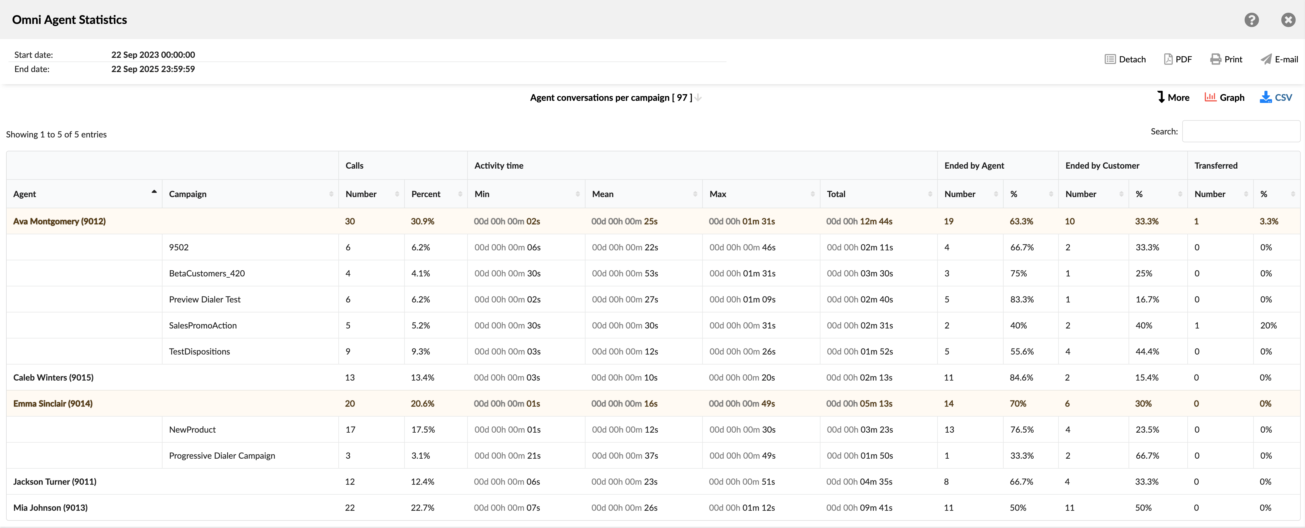
The report groups data first by agent and then breaks it down by each campaign they participated in, offering both a high-level summary and a granular look at performance.
- Agent: Shows the full name and internal ID of the agent.
- Campaign: Lists the specific campaigns the agent participated in.
- Calls: This section quantifies the call volume. It's divided into two columns:
- Number: Shows the total number of calls handled by the agent for that specific campaign (or their total).
- Percent (%): Shows the percentage of calls in this row compared to the grand total of all calls in the report.
- Activity time: Provides metrics on the duration of agent engagement on calls. Divided into four columns:
- Min: Shows the duration of the shortest single call for that row's category.
- Mean: Shows the average duration of a single call.
- Max: Shows the duration of the longest single call.
- Total: Shows the cumulative time the agent spent on all calls in that category.
- Ended by Agent: Details the calls that were terminated by the agent. Divided into two columns:
- Number: Shows the total count of calls in that category hung up by the agent.
- %: Shows the percentage of calls in that specific row that were ended by the agent.
- Ended by Customer: Details the calls that were terminated by the person the agent called. Divided into two columns:
- Number: Shows the total count of calls hung up by the customer.
- %: Shows the percentage of calls in that row that were ended by the customer.
- Transferred: Details the calls that were transferred by the agent to another destination. Divided into two columns:
- Number: Shows the total count of calls transferred.
- %: Shows the percentage of calls in that row that were transferred.
¶ Agent Conversations per Campaign Breakedown
The "Agent Conversations per Campaign Breakdown" table provides the most granular view of the report, presenting a complete, row-by-row log of every individual call made within a campaign. Each row represents a single conversation, allowing supervisors to drill down from the campaign summary to analyze specific interactions.
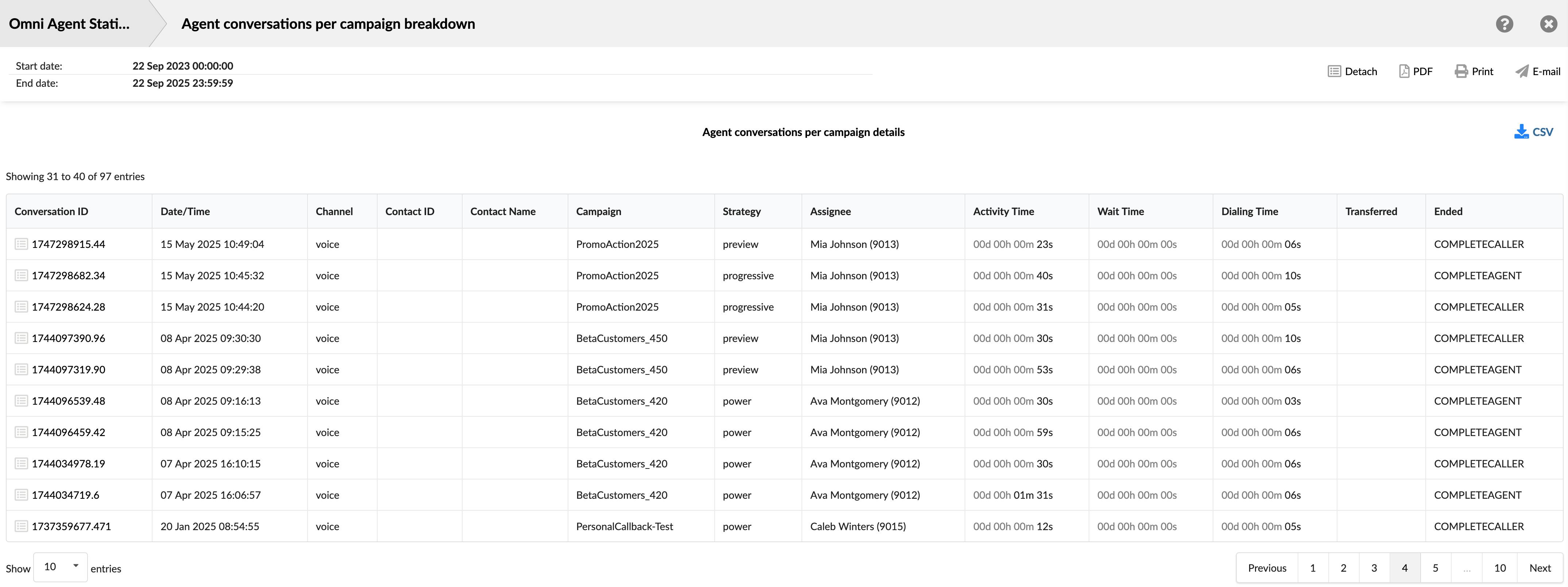
This detailed view is essential for auditing agent performance on specific calls, investigating unusual outcomes, finding calls for quality review, and cross-referencing data with call recordings.
- Conversation ID: Shows the unique identifier for each call. This ID can be used to search for and track a specific call.
- Date/Time: Shows the date and time when each call occurred. This allows you to view and sort calls based on the time they occurred.
- Channel: Shows the communication method used for the conversation, which will typically be voice for this report.
- Contact ID: Shows the unique identifier for the contact, if available.
- Contact Name: Shows the contact person's name, if available.
- Campaign: Shows the specific campaign associated with the call.
- Strategy: Shows the dialing strategy used for the call.
- Assignee: Shows the agent who handled the call.
- Activity Time: Shows the total duration the agent spent actively engaged with the call.
- Wait Time: Shows the time passed after the lead answered the call until the lead is connected to an agent.
- Dialing Time: Shows the time elapsed from when the Dialer or agent initiates a dial to the lead until the lead answers the call.
- Transferred: Indicates if the call was transferred and shows the destination of the transfer.
- Ended: Shows the outcome or status of each call attempt.
¶ Agent Conversations per Campaign Graph
The "Agent Conversations per Campaign Graph" page offers a powerful visual dashboard for analyzing campaign data from multiple perspectives. It is composed of three distinct charts that together provide insights into overall campaign volume, agent workload distribution, and agent efficiency metrics.
At the top of the page, you can use the campaign checkboxes to filter the data displayed across all three charts. This allows you to focus your analysis on specific campaigns of interest.
- Total Conversations/Agents Available per Campaign
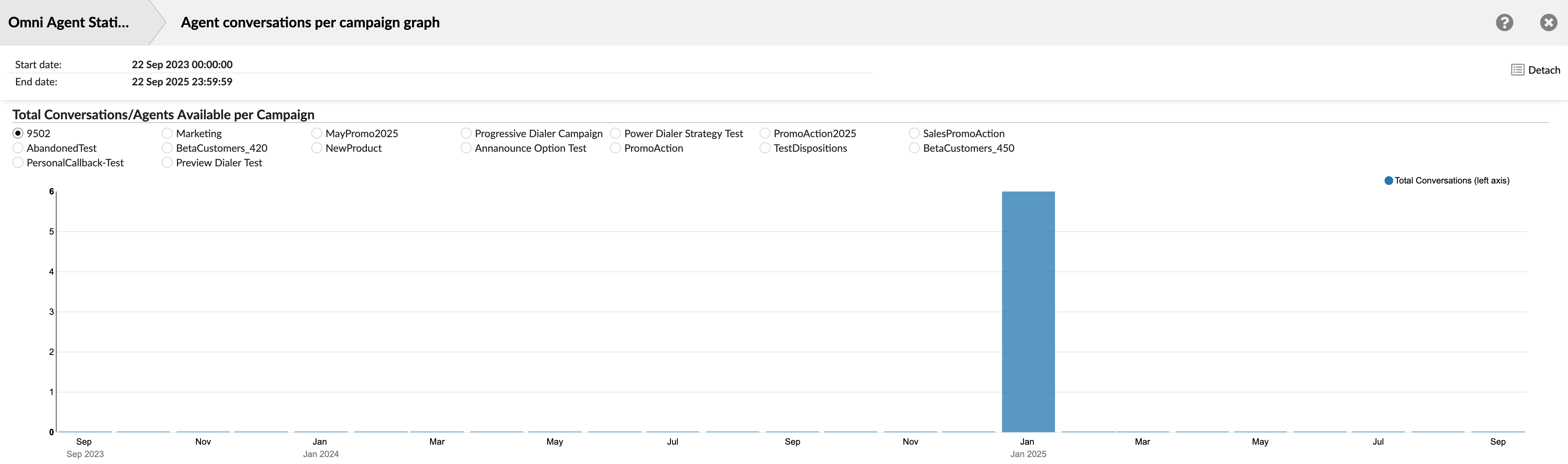
This chart provides a high-level overview of conversation volume over time for the selected campaigns. The purpose is to identify historical trends and peak periods of campaign activity. This is a vertical bar chart, where the horizontal axis represents a timeline (in months/years) and the vertical axis shows the total number of conversations. It helps you visualize the overall performance and volume of your selected campaigns over a long period.
- Agent Conversations per Campaign
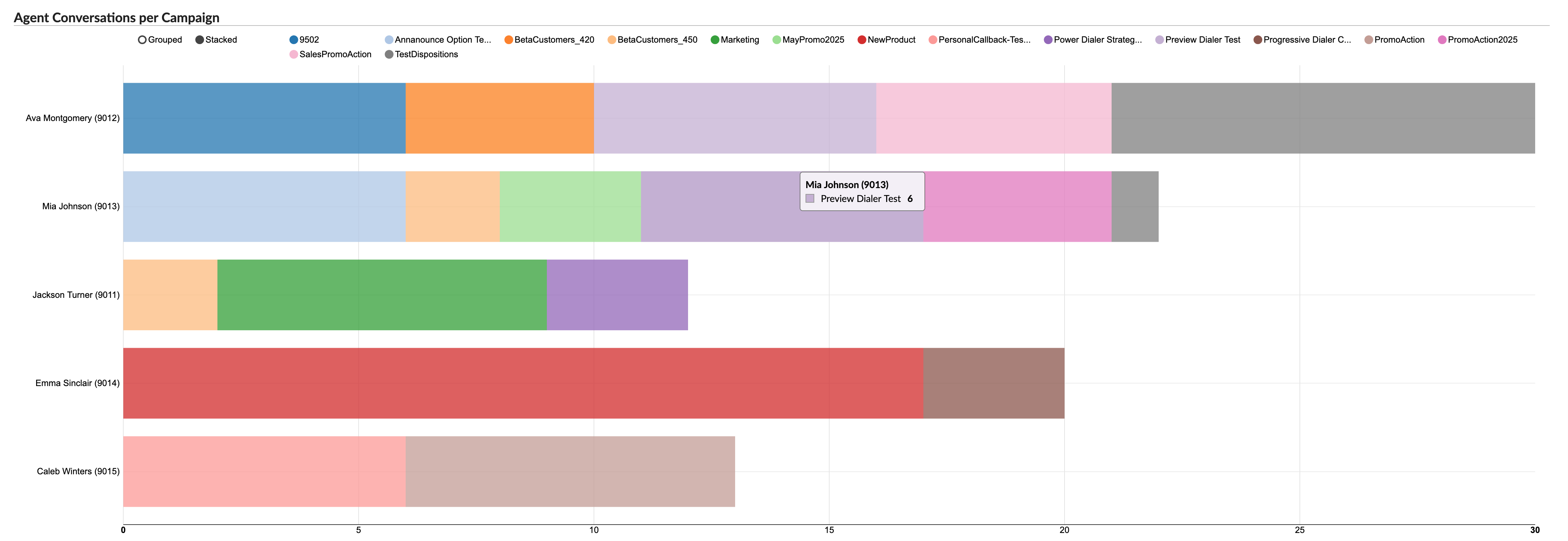
This chart focuses on comparing agent workloads and their specific involvement in different campaigns. The purpose is to understand how campaign work is distributed among agents and to identify which agents are the most active on specific campaigns.
Each agent is represented by a horizontal bar. The total length of the bar shows the total number of campaign calls the agent handled. The bar is divided into colored segments, with each color corresponding to a different campaign (as shown in the legend). This visualizes the proportion of work each agent dedicated to each campaign.
- Agent [Mean Delay] and [Mean Activity Time] per Campaign
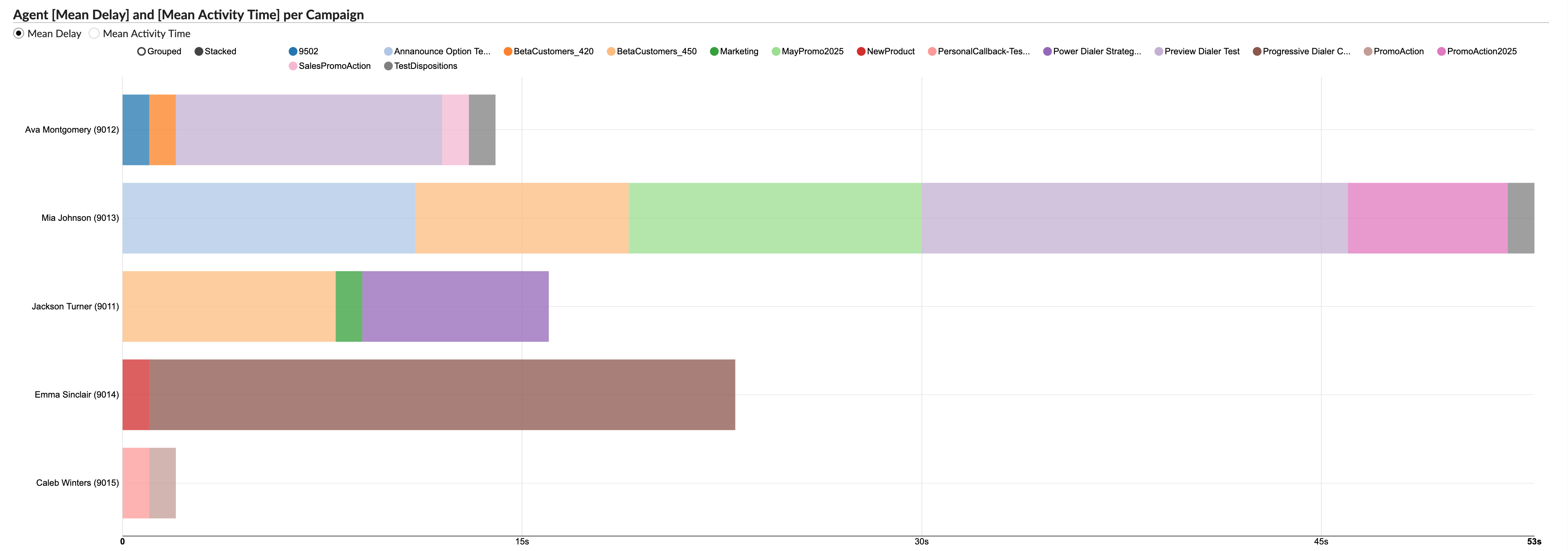
This chart shifts the focus from call volume to agent efficiency, visualizing two key time-based metrics for each agent on a per-campaign basis. The purpose is to analyze and compare agent efficiency, such as how quickly they are connected to calls and how long their conversations last for different campaigns.
For each agent, this chart displays two metrics for each campaign:
- Mean Delay: Represented the average time a customer waited before being connected to the agent.
- Mean Activity Time: Represented the agent's average talk time for that campaign.
This powerful visualization enables you to quickly identify outliers, such as an agent with a particularly long talk time on a specific campaign, or pinpoint campaigns that consistently result in longer wait times for customers.
¶ Agent Conversations per Channel
The "Agent Conversations Per Channel" report provides a comprehensive overview of the interactions handled by each agent across various channels. This report showcases the volume, efficiency, and outcome of conversations that agents have participated in during a specified period. It offers insights into the frequency of conversations, their duration, and how they conclude, are they ended by the agent, the customer, or transferred. This data is instrumental for understanding agent performance, optimizing workflows, and ensuring customer satisfaction. The report is divided into several columns, each providing specific details about the conversations.
-
Agent: This column lists the names of all the agents.
-
Channel: This column indicates the communication channel for the conversations, such as chat, email, or messaging.
-
Conversations: This column is divided into three sub-columns:
- Number: Shows the total number of conversations each agent has handled in each channel.
- Per Hour: Displays the average number of conversations each agent handles per hour in each channel.
- Percent: Represents the percentage of total conversations that each agent handles in each channel.
-
Activity Time: This column is divided into three sub-columns:
- Total: Shows the cumulative time the agent has spent on conversations in each channel.
- Mean: Displays the average time spent per conversation by each agent in each channel.
- Mean Delay: Represents the average delay time before each agent responds to a conversation in each channel.
-
Ended by Agent: This column is divided into two sub-columns:
- Number: Shows the number of conversations that were ended by the agent in each channel.
- %: Represents the percentage of conversations that were ended by the agent in each channel.
-
Ended by Customer: This column is divided into two sub-columns:
- Number: Shows the number of conversations that were ended by the customer in each channel.
- %: Represents the percentage of conversations that were ended by the customer in each channel.
-
Transferred: This column is divided into two sub-columns:
- Number: Shows the number of conversations that were transferred to another agent or queue in each channel.
- %: Represents the percentage of conversations that were transferred in each channel.
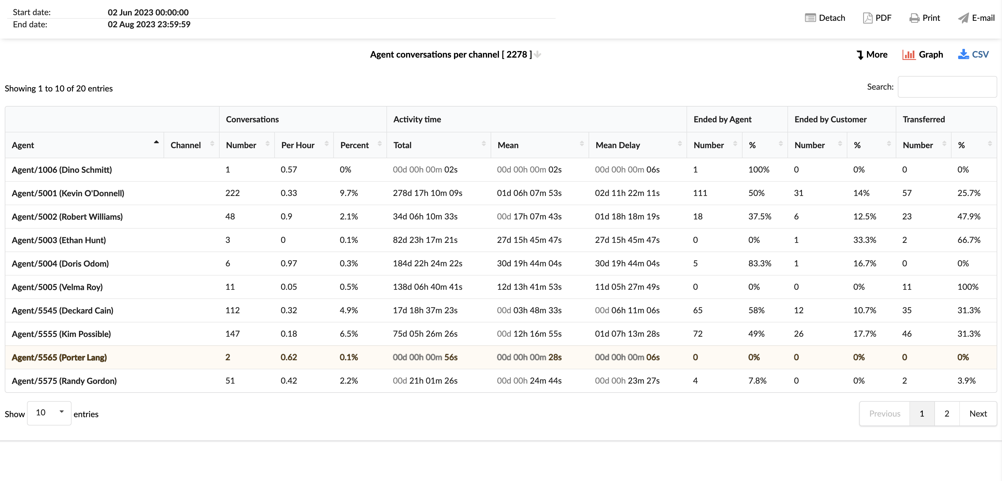
By using the "Agent Conversations per Channel" statistics report, agents and managers can gain insights into the performance of each agent across different channels, identify areas for improvement, and implement strategies to enhance efficiency and customer service.
¶ Agent Conversations per Channel Breakdown
The "Agent Conversations per Channel Breakdown" statistics table provides detailed information about each conversation handled by agents across different communication channels. The table consists of fourteen columns, each offering specific insights about the conversations.
-
Conversation ID: This column lists the unique identifiers for each conversation.
-
Date: This column shows the date when each conversation took place.
-
Channel: This column indicates the communication channel used for each conversation, such as chat, email, or messaging.
-
Customer: This column lists the customers involved in each conversation.
-
Queue: This column shows the queue in which each conversation was handled.
-
Campaign: This column indicates the campaign associated with each conversation.
-
Assignee: This column lists the agent assigned to each conversation.
-
Activity Time: This column shows the total time the agent spent on each conversation.
-
Speed To Answer: This column represents the time taken by the agent to answer each conversation.
-
Entry: This column indicates the time each conversation entered the queue.
-
Exit: This column shows the time each conversation exited the queue.
-
Transferred: This column indicates whether each conversation was transferred to another agent or queue.
-
Last Action By: This column shows who performed the last action in the conversation, whether it was the agent or the customer.
-
Ended: This column indicates how each conversation was concluded.
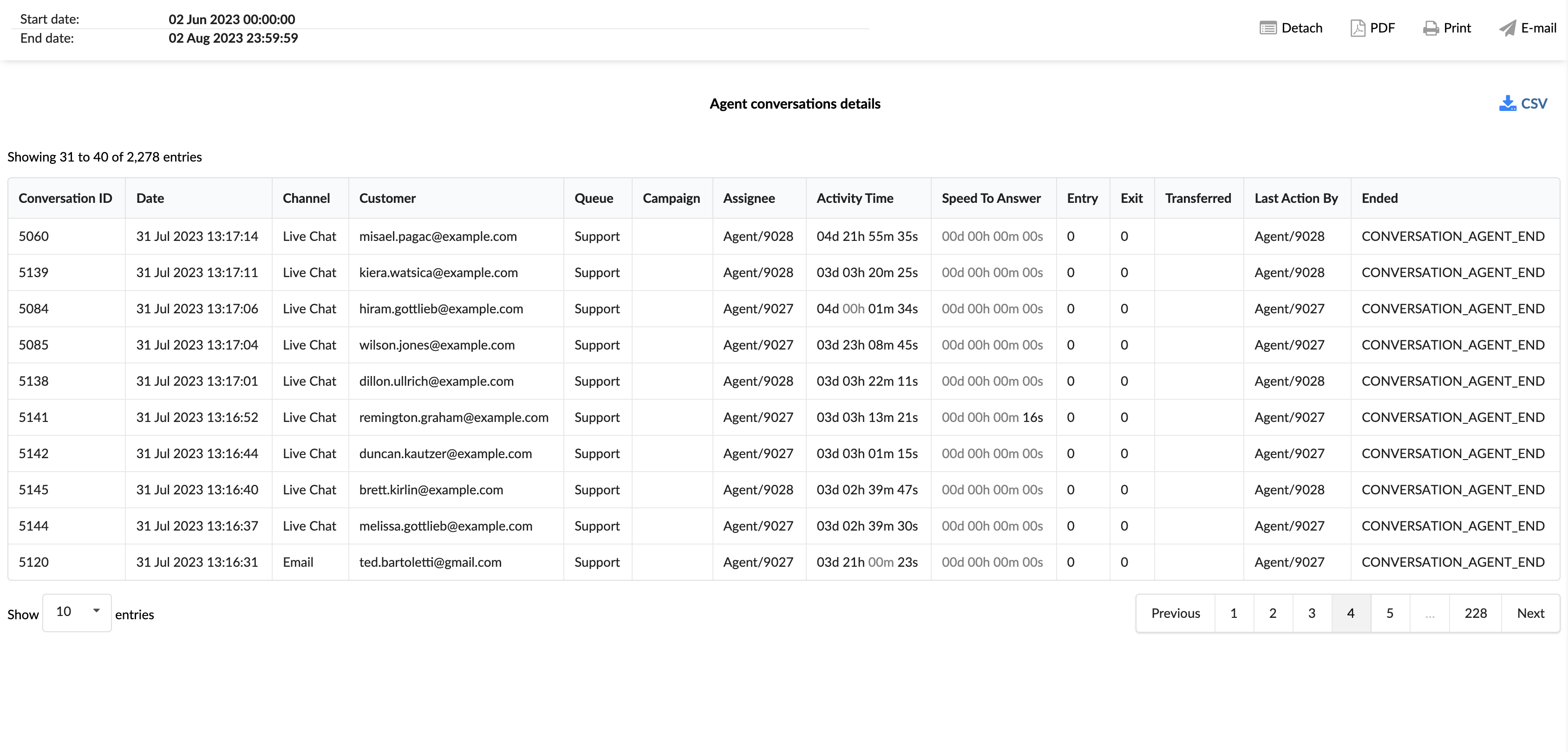
In the report breakdown, two icons are linked to the ConversationID field. The first icon permits users to directly view transcripts of selected conversations, while the second enables them to download these transcripts for further review or analysis. These functionalities offer users convenient access to comprehensive records of customer interactions, which supports meticulous monitoring and evaluation of both agent performance and overall customer service quality.
By using the "Agent Conversations per Channel Breakdown" statistics table, agents and managers can gain a granular understanding of each conversation, identify patterns, and implement strategies to improve agent performance and customer service.
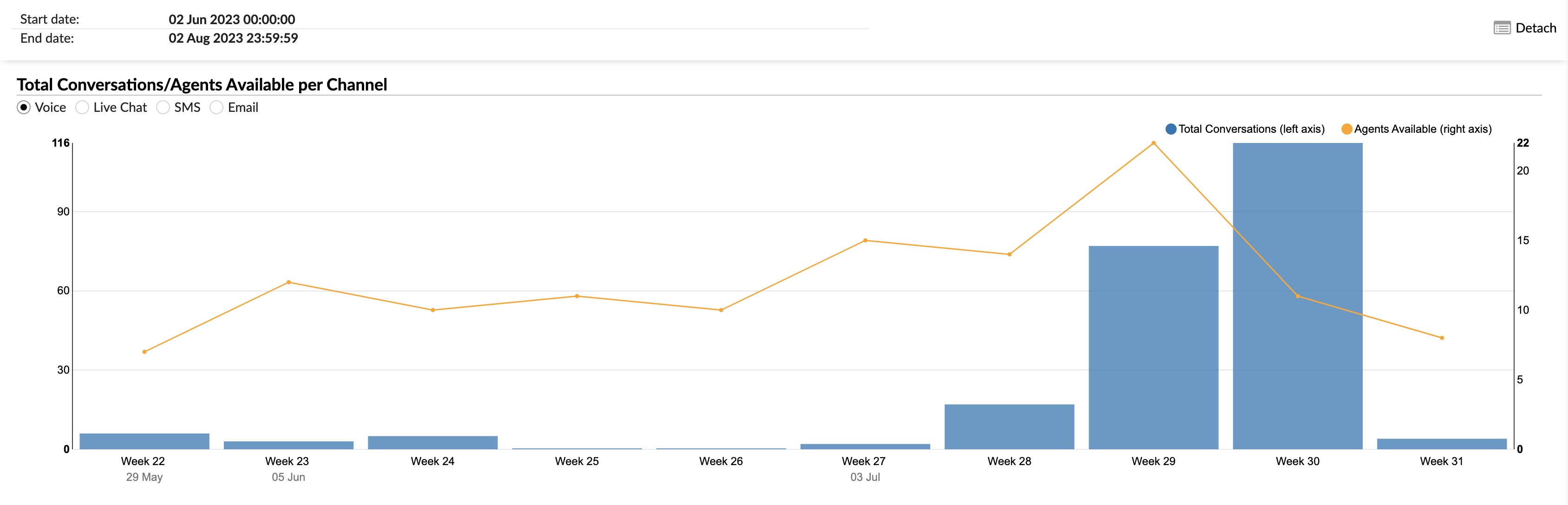
¶ Total Conversations/Agents Available per Channel Graph
The "Total Conversations/Agents Available per Channel" graph provides a visual representation of the total conversations handled and the availability of agents across different communication channels. The graph is designed to allow for a clear comparison and analysis of these two key metrics.
-
Total Conversations (left axis): This metric is represented by vertical columns. Each column corresponds to the total number of conversations handled in a specific channel. The height of the column corresponds to the number of conversations, as indicated on the left axis.
-
Agents Available (right axis): This metric is represented by a yellow line that intersects the vertical columns. Each point on the line corresponds to the number of agents available at a given time, as indicated on the right axis.
Users can select the channels they want to view on the graph using radio buttons. Options include Voice, Live Chat, SMS, and Email. By selecting a specific channel, the graph will render the corresponding data for that channel.
By using the "Total Conversations/Agents Available per Channel" graph, agents and managers can visually analyze the volume of conversations and agent availability across different channels, identify trends, and implement strategies to improve performance and efficiency.
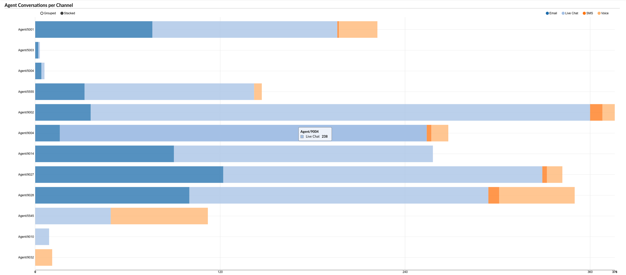
¶ Agent Conversations per Channel Graph
The "Agent Conversations per Channel" graph provides a visual representation of the number of conversations handled by each agent across different communication channels. The graph is designed to allow for a clear comparison and analysis of these key metrics.
-
Agent Conversations: This metric is represented by horizontally laid columns for each agent. Each column corresponds to the total number of conversations handled by a specific agent. The length of the column corresponds to the number of conversations.
-
Channels: The conversations are further divided within each column by color, with each color representing a different communication channel. This allows for a clear view of the distribution of conversations across channels for each agent.
Users can select the channels they want to view on the graph using radio buttons. Options include Voice, Live Chat, SMS, and Email. By selecting a specific channel, the graph will highlight the corresponding data for that channel within each agent's column.
Additionally, by hovering over a specific color within an agent's column, users can see the exact number of tickets or calls handled by that agent for the corresponding channel.
By using the "Agent Conversations per Channel" graph, agents and managers can visually analyze the distribution of conversations across agents and channels, identify trends, and implement strategies to improve performance and efficiency.
¶ Agent Mean Delay and Mean Activity Time per Channel Graph
The "Agent Mean Delay and Mean Activity Time per Channel" graph provides a visual representation of two key metrics for each agent across different communication channels. The graph is designed to allow for a clear comparison and analysis of these metrics.
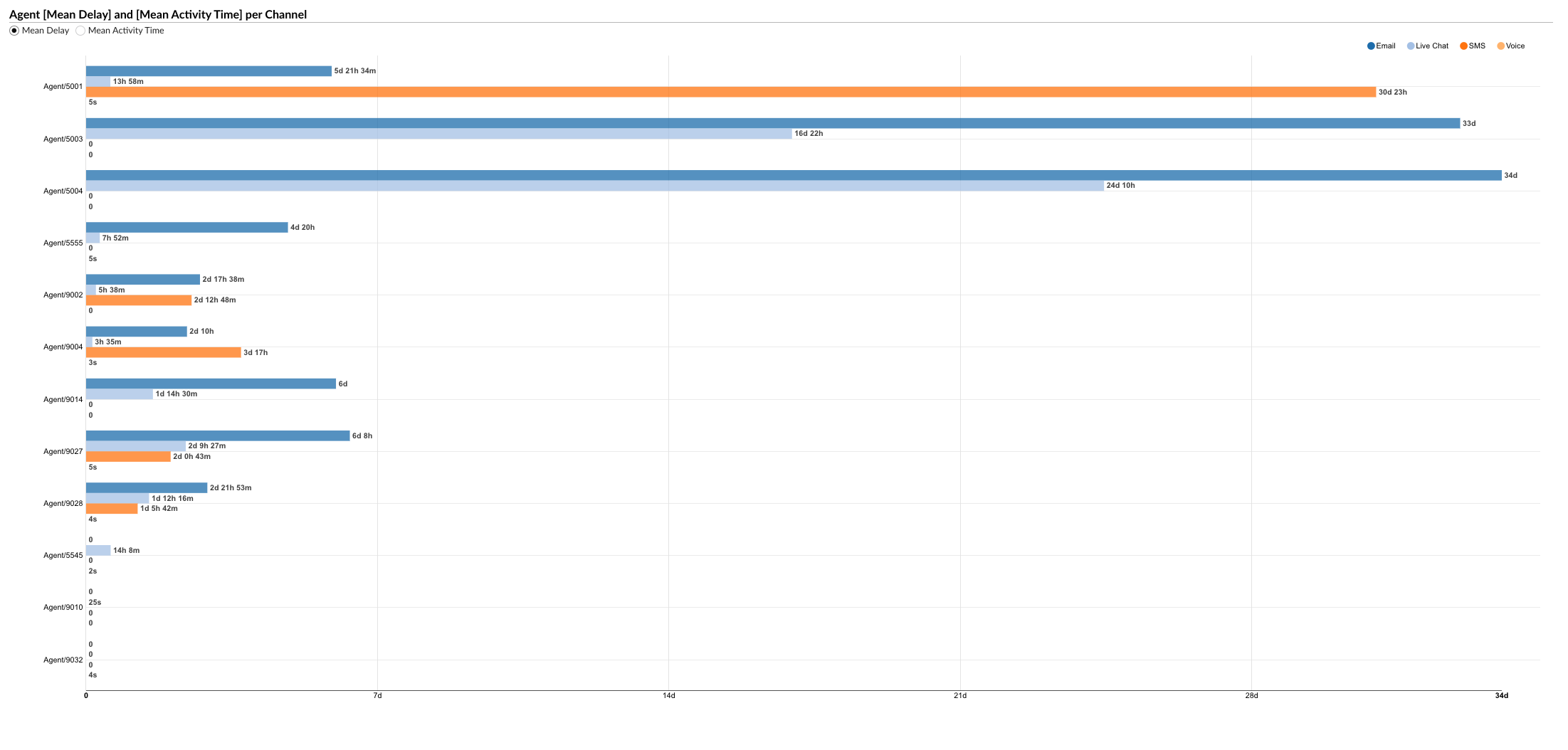
-
Mean Delay and Mean Activity Time: Users can select either of these metrics to view on the graph using radio buttons. The "Mean Delay" represents the average delay time before each agent responds to a conversation, while the "Mean Activity Time" shows the average time the agent spends on each conversation.
-
Channels: Each channel is represented by a different color, as indicated by colored radio buttons. Users can select a specific channel to view the corresponding data for that channel.
-
Agent Metrics: The selected metric is represented by horizontally laid columns for each agent. Each column corresponds to the selected metric (either Mean Delay or Mean Activity Time) for a specific agent. The length of the column corresponds to the value of the metric.
By using the "Agent Mean Delay and Mean Activity Time per Channel" graph, agents and managers can visually analyze these key performance metrics across agents and channels, identify trends, and implement strategies to improve performance and efficiency.
¶ Agent Conversations per Queue
The "Agent Conversations per Queue" statistics report provides a comprehensive overview of the conversations handled by each agent across different queues. The report is divided into several columns, each providing specific details about the conversations.
-
Agent: This column lists the names of all the agents.
-
Queue: This column indicates the queue in which the conversations were handled.
-
Conversations: This column is divided into three sub-columns:
- Number: Shows the total number of conversations each agent has handled in each queue.
- Per Hour: Displays the average number of conversations each agent handles per hour in each queue.
- Percent: Represents the percentage of total conversations that each agent handles in each queue.
-
Activity Time: This column is divided into three sub-columns:
- Total: Shows the cumulative time the agent has spent on conversations in each queue.
- Mean: Displays the average time spent per conversation by each agent in each queue.
- Mean Delay: Represents the average delay time before each agent responds to a conversation in each queue.
-
Ended by Agent: This column is divided into two sub-columns:
- Number: Shows the number of conversations that were ended by the agent in each queue.
- %: Represents the percentage of conversations that were ended by the agent in each queue.
-
Ended by Customer: This column is divided into two sub-columns:
- Number: Shows the number of conversations that were ended by the customer in each queue.
- %: Represents the percentage of conversations that were ended by the customer in each queue.
-
Transferred: This column is divided into two sub-columns:
- Number: Shows the number of conversations that were transferred to another agent or queue in each queue.
- %: Represents the percentage of conversations that were transferred in each queue.
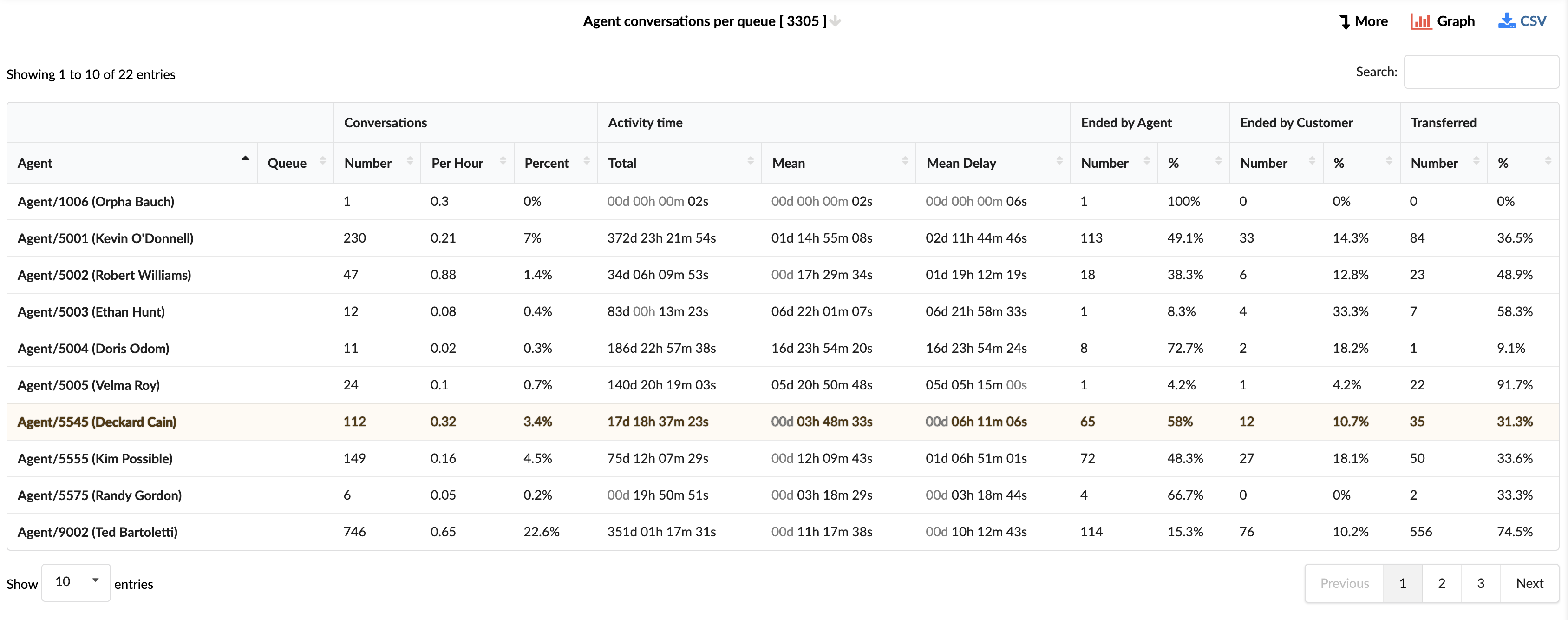
By using the "Agent Conversations per Queue" statistics report, agents and managers can gain insights into the performance of each agent across different queues, identify areas for improvement, and implement strategies to enhance efficiency and customer service.
¶ Agent Conversations per Queue Breakdown
The "Agent Conversations per Queue Breakdown" statistics table provides detailed information about each conversation handled by agents across different queues. The table consists of fourteen columns, each offering specific insights about the conversations.
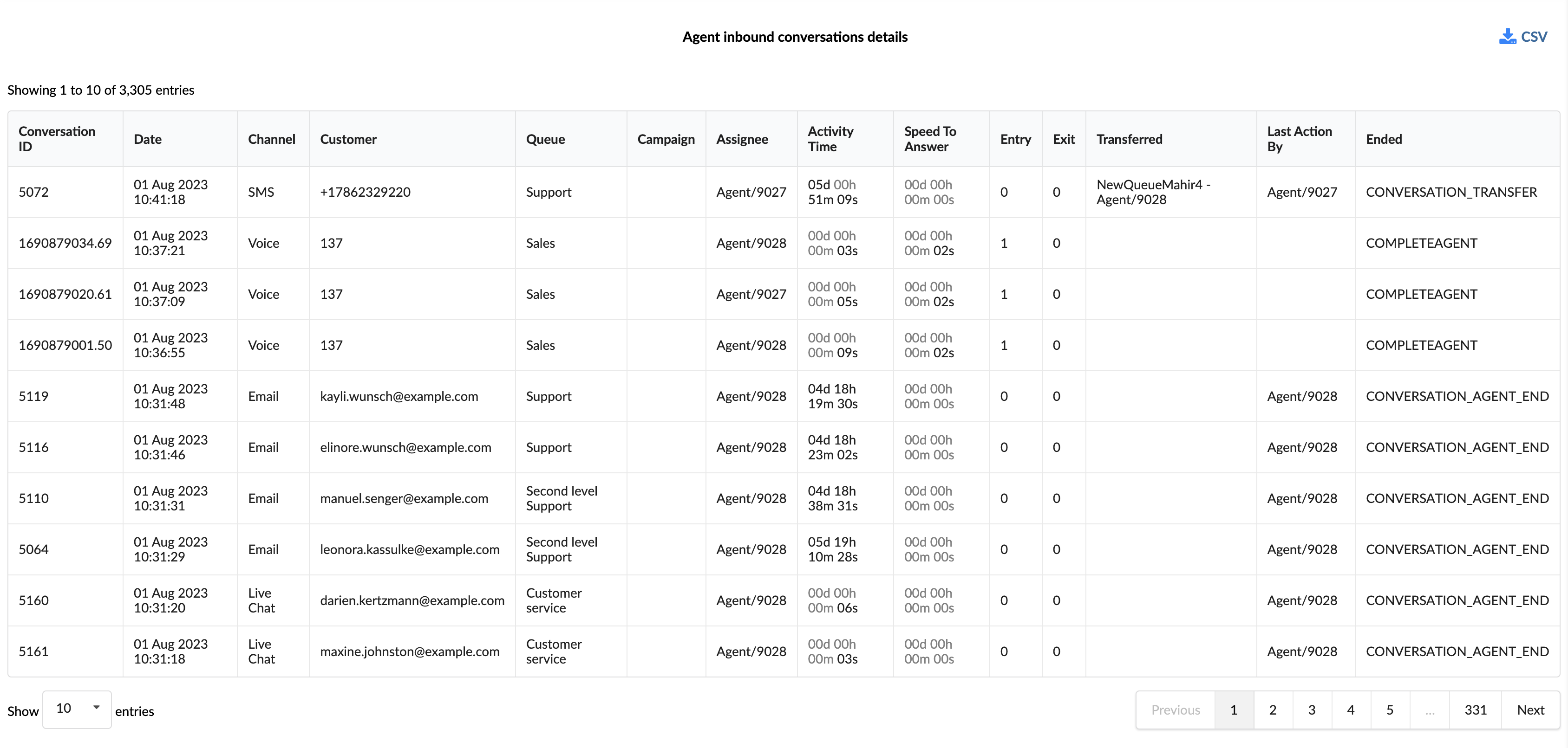
-
Conversation ID: This column lists the unique identifiers for each conversation.
-
Date: This column shows the date when each conversation took place.
-
Channel: This column indicates the communication channel used for each conversation, such as chat, email, or messaging.
-
Customer: This column lists the customers involved in each conversation.
-
Queue: This column shows the queue in which each conversation was handled.
-
Campaign: This column indicates the campaign associated with each conversation.
-
Assignee: This column lists the agent assigned to each conversation.
-
Activity Time: This column shows the total time the agent spent on each conversation.
-
Speed To Answer: This column represents the time taken by the agent to answer each conversation.
-
Entry: This column indicates the time each conversation entered the queue.
-
Exit: This column shows the time each conversation exited the queue.
-
Transferred: This column indicates whether each conversation was transferred to another agent or queue.
-
Last Action By: This column shows who performed the last action in the conversation, whether it was the agent or the customer.
-
Ended: This column indicates how each conversation was concluded.
In the report breakdown, two icons are linked to the ConversationID field. The first icon permits users to directly view transcripts of selected conversations, while the second enables them to download these transcripts for further review or analysis. These functionalities offer users convenient access to comprehensive records of customer interactions, which supports meticulous monitoring and evaluation of both agent performance and overall customer service quality.
By using the "Agent Conversations per Queue Breakdown" statistics table, agents and managers can gain a granular understanding of each conversation, identify patterns, and implement strategies to improve agent performance and customer service.
¶ Total Conversations/Agents Available per Queue Graph
The "Total Conversations/Agents Available per Queue" graph provides a visual representation of the total conversations handled and the availability of agents across different queues. The graph is designed to allow for a clear comparison and analysis of these two key metrics.
-
Total Conversations (left axis): This metric is represented by vertical columns. Each column corresponds to the total number of conversations handled in a specific queue. The height of the column corresponds to the number of conversations, as indicated on the left axis.
-
Agents Available (right axis): This metric is represented by a yellow line that intersects the vertical columns. Each point on the line corresponds to the number of agents available at a given time, as indicated on the right axis.
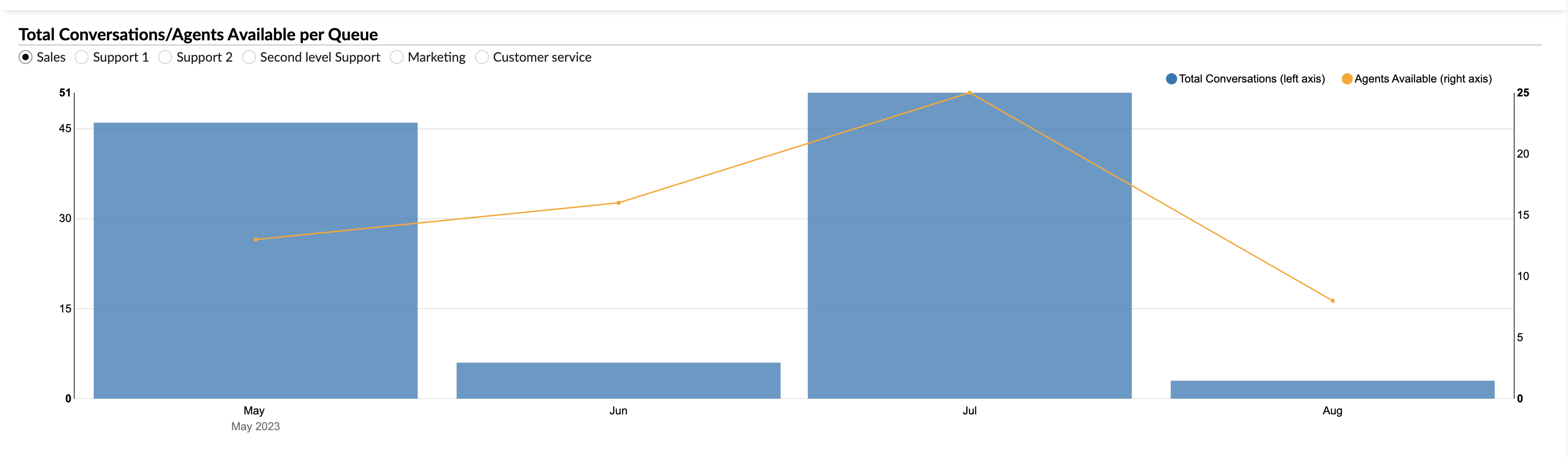
Users can select the queues they want to view on the graph using radio buttons. By selecting a specific queue, the graph will render the corresponding data for that queue.
By using the "Total Conversations/Agents Available per Queue" graph, agents and managers can visually analyze the volume of conversations and agent availability across different queues, identify trends, and implement strategies to improve performance and efficiency.
¶ Agent Conversations per Queue Graph
The "Agent Conversations per Queue" graph provides a visual representation of the number of conversations handled by each agent across different queues. The graph is designed to allow for a clear comparison and analysis of these key metrics.
-
Agent Conversations: This metric is represented by horizontally laid columns for each agent. Each column corresponds to the total number of conversations handled by a specific agent. The length of the column corresponds to the number of conversations.
-
Queues: The conversations are further divided within each column by color, with each color representing a different queue. This allows for a clear view of the distribution of conversations across queues for each agent.
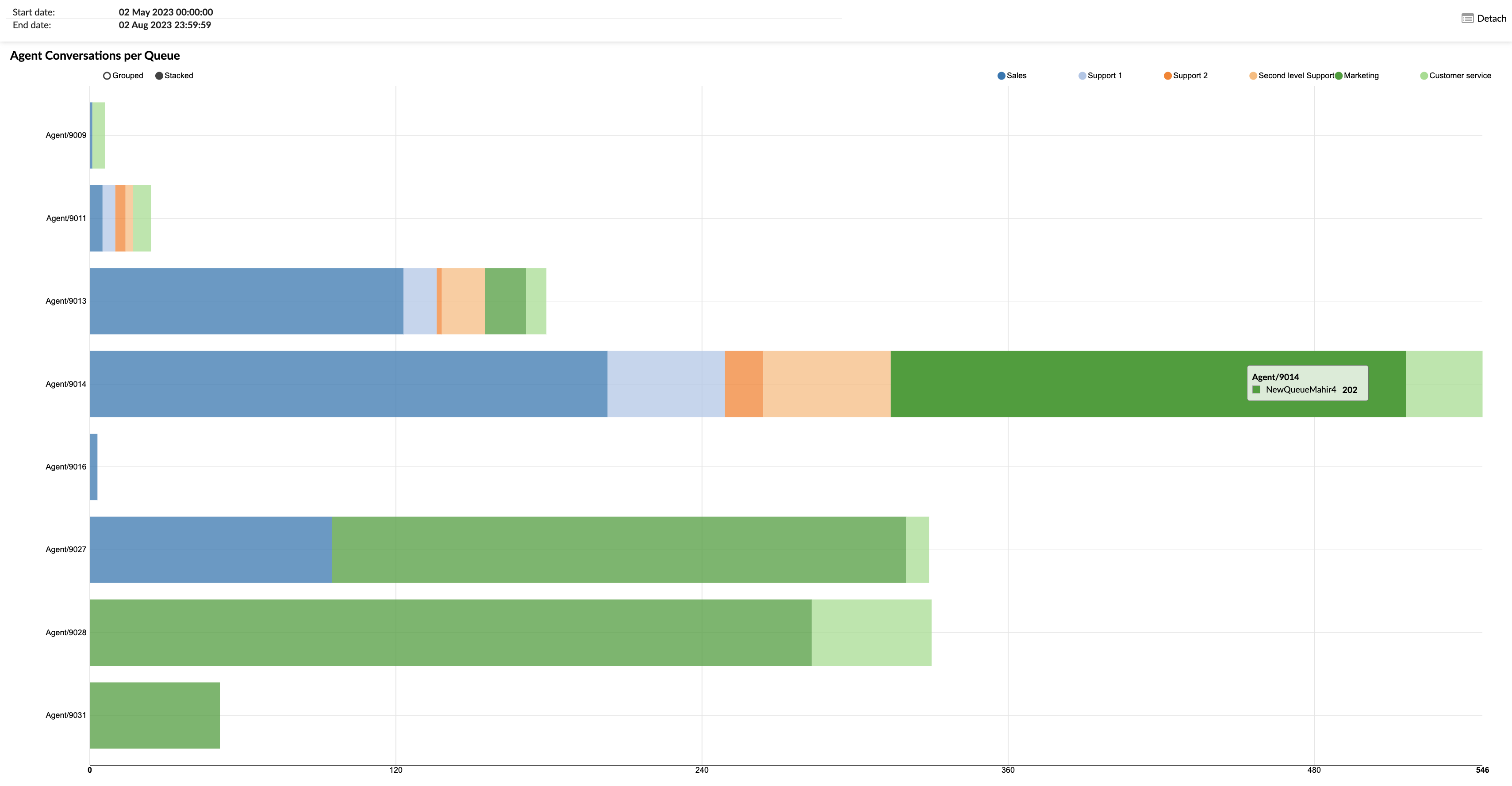
Users can select the queues they want to view on the graph using radio buttons. By selecting a specific queue, the graph will highlight the corresponding data for that queue within each agent's column.
Additionally, by hovering over a specific color within an agent's column, users can see the exact number of conversations handled by that agent for the corresponding queue.
By using the "Agent Conversations per Queue" graph, agents and managers can visually analyze the distribution of conversations across agents and queues, identify trends, and implement strategies to improve performance and efficiency.
¶ Agent [Mean Delay] and [Mean Activity Time] per Queue Graph
The "Agent Mean Delay and Mean Activity Time per Queue" graph provides a visual representation of two key metrics for each agent across different queues. The graph is designed to allow for a clear comparison and analysis of these metrics.
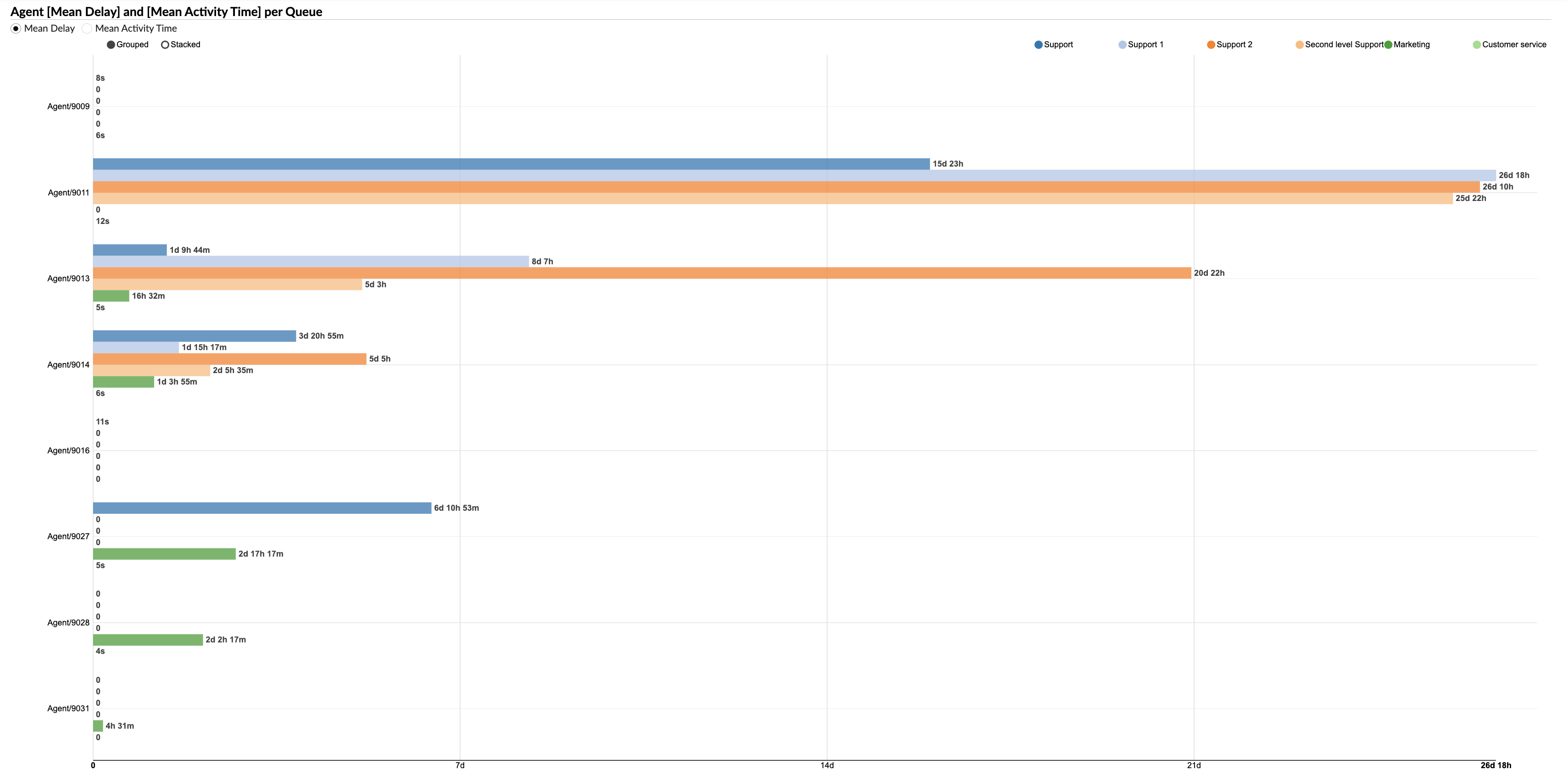
-
Mean Delay and Mean Activity Time: Users can select either of these metrics to view on the graph using radio buttons. The "Mean Delay" represents the average delay time before each agent responds to a conversation, while the "Mean Activity Time" shows the average time the agent spends on each conversation.
-
Queues: Each queue is represented by a different color, as indicated by colored radio buttons. Users can select a specific queue to view the corresponding data for that queue.
-
Agent Metrics: The selected metric is represented by horizontally laid columns for each agent. Each column corresponds to the selected metric (either Mean Delay or Mean Activity Time) for a specific agent. The length of the column corresponds to the value of the metric.
By using the "Agent Mean Delay and Mean Activity Time per Queue" graph, agents and managers can visually analyze these key performance metrics across agents and queues, identify trends, and implement strategies to improve performance and efficiency.
¶ Agent Direct Out Calls
The "Agent Direct Out Calls" report offers a comprehensive view of all outbound calls manually dialed by agents. It provides detailed time metrics, call results, and individual call logs, helping supervisors analyze agent behavior, call-handling performance, and outreach success. This report is valuable for identifying training opportunities, understanding call resolution patterns, and optimizing outbound engagement strategies.
¶ Agent Direct Out Calls
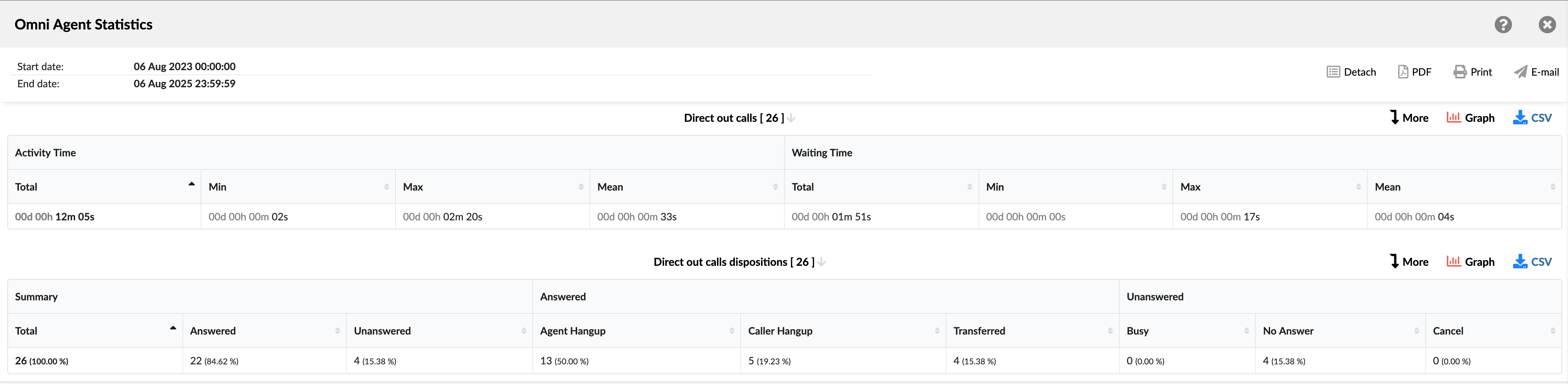
This table summarizes key time metrics for all manually placed outbound calls.
- Activity time: The total time an agent spent actively engaged on a call. This is broken down into:
- Total: Shows the total time spent on all outbound calls.
- Min: Shows the shortest time spent on the outbound call.
- Max: Shows the longest time spent on the outbound call.
- Mean: Shows the average time spent on all outbound calls.
- Waiting time: The time that elapses between an agent placing a call and the call being answered. This is broken down into:
- Total: Shows the total waiting time for all outbound calls.
- Min: Shows the shortest waiting time for an outbound call.
- Max: Shows the longest waiting time for an outbound call.
- Mean: Shows the average waiting time for all outbound calls.
¶ Agent Direct Out Calls Dispositions
This table breaks down all manually placed outbound calls by their final outcome (disposition), showing the total count and percentage for each category.
- Summary:
- Total: Shows the total number of manually dialed calls.
- Answered: Shows the total number and percentage of calls that were answered.
- Unanswered: Shows the total number and percentage of calls that were not answered.
- Answered:
- Agent Hangup: Shows the total number and percentage of all answered calls that the agent ended.
- Caller Hangup: Shows the total number and percentage of all answered calls that the caller ended.
- Transferred: Shows the total number and percentage of all answered calls that were forwarded to another destination.
- Unanswered:
- Busy: Shows the total number and percentage of unanswered calls that failed to connect because the caller's line was busy.
- No Answer: Shows the total number and percentage of unanswered calls that rang but were not answered.
- Cancel: Shows the total number and percentage of unanswered calls that were canceled before it was connected.
¶ Agent Direct Out Calls / Direct Out Calls Dispositions Breakdown
The "Agent Direct Out Calls / Direct Out Calls Dispositions Breakdown" table provides a detailed, row-by-row view of each outbound call manually placed by agents. This breakdown helps supervisors and analysts trace specific interactions, audit individual call behaviors, and cross-reference timing, routing, and call resolution details.
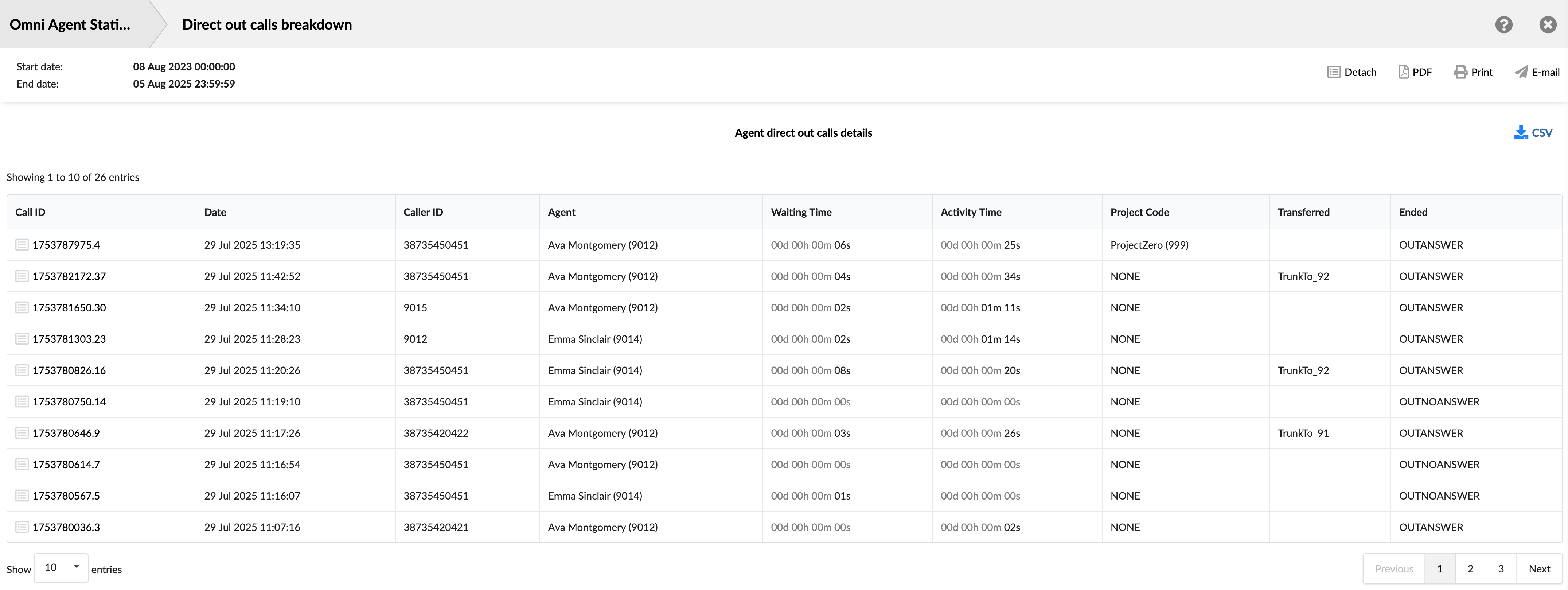
- Call ID: Shows the unique identifier for each call. This ID can be used to search for and track a specific call.
- Date: Shows the date and time when each call occurred. This allows you to view and sort calls based on when they happened.
- Caller ID: Shows the phone/extension number the agent attempted to reach.
- Agent: Displays the full name (and internal ID) of the agent who manually placed the call.
- Waiting Time: Shows the time between when the call was placed and when it was answered.
- Activity Time: Shows the total time the agent spent on the call.
- Project Code: Shows the project label associated with the call, if the agent initiated the call using a special project access code.
- Transferred: Indicates whether the call was transferred, and if so, shows the destination.
- Ended: Shows the outcome or status of the call attempt (e.g., OUTANSWER, OUTNOANSWER).
¶ Agent Direct Out Calls / Direct Out Calls Dispositions Graph
The "Agent Direct Out Calls / Direct Out Calls Dispositions Graphs" page provides a visual representation of how manually dialed outbound calls are distributed across various outcomes. Use these graphs to quickly identify trends and understand the overall distribution of call results.
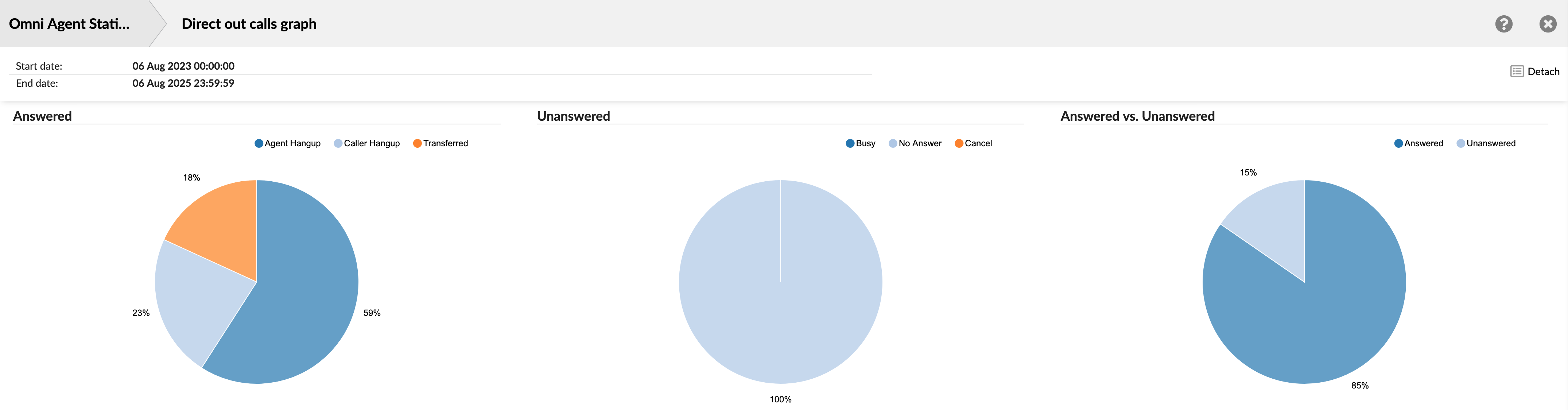
The section includes three charts:
- Answered Calls Disposition - A pie chart showing the proportion of answered calls by their outcome: Agent Hangup, Caller Hangup, or Transferred.
- Unanswered Calls Disposition - A pie chart breaking down the reasons for unanswered calls: Busy, No Answer, or Canceled.
- Answered vs. Unanswered Comparison - A pie chart providing a high-level comparison of all answered versus all unanswered calls.
¶ Agent Direct Out Calls per Project
The "Agent Direct Out Calls per Project" report provides a detailed breakdown of manually dialed outbound calls that agents have categorized using specific project codes. This report is essential for businesses that need to track agent activity and call metrics on a per-project, client, or task basis.
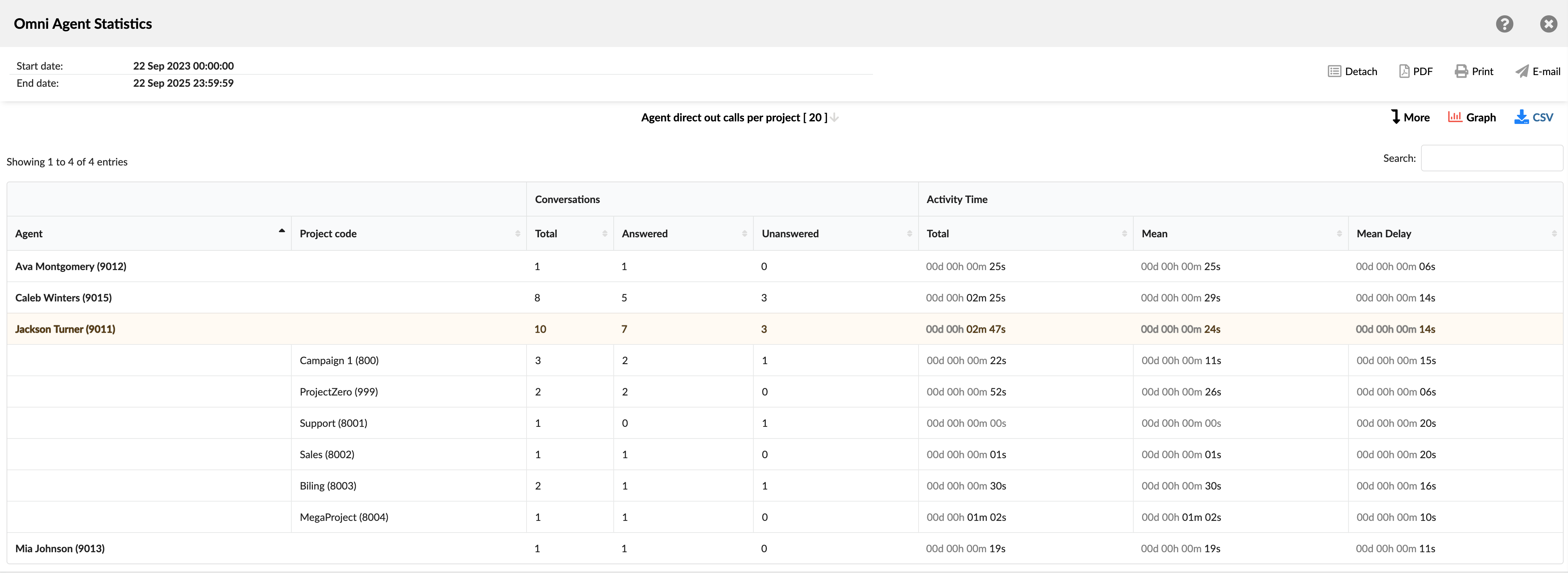
It helps supervisors understand where agents are allocating their time, measure call volumes for different projects, and analyze performance related to specific business functions, such as sales, support, or billing. The report groups data first by agent and then breaks it down by each project code they used.
- Agent: Shows the full name and internal ID of the agent.
- Project code: Lists the specific project codes associated with the agent's direct out calls.
- Conversations: This section summarizes the volume and outcome of the calls. It is divided into three columns:
- Total: Shows the total number of direct out calls made for that specific project or for the agent's overall total.
- Answered: Shows the number of calls that were successfully connected and answered by the recipient.
- Unanswered: Shows the number of calls that were not answered (e.g., rang out, busy signal).
- Activity Time: This section provides metrics related to the duration of the calls. It is divided into three columns:
- Total: Shows the cumulative talk time of all calls for specific project.
- Mean: Shows the average talk time of all calls for specific project.
- Mean Delay: Shows the average time from when an agent initiated the dial until the call was answered by the recipient.
¶ Agent Direct Out Calls per Project Breakdown
The "Agent Direct Out Calls per Project Breakdown" table provides the most granular view of the report, presenting a complete, call-by-call log of all manually dialed outbound calls associated with project codes. Each row represents a single call, allowing supervisors to drill down from the summary to analyze specific interactions.
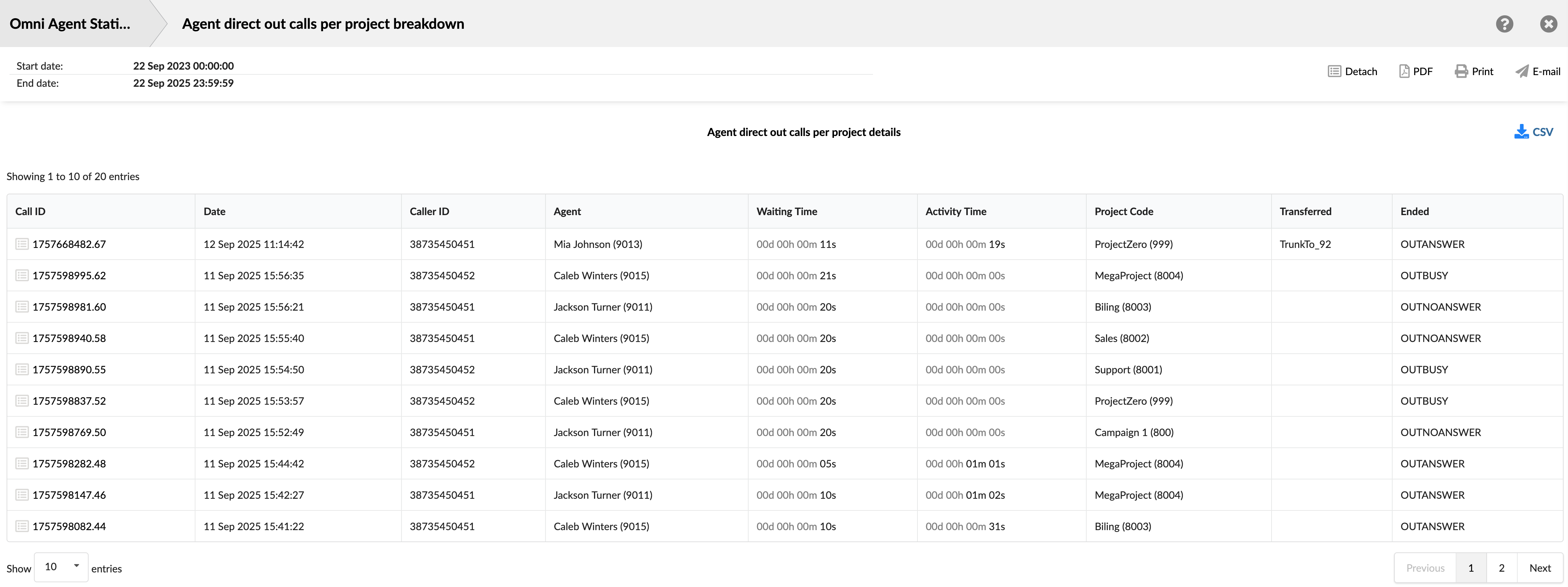
This detailed view is ideal for auditing project-specific work, verifying that calls are coded correctly, and investigating the outcome of individual project-related communications.
- Call ID: Shows the unique identifier for each call. This ID can be used to search for and track a specific call.
- Date: Shows the date and time when each call occurred. This allows you to view and sort calls based on the time they occurred.
- Caller ID: Shows the phone/extension number the agent attempted to reach.
- Agent: Displays the full name (and internal ID) of the agent who manually placed the call.
- Waiting Time: Shows the time between when the call was placed and when it was answered.
- Activity Time: Shows the total time the agent spent on the call.
- Project Code: Shows the specific project code that was assigned to the call.
- Transferred: Indicates whether the call was transferred, and if so, shows the destination.
- Ended: Shows the outcome or status of the call attempt (e.g., OUTANSWER, OUTNOANSWER).
¶ Agent Direct Out Calls per Project Graph
The "Agent Direct Out Calls per Project Graph" provides a visual summary of the report data, making it easy to compare agent activity and workload across different projects. This chart allows supervisors to quickly identify which agents are making the most project-coded calls and to see how their efforts are distributed among various tasks or clients.
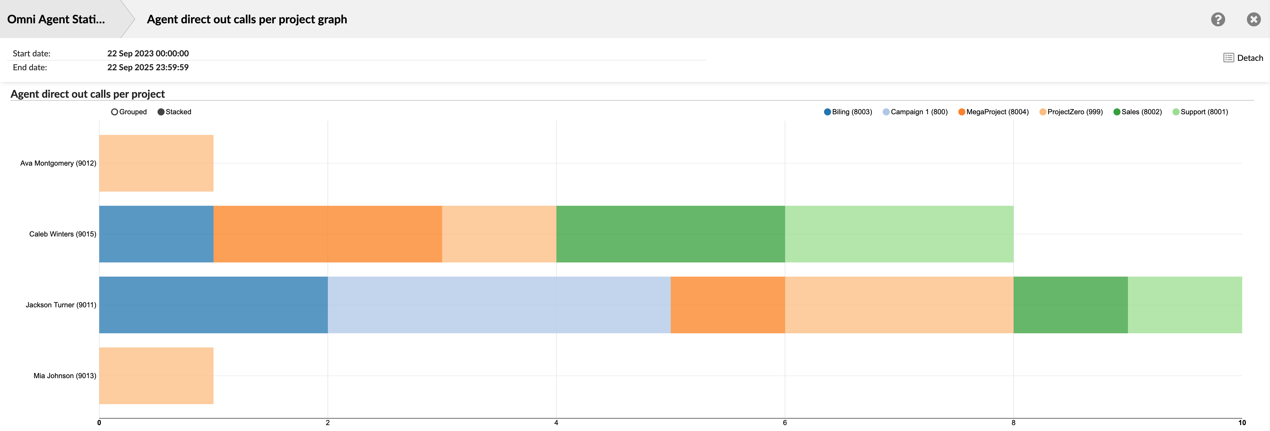
The graph is a horizontal bar chart where each agent is represented by a bar.
- Total Volume: The total length of an agent's bar corresponds to the total number of project-coded calls they made. This allows for a quick comparison of overall activity between agents.
- Work Distribution: Each bar is divided into colored segments. As shown in the legend at the top, each color represents a different project code. The size of each segment indicates the number of calls the agent made for that specific project, visualizing their workload distribution.
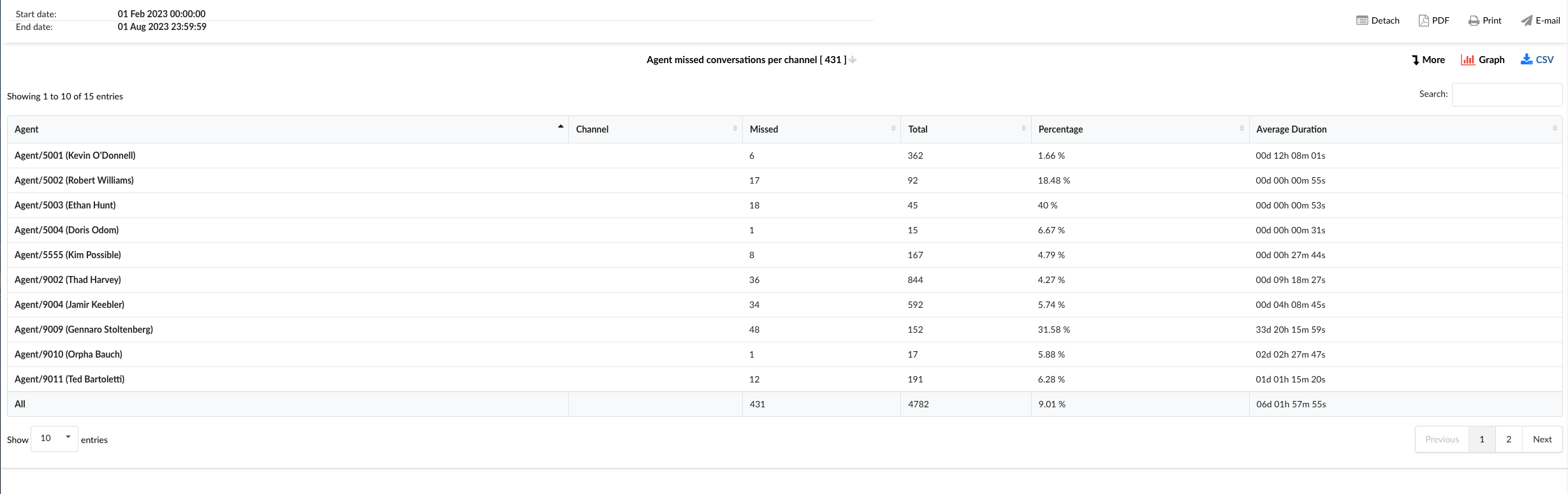
¶ Agent Missed Conversations per Channel
The "Agent Missed Conversations Per Channel" report provides an in-depth look into interactions that agents missed over various communication channels. This analysis helps identify areas where customer interactions might have been overlooked, allowing businesses to address gaps in their service. The table is divided into six columns, each providing specific details about the missed conversations.
-
Agent: This column lists the names of all the agents.
-
Channel: This column indicates the communication channel for the missed conversations, such as chat, email, or messaging.
-
Missed: This column shows the total number of conversations each agent has missed in each channel.
-
Total: This column displays the total number of conversations each agent was assigned in each channel, including both handled and missed conversations.
-
Percentage: This column represents the percentage of conversations missed by each agent in each channel, calculated as the number of missed conversations divided by the total number of conversations.
-
Average Duration: This column shows the average duration of the missed conversations for each agent in each channel.
By using the "Agent Missed Conversations per Channel" statistics table, agents and managers can gain insights into the performance of each agent across different channels, identify areas for improvement, and implement strategies to reduce the number of missed conversations.
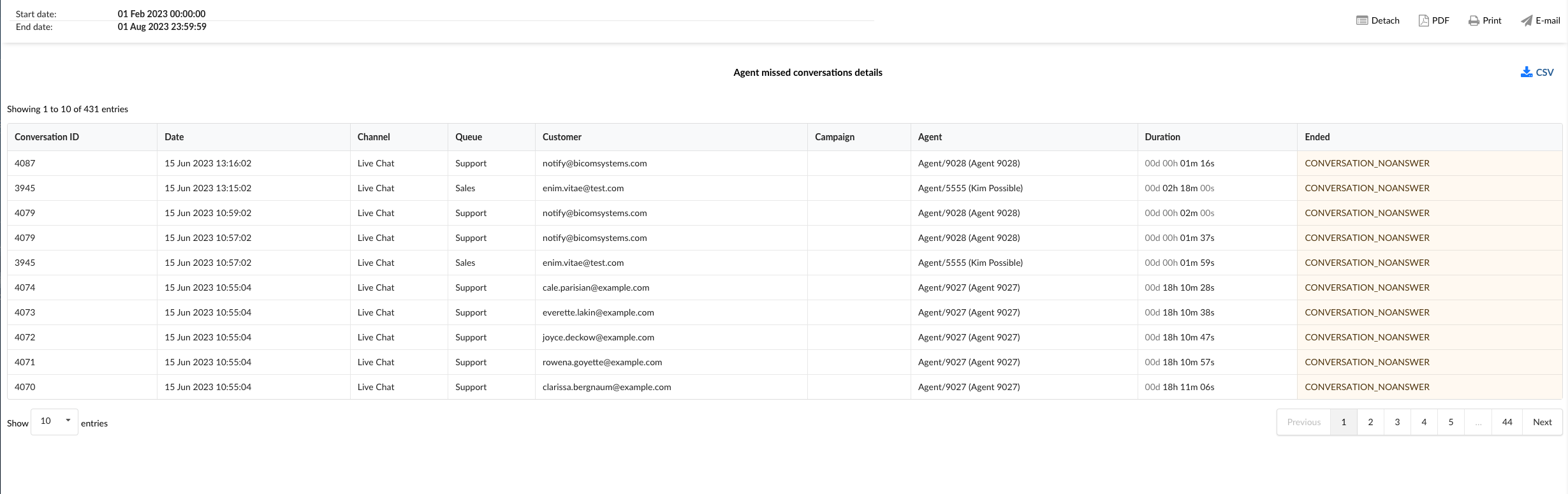
¶ Agent Missed Conversations per Channel Breakdown
The "Agent Missed Conversations per Channel Breakdown" statistics table provides detailed information about each missed conversation across different communication channels. The table consists of nine columns, each offering specific insights about the missed conversations.

-
Conversation ID: This column lists the unique identifiers for each missed conversation.
-
Date: This column shows the date when each missed conversation took place.
-
Channel: This column indicates the communication channel of the missed conversation, such as chat, email, or messaging.
-
Queue: This column shows the queue in which each missed conversation was assigned.
-
Customer: This column lists the customers involved in each missed conversation.
-
Campaign: This column indicates the campaign associated with each missed conversation.
-
Agent: This column lists the agent who missed each conversation.
-
Duration: This column shows the duration of each missed conversation.
-
Ended: This column indicates how each missed conversation was concluded.
In the report breakdown, two icons are linked to the ConversationID field. The first icon permits users to directly view transcripts of selected conversations, while the second enables them to download these transcripts for further review or analysis. These functionalities offer users convenient access to comprehensive records of customer interactions, which supports meticulous monitoring and evaluation of both agent performance and overall customer service quality.
By using the "Agent Missed Conversations per Channel Breakdown" statistics table, agents and managers can gain a granular understanding of each missed conversation, identify patterns, and implement strategies to improve agent performance and reduce the number of missed conversations.
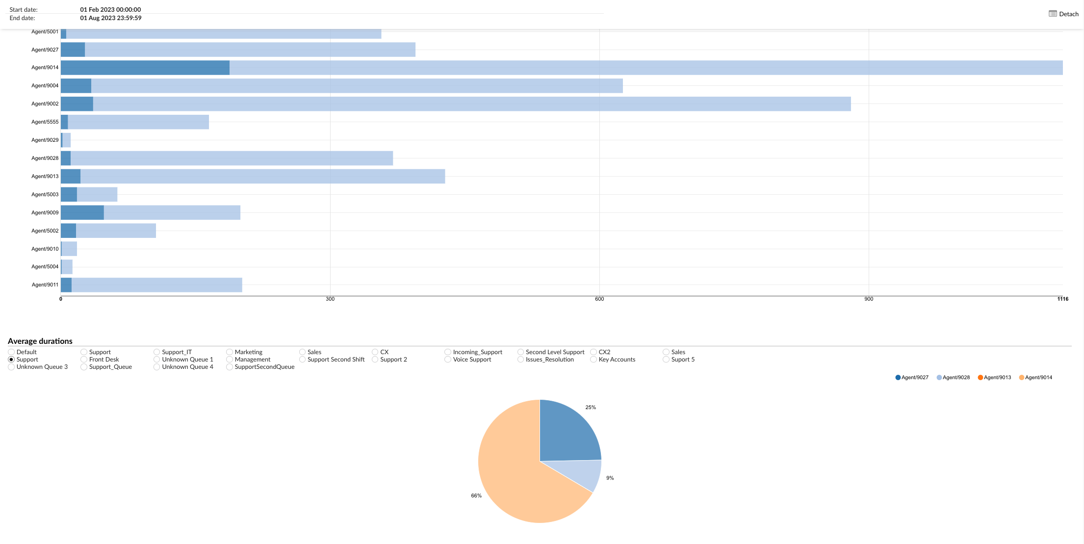
¶ Agent Missed Conversations per Channel Graph
The "Agent Missed Conversations per Channel" graph provides a visual representation of the conversations missed by each agent across different communication channels. The graph is divided into two sections, each providing specific insights about the missed conversations.
-
Missed Conversations: This section displays horizontally laid bars for each agent. Each bar indicates the total number of conversations assigned to the agent and the number of those conversations that were missed. The length of the bar represents the total number of conversations, while the highlighted portion of the bar represents the number of missed conversations. These bars can be aligned in two ways: 'Grouped' and 'Stacked', providing different perspectives on the data.
-
Average Durations: This section enables users to select specific agents and channels to display a pie chart that represents the average duration of conversations. Users can choose to view data for an individual agent, all agents, or a selected group of agents, across different channels such as Voice, SMS, Live Chat, and Email. Each segment of the pie chart corresponds to an agent's average conversation duration for a specific channel. The size of each segment is proportional to the average duration, effectively visualizing the average conversation durations per channel for each agent.
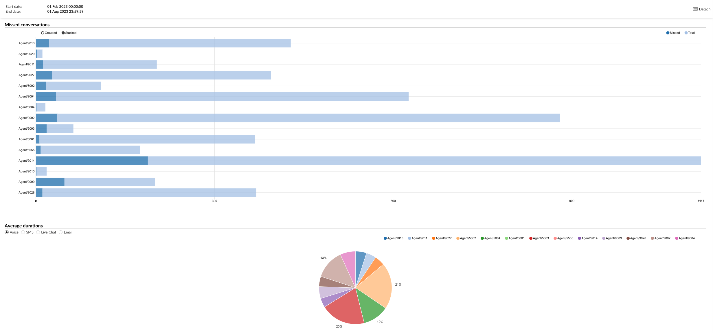
By using the "Agent Missed Conversations per Channel" graph, agents and managers can visually analyze the performance of each agent across different channels, identify trends, and implement strategies to reduce the number of missed conversations.
¶ Agent Missed Conversations per Queue
The "Agent Missed Conversations per Queue" statistics table provides a detailed overview of the conversations missed by each agent across different queues. The table is divided into six columns, each providing specific details about the missed conversations.
-
Agent: This column lists the names of all the agents.
-
Queue: This column indicates the queue in which the conversations were missed.
-
Missed: This column shows the total number of conversations each agent has missed in each queue.
-
Total: This column displays the total number of conversations each agent was assigned in each queue, including both handled and missed conversations.
-
Percentage: This column represents the percentage of conversations missed by each agent in each queue, calculated as the number of missed conversations divided by the total number of conversations.
-
Average Duration: This column shows the average duration of the missed conversations for each agent in each queue.
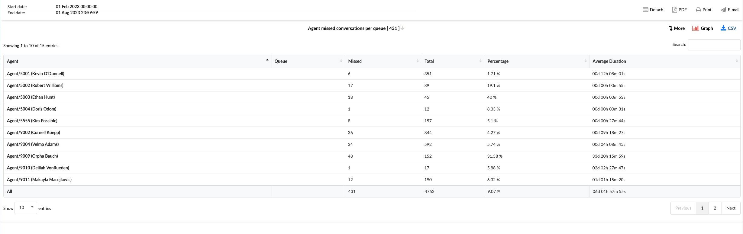
By using the "Agent Missed Conversations per Queue" statistics table, agents and managers can gain insights into the performance of each agent across different queues, identify areas for improvement, and implement strategies to reduce the number of missed conversations.
¶ Agent Missed Conversations per Queue Breakdown
The "Agent Missed Conversations per Queue Breakdown" statistics table provides detailed information about each missed conversation across different queues. The table consists of nine columns, each offering specific insights about the missed conversations.
-
Conversation ID: This column lists the unique identifiers for each missed conversation.
-
Date: This column shows the date when each missed conversation took place.
-
Channel: This column indicates the communication channel of the missed conversation, such as chat, email, or messaging.
-
Queue: This column shows the queue in which each missed conversation was assigned.
-
Customer: This column lists the customers involved in each missed conversation.
-
Campaign: This column indicates the campaign associated with each missed conversation.
-
Agent: This column lists the agent who missed each conversation.
-
Duration: This column shows the duration of each missed conversation.
-
Ended: This column indicates how each missed conversation was concluded.
Within the report breakdown, there are two icons associated with the ConversationID field. The first icon allows supervisors to view the transcripts of selected conversations directly. The second icon enables them to download the transcripts of selected conversations for further review or analysis. These features provide supervisors with convenient access to detailed records of customer interactions, facilitating thorough monitoring and assessment of agent performance and customer service quality.
By using the "Agent Missed Conversations per Queue Breakdown" statistics table, agents and managers can gain a granular understanding of each missed conversation, identify patterns, and implement strategies to improve agent performance and reduce the number of missed conversations.
¶ Agent Missed Conversations per Queue Graph
The "Agent Missed Conversations per Queue" graph provides a visual representation of the conversations missed by each agent across different queues. The graph is divided into two sections, each providing specific insights about the missed conversations.
-
Missed Conversations: This section displays horizontally laid bars for each agent. Each bar indicates the total number of conversations assigned to the agent and the number of those conversations that were missed. The length of the bar represents the total number of conversations, while the highlighted portion of the bar represents the number of missed conversations.
-
Average Durations: In this section, users can select a specific queue to view a pie chart that shows the average duration of missed conversations per agent in that queue. Each slice of the pie chart represents an agent, and the size of the slice corresponds to the average duration of the conversations missed by that agent.
By using the "Agent Missed Conversations per Queue" graph, agents and managers can visually analyze the performance of each agent across different queues, identify trends, and implement strategies to reduce the number of missed conversations.
¶ Agent Pauses
An Agent Pauses statistics report offers comprehensive insights into the pauses taken by agents within a working environment. These pauses, essential for maintaining productivity and well-being, encompass a variety of activities such as short breaks for rest, personal needs like bathroom breaks, stretching exercises, or brief moments for administrative tasks.
The report details the frequency, duration, and timing of these pauses for each agent, providing supervisors with a clear understanding of how agents manage their time throughout their shifts. By analyzing this data, supervisors can optimize schedules to accommodate necessary breaks without compromising service levels. Additionally, the report aids in identifying trends or patterns in pause behavior, which can inform policies or training initiatives aimed at improving overall agent well-being and efficiency. This level of insight ensures that agents can maintain optimal performance while balancing their personal needs, contributing to a healthier and more productive work environment.
Supervisors can use these reports to analyze whether the timing and frequency of pauses affect overall service levels and customer satisfaction. Also, by studying these reports, supervisors can identify opportunities to optimize break schedules, provide additional training, or adjust staffing levels to ensure that service quality remains high.
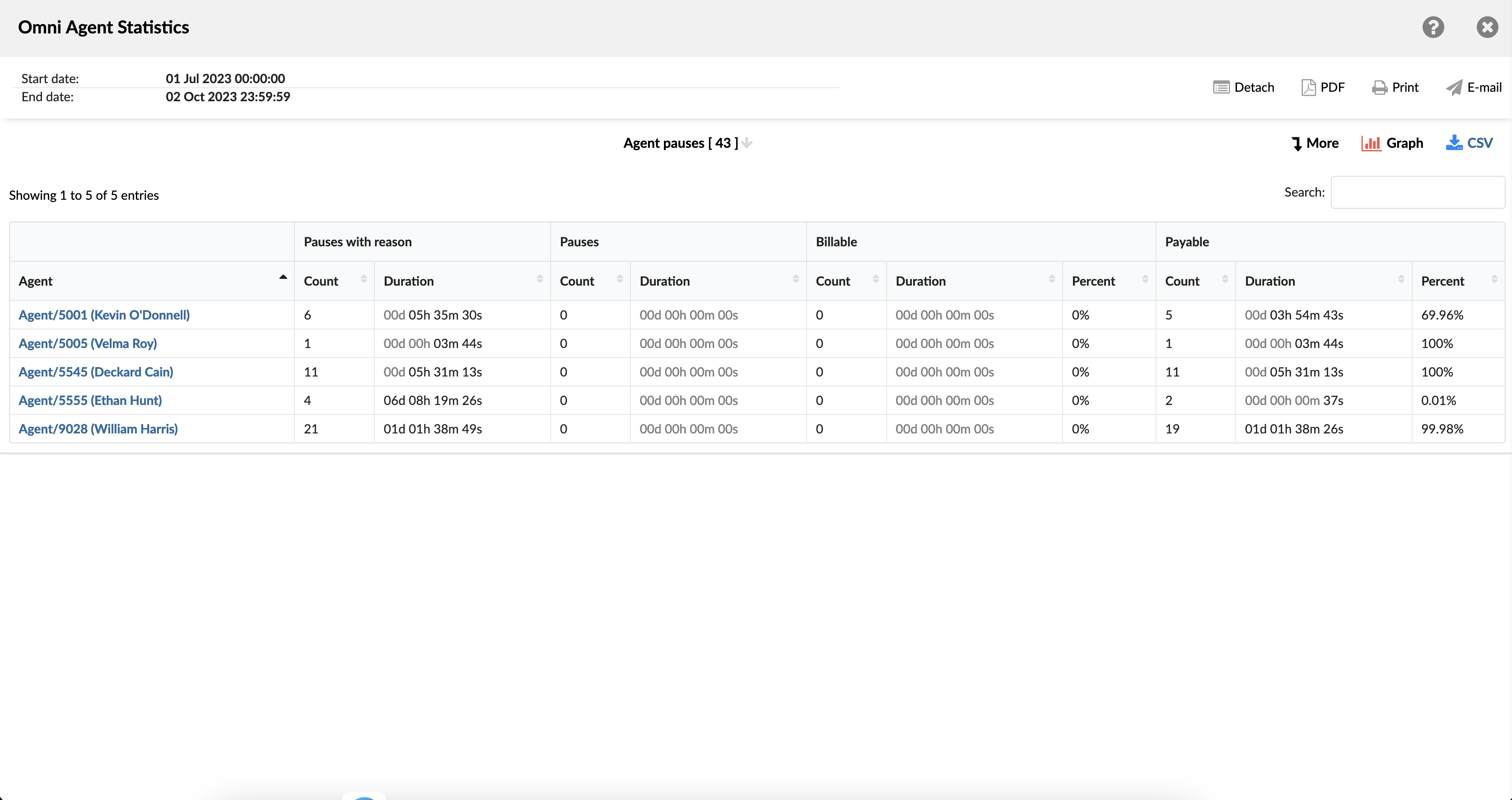
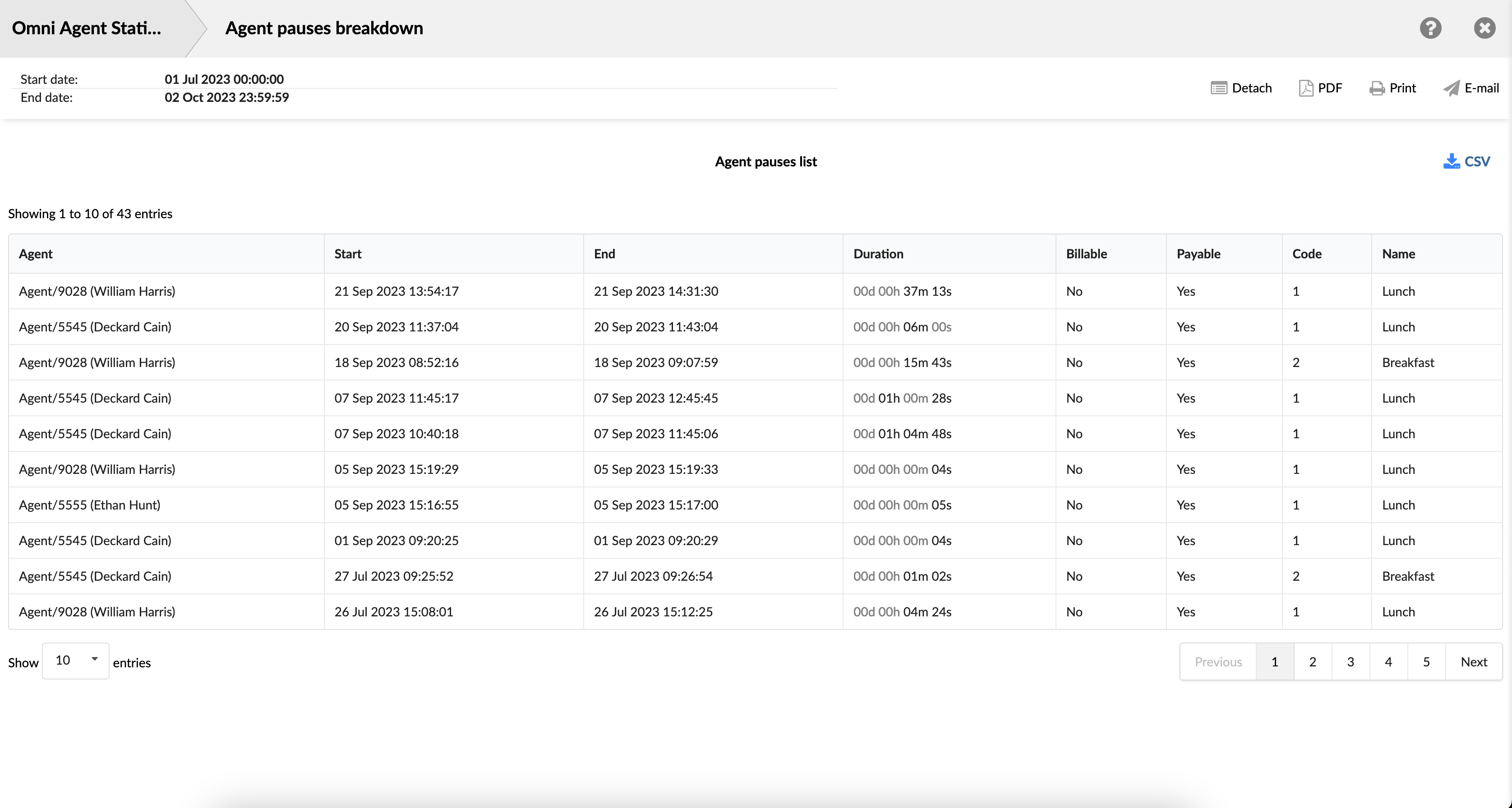
¶ Agent Pauses Breakdown
The Agent Pause Breakdown Report provides a thorough overview of the breaks taken by agents during their shifts. This report includes key details such as the agent's name, the exact start and end times of each break, and the duration of each break. Additionally, it specifies whether each break is classified as billable or non-billable, which is crucial for understanding the impact on productivity and payroll.
By examining this data, supervisors can gain valuable insights into how breaks are distributed throughout the day, ensuring that agents are taking necessary breaks without negatively affecting customer service. This information can also help in scheduling, as supervisors can identify optimal times for breaks that align with lower customer demand.
¶ Agent Pauses Graph
The report is divided into three sections, each offering a distinct perspective on agent pauses. The first section features a graph that visually represents the duration of pauses taken by each agent. This graph allows supervisors to quickly identify trends and outliers in break lengths, helping to ensure that breaks are within acceptable limits and evenly distributed among the team.
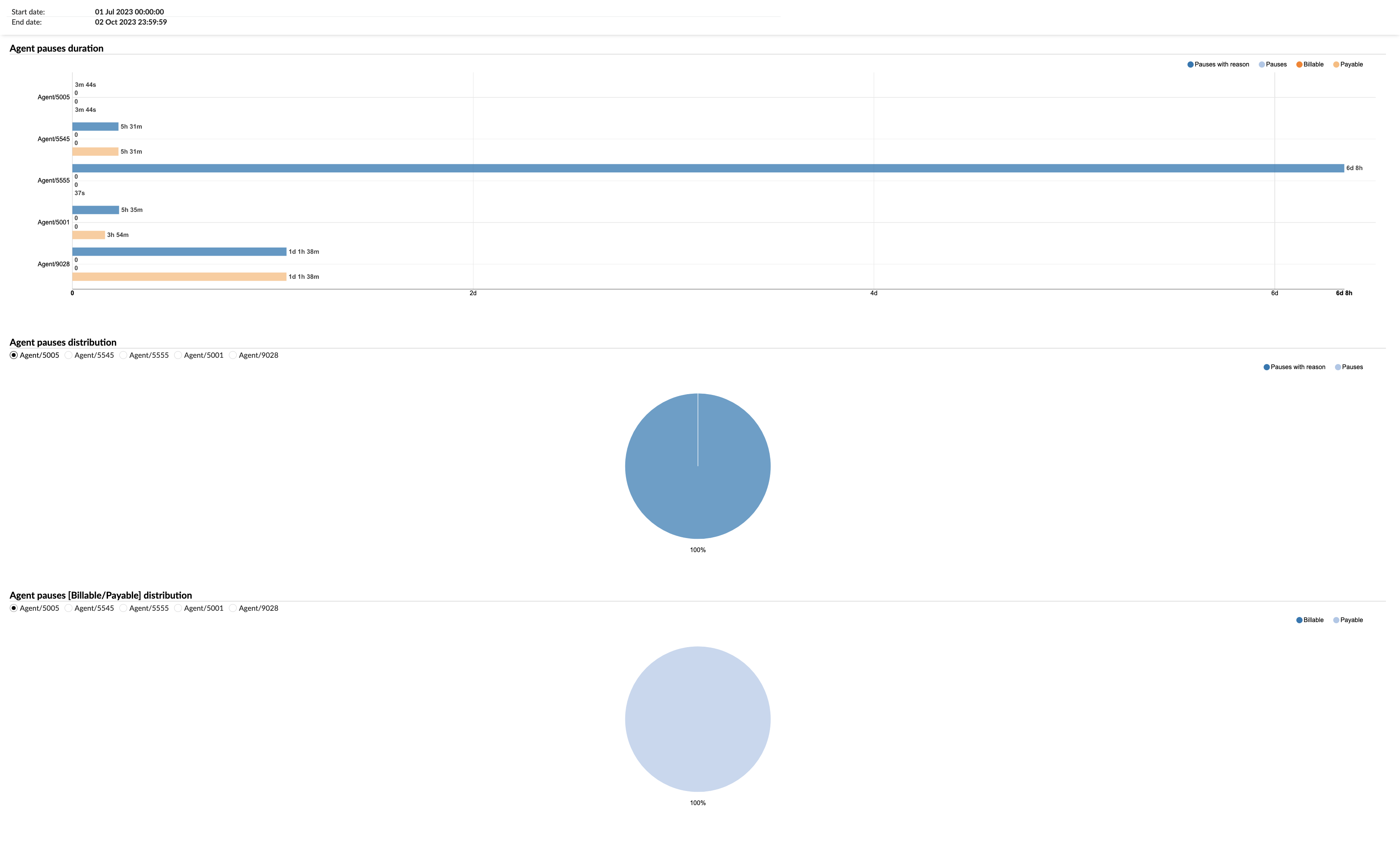
The second section presents a pie chart that depicts the distribution of agent pauses, categorized by the reasons for the breaks. This chart provides a clear breakdown of why agents are pausing, such as for personal needs, administrative tasks, rest periods, or technical issues. Understanding the reasons behind pauses can help supervisors address any underlying issues that may be causing frequent interruptions, such as technical problems or high stress levels.
The third section includes a chart that distinguishes between billable and non-billable pauses. Billable pauses are those that are compensated, typically scheduled and necessary for the job, like training or mandatory meetings. Non-billable pauses, on the other hand, might include unscheduled breaks for personal reasons. This chart is essential for financial tracking and ensures that billable time is accurately accounted for, aiding in payroll management and productivity assessments.
¶ Agent Sessions and Pauses
Agent sessions and pauses represent a detailed overview of the activity and productivity metrics of agents during a specified time period, indicating which agents were active, how many sessions they had, and the total duration they spent in these sessions. The report also provides insights into any interruptions or breaks taken by agents, including the number of pauses, the total time spent on these pauses, and the average pause duration. Additionally, it offers a comparative analysis of the agents' active session time versus their pause time in terms of percentage and average values, serving as a valuable tool for managers and supervisors to monitor agent efficiency, understand work patterns, and identify areas for improvement. The report is divided into several columns, each providing specific details about the sessions and pauses.
-
Agent: This column lists the names of all the agents.
-
Sessions: This column is divided into three sub-columns:
- Count: Shows the total number of sessions each agent has had.
- Duration: Displays the total duration of all sessions for each agent.
- Mean: Represents the average duration of sessions for each agent. For example, if an agent has had three sessions with durations of 10 minutes, 20 minutes, and 30 minutes respectively, the total duration would be 60 minutes. The 'Mean' would then be calculated as 60 minutes (total duration) divided by 3 (total number of sessions), which equals 20 minutes.
So, the 'Mean' represents the average duration of a session for the agent.
- Pauses: This column is divided into five sub-columns:
-
Count: Shows the total number of pauses each agent has taken during their sessions.
-
Duration: Displays the total duration of all pauses for each agent.
-
Mean: Represents the average duration of pauses for each agent.
-
Pause %: Shows the percentage of the total session time that each agent spent on pauses. The 'Pause %' is calculated by taking the total duration of all pauses and dividing it by the total duration of all sessions (including both active time and pause time), then multiplying the result by 100 to get a percentage. For example, if an agent has a total session time of 500 minutes, and during that time they were on pause for 50 minutes, the 'Pause %' would be calculated as follows: (50 minutes (total pause duration) / 500 minutes (total session duration)) * 100 = 10%. So, the 'Pause %' represents the percentage of the total session time that the agent spent on pause. So, the 'Pause %' represents the percentage of the total session time that the agent spent on pause.
-
Pauses per session %: Represents the average percentage of pauses per session for each agent. The 'Pauses per session %' is calculated by dividing the total number of pauses by the total number of sessions, and then multiplying the result by 100 to get a percentage.
For example, if an agent has had 10 sessions and during those sessions, they took a total of 20 pauses, the 'Pauses per session %' would be calculated as follows:
(20 pauses (total number of pauses) / 10 sessions (total number of sessions)) * 100 = 200%
Please note that this calculation assumes that each pause is counted as a discrete event, regardless of its duration. If your system counts pauses differently, the calculation may need to be adjusted accordingly.
-
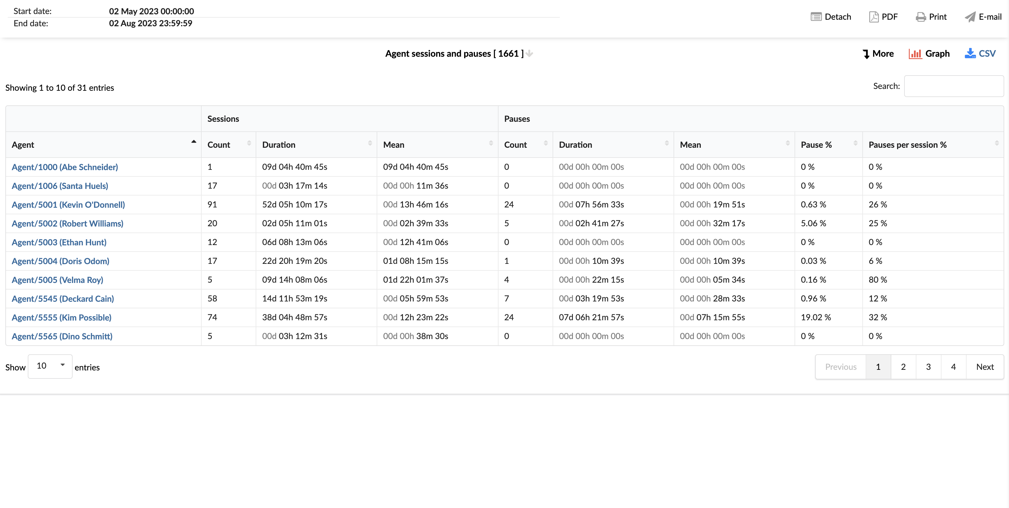
By using the "Agent Sessions and Pauses" statistics report, managers can gain insights into the work patterns of each agent, identify areas for improvement, and implement strategies to enhance efficiency and productivity.
¶ Agent Sessions and Pauses Breakdown
The "Agent Sessions and Pauses Breakdown" statistics table provides detailed information about each session and pause taken by agents. The table consists of six columns, each offering specific insights about the sessions and pauses.
-
Agent: This column lists the names of all the agents.
-
Start: This column shows the start time of each session or pause.
-
End: This column indicates the end time of each session or pause.
-
Duration: This column displays the total duration of each session or pause. This is calculated as the difference between the end time and the start time.
-
Reason Name: This column provides the reason for each pause, if applicable. This could include reasons such as 'break', 'technical issue', 'training', etc.
-
Event: This column indicates whether the record corresponds to a session or a pause.
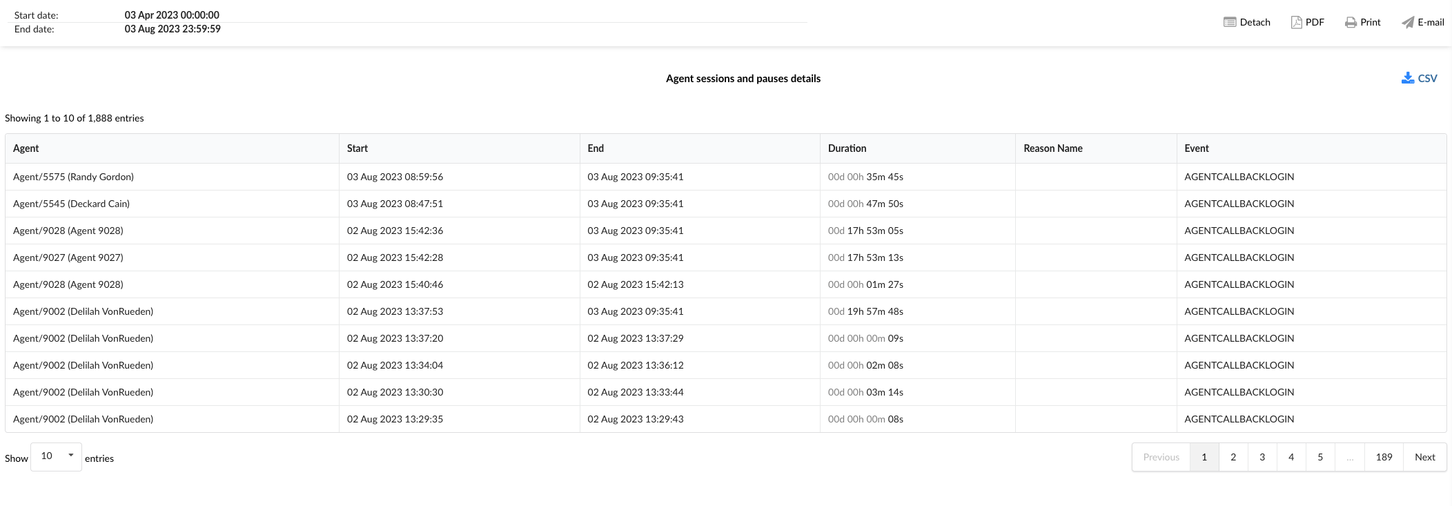
By using the "Agent Sessions and Pauses Breakdown" statistics table, managers can gain a granular understanding of each agent's work patterns, identify trends, and implement strategies to improve efficiency and productivity. This can also help in identifying any issues that might be causing frequent or lengthy pauses, allowing for targeted problem-solving.
¶ Agent Sessions and Pauses Graph
The "Agent Sessions and Pauses" graph provides a visual representation of the count and duration of sessions and pauses for each agent. The graph is divided into two sections, each providing specific insights about the sessions and pauses.
-
Sessions and Pauses Count: This graph displays horizontally laid columns for each agent, representing the total count of sessions and pauses. Users can select either "Sessions" or "Pauses" from the radio buttons to view the corresponding data. Each column corresponds to the total count of the selected event (either sessions or pauses) for a specific agent.
-
Sessions and Pauses Duration: This graph also displays horizontally laid columns for each agent, but it represents the total duration of sessions and pauses. Users can select either "Session Duration" or "Pause Duration" from the radio buttons to view the corresponding data. Each column corresponds to the total duration of the selected event (either session duration or pause duration) for a specific agent.
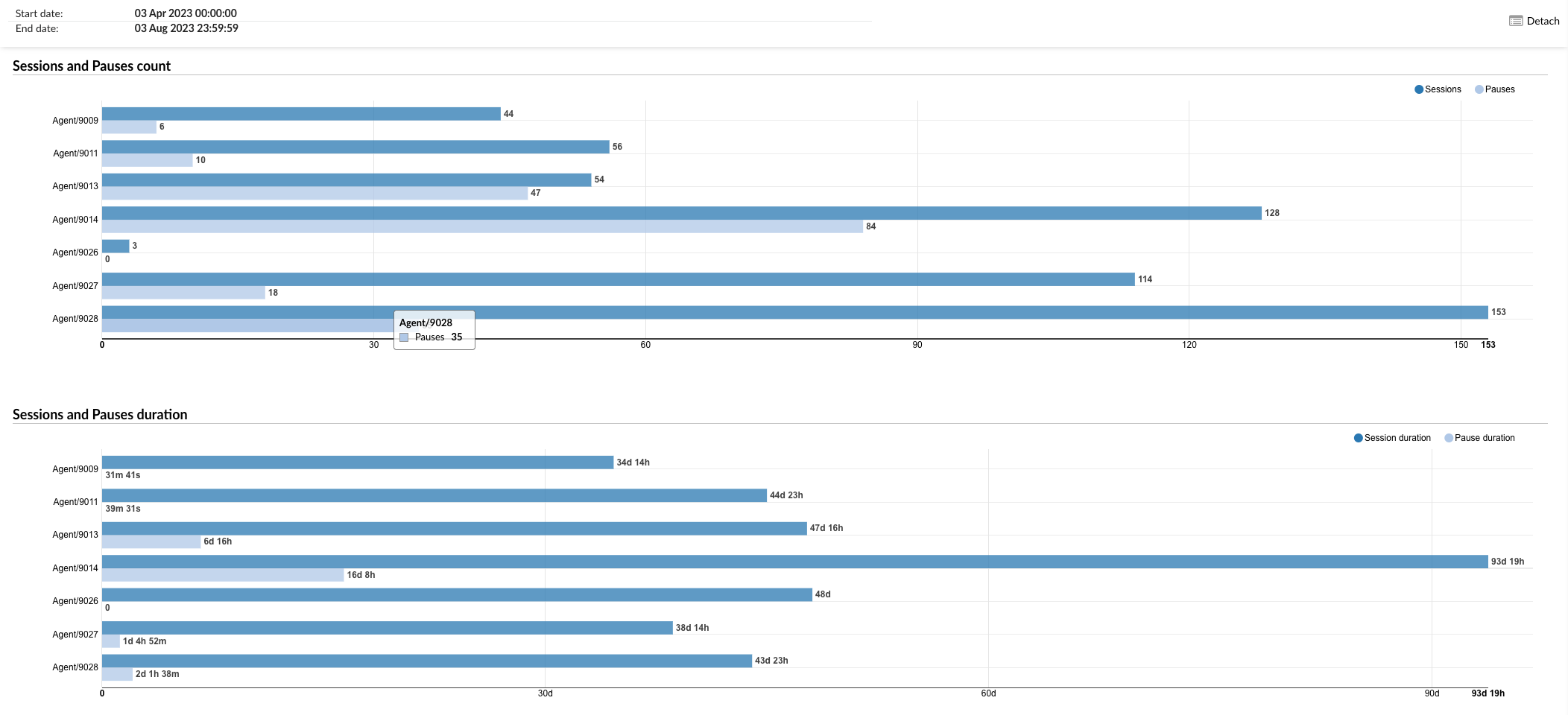
By using the "Agent Sessions and Pauses" graph, managers can visually analyze the count and duration of sessions and pauses for each agent, identify trends, and implement strategies to improve efficiency and productivity. This can also help in identifying any issues that might be causing frequent or lengthy pauses, allowing for targeted problem-solving.
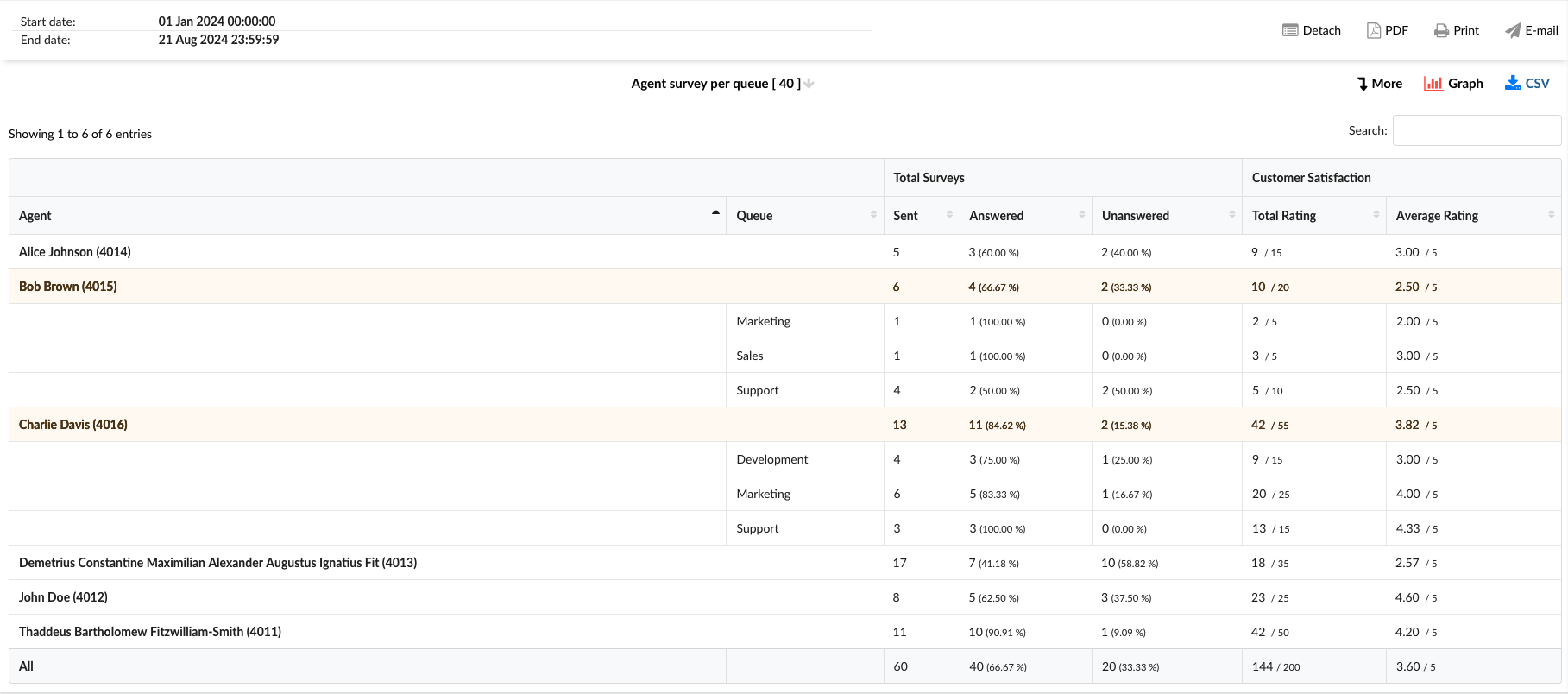
¶ Agent Survey per Queue
An "Agent Survey per Queue" report analyzes customer satisfaction for each agent based on their overall performance and performance within the specific queues they belong to. This report compiles feedback from post-interaction surveys, providing insights into how good agents perform across different queues, identifying areas of excellence and those needing improvement to enhance overall service quality.
-
Agent: This column lists the names of all agents.
-
Queue: This column indicates the queues to whom the agent is assigned.
-
Total Surveys: This column is divided into three sub-columns:
- Sent: Total number of surveys sent to customers after interacting with agents.
- Answered: Total number of surveys that the customer answered, including percentage of answers out of total.
- Unanswered: Total number of unanswered surveys by the customer, including the percentage of unanswered surveys out of the total.
-
Customer Satisfaction: This column is divided into two sub-columns:
- Total rating: The cumulative score of all customer satisfaction ratings received from answered surveys.
- Average Rating: The average rating of all customer satisfaction ratings obtained from completed surveys.
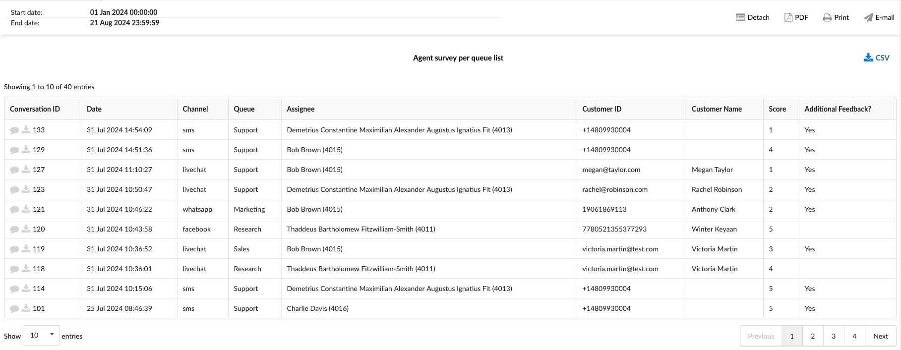
¶ Agent Survey per Queue Breakdown
The "Survey per Queue Breakdown" statistics table provides detailed information about each conversation across different communication channels that had the survey answered. The table consists of nine columns, each offering specific conversation insights.
-
Conversation ID: This column lists the unique identifiers for each conversation. In this column, besides the unique ID, we have two additional options:
- View Chat transcript: This option allows access to the complete conversation record, directly providing agent and customer interaction details from the GUI.
- Download Chat transcript: This option saves a copy of the entire conversation between the agent and the customer to a local disk.
-
Date: This column shows the date each conversation took place.
-
Channel: This column indicates the communication channel used for each conversation, such as facebook, whatsapp, livechat, email, or messaging.
-
Queue: This column shows the queue in which each conversation was handled.
-
Assignee: This column lists the agent assigned to each conversation.
-
Customer ID: This column comprises a distinctive identifier for each customer, including a Facebook or WhatsApp ID number, SMS number, or email address.
-
Customer Name: This column shows the customer's name if it's available.
-
Score: This column shows the customer's final rating after the conversation, indicating their overall satisfaction with the interaction.
-
Additional Feedback?: This column contains "Yes" when a customer has provided an additional comment along with their rating. To view left feedback, click on the View Chat transcript option under the Conversation ID column.
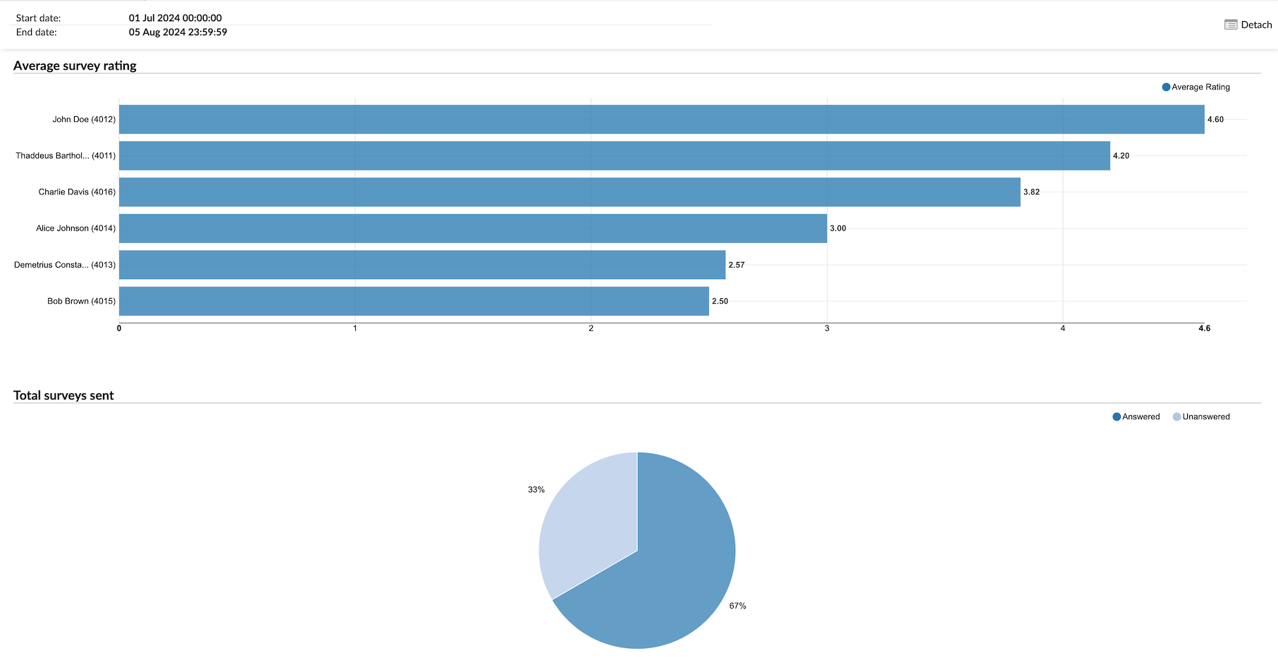
¶ Agent Survey per Queue Graph
The "Survey per Queue graph" visually represents individual survey data for each agent. The graph is divided into two sections:
-
Average survey rating: This graph displays the average satisfaction rating for each agent, allowing for an easy comparison of performance across agents.
-
Total surveys sent: This pie chart illustrates the distribution of answered versus unanswered surveys, showing the percentage of each category for a clear understanding of response rates.
¶ Conversations per Channel
Conversations per channel provide a comprehensive overview of communication interactions across various channels within a specified time frame. This report highlights the total number of conversations, distinguishing between those that were answered and unanswered, and offers insights into the speed of responses. The table is divided into several columns, each providing specific details about the conversations.
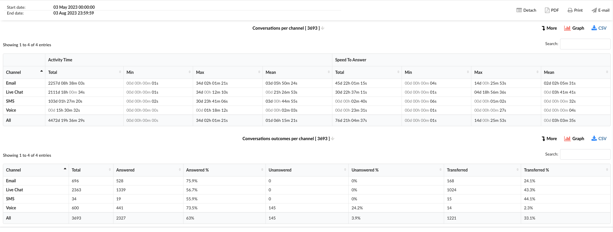
-
Channel: This column lists the communication channels, including Email, Live Chat, SMS, Voice, and an option for All channels combined.
-
Activity Time: This column is divided into four sub-columns:
- Total: Shows the total activity time for each channel.
- Min: Displays the shortest activity time recorded for each channel.
- Max: Represents the longest activity time recorded for each channel.
- Mean: Indicates the average activity time for each channel.
-
Speed To Answer: This column is also divided into four sub-columns:
- Total: Shows the total speed to answer for each channel.
- Min: Displays the shortest speed to answer recorded for each channel.
- Max: Represents the longest speed to answer recorded for each channel.
- Mean: Indicates the average speed to answer for each channel.
¶ Conversations Outcomes per Channel
The "Conversations Outcomes per Channel" statistics table provides detailed information about the outcomes of the conversations handled across different communication channels. The table consists of several columns, each offering specific insights about the conversation outcomes.
-
Channel: This column lists the communication channels, including Email, Live Chat, SMS, Voice, and an option for All channels combined.
-
Total: This column shows the total number of conversations for each channel.
-
Answered: This column displays the number of conversations that were answered in each channel.
-
Answered %: This column represents the percentage of conversations that were answered in each channel.
-
Unanswered: This column shows the number of conversations that were unanswered in each channel.
-
Unanswered %: This column represents the percentage of conversations that were unanswered in each channel.
-
Transferred: This column displays the number of conversations that were transferred to another agent or queue in each channel.
-
Transferred %: This column represents the percentage of conversations that were transferred in each channel.
By using the "Conversations per Channel" and "Conversations Outcomes per Channel" statistics tables, managers can gain insights into the performance across different channels, identify areas for improvement, and implement strategies to enhance efficiency and customer service.
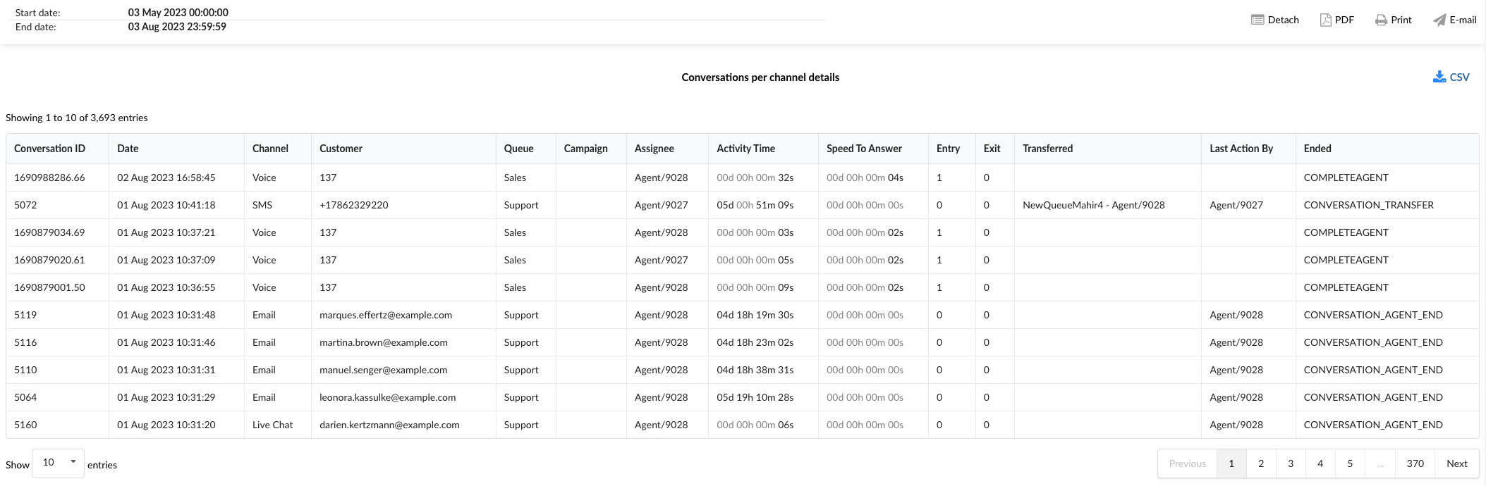
¶ Conversations per Channel Breakdown
The "Conversations per Channel Breakdown" statistics table provides detailed information about each conversation handled across different communication channels. The table consists of fourteen columns, each offering specific insights about the conversations.
-
Conversation ID: This column lists the unique identifiers for each conversation.
-
Date: This column shows the date when each conversation took place.
-
Channel: This column indicates the communication channel used for each conversation, such as chat, email, or messaging.
-
Customer: This column lists the customers involved in each conversation.
-
Queue: This column shows the queue in which each conversation was handled.
-
Campaign: This column indicates the campaign associated with each conversation.
-
Assignee: This column lists the agent assigned to each conversation.
-
Activity Time: This column shows the total time the agent spent on each conversation.
-
Speed To Answer: This column represents the time taken by the agent to answer each conversation.
-
Entry: This column indicates the time each conversation entered the queue.
-
Exit: This column shows the time each conversation exited the queue.
-
Transferred: This column indicates whether each conversation was transferred to another agent or queue.
-
Last Action By: This column shows who performed the last action in the conversation, whether it was the agent or the customer.
-
Ended: This column indicates how each conversation was concluded.
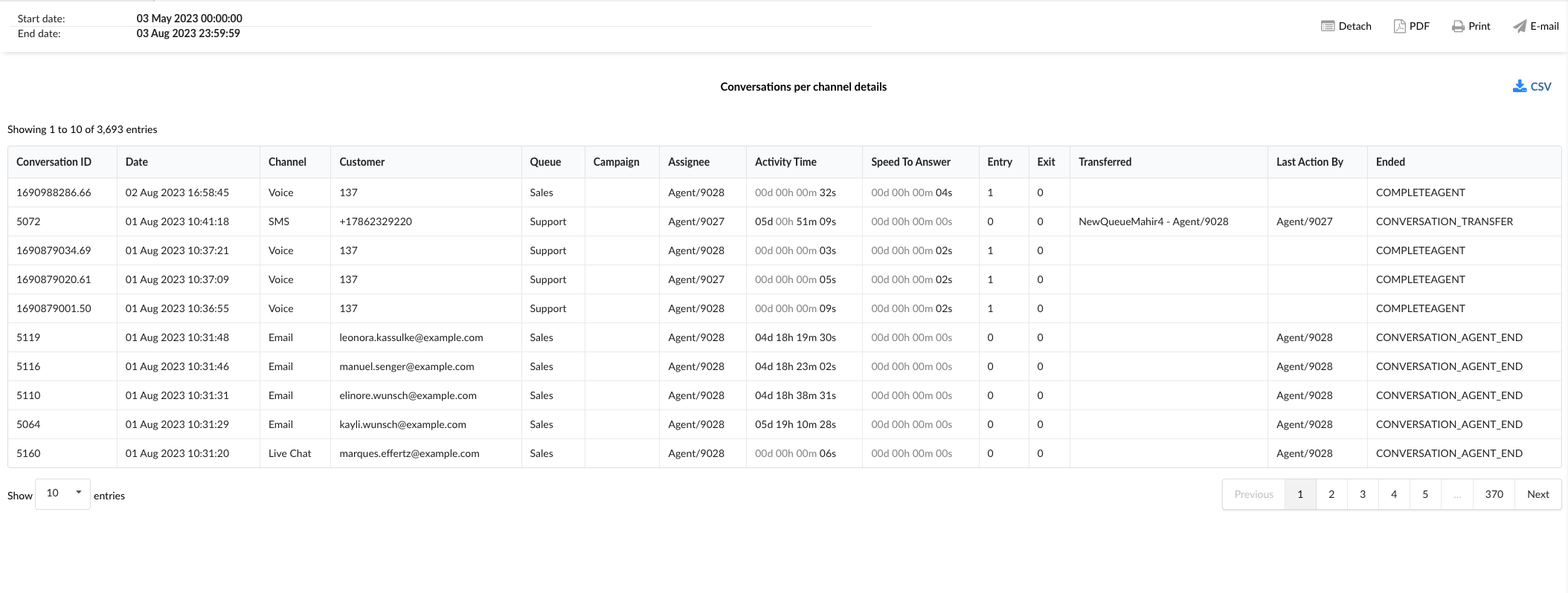
By using the "Conversations per Channel Breakdown" statistics table, managers can gain a granular understanding of each conversation, identify patterns, and implement strategies to improve agent performance and customer service.
¶ Conversations Outcomes per Channel Breakdown
The "Conversations Outcomes per Channel Breakdown" statistics table provides detailed information about each conversation handled across different communication channels, along with their outcomes. The table consists of fourteen columns, each offering specific insights about the conversations and their outcomes.
-
Conversation ID: This column lists the unique identifiers for each conversation.
-
Date: This column shows the date when each conversation took place.
-
Channel: This column indicates the communication channel used for each conversation, such as chat, email, or messaging.
-
Customer: This column lists the customers involved in each conversation.
-
Queue: This column shows the queue in which each conversation was handled.
-
Campaign: This column indicates the campaign associated with each conversation.
-
Assignee: This column lists the agent assigned to each conversation.
-
Activity Time: This column shows the total time the agent spent on each conversation.
-
Speed To Answer: This column represents the time taken by the agent to answer each conversation.
-
Entry: This column indicates the time each conversation entered the queue.
-
Exit: This column shows the time each conversation exited the queue.
-
Transferred: This column indicates whether each conversation was transferred to another agent or queue.
-
Last Action By: This column shows who performed the last action in the conversation, whether it was the agent or the customer.
-
Ended: This column indicates how each conversation was concluded, providing insights into the outcomes of the conversations.
By using the "Conversations Outcomes per Channel Breakdown" statistics table, managers can gain a granular understanding of each conversation, identify patterns in conversation outcomes, and implement strategies to improve agent performance and customer service.
¶ Conversations per Channel Graph
The "Conversations per Channel Graph" provides a visual representation of various aspects of conversations handled across different communication channels. The graph is divided into three sections, each focusing on a specific aspect of the conversations.
¶ Activity Time
This section allows users to monitor the durations of conversations for each channel over a specific period.
- Radio Buttons (Left): Users can select between "Minimum," "Maximum," and "Mean" to view the corresponding data for the activity time.
- Radio Buttons (Right): Users can filter the data by channel, selecting between "Voice," "Live Chat," "SMS," and "Email."
By using this section, managers can analyze trends in conversation durations and identify areas for improvement.
¶ Speed To Answer
This section provides insights into the speed at which agents answer conversations across different channels.
- Radio Buttons (Left): Users can select between "Minimum," "Maximum," and "Mean" to view the corresponding data for the speed to answer.
- Radio Buttons (Right): Users can filter the data by channel, selecting between "Email," "Voice," "Live Chat," and "SMS."
This section helps in understanding how quickly agents are responding to customer inquiries and can guide efforts to reduce response times.
¶ Total Conversations
This section allows users to monitor the total number of conversations for each channel over a specific period.
- Radio Buttons (Left): Users can filter the data by channel, selecting between "Email," "Voice," "Live Chat," and "SMS."
- Radio Buttons (Right): Users can view the data for "Answered," "Unanswered," and "Transferred" conversations.
By hovering over the peaks in the graph, users can see detailed data for each period.
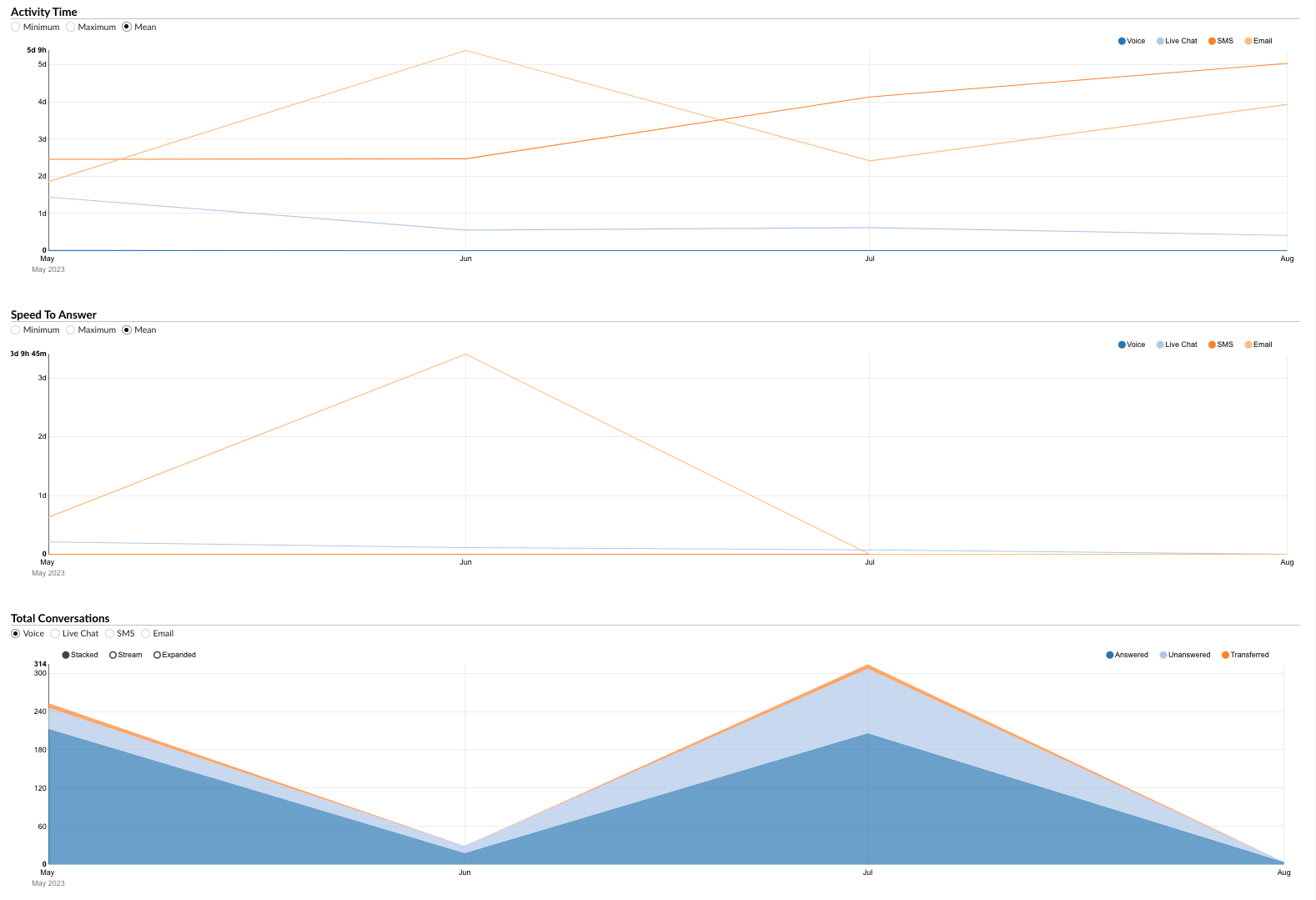
By using the "Total Conversations" section, managers can gain insights into the volume and outcomes of conversations, helping in resource allocation and performance improvement.
The "Conversations per Channel Graph" serves as a powerful tool for visually analyzing various aspects of conversations, enabling managers to make informed decisions and implement strategies to enhance customer service and efficiency.
¶ Conversations Outcomes per Channel Graph
The "Conversations Outcomes per Channel Graph" provides a visual representation of the outcomes of conversations handled across different communication channels. The graph is divided into three sections, each providing specific insights about the conversation outcomes.
¶ Total Outcomes
This section displays horizontally laid columns for each channel, representing the total outcomes of "Answered," "Unanswered," and "Transferred" conversations. By examining these columns, users can gain a quick overview of the distribution of conversation outcomes across different channels.
¶ Pie Charts
The graph is further divided into three sections represented by pie charts:
-
Answered per Channel: This pie chart provides a visual breakdown of answered conversations across different channels. Users can view data for all channels combined or select an individual channel to view its specific data.
-
Unanswered per Channel: This pie chart displays the distribution of unanswered conversations across different channels. Users can view data for all channels combined or select an individual channel to view its specific data.
-
Transferred per Channel: This pie chart shows the distribution of transferred conversations across different channels. Users can view data for all channels combined or select an individual channel to view its specific data.
These pie charts allow users to easily compare and analyze the distribution of conversation outcomes across different channels.
¶ Summary per Channel
This section provides a pie chart that summarizes the outcomes of conversations for each channel. Users can view data for all channels combined or select an individual channel to view its specific data. The pie chart provides a comprehensive view of the distribution of conversation outcomes (answered, unanswered, and transferred) for the selected channel(s).
By using the "Conversations Outcomes per Channel Graph," managers can visually analyze the outcomes of conversations across different channels, identify trends, and implement strategies to improve customer service and efficiency.
¶ Project Calls
The "Project Calls" report provides a project-centric summary of all manually dialed outbound calls that have been tagged with project codes. Instead of focusing on individual agent performance, this report aggregates data to show the total call activity for each project across the entire system.
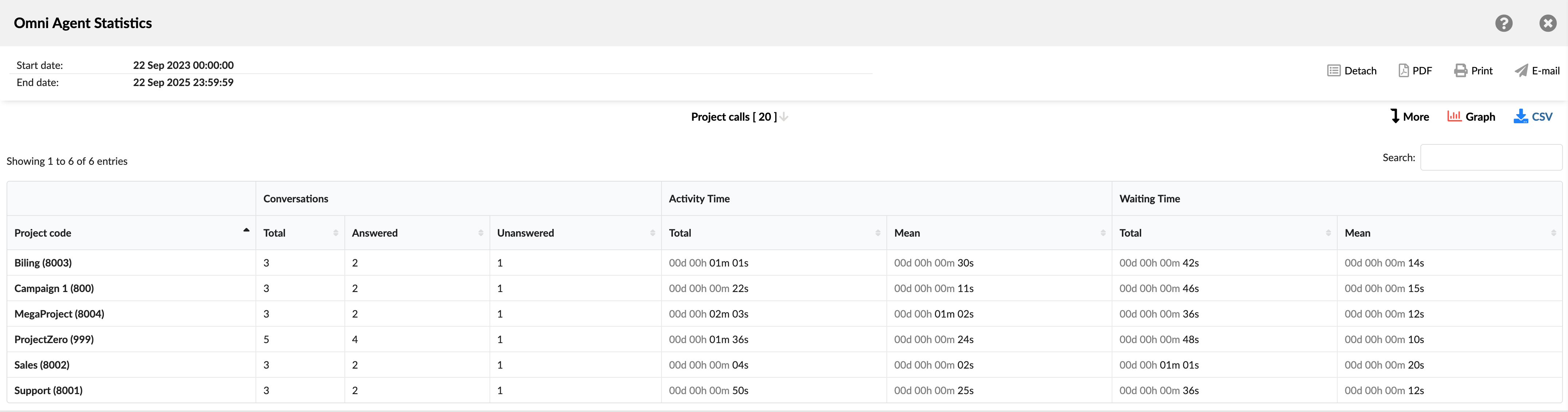
This view is designed for supervisors and project managers who need to understand the overall communication effort, time spent, and call outcomes for specific tasks, clients, or internal projects, regardless of which agent made the calls.
- Project code: Displays the name and internal ID of each project code that was used to make calls during the selected period.
- Conversations: Summarizes the volume and outcomes of all calls associated with a project. It is divided into three columns:
- Total: Shows the total number of calls made with this project code by all agents.
- Answered: Shows the total number of calls for this project that were successfully answered.
- Unanswered: Shows the total number of calls for this project that were not answered.
- Activity time: Provides metrics on the total and average talk time for all calls within a project. It is divided into two columns:
- Total: Shows the cumulative talk time for all calls associated with this project.
- Mean: Shows the average talk time for a single call made for this project.
- Waiting Time: Provides metrics on the total and average ringing time before calls were connected. It is divided into two columns:
- Total: Shows the cumulative ringing time for all calls made for this project.
- Mean: Shows the average ringing time for a single call made for this project.
¶ Project Calls Breakdown
The "Project Calls Breakdown" table provides the most detailed, call-by-call log of all manually dialed outbound calls associated with project codes. Each row represents a single call, allowing supervisors to drill down from the summary to analyze specific interactions.
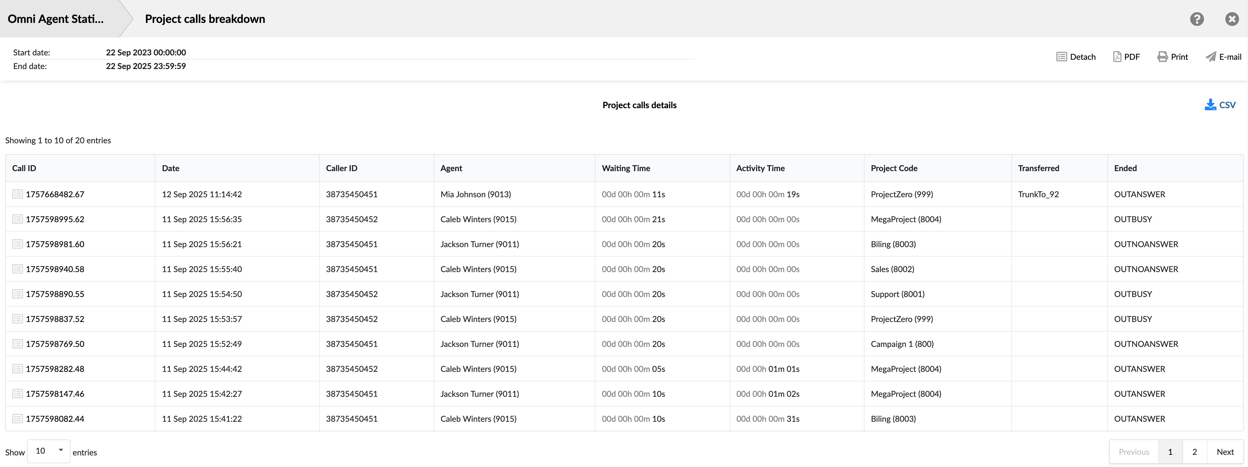
This detailed view is ideal for auditing project-specific work, verifying that calls are coded correctly, and investigating the outcome of individual project-related communications.
- Call ID: Shows the unique identifier for each call. This ID can be used to search for and track a specific call.
- Date: Shows the date and time when each call occurred. This allows you to view and sort calls based on the time they occurred.
- Caller ID: Shows the phone/extension number the agent attempted to reach.
- Agent: Displays the full name (and internal ID) of the agent who manually placed the call.
- Waiting Time: Shows the time between when the call was placed and when it was answered.
- Activity Time: Shows the total time the agent spent on the call.
- Project Code: Shows the specific project code that was assigned to the call.
- Transferred: Indicates whether the call was transferred, and if so, shows the destination.
- Ended: Shows the outcome or status of the call attempt (e.g., OUTANSWER, OUTNOANSWER).
¶ Project Calls Graph
The "Project Calls Graph" provides a simple and effective visual representation of how the total volume of project-coded calls is distributed among different projects. This pie chart enables supervisors and managers to quickly identify which projects generate the most call activity and to understand the overall share of work for each project.
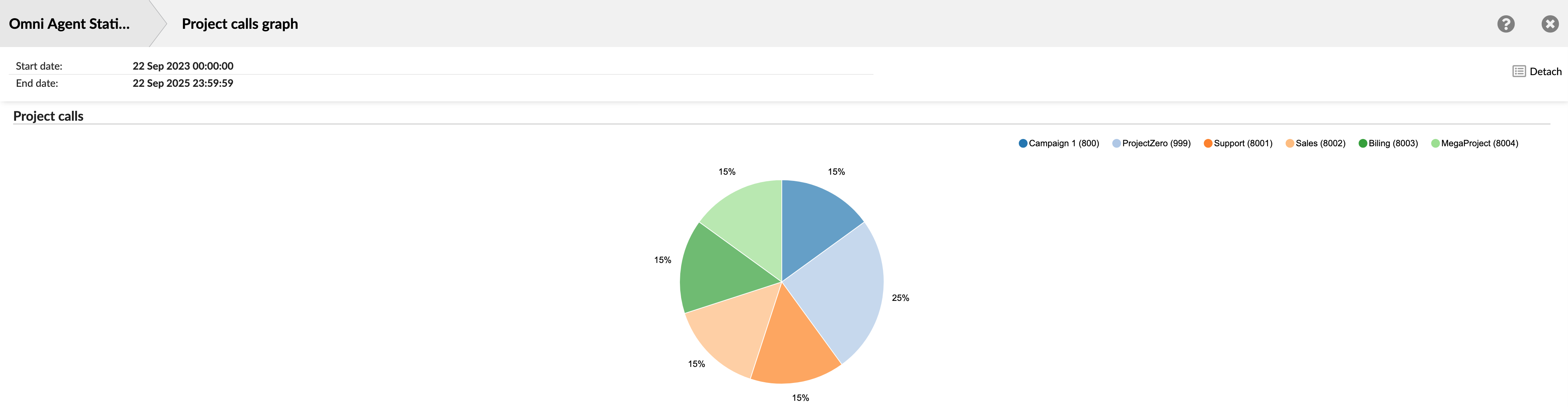
The graph consists of a single pie chart that represents 100% of the project-coded calls made during the selected time frame. The legend at the top of the chart assigns a unique color to each project code. Each colored slice of the pie represents one of those projects. The size of the slice and its corresponding percentage label clearly indicate the project's share of the total call volume. For example, a project with a "25%" label accounted for one-quarter of all project-coded calls in the report.
¶ Queue Statistics
The Queue Statistics section offers insights into the distribution and management of conversations across different channels and queues. Use this data to optimize queue management and ensure customers receive timely support.
The Queues Statistics page offers a comprehensive and customizable view of various queue-related metrics. With multiple filters, adjustable time formats, and report generation capabilities, this page enables you to analyze and optimize Queue performance effectively. Here's an overview of the features and options available on the Queues Statistics landing page.
Filters
This page offers several filters to help you refine the data displayed:
- Date Range Filter: Select a custom date range to view data specific to that period.
- Agent Name Filter: Filter results by individual agents to assess their performance and identify opportunities for improvement.
- Channel Filter: Choose specific communication channels to evaluate agent performance within different mediums.
- Queue Name Filter: Filter data by specific queues to analyze agent activity and performance in managing particular queues.
- Waiting time duration: Represents the time elapsed from when a call enters the queue until it begins ringing for an agent.
- Speed to Answer: Measure the time from when a call starts ringing until an agent answers, reflecting response efficiency.
- Activity Time: Track the duration an agent spends handling requests, from assignment until closure or transfer. This includes talk time for voice channels and handling time for messaging channels.
- Time Format Customization: Adjust the time display format to show durations in days, hours, minutes, or seconds based on reporting needs.
Report Type Selection
Currently, the landing page supports generating Queue reports. Choose the "Queue" report type to generate and view metrics related to queue performance and conversation distribution.
Search for Reports
The search feature allows you to quickly find specific reports based on keywords or phrases. Simply enter your search term, and the system will display relevant reports in the results.
Adding Reports to the Show List
To create a customized report, you can add specific reports to your generation list by clicking the green plus button next to each report. This allows you to select only the metrics you're interested in, creating a focused and tailored report.
Once you have added the desired reports to your list, click the "Show" button to create a report based on your selected metrics. The generated report can then be viewed, printed, or exported for further analysis.
With its versatile filters, customization options, and report generation capabilities, the Queues Statistics landing page offers a powerful tool for analyzing and optimizing your organization's queue management processes.
¶ All Conversations per Channel
The "All Conversations per Channel" report provides a comprehensive overview of customer interactions across different communication channels. This report aggregates key metrics to measure the efficiency and effectiveness of communication. Users can gain insights into various keymetrics such as activity time, speed to answer, waiting time, first response time, and resolution time. Additionally, it breaks down the total number of conversations, the percentage answered, unanswered, and transferred.
The "All Conversations per Channel" statistics are divided into three tables, each providing specific insights about the conversations handled across different communication channels.
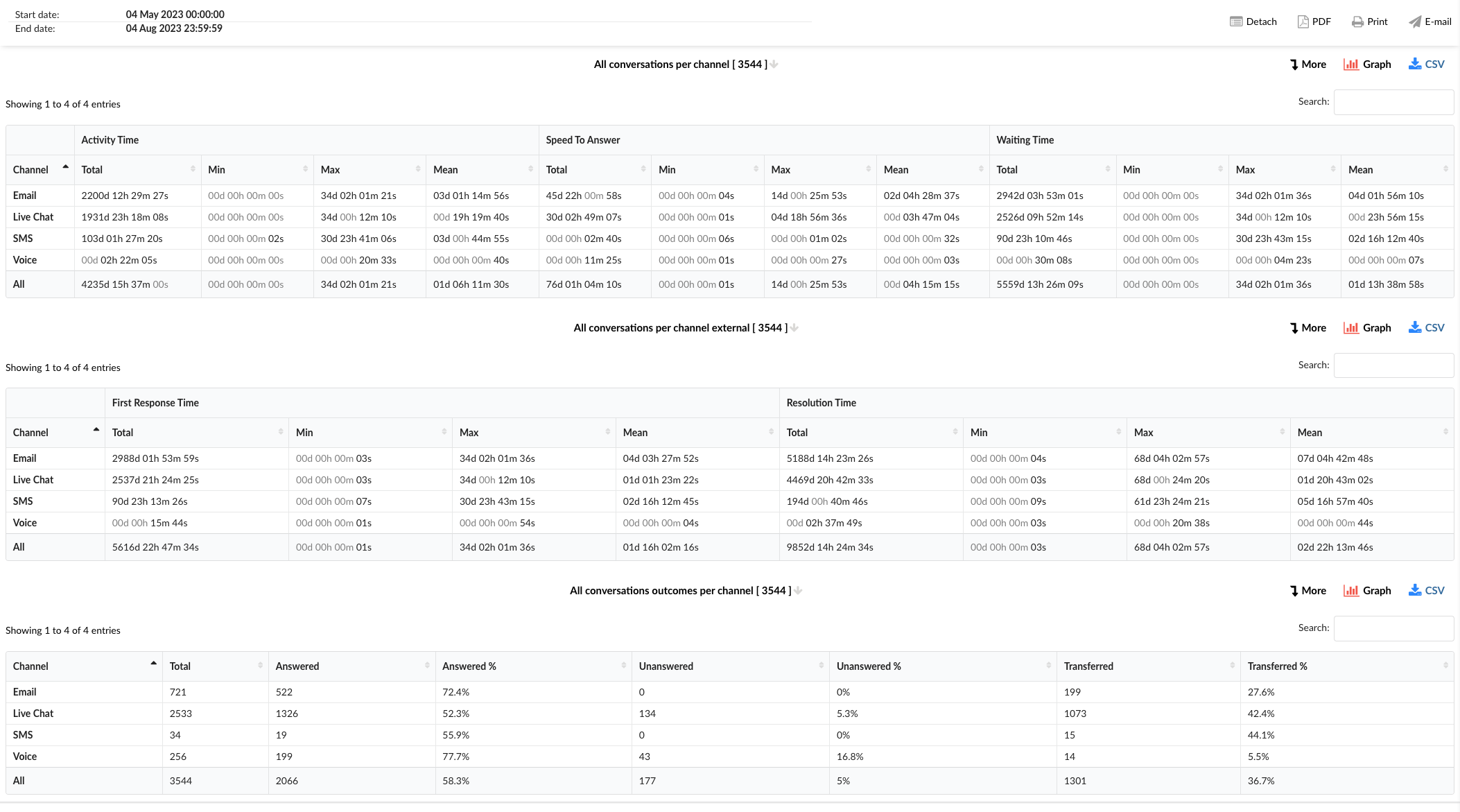
¶ All Conversations per Channel
This table provides a comprehensive overview of all conversations handled across different channels.
-
Channel: This column lists the communication channels, including Email, Live Chat, SMS, Voice, and an option for All channels combined.
-
Activity Time: This column is divided into four sub-columns:
- Total: Shows the total activity time for each channel.
- Min: Displays the shortest activity time recorded for each channel.
- Max: Represents the longest activity time recorded for each channel.
- Mean: Indicates the average activity time for each channel.
-
Speed To Answer: This column is also divided into four sub-columns:
- Total: Shows the total speed to answer for each channel.
- Min: Displays the shortest speed to answer recorded for each channel.
- Max: Represents the longest speed to answer recorded for each channel.
- Mean: Indicates the average speed to answer for each channel.
-
Waiting Time: This column is divided into four sub-columns:
- Total: Shows the total waiting time for each channel.
- Min: Displays the shortest waiting time recorded for each channel.
- Max: Represents the longest waiting time recorded for each channel.
- Mean: Indicates the average waiting time for each channel.
¶ All Conversations per Channel External
This table provides insights into the first response time and resolution time for conversations across different channels.
-
Channel: This column lists the communication channels.
-
First Response Time: This column is divided into four sub-columns:
- Total: Shows the total first response time for each channel.
- Min: Displays the shortest first response time recorded for each channel.
- Max: Represents the longest first response time recorded for each channel.
- Mean: Indicates the average first response time for each channel.
-
Resolution Time: This column is divided into four sub-columns:
- Total: Shows the total resolution time for each channel.
- Min: Displays the shortest resolution time recorded for each channel.
- Max: Represents the longest resolution time recorded for each channel.
- Mean: Indicates the average resolution time for each channel.
¶ All Conversations Outcomes per Channel
This table provides detailed information about the outcomes of the conversations handled across different communication channels.
-
Channel: This column lists the communication channels.
-
Total: This column shows the total number of conversations for each channel.
-
Answered: This column displays the number of conversations that were answered in each channel.
-
Answered %: This column represents the percentage of conversations that were answered in each channel.
-
Unanswered: This column shows the number of conversations that were unanswered in each channel.
-
Unanswered %: This column represents the percentage of conversations that were unanswered in each channel.
-
Transferred: This column displays the number of conversations that were transferred to another agent or queue in each channel.
-
Transferred %: This column represents the percentage of conversations that were transferred in each channel.
By using the "All Conversations per Channel" statistics tables, managers can gain insights into the performance across different channels, identify areas for improvement, and implement strategies to enhance efficiency and customer service.
¶ All Conversations per Channel Breakdown
The "All Conversations per Channel Breakdown" statistics table provides detailed information about each conversation handled across different communication channels. The table consists of fourteen columns, each offering specific insights about the conversations.
-
Conversation ID: This column lists the unique identifiers for each conversation.
-
Date: This column shows the date when each conversation took place.
-
Channel: This column indicates the communication channel used for each conversation, such as chat, email, or messaging.
-
Customer: This column lists the customers involved in each conversation.
-
Queue: This column shows the queue in which each conversation was handled.
-
Assignee: This column lists the agent assigned to each conversation.
-
Activity Time: This column shows the total time the agent spent on each conversation.
-
Speed To Answer: This column represents the time taken by the agent to answer each conversation.
-
Waiting Time: This column indicates the time each conversation spent waiting in the queue before being answered.
-
Entry: This column indicates the time each conversation entered the queue.
-
Exit: This column shows the time each conversation exited the queue.
-
Transferred: This column indicates whether each conversation was transferred to another agent or queue.
-
Last Action By: This column shows who performed the last action in the conversation, whether it was the agent or the customer.
-
Ended: This column indicates how each conversation was concluded.
In the report breakdown, two icons are linked to the ConversationID field. The first icon permits users to directly view transcripts of selected conversations, while the second enables them to download these transcripts for further review or analysis. These functionalities offer users convenient access to comprehensive records of customer interactions, which supports meticulous monitoring and evaluation of both agent performance and overall customer service quality.
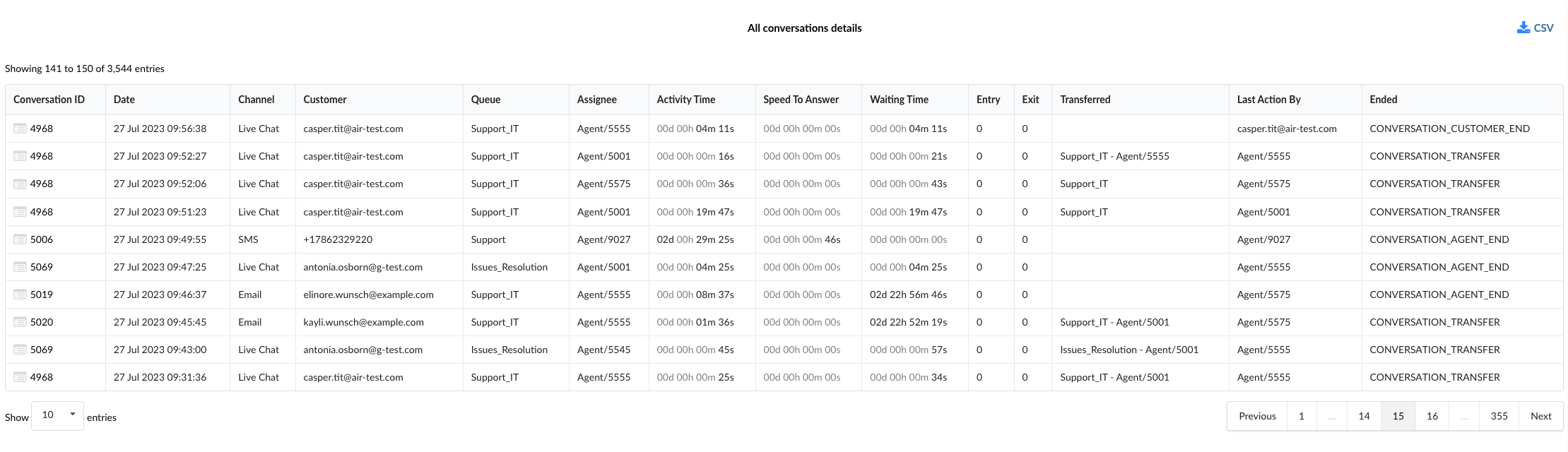
By using the "All Conversations per Channel Breakdown" statistics table, managers can gain a granular understanding of each conversation, identify patterns, and implement strategies to improve agent performance and customer service.
¶ All Conversations per Channel External Breakdown
The "All Conversations per Channel External Breakdown" statistics table provides detailed information about each conversation handled across different communication channels, with a focus on external interactions. The table consists of fourteen columns, each offering specific insights about the conversations.
-
Conversation ID: This column lists the unique identifiers for each conversation.
-
Date: This column shows the date when each conversation took place.
-
Channel: This column indicates the communication channel used for each conversation, such as chat, email, or messaging.
-
Customer: This column lists the customers involved in each conversation.
-
Queue: This column shows the queue in which each conversation was handled.
-
Assignee: This column lists the agent assigned to each conversation.
-
Activity Time: This column shows the total time the agent spent on each conversation.
-
Speed To Answer: This column represents the time taken by the agent to answer each conversation.
-
Waiting Time: This column indicates the time each conversation spent waiting in the queue before being answered.
-
Entry: This column indicates the time each conversation entered the queue.
-
Exit: This column shows the time each conversation exited the queue.
-
Transferred: This column indicates whether each conversation was transferred to another agent or queue.
-
Last Action By: This column shows who performed the last action in the conversation, whether it was the agent or the customer.
-
Ended: This column indicates how each conversation was concluded.
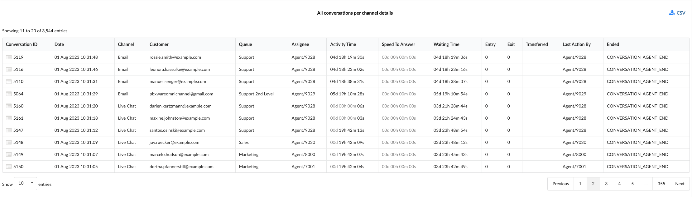
By using the "All Conversations per Channel External Breakdown" statistics table, managers can gain a granular understanding of each conversation, identify patterns in external interactions, and implement strategies to improve agent performance and customer service.
¶ All Conversations Outcomes per Channel Breakdown
The "All Conversations Outcomes per Channel Breakdown" statistics table provides detailed information about each conversation handled across different communication channels, with a focus on the outcomes of these conversations. The table consists of fourteen columns, each offering specific insights about the conversations and their outcomes.
-
Conversation ID: This column lists the unique identifiers for each conversation.
-
Date: This column shows the date when each conversation took place.
-
Channel: This column indicates the communication channel used for each conversation, such as chat, email, or messaging.
-
Customer: This column lists the customers involved in each conversation.
-
Queue: This column shows the queue in which each conversation was handled.
-
Assignee: This column lists the agent assigned to each conversation.
-
Activity Time: This column shows the total time the agent spent on each conversation.
-
Speed To Answer: This column represents the time taken by the agent to answer each conversation.
-
Waiting Time: This column indicates the time each conversation spent waiting in the queue before being answered.
-
Entry: This column indicates the time each conversation entered the queue.
-
Exit: This column shows the time each conversation exited the queue.
-
Transferred: This column indicates whether each conversation was transferred to another agent or queue.
-
Last Action By: This column shows who performed the last action in the conversation, whether it was the agent or the customer.
-
Ended: This column indicates how each conversation was concluded, providing insights into the outcomes of the conversations.
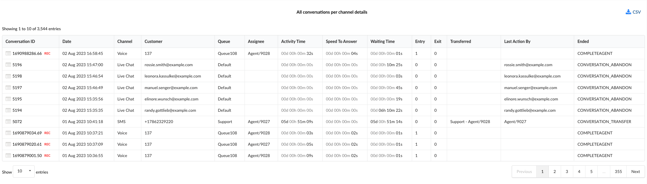
By using the "All Conversations Outcomes per Channel Breakdown" statistics table, managers can gain a granular understanding of each conversation, identify patterns in conversation outcomes, and implement strategies to improve agent performance and customer service.
¶ All Conversations per Channel Graph
The "All Conversations per Channel Graph" provides a visual representation of various aspects of all conversations handled across different communication channels. The graph is divided into four sections, each focusing on a specific aspect of the conversations.
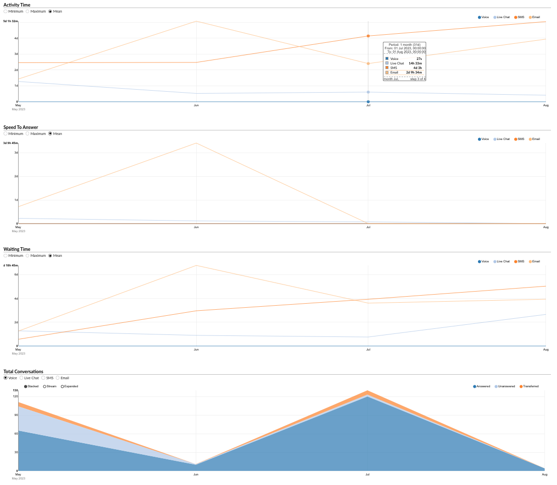
¶ Activity Time
This section allows users to monitor the durations of conversations for each channel over a specific period.
- Radio Buttons (Left): Users can select between "Minimum," "Maximum," and "Mean" to view the corresponding data for the activity time.
- Radio Buttons (Right): Users can filter the data by channel, selecting between "Voice," "Live Chat," "SMS," and "Email."
By using this section, managers can analyze trends in conversation durations and identify areas for improvement.
¶ Speed To Answer
This section provides insights into the speed at which agents answer conversations across different channels.
- Radio Buttons (Left): Users can select between "Minimum," "Maximum," and "Mean" to view the corresponding data for the speed to answer.
- Radio Buttons (Right): Users can filter the data by channel, selecting between "Email," "Voice," "Live Chat," and "SMS."
This section helps in understanding how quickly agents are responding to customer inquiries and can guide efforts to reduce response times.
¶ Waiting Time
This section allows users to monitor the waiting times of conversations for each channel over a specific period.
- Radio Buttons (Left): Users can select between "Minimum," "Maximum," and "Mean" to view the corresponding data for the waiting time.
- Radio Buttons (Right): Users can filter the data by channel, selecting between "Voice," "Live Chat," "SMS," and "Email."
By using this section, managers can analyze trends in waiting times and identify areas for improvement.
¶ Total Conversations
This section allows users to monitor the total number of conversations for each channel over a specific period.
- Radio Buttons (Left): Users can filter the data by channel, selecting between "Email," "Voice," "Live Chat," and "SMS."
- Radio Buttons (Right): Users can view the data for "Answered," "Unanswered," and "Transferred" conversations.
By using the "Total Conversations" section, managers can gain insights into the volume and outcomes of conversations, helping in resource allocation and performance improvement.
The "All Conversations per Channel Graph" serves as a powerful tool for visually analyzing various aspects of conversations, enabling managers to make informed decisions and implement strategies to enhance customer service and efficiency.
¶ All Conversations per Channel External Graph
The "All Conversations per Channel External" graph provides a visual representation of various aspects of all external conversations handled across different communication channels. The graph is divided into three sections, each focusing on a specific aspect of the conversations.
¶ First Response Time
This section allows users to monitor the first response times of conversations for each channel over a specific period.
- Radio Buttons (Left): Users can select between "Minimum," "Maximum," and "Mean" to view the corresponding data for the first response time.
- Radio Buttons (Right): Users can filter the data by channel, selecting between "Voice," "Live Chat," "SMS," and "Email."
By using this section, managers can analyze trends in first response times and identify areas for improvement.
¶ Resolution Time
This section provides insights into the resolution times of conversations across different channels.
- Radio Buttons (Left): Users can select between "Minimum," "Maximum," and "Mean" to view the corresponding data for the resolution time.
- Radio Buttons (Right): Users can filter the data by channel, selecting between "Email," "Voice," "Live Chat," and "SMS."
This section helps in understanding how quickly agents are resolving customer inquiries and can guide efforts to reduce resolution times.
¶ Total Conversations
This section allows users to monitor the total number of external conversations for each channel over a specific period.
- Radio Buttons (Left): Users can filter the data by channel, selecting between "Email," "Voice," "Live Chat," and "SMS."
- Radio Buttons (Right): Users can view the data for "Answered," "Unanswered," and "Transferred" conversations.
By using the "Total Conversations" section, managers can gain insights into the volume and outcomes of external conversations, helping in resource allocation and performance improvement.
The "All Conversations per Channel External Graph" serves as a powerful tool for visually analyzing various aspects of external conversations, enabling managers to make informed decisions and implement strategies to enhance customer service and efficiency.
¶ All Conversations Outcomes per Channel Graph
The "All Conversations Outcomes per Channel" graph provides a visual representation of the outcomes of all conversations handled across different communication channels. The graph is divided into five sections, each focusing on a specific aspect of the conversation outcomes.
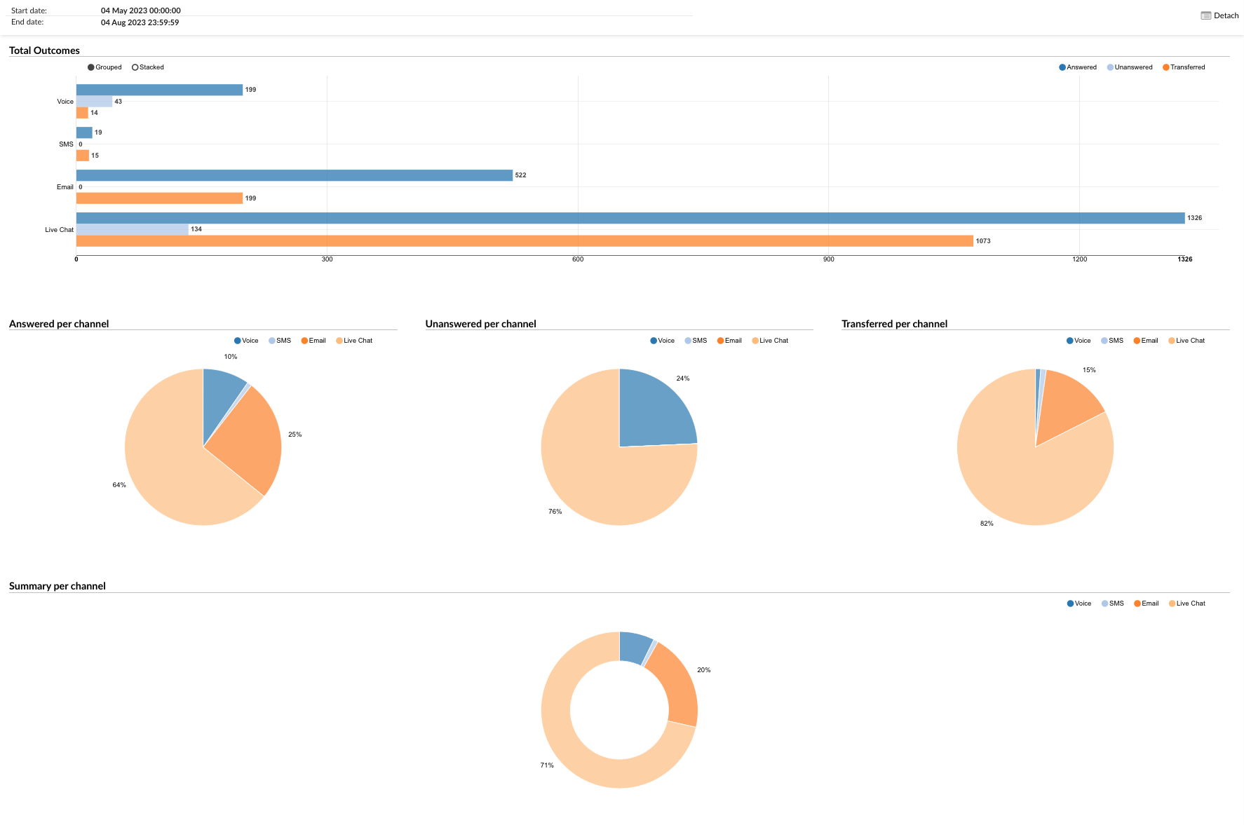
¶ Total Outcomes
This section presents a horizontal bar graph showing the "Answered," "Unanswered," and "Transferred" conversations for each channel.
- Radio Buttons: Users can filter the data by selecting the desired outcome (Answered, Unanswered, Transferred) to view the corresponding data for each channel.
¶ Answered per Channel
This section provides a pie chart that represents the proportion of answered conversations for each channel.
- Radio Buttons: Users can filter the data by channel, selecting between "Voice," "Live Chat," "SMS," and "Email."
¶ Unanswered per Channel
This section provides a pie chart that represents the proportion of unanswered conversations for each channel.
- Radio Buttons: Users can filter the data by channel, selecting between "Voice," "Live Chat," "SMS," and "Email."
¶ Transferred per Channel
This section provides a pie chart that represents the proportion of transferred conversations for each channel.
- Radio Buttons: Users can filter the data by channel, selecting between "Voice," "Live Chat," "SMS," and "Email."
¶ Summary per Channel
This section provides a summary pie chart that represents the overall distribution of conversation outcomes for each channel.
- Radio Buttons: Users can filter the data by channel, selecting between "Voice," "Live Chat," "SMS," and "Email."
The "All Conversations Outcomes per Channel" graph serves as a powerful tool for visually analyzing the outcomes of conversations, enabling managers to identify trends, make informed decisions, and implement strategies to enhance customer service and efficiency.
¶ All Conversations per Queue
This feature provides a comprehensive overview of all conversations that have taken place in each queue. The information is divided into three tables:
¶ All Conversations per Queue
This table provides a detailed breakdown of each conversation per queue. The columns in this table are:
- Queue: The specific queue where the conversation took place.
- Channel: The communication channel used for the conversation.
- Activity Time: This column is divided into four subcolumns:
- Total: The total activity time for all conversations in the queue.
- Min: The shortest activity time recorded in the queue.
- Max: The longest activity time recorded in the queue.
- Mean: The average activity time of all conversations in the queue.
- Speed to Answer: This column is divided into four subcolumns:
- Total: The total time taken to answer all conversations in the queue.
- Min: The shortest time taken to answer a conversation in the queue.
- Max: The longest time taken to answer a conversation in the queue.
- Mean: The average time taken to answer conversations in the queue.
- Waiting Time: This column is divided into four subcolumns:
- Total: The total waiting time for all conversations in the queue.
- Min: The shortest waiting time recorded in the queue.
- Max: The longest waiting time recorded in the queue.
- Mean: The average waiting time of all conversations in the queue.
¶ All Conversations per Queue (External)
This table provides a detailed breakdown of each external conversation per queue. The columns in this table are:
- Queue: The specific queue where the conversation took place.
- Channel: The communication channel used for the conversation.
- First Response Time: This column is divided into four subcolumns:
- Total: The total first response time for all external conversations in the queue.
- Min: The shortest first response time recorded in the queue.
- Max: The longest first response time recorded in the queue.
- Mean: The average first response time of all external conversations in the queue.
- Resolution Time: This column is divided into four subcolumns:
- Total: The total resolution time for all external conversations in the queue.
- Min: The shortest resolution time recorded in the queue.
- Max: The longest resolution time recorded in the queue.
- Mean: The average resolution time of all external conversations in the queue.
¶ All Conversations Outcomes per Queue
This table provides a detailed breakdown of the outcomes of each conversation per queue. The columns in this table are:
- Queue: The specific queue where the conversation took place.
- Channel: The communication channel used for the conversation.
- Total: The total number of conversations in the queue.
- Answered: The total number of conversations that were answered in the queue.
- Unanswered: The total number of conversations that were unanswered in the queue.
- Ended by Agent (%): The percentage of conversations that were ended by the agent.
- Ended by Customer (%): The percentage of conversations that were ended by the customer.
- Transferred (%): The percentage of conversations that were transferred to another queue or agent.
- Abandoned (%): The percentage of conversations that were abandoned by the customer before they were answered.
- Exit with key (%): The percentage of conversations where the customer exited the queue using a key.
- Timed out (%): The percentage of conversations that timed out before they were answered.
This documentation provides a comprehensive overview of the "All Conversations per Queue" feature. For more detailed information or assistance, please refer to the official product documentation or contact our support team.
¶ All Conversations per Queue Breakdown
This feature provides a detailed overview of each conversation that has taken place in each queue. The information is presented in a table with the following columns:
-
Conversation ID: A unique identifier for each conversation. This can be used to track or reference a specific conversation.
-
Date: The date when the conversation took place.
-
Channel: The communication channel used for the conversation. This could be via phone, email, chat, etc.
-
Customer: The customer involved in the conversation. This could be the customer's name, ID, or any other identifier used in your system.
-
Queue: The specific queue where the conversation took place.
-
Assignee: The agent or representative who was assigned to handle the conversation.
-
Activity Time: The total time of activity for the conversation. This includes the time the agent spent talking to the customer, as well as any after-call work.
-
Speed To Answer: The time it took for the agent to answer the conversation after it was initiated.
-
Waiting Time: The time the customer spent waiting before the conversation was answered by the agent.
-
Entry: The method or point of entry for the conversation into the queue. This could be a direct call, a transfer from another queue, etc.
-
Exit: The method or point of exit for the conversation from the queue. This could be a hang-up, a transfer to another queue, etc.
-
Transferred: Indicates whether the conversation was transferred to another queue or agent. This could be a 'Yes' or 'No', or it could provide more detailed information.
-
Last Action By: The last person (either an agent or the customer) who took an action in the conversation.
-
Ended: Indicates how the conversation was ended. This could be 'By Agent', 'By Customer', 'Timed Out', etc.
In the report breakdown, two icons are linked to the ConversationID field. The first icon permits users to directly view transcripts of selected conversations, while the second enables them to download these transcripts for further review or analysis. These functionalities offer users convenient access to comprehensive records of customer interactions, which supports meticulous monitoring and evaluation of both agent performance and overall customer service quality.
¶ All Conversations per Queue External Breakdown
The "All Conversations per Queue External Breakdown" statistics table provides detailed information about each conversation handled across different communication channels, with a focus on external interactions. The table consists of fourteen columns, each offering specific insights about the conversations.
-
Conversation ID: This column lists the unique identifiers for each conversation.
-
Date: This column shows the date when each conversation took place.
-
Channel: This column indicates the communication channel used for each conversation, such as chat, email, or messaging.
-
Customer: This column lists the customers involved in each conversation.
-
Queue: This column shows the queue in which each conversation was handled.
-
Assignee: This column lists the agent assigned to each conversation.
-
Activity Time: This column shows the total time the agent spent on each conversation.
-
Speed To Answer: This column represents the time taken by the agent to answer each conversation.
-
Waiting Time: This column indicates the time each conversation spent waiting in the queue before being answered.
-
Entry: This column indicates the time each conversation entered the queue.
-
Exit: This column shows the time each conversation exited the queue.
-
Transferred: This column indicates whether each conversation was transferred to another agent or queue.
-
Last Action By: This column shows who performed the last action in the conversation, whether it was the agent or the customer.
-
Ended: This column indicates how each conversation was concluded.
By using the "All Conversations per Queue External Breakdown" statistics table, managers can gain a granular understanding of each conversation, identify patterns in external interactions, and implement strategies to improve agent performance and customer service.
This documentation provides a comprehensive overview of the "All Conversations per Queue Breakdown" feature. For more detailed information or assistance, please refer to the official product documentation or contact our support team.
¶ All Conversations Outcomes per Queue Breakdown
The "All Conversations Outcomes per Queue Breakdown" statistics table provides detailed information about each conversation handled across different communication channels, with a focus on the outcomes of these conversations. The table consists of fourteen columns, each offering specific insights about the conversations and their outcomes.
-
Conversation ID: This column lists the unique identifiers for each conversation.
-
Date: This column shows the date when each conversation took place.
-
Channel: This column indicates the communication channel used for each conversation, such as chat, email, or messaging.
-
Customer: This column lists the customers involved in each conversation.
-
Queue: This column shows the queue in which each conversation was handled.
-
Assignee: This column lists the agent assigned to each conversation.
-
Activity Time: This column shows the total time the agent spent on each conversation.
-
Speed To Answer: This column represents the time taken by the agent to answer each conversation.
-
Waiting Time: This column indicates the time each conversation spent waiting in the queue before being answered.
-
Entry: This column indicates the time each conversation entered the queue.
-
Exit: This column shows the time each conversation exited the queue.
-
Transferred: This column indicates whether each conversation was transferred to another agent or queue.
-
Last Action By: This column shows who performed the last action in the conversation, whether it was the agent or the customer.
-
Ended: This column indicates how each conversation was concluded, providing insights into the outcomes of the conversations.
By using the "All Conversations Outcomes per Queue Breakdown" statistics table, managers can gain a granular understanding of each conversation, identify patterns in conversation outcomes, and implement strategies to improve agent performance and customer service.
¶ All Conversations per Queue Graph
The "All Conversations per Queue" graph provides a visual representation of various aspects of all conversations handled across different queues. The graph is divided into four sections, each focusing on a specific aspect of the conversations.
¶ Activity Time
This section allows users to monitor the durations of conversations for each queue over a specific period.
- Radio Buttons (Left): Users can select between "Minimum," "Maximum," and "Mean" to view the corresponding data for the activity time.
- Radio Buttons (Right): Users can filter the data by queue.
- Hovering: Users can hover over the graph line to see the exact data for each queue.
¶ Speed To Answer
This section provides insights into the speed at which agents answer conversations across different queues.
- Radio Buttons (Left): Users can select between "Minimum," "Maximum," and "Mean" to view the corresponding data for the speed to answer.
- Radio Buttons (Right): Users can filter the data by queue.
- Hovering: Users can hover over the graph line to see the exact data for each queue.
¶ Waiting Time
This section allows users to monitor the waiting times of conversations for each queue over a specific period.
- Radio Buttons (Left): Users can select between "Minimum," "Maximum," and "Mean" to view the corresponding data for the waiting time.
- Radio Buttons (Right): Users can filter the data by queue.
- Hovering: Users can hover over the graph line to see the exact data for each queue.
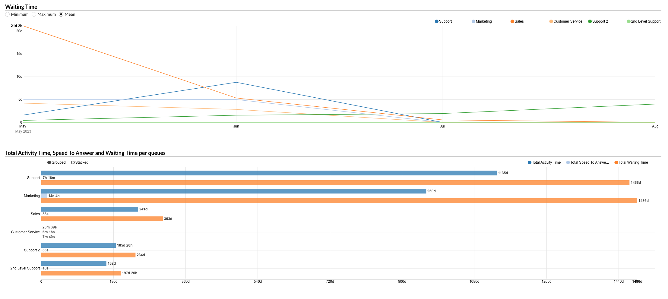
¶ Total Activity Time, Speed To Answer, and Waiting Time per Queues
This section presents a bar graph showing the total activity time, total speed to answer, and total waiting time for all queues.
- Hovering: Users can hover over the bars to see the exact data for each queue.
The "All Conversations per Queue" graph serves as a powerful tool for visually analyzing various aspects of conversations, enabling managers to identify trends, make informed decisions, and implement strategies to enhance customer service and efficiency.
¶ Answered Conversations per Channel
The "Answered Conversations per Channel" statistics provide detailed information about all answered conversations handled across different communication channels. The statistics are divided into two tables, each focusing on a specific aspect of the answered conversations.
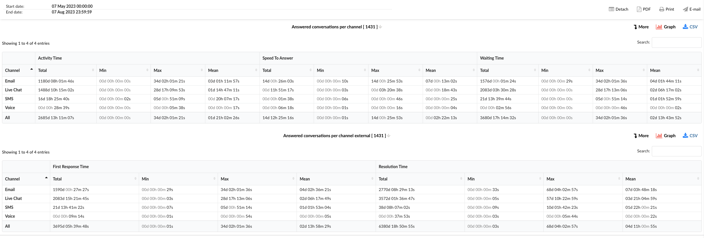
¶ Answered Conversations per Channel
This table provides insights into the activity time, speed to answer, and waiting time of the answered conversations for each channel.
-
Channel: This column lists the communication channels, including "Email," "Live Chat," "SMS," "Voice," and an "All" option for viewing aggregated data.
-
Activity Time: This column shows the total, minimum, maximum, and mean activity time for each channel.
-
Speed To Answer: This column represents the total, minimum, maximum, and mean speed to answer for each channel.
-
Waiting Time: This column indicates the total, minimum, maximum, and mean waiting time for each channel.
¶ Answered Conversations per Channel External
This table provides insights into the first response time and resolution time of the answered conversations for each channel.
-
Channel: This column lists the communication channels, including "Email," "Live Chat," "SMS," "Voice," and an "All" option for viewing aggregated data.
-
First Response Time: This column shows the total, minimum, maximum, and mean first response time for each channel.
-
Resolution Time: This column represents the total, minimum, maximum, and mean resolution time for each channel.
The "Answered Conversations per Channel" statistics serve as a powerful tool for analyzing the performance of agents in handling answered conversations, enabling managers to identify trends, make informed decisions, and implement strategies to enhance customer service and efficiency.
Absolutely, here's a user-friendly documentation for the "Answered Conversations per Channel Breakdown" statistics:
¶ Answered Conversations per Channel Breakdown
The "Answered Conversations per Channel Breakdown" statistics table provides detailed information about each answered conversation handled across different communication channels. The table consists of fourteen columns, each offering specific insights about the conversations.
-
Conversation ID: This column lists the unique identifiers for each conversation.
-
Date: This column shows the date when each conversation took place.
-
Channel: This column indicates the communication channel used for each conversation, such as chat, email, or messaging.
-
Customer: This column lists the customers involved in each conversation.
-
Queue: This column shows the queue in which each conversation was handled.
-
Assignee: This column lists the agent assigned to each conversation.
-
Activity Time: This column shows the total time the agent spent on each conversation.
-
Speed To Answer: This column represents the time taken by the agent to answer each conversation.
-
Waiting Time: This column indicates the time each conversation spent waiting in the queue before being answered.
-
Entry: This column indicates the time each conversation entered the queue.
-
Exit: This column shows the time each conversation exited the queue.
-
Transferred: This column indicates whether each conversation was transferred to another agent or queue.
-
Last Action By: This column shows who performed the last action in the conversation, whether it was the agent or the customer.
-
Ended: This column indicates how each conversation was concluded.
In the report breakdown, two icons are linked to the ConversationID field. The first icon permits users to directly view transcripts of selected conversations, while the second enables them to download these transcripts for further review or analysis. These functionalities offer users convenient access to comprehensive records of customer interactions, which supports meticulous monitoring and evaluation of both agent performance and overall customer service quality.
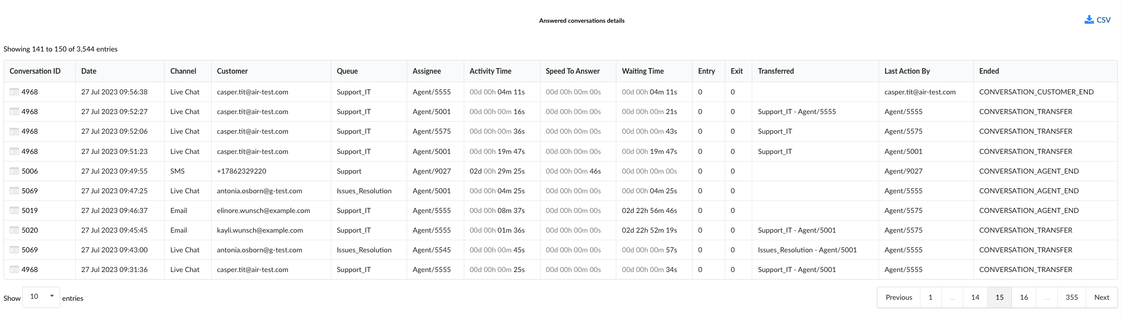
By using the "Answered Conversations per Channel Breakdown" statistics table, managers can gain a granular understanding of each conversation, identify patterns in answered interactions, and implement strategies to improve agent performance and customer service.
¶ Answered Conversations per Channel Graph
The "Answered Conversations per Channel" graph provides a visual representation of various aspects of all answered conversations handled across different communication channels. The graph is divided into four sections, each focusing on a specific aspect of the conversations.
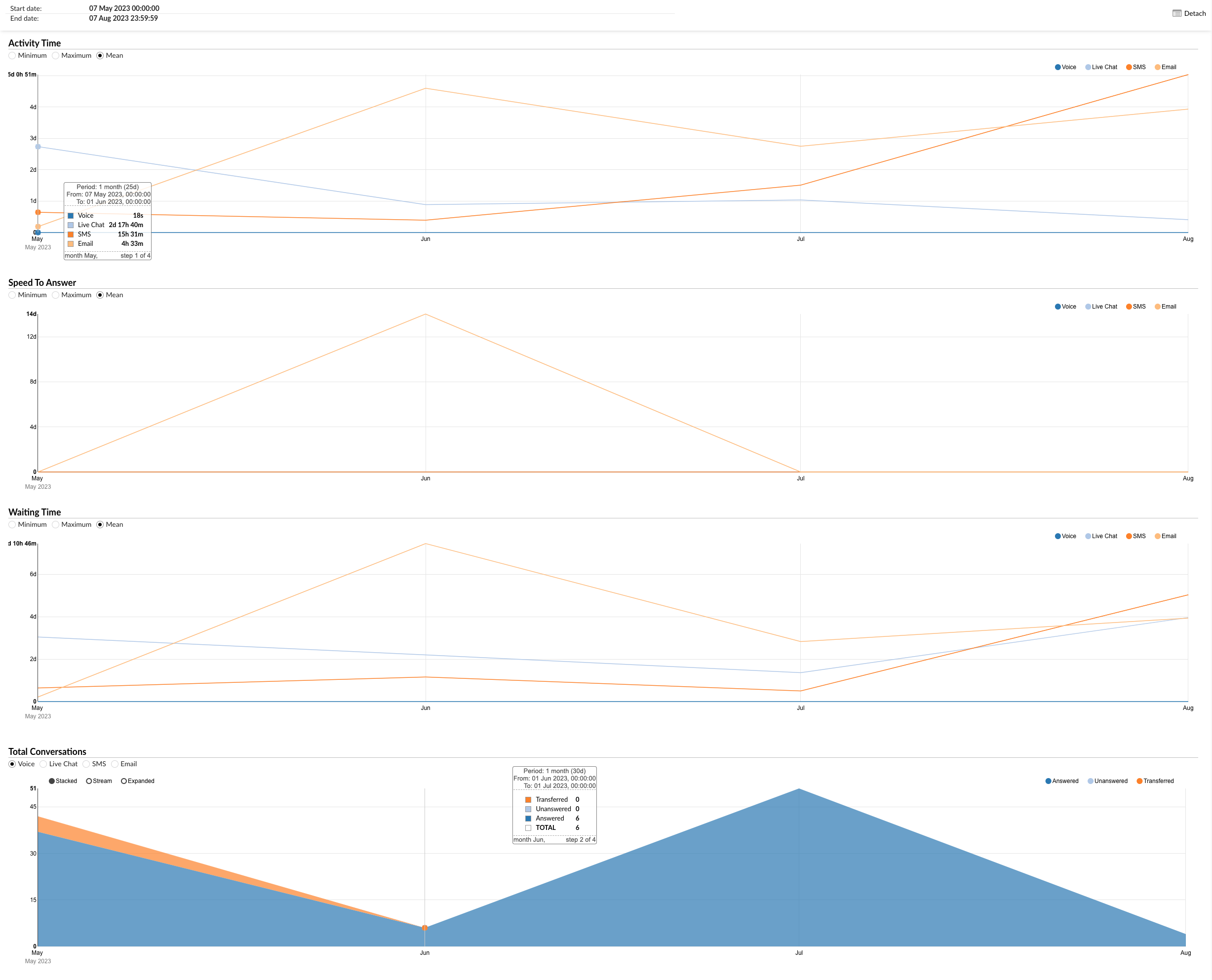
¶ Activity Time
This section allows users to monitor the durations of conversations for each channel over a specific period.
- Radio Buttons (Left): Users can select between "Minimum," "Maximum," and "Mean" to view the corresponding data for the activity time.
- Radio Buttons (Right): Users can filter the data by channel (Voice, Live Chat, SMS, Email).
- Hovering: Users can hover over the graph line to see the exact data for each channel.
¶ Speed To Answer
This section provides insights into the speed at which agents answer conversations across different channels.
- Radio Buttons (Left): Users can select between "Minimum," "Maximum," and "Mean" to view the corresponding data for the speed to answer.
- Radio Buttons (Right): Users can filter the data by channel (Voice, Live Chat, SMS, Email).
- Hovering: Users can hover over the graph line to see the exact data for each channel.
¶ Waiting Time
This section allows users to monitor the waiting times of conversations for each channel over a specific period.
- Radio Buttons (Left): Users can select between "Minimum," "Maximum," and "Mean" to view the corresponding data for the waiting time.
- Radio Buttons (Right): Users can filter the data by channel (Voice, Live Chat, SMS, Email).
- Hovering: Users can hover over the graph line to see the exact data for each channel.
¶ Total Conversations
This section presents a bar graph showing the total number of answered, unanswered, and transferred conversations for all channels.
- Radio Buttons (Left): Users can filter the data by channel (Voice, Live Chat, SMS, Email).
- Radio Buttons (Right): Users can filter the data by conversation outcome (Answered, Unanswered, Transferred).
- Hovering: Users can hover over the bars to see the exact data for each channel.
The "Answered Conversations per Channel" graph serves as a powerful tool for visually analyzing various aspects of conversations, enabling managers to identify trends, make informed decisions, and implement strategies to enhance customer service and efficiency.
Absolutely, here's a user-friendly documentation for the "Answered Conversations per Channel External" graph:
¶ Answered Conversations per Channel External Graph
The "Answered Conversations per Channel External" graph provides a visual representation of various aspects of all answered conversations handled across different communication channels. The graph is divided into three sections, each focusing on a specific aspect of the conversations.
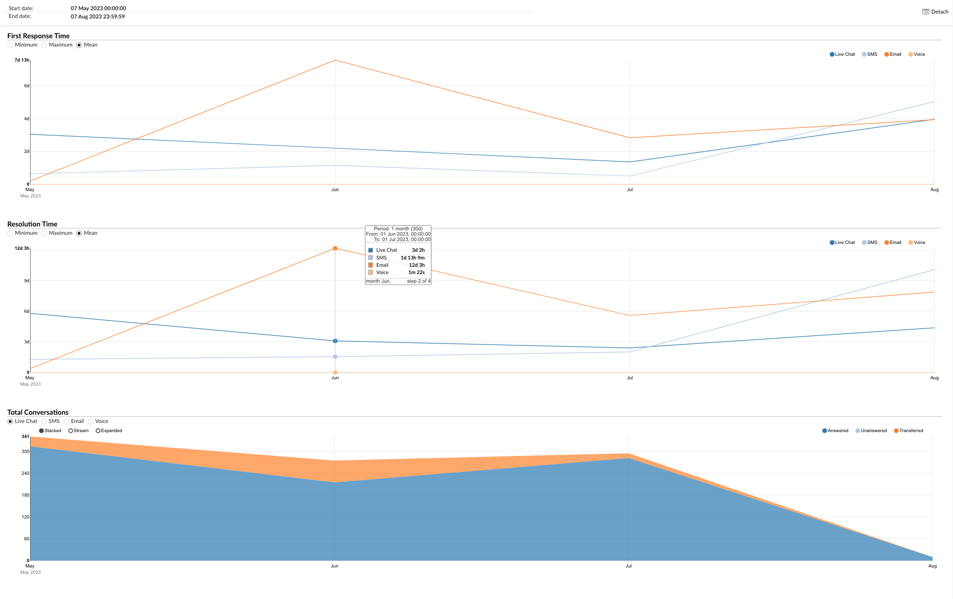
¶ First Response Time
This section allows users to monitor the first response times of conversations for each channel over a specific period.
- Radio Buttons (Left): Users can select between "Minimum," "Maximum," and "Mean" to view the corresponding data for the first response time.
- Radio Buttons (Right): Users can filter the data by channel (Voice, Live Chat, SMS, Email).
- Hovering: Users can hover over the graph line to see the exact data for each channel.
¶ Resolution Time
This section provides insights into the resolution times of conversations across different channels.
- Radio Buttons (Left): Users can select between "Minimum," "Maximum," and "Mean" to view the corresponding data for the resolution time.
- Radio Buttons (Right): Users can filter the data by channel (Voice, Live Chat, SMS, Email).
- Hovering: Users can hover over the graph line to see the exact data for each channel.
¶ Total Conversations
This section presents a bar graph showing the total number of answered, unanswered, and transferred conversations for all channels.
- Radio Buttons (Left): Users can filter the data by channel (Voice, Live Chat, SMS, Email).
- Radio Buttons (Right): Users can filter the data by conversation outcome (Answered, Unanswered, Transferred).
- Hovering: Users can hover over the bars to see the exact data for each channel.
The "Answered Conversations per Channel External" graph serves as a powerful tool for visually analyzing various aspects of conversations, enabling managers to identify trends, make informed decisions, and implement strategies to enhance customer service and efficiency.
¶ Answered Conversations per Queue
The "Answered Conversations per Queue" statistics provide a comprehensive overview of all answered conversations across different queues. The statistics are divided into three tables, each focusing on a specific aspect of the answered conversations.
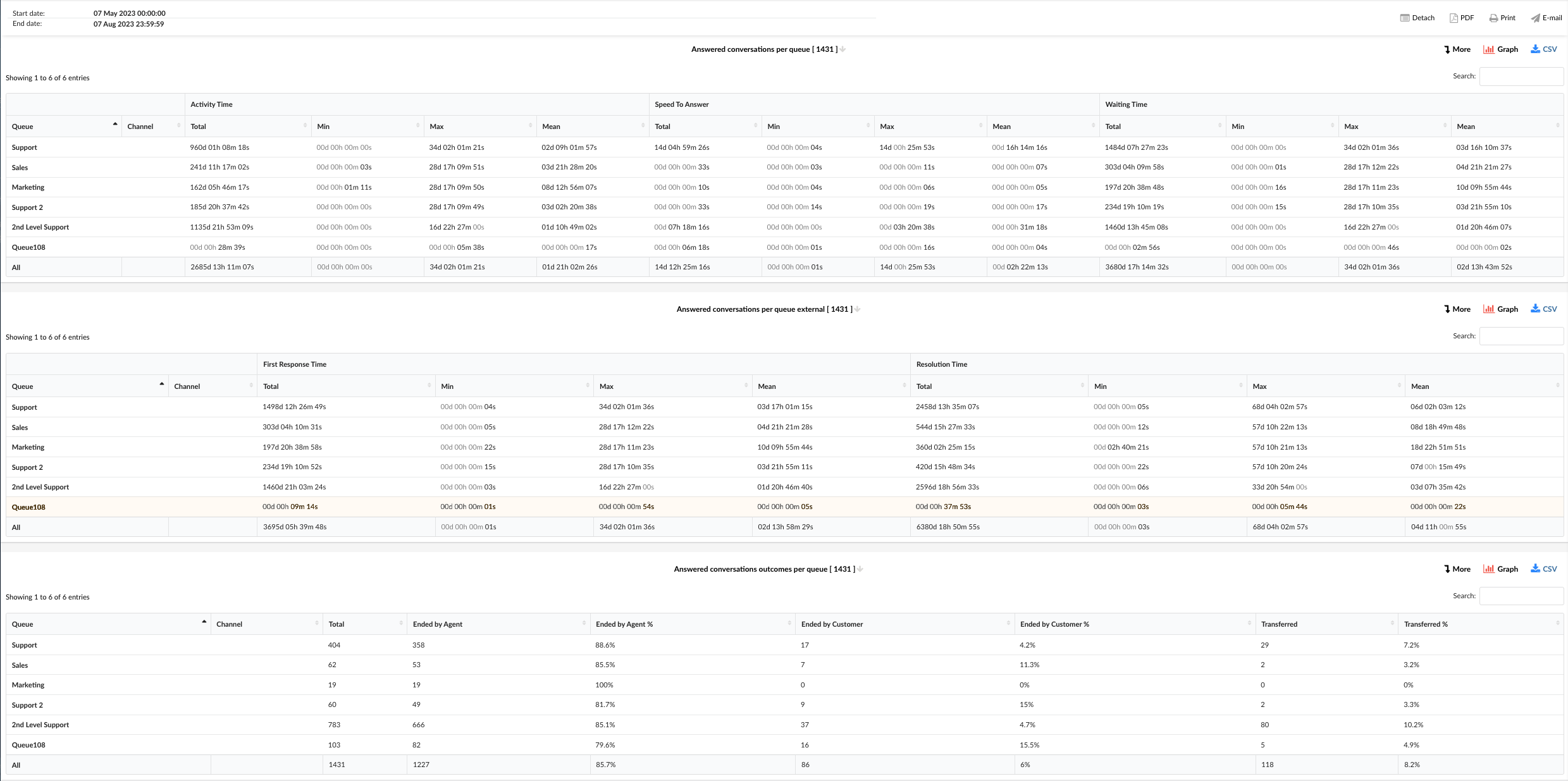
¶ Answered Conversations per Queue
This table provides a detailed breakdown of the activity time, speed to answer, and waiting time of the answered conversations for each queue.
-
Queue: This column lists the queues. Each queue represents a category of issues or inquiries that your customer service team handles.
-
Channel: This column indicates the communication channel used for each conversation. Channels can include chat, email, or messaging, and this column helps you understand which channels are most commonly used in each queue.
-
Activity Time: This column provides a detailed breakdown of the time spent on each conversation in a queue. It includes:
- Total: The sum of the duration of all conversations in the queue.
- Min: The shortest conversation duration in the queue.
- Max: The longest conversation duration in the queue.
- Mean: The average duration of conversations in the queue.
-
Speed To Answer: This column provides insights into how quickly agents in each queue respond to conversations. It includes:
- Total: The sum of all response times in the queue.
- Min: The shortest response time in the queue.
- Max: The longest response time in the queue.
- Mean: The average response time in the queue.
-
Waiting Time: This column provides information about how long conversations in each queue wait before an agent responds. It includes:
- Total: The sum of all waiting times in the queue.
- Min: The shortest waiting time in the queue.
- Max: The longest waiting time in the queue.
- Mean: The average waiting time in the queue.
¶ Answered Conversations per Queue External
This table provides a detailed breakdown of the first response time and resolution time of the answered conversations for each queue.
-
Queue: This column lists the queues. Each queue represents a category of issues or inquiries that your customer service team handles.
-
Channel: This column indicates the communication channel used for each conversation. Channels can include chat, email, or messaging, and this column helps you understand which channels are most commonly used in each queue.
-
First Response Time: This column provides insights into how quickly agents in each queue provide the first response to conversations. It includes:
- Total: The sum of all first response times in the queue.
- Min: The shortest first response time in the queue.
- Max: The longest first response time in the queue.
- Mean: The average first response time in the queue.
-
Resolution Time: This column provides information about how long it takes for conversations in each queue to be resolved. It includes:
- Total: The sum of all resolution times in the queue.
- Min: The shortest resolution time in the queue.
- Max: The longest resolution time in the queue.
- Mean: The average resolution time in the queue.
¶ Answered Conversations Outcomes per Queue
This table provides a summary of the outcomes of the answered conversations for each queue.
-
Queue: This column lists the queues. Each queue represents a category of issues or inquiries that your customer service team handles.
-
Channel: This column indicates the communication channel used for each conversation. Channels can include chat, email, or messaging, and this column helps you understand which channels are most commonly used in each queue.
-
Total: This column shows the total number of answered conversations for each queue. This helps you understand the volume of conversations handled by each queue.
-
Ended by Agent: This column indicates the number and percentage of conversations that were concluded by the agent. This helps you understand how often agents are the ones to end conversations in each queue.
-
Ended by Customer: This column shows the number and percentage of conversations that were concluded by the customer. This helps you understand how often customers are the ones to end conversations in each queue.
-
Transferred: This column represents the number and percentage of conversations that were transferred to another agent or queue. This helps you understand how often conversations in each queue are transferred.
The "Answered Conversations per Queue" statistics serve as a powerful tool for analyzing the performance of agents in handling answered conversations, enabling managers to identify trends, make informed decisions, and implement strategies to enhance customer service and efficiency.
¶ Answered Conversations per Queue Breakdown
The "Answered Conversations per Queue Breakdown" statistics table provides detailed information about each answered conversation handled across different communication channels. The table consists of fourteen columns, each offering specific insights about the conversations.
-
Conversation ID: This column lists the unique identifiers for each conversation.
-
Date: This column shows the date when each conversation took place.
-
Channel: This column indicates the communication channel used for each conversation, such as chat, email, or messaging.
-
Customer: This column lists the customers involved in each conversation.
-
Queue: This column shows the queue in which each conversation was handled.
-
Assignee: This column lists the agent assigned to each conversation.
-
Activity Time: This column shows the total time the agent spent on each conversation.
-
Speed To Answer: This column represents the time taken by the agent to answer each conversation.
-
Waiting Time: This column indicates the time each conversation spent waiting in the queue before being answered.
-
Entry: This column indicates the time each conversation entered the queue.
-
Exit: This column shows the time each conversation exited the queue.
-
Transferred: This column indicates whether each conversation was transferred to another agent or queue.
-
Last Action By: This column shows who performed the last action in the conversation, whether it was the agent or the customer.
-
Ended: This column indicates how each conversation was concluded.
In the report breakdown, two icons are linked to the ConversationID field. The first icon permits users to directly view transcripts of selected conversations, while the second enables them to download these transcripts for further review or analysis. These functionalities offer users convenient access to comprehensive records of customer interactions, which supports meticulous monitoring and evaluation of both agent performance and overall customer service quality.
By using the "Answered Conversations per Queue Breakdown" statistics table, managers can gain a granular understanding of each conversation, identify patterns in answered interactions, and implement strategies to improve agent performance and customer service.
¶ Answered Conversations per Queue Graph
The "Answered Conversations per Queue" graph provides a visual representation of the answered conversations across different queues. The graph is divided into four sections, each focusing on a specific aspect of the answered conversations.
¶ Activity Time
This graph shows the activity time for each queue. You can filter the graph by minimum, maximum, and mean activity time using the options on the left. The queues are listed on the right, and you can select which queues you want to view on the graph. By hovering over the graph line, you can see the exact activity time data for each queue. This allows you to quickly compare the activity times across different queues and identify any queues that may be taking longer than others.
¶ Speed To Answer
This graph shows the speed to answer for each queue. Similar to the Activity Time graph, you can filter the graph by minimum, maximum, and mean speed to answer using the options on the left. The queues are listed on the right, and you can select which queues you want to view on the graph. By hovering over the graph lines, you can see the exact speed to answer data for each queue. This helps you understand how quickly agents in each queue are responding to conversations.
¶ Waiting Time
This graph shows the waiting time for each queue. You can filter the graph by minimum, maximum, and mean waiting time using the options on the left. The queues are listed on the right, and you can select which queues you want to view on the graph. By hovering over the graph lines, you can see the exact waiting time data for each queue. This allows you to identify any queues where customers may be waiting longer than others.
¶ Total Activity Time, Speed To Answer, and Waiting Time per Queue
This graph shows the total activity time, speed to answer, and waiting time for all queues. The graph is organized in a way that there are bars for total activity time, total speed to answer, and total waiting time. This provides a comprehensive overview of the overall performance of all queues in terms of activity time, speed to answer, and waiting time.
The "Answered Conversations per Queue" graph serves as a powerful tool for visually analyzing the performance of agents in handling answered conversations across different queues. It enables managers to identify trends, make informed decisions, and implement strategies to enhance customer service and efficiency.
¶ Answered Conversations per Queue External Graph
The "Answered Conversations per Queue External" graph provides a visual representation of the first response time and resolution time for answered conversations across different queues. The graph is divided into three sections, each focusing on a specific aspect of the answered conversations.
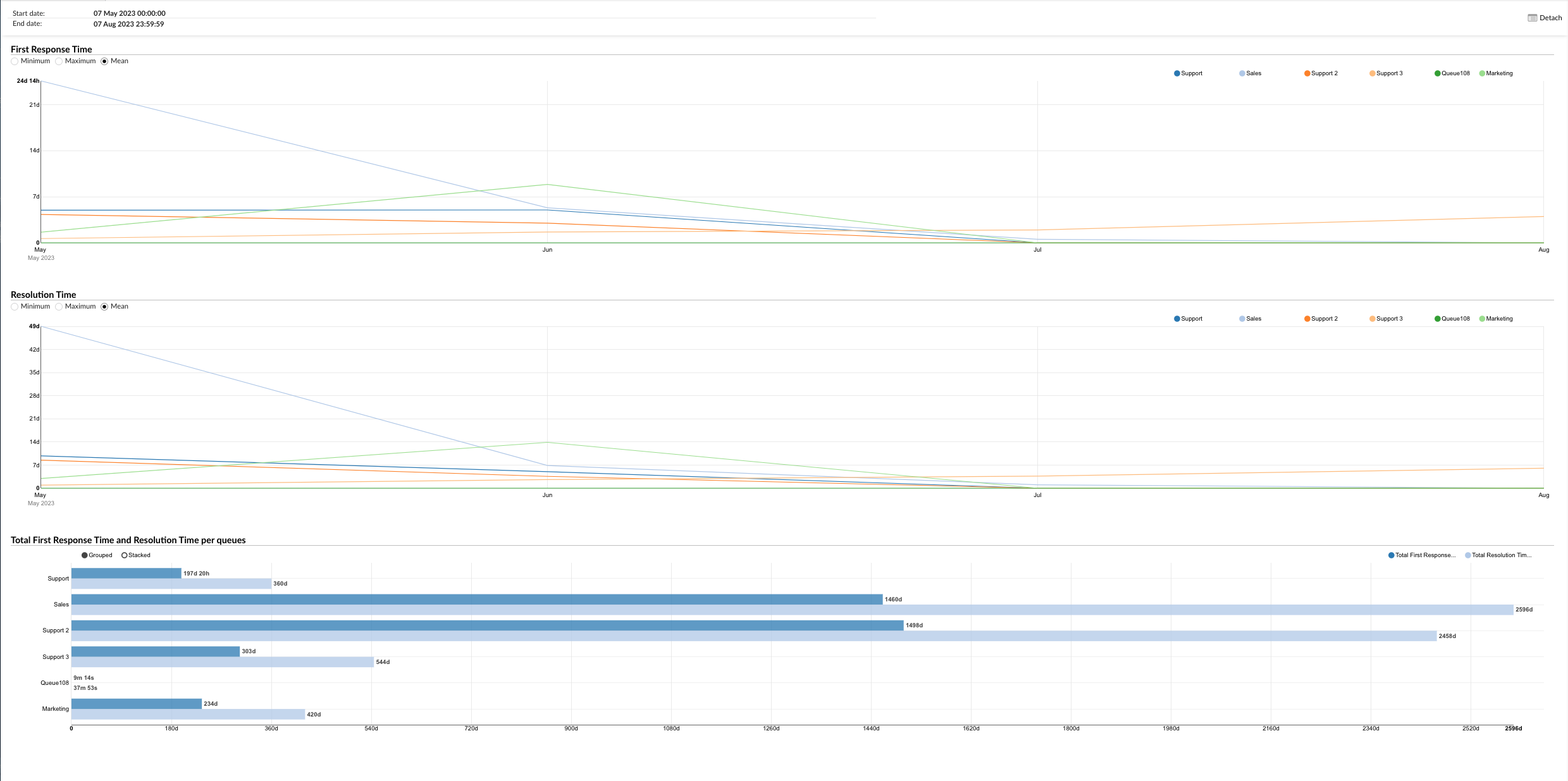
¶ First Response Time
This graph shows the first response time for each queue. You can filter the graph by minimum, maximum, and mean first response time using the options on the left. The queues are listed on the right, and you can select which queues you want to view on the graph. By hovering over the graph line, you can see the exact first response time data for each queue. This allows you to quickly compare the first response times across different queues and identify any queues where the first response may be taking longer than others.
¶ Resolution Time
This graph shows the resolution time for each queue. Similar to the First Response Time graph, you can filter the graph by minimum, maximum, and mean resolution time using the options on the left. The queues are listed on the right, and you can select which queues you want to view on the graph. By hovering over the graph lines, you can see the exact resolution time data for each queue. This helps you understand how quickly issues are being resolved in each queue.
¶ Total First Response Time and Resolution Time per Queue
This graph shows the total first response time and resolution time for all queues. The graph is organized in a way that there are horizontally laid bars for total first response time and total resolution time. You can filter the graph by total first response time and total resolution time using the radio button on the right. This provides a comprehensive overview of the overall performance of all queues in terms of first response time and resolution time.
The "Answered Conversations per Queue External" graph serves as a powerful tool for visually analyzing the performance of agents in handling answered conversations across different queues. It enables managers to identify trends, make informed decisions, and implement strategies to enhance customer service and efficiency.
¶ Answered Conversations per Queue Pie Charts
The "Answered Conversations per Queue" section provides two pie charts that offer a visual representation of the distribution of answered conversations across different queues.
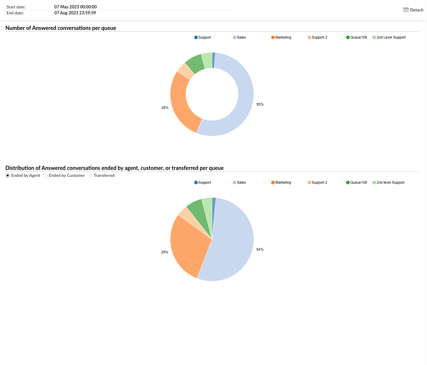
¶ Number of Answered Conversations per Queue
The first pie chart shows the number of answered conversations per queue. Each slice of the pie represents a different queue, and the size of the slice corresponds to the number of conversations answered in that queue. You can filter the data displayed on the chart by selecting the desired queues from the radio buttons on the right. This allows you to focus on specific queues and compare their performance in terms of answered conversations.
¶ Distribution of Answered Conversations Ended by Agent, Customer, or Transferred per Queue
The second pie chart shows the distribution of answered conversations that were ended by an agent, a customer, or transferred, per queue. Each slice of the pie represents a different ending status (ended by agent, ended by customer, or transferred), and the size of the slice corresponds to the number of conversations with that ending status in the selected queue. You can filter the data displayed on the chart by selecting the desired ending status from the radio buttons on the left, and the desired queues from the radio buttons on the right. This allows you to analyze the distribution of how conversations are typically concluded in each queue.
These pie charts serve as a powerful tool for visually analyzing the performance of agents in handling answered conversations across different queues. They enable managers to identify trends, make informed decisions, and implement strategies to enhance customer service and efficiency.
¶ Conversations Summary
The report will present a table summarizing the total number of calls, answered calls, and unanswered calls across various queues. All incoming calls will be grouped together as one call within specific time ranges.
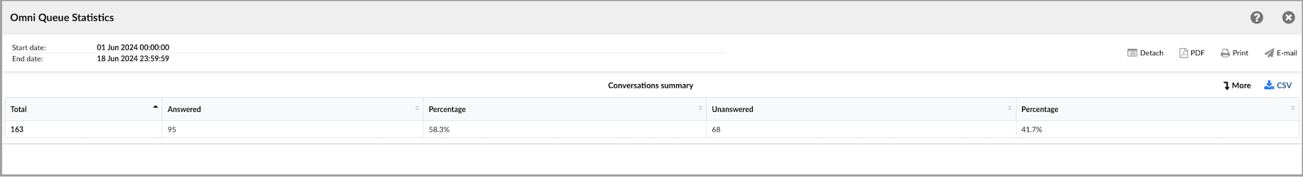
(i.e. If a call enters Queue A, which has a timeout option redirecting it to Queue B, and then gets transferred from Queue B to Queue C, where it is answered and completed, the report should reflect this as a single answered call across all three queues.)
¶ Distributions of Conversations per Channel
These reports provide valuable insights into how customers prefer to engage with the business and how these preferences might vary over time.
For example, if you're analyzing the distribution of conversations per channel over a specific time, you might find that customers tend to communicate more frequently through live chat during certain hours of the day, while email interactions are more evenly distributed throughout the day. This information can help businesses allocate resources, such as staffing levels, to accommodate the varying communication patterns better and ensure timely responses to customers.
All reports contain folowing columns, each offering specific insights about the conversation:
- Hour / Day / Day of the Week - displays the distribution of conversations across hours, days, and days of the week.
- Channel - Indicates the method of communication for each conversation, including voice, chat, email, or messaging.
- Total - Total number of conversations for the selected time frame (day, hour, or day of the week).
- Answered - Number of conversations that have received a response within the chosen time interval.
- Unanswered - Number of conversations that have not received a response within the chosen time interval.
- Average time - Displayed in five columns, each showing the average time taken to respond within a specific time period.
- Total time -Presented in five columns, each indicating the cumulative time spent in responses within a specific time period.
¶ Distributions of Conversations per Channel per Hour
This statistic reveals how conversations are distributed across various communication channels throughout the day, helping pinpoint peak times for customer interactions. By analyzing this data, supervisors can identify specific periods when customer communication is at its highest, whether it’s through phone calls, emails, live chats, or social media messages. This insight is invaluable for making informed decisions about staffing levels and resource allocation. For instance, if the data shows a surge in live chat conversations during the late afternoon, supervisors can adjust schedules to ensure more agents are available during that time. Similarly, understanding peak times for different channels allows for better planning of multi-channel support strategies, ensuring that resources are efficiently allocated to meet customer demand.
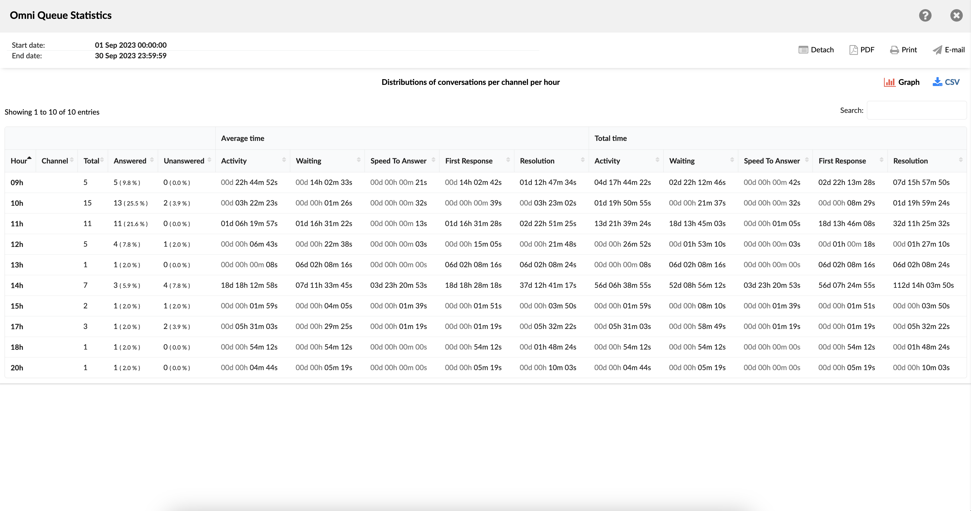
¶ Distributions of Conversations per Channel per Hour Graph
This graph consists of three additional graphs. The first one shows distributions of conversations per channel per hour. The second graph shows the average time for distribution of Activity, Speed to answer, and Waiting times per channel per hour. And the third one, similarly to the second one, shows the total time for distribution of Activity, Speed to answer, and Waiting times per channel per hour.
¶ Distributions of Conversations per Channel per Day
This statistic presents the daily distribution of conversations across various channels, enabling users to detect patterns and trends in customer communication volume over time. By providing a detailed breakdown of interactions via phone, email, live chat, social media, and other channels, this data helps users understand when and how customers prefer to engage with support. This insight is particularly useful for tracking customer interaction dynamics, such as identifying peak hours for each channel, seasonal fluctuations in communication volume, and shifts in customer preferences. With this information, managers can make informed decisions about staffing, resource allocation, and training, ensuring that the right support is available at the right times.
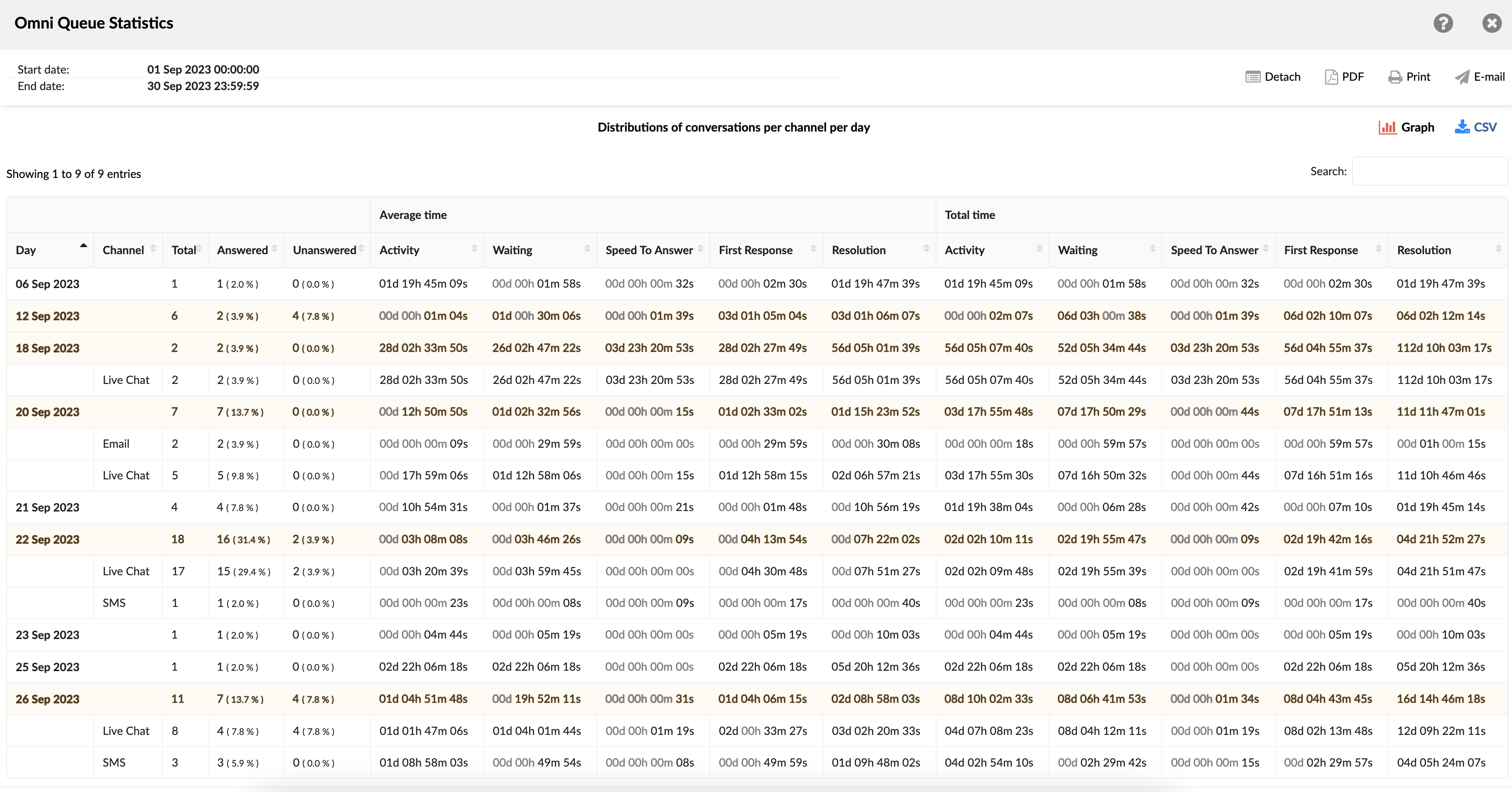
¶ Distributions of Conversations per Channel per Day Graph
This combined graph contains three additional segments that provide a comprehensive view of customer service performance. The initial segment illustrates the daily conversation distributions per channel, offering insights into how customer interactions are spread across phone, email, live chat, social media, and other platforms each day. This helps identify peak communication times and preferred channels, aiding in effective resource allocation.
The second segment features a chart showcasing the average duration of key performance metrics per channel per day. It includes the Activity distribution, which tracks how agents spend their time on various tasks; Speed to answer, which measures the responsiveness of agents; and Waiting times, indicating how long customers wait before receiving assistance. This segment allows supervisors to assess the efficiency and responsiveness of their team across different communication channels.
The third segment mirrors the second one but focuses on the cumulative time for the same metrics per channel per day. It aggregates the total time spent on Activity distribution, Speed to answer, and Waiting times, providing a holistic view of the overall workload and performance trends. This cumulative data is crucial for identifying long-term patterns and making strategic adjustments to improve service quality and operational efficiency.
Together, these segments offer a detailed analysis of customer service interactions, helping managers optimize staffing, enhance response times, and improve the overall customer experience.
¶ Distributions of Conversations per Channel per Day of Week
This metric showcases the distribution of conversations per channel across the days of the week, providing valuable insights into peak customer communication days. By analyzing this data, supervisors can identify which days experience the highest volumes of customer interactions across various channels, such as phone, email, live chat, and social media.
This information supports strategic analysis and resource allocation planning, allowing managers to optimize staffing levels and ensure adequate coverage during peak times. Understanding these patterns also helps in anticipating busy periods and preparing accordingly, ultimately enhancing service efficiency and customer satisfaction.
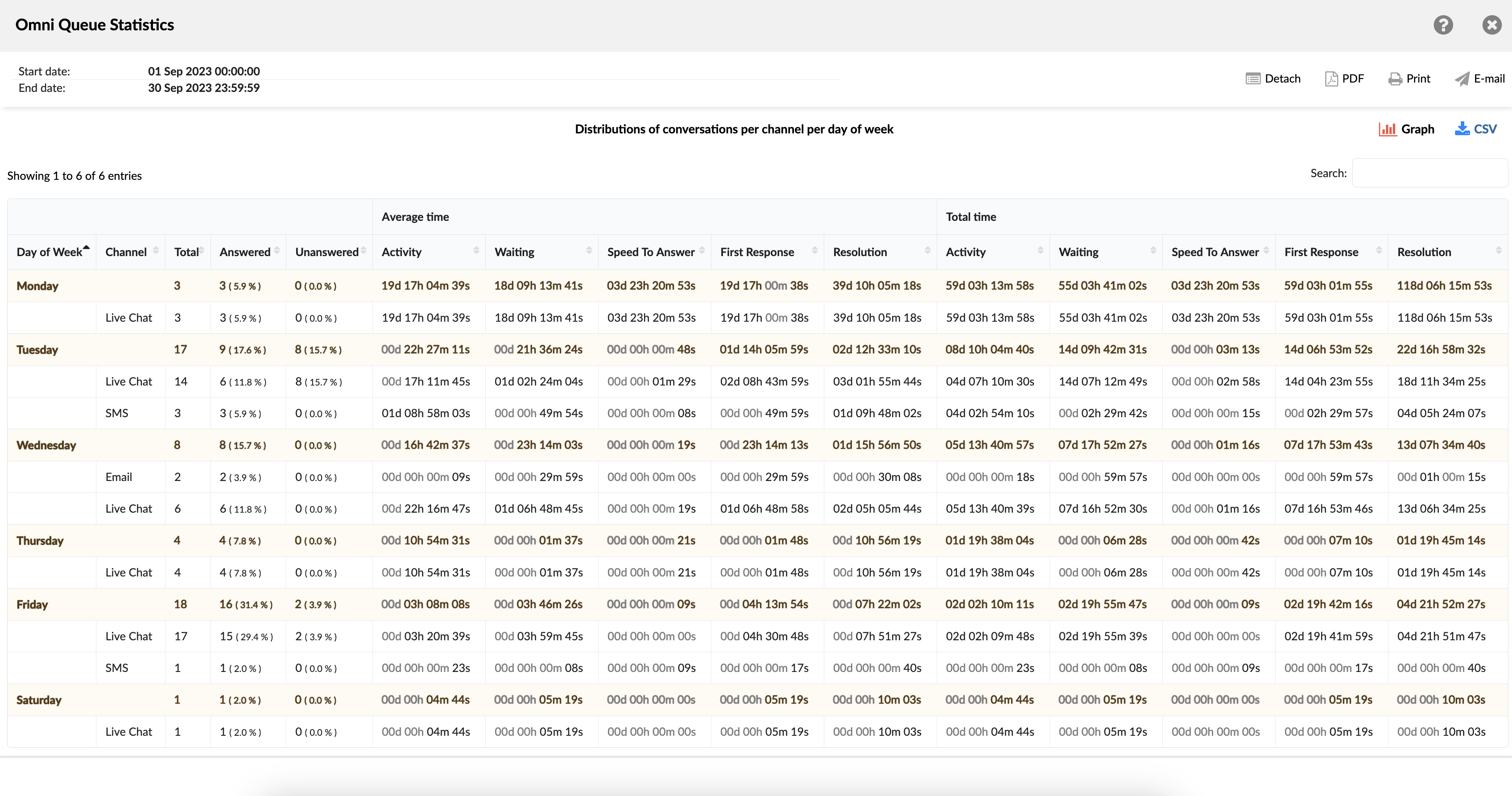
¶ Distributions of Conversations per Channel per Day of Week Graph
This graph is composed of three additional sections. The initial section presents conversation distributions per channel for each day of the week. The second section illustrates the average duration for Activity distribution, Speed to answer, and Waiting times per channel, categorized by day of the week. Correspondingly, the third section mirrors the second, displaying the cumulative time for Activity distribution, Speed to answer, and Waiting times per channel, also segmented by day of the week.
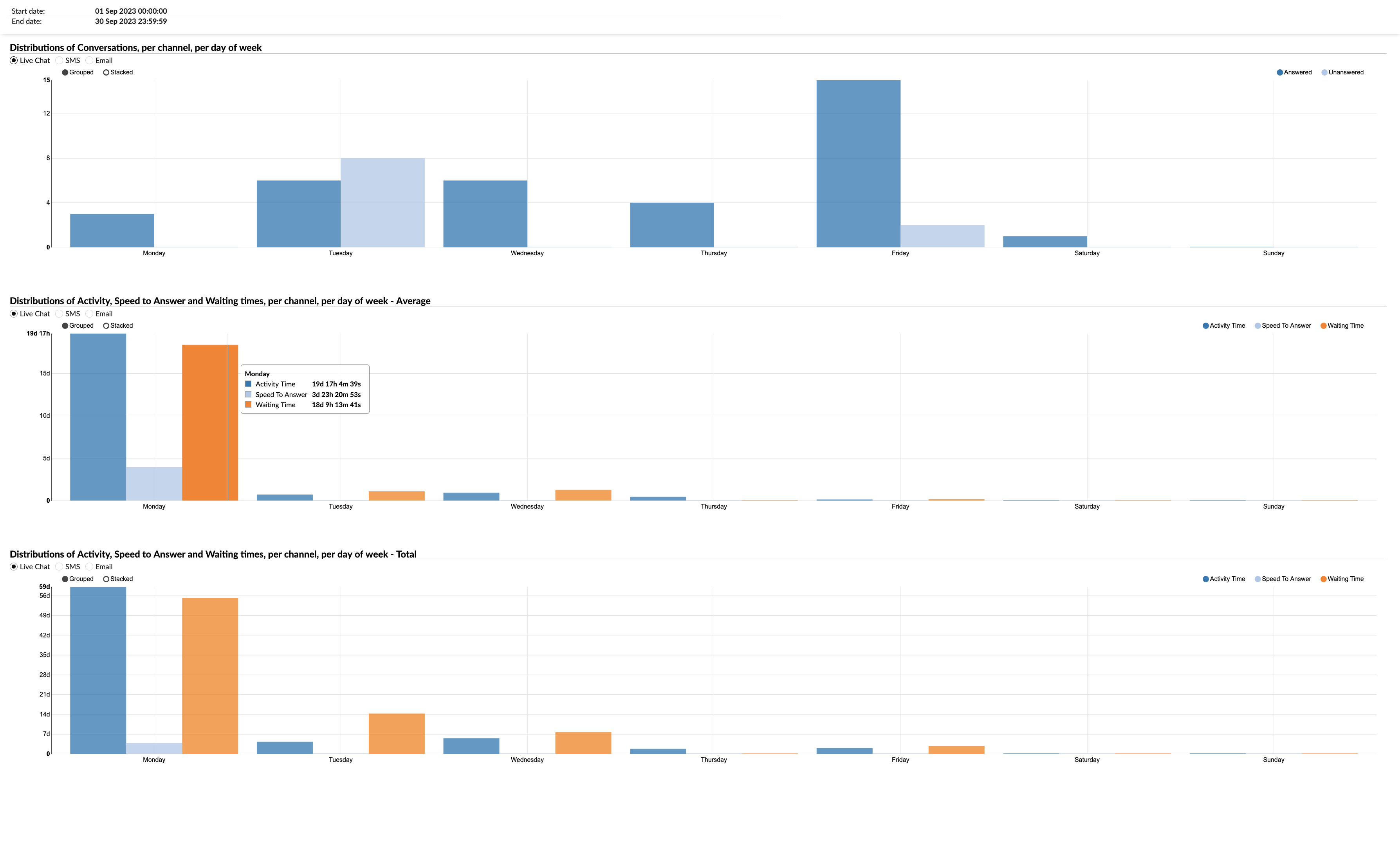
¶ Distributions of Conversations per Queue
The "Distribution of Conversations per Queue" reports involve analyzing customer interactions within a business according to designated queues. This analytical process aids users in comprehending how customer inquiries or requests are dispersed across specialized domains.
For instance, consider a business that operates queues for diverse functions such as technical support, billing inquiries, product information, and general customer service. By examining the distribution of conversations per queue, the company can pinpoint areas or queues encountering elevated interaction levels. This insight enables the strategic allocation additional personnel or resources to cater to heightened demand during peak periods.
All reports contain folowing columns, each offering specific insights about the conversation:
- Hour / Day / Day of the Week - displays the distribution of conversations across hours, days, and days of the week per queue.
- Queue - This column presents the names of all the queues where conversations were distributed.
- Total - represents the overall number of conversations per queue during the chosen timeframe (daily, hourly, or by day of the week).
- Answered - Indicates the count of conversations per queue that have received responses during the chosen time interval.
- Unanswered - Indicates the count of conversations per queue that have not yet received responses within the chosen time interval.
- Average time - Presented in five columns, each reflecting the average response time during a specific period.
- Total time - Presented in five columns, each reflecting the cumulative response time during a specific period.
¶ Distributions of Conversations per Queue per Hour
This statistical representation illustrates the dispersion of conversations across queues throughout the day. Its purpose lies in aiding the identification of peak periods for customer communication.
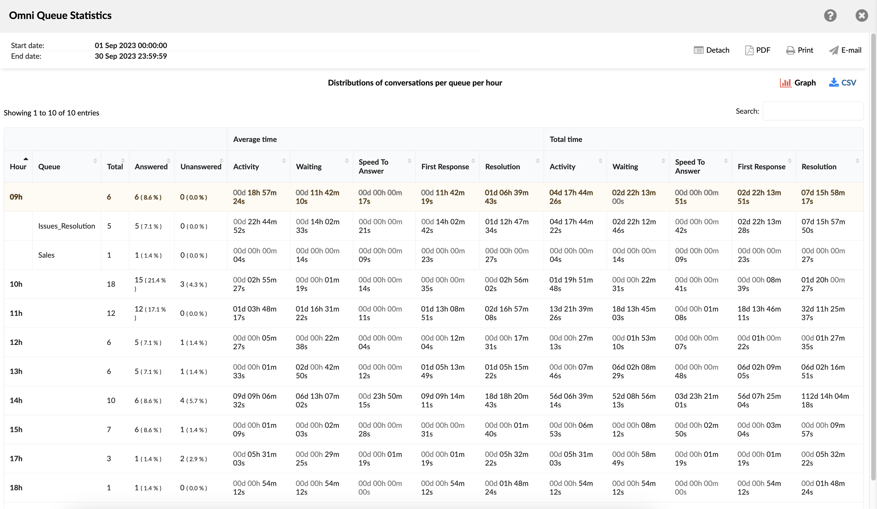
¶ Distributions of Conversations per Queue per Hour Graph
This composite graph includes three separate sub-graphs that offer a detailed analysis of customer service metrics. The initial sub-graph displays the hourly distribution of conversations across different queues, allowing supervisors to identify peak hours for customer interactions and manage staffing levels accordingly.
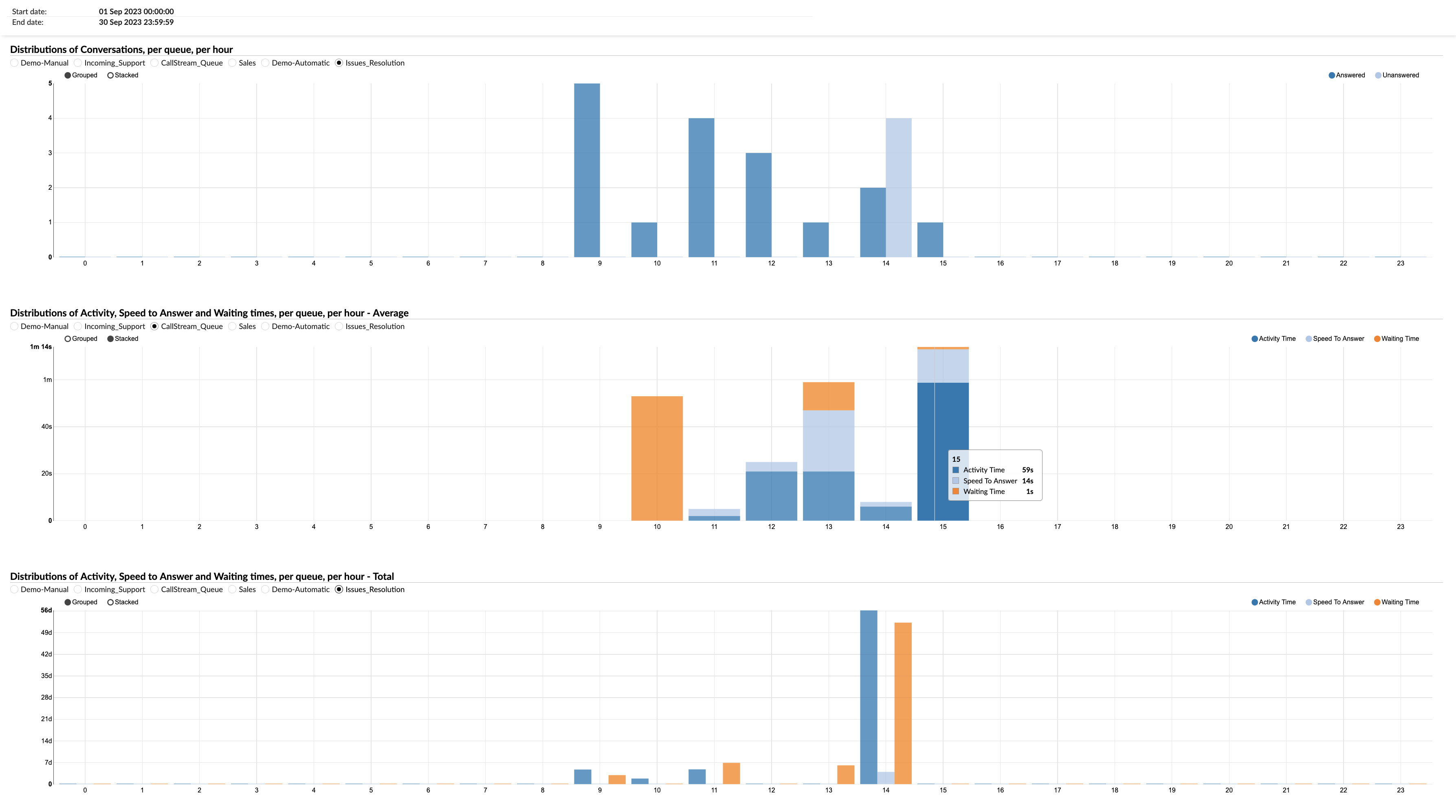
The second sub-graph illustrates the average duration for key performance metrics per hour for each queue. These metrics include Activity distribution, which tracks how agents spend their time; Speed to Answer, which measures the promptness of responses; and Waiting Times, which indicates how long customers wait before receiving assistance. This sub-graph helps assess the average efficiency and responsiveness of agents throughout the day.
Lastly, the third sub-graph shows the cumulative time for the same metrics—Activity distribution, Speed to Answer, and Waiting Times—per hour for each queue. This cumulative view provides insights into the total workload and performance trends over the course of the day, aiding in long-term strategic planning and resource optimization.
Together, these sub-graphs provide a comprehensive hourly breakdown of customer service operations, supporting informed decision-making to enhance service quality and operational efficiency.
¶ Distributions of Conversations per Queue per Day
This statistic provides insights into the daily dispersion of conversations across queues, enabling the discovery of patterns and trends in customer communication volume over time. It serves as an effective tool for tracking customer interaction dynamics.
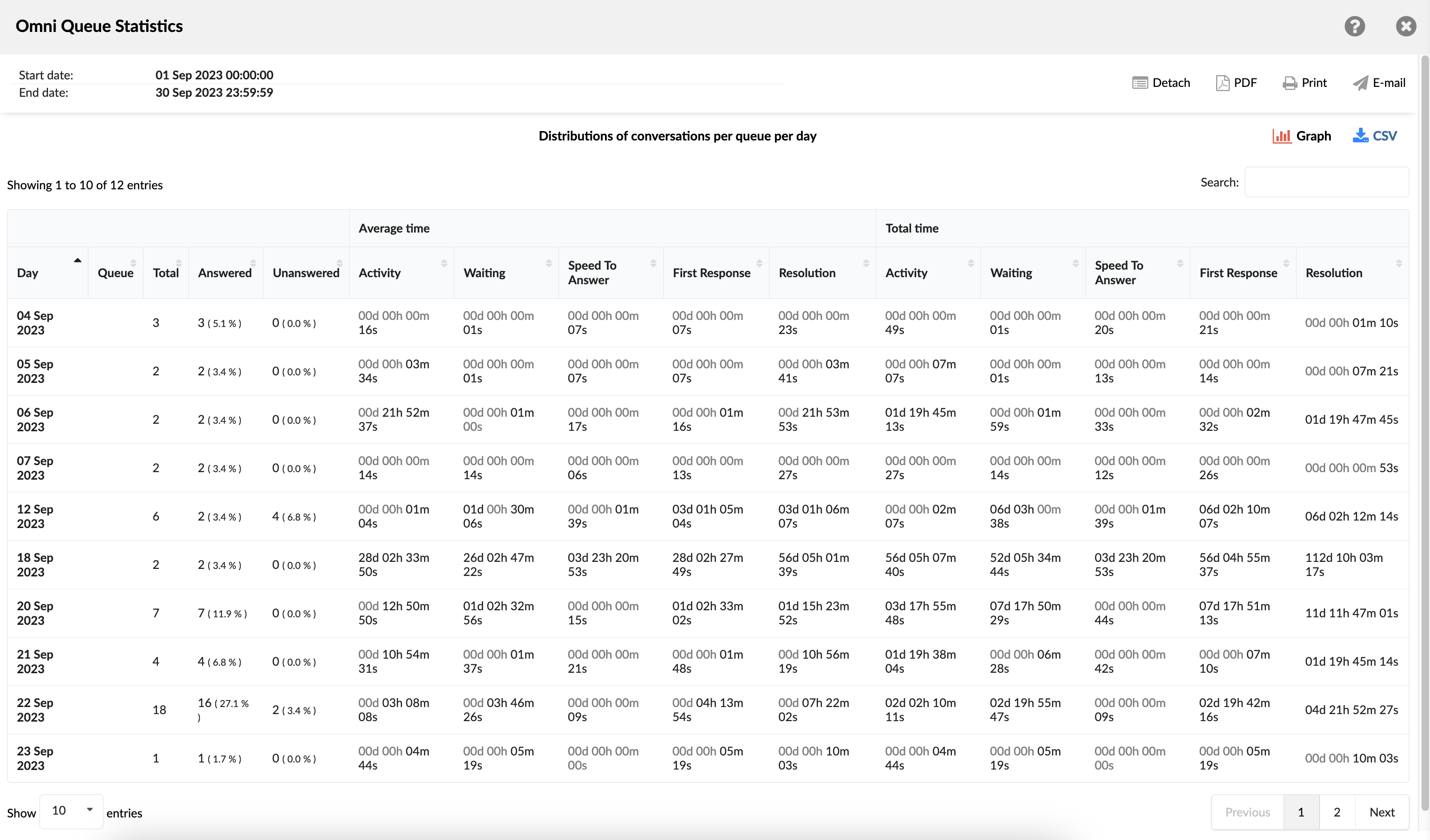
¶ Distributions of Conversations per Queue per Day Graph
This combined graph contains three segments. The initial segment illustrates the daily conversation distributions per queue. The second element features a chart showcasing the average duration of Activity distribution, Speed to answer, and Waiting times per queue per day. The third segment mirrors the second one, displaying the cumulative time for activity distribution, speed to answer, and waiting times per queue per day.
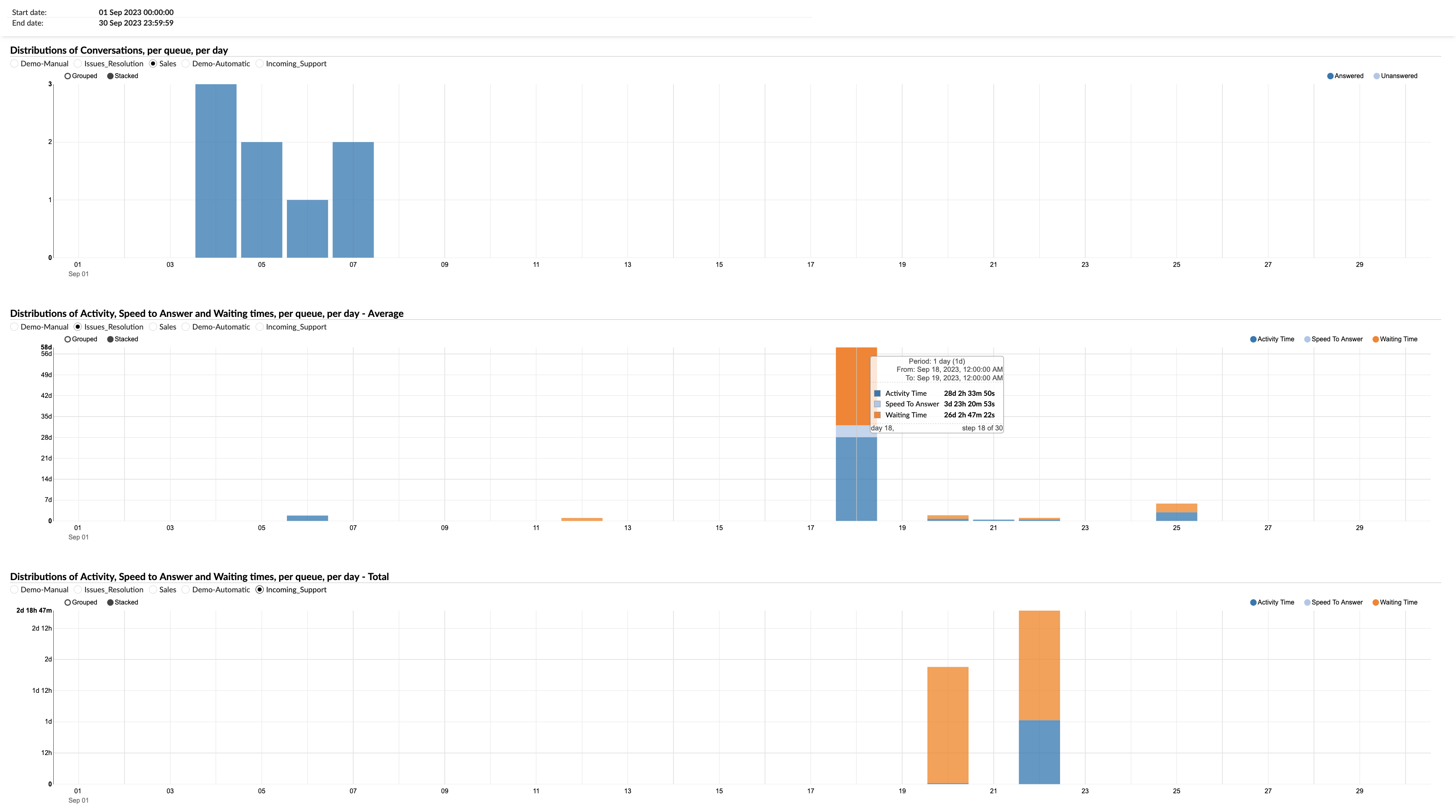
¶ Distributions of Conversations per Queue per Day of Week
This metric highlights the spread of conversations per queue across days of the week, offering valuable insights into peak days for customer communication. These insights form a foundation for strategic analysis and resource allocation planning.
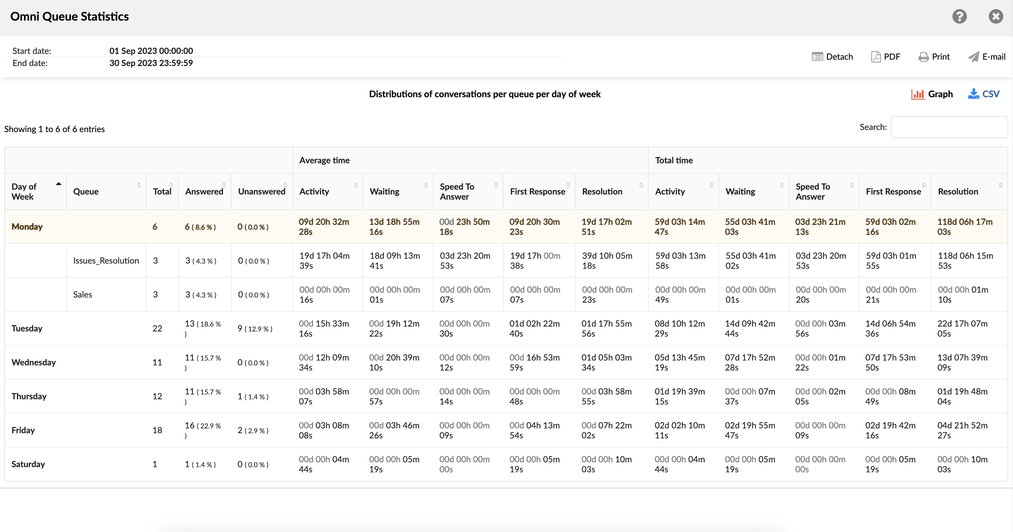
¶ Distributions of Conversations per Queue per Day of Week Graph
This graph contains three segments that provide a comprehensive overview of customer service performance metrics across the days of the week. The first segment showcases the distribution of conversations per queue for each day, allowing supervisors to identify peak communication days and adjust staffing and resources accordingly.
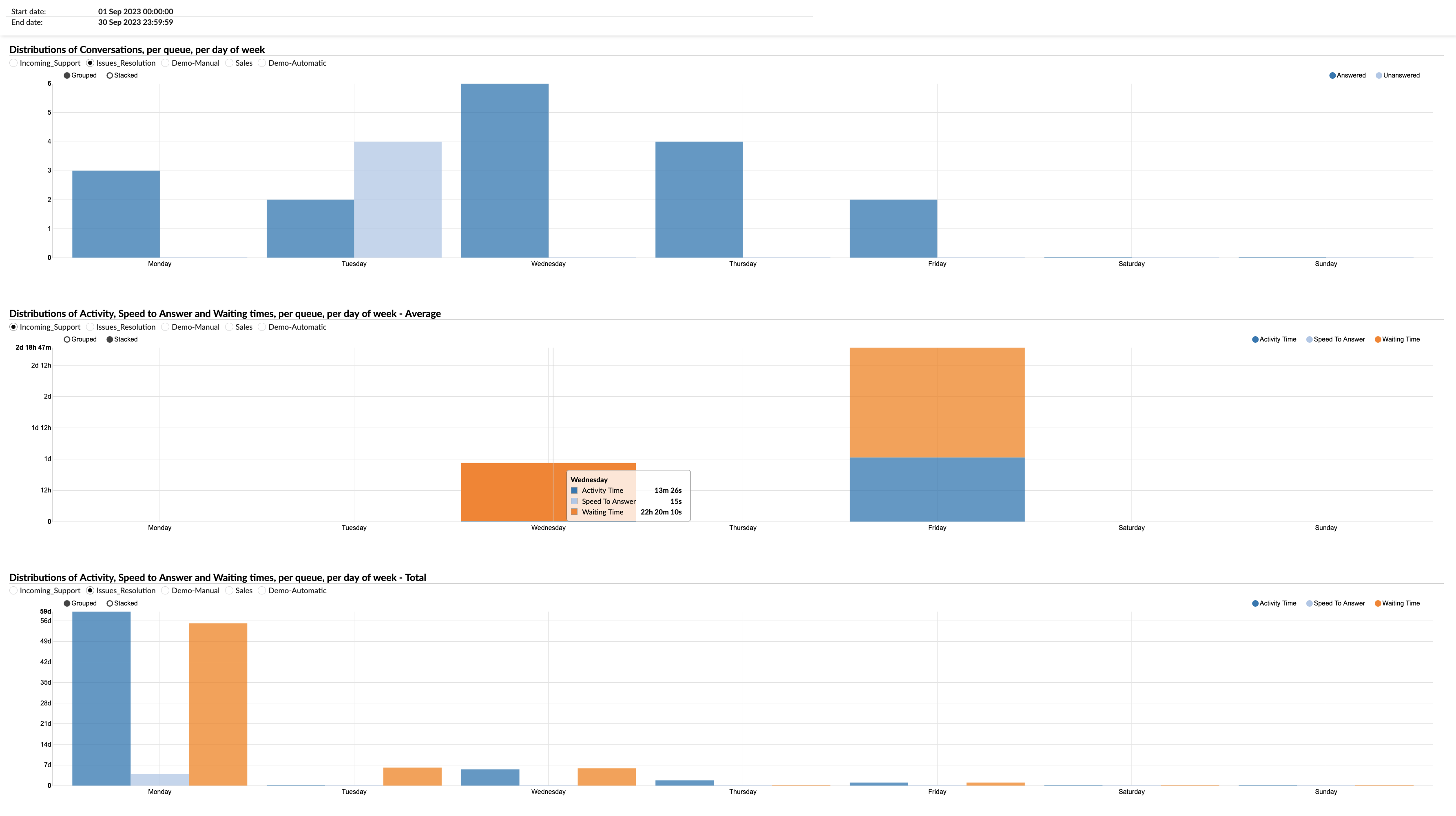
The second segment portrays the mean duration for key performance metrics per queue, including Activity distribution, Speed to Answer, and Waiting Times, all grouped by the respective day of the week. This segment helps in assessing the average efficiency and responsiveness of agents on different days, highlighting any variances in performance.
Similarly, the third segment illustrates the aggregated time taken for the same metrics—Activity distribution, Speed to Answer, and Waiting Times—per queue, segmented by the days of the week. This cumulative view provides insights into the total workload and performance trends, enabling strategic planning and optimization of resources.
Together, these segments offer a detailed analysis of daily operational dynamics, supporting informed decision-making to enhance service quality and efficiency.
¶ Queue Conversations per Agent
The "Queue conversations per agent" report provides an overview of agent interactions across various service queues within a specified timeframe. It displays key metrics like the number of conversations handled by each queue, average and total activity durations, the speed at which agents responded to queries, and average and total wait times. The report also offers insights into how many conversations were concluded by agents, how many ended by customers, and the number of conversations transferred. This consolidated view enables organizations to assess agent performance, queue efficiency, and areas for optimization, ensuring smoother and more effective customer service operations.
-
Queue Name: This column lists the names of all the queues.
-
Conversations (Number %): This column shows the total number of conversations each agent has handled in each queue, represented as a number and a percentage of the total conversations.
-
Activity Time (Total / Mean): This column is divided into two sub-columns: Total and Mean. The 'Total' sub-column shows the cumulative time the agent has spent on conversations in each queue. The 'Mean' sub-column shows the average time spent per conversation.
-
Speed To Answer (Total / Mean): This column, also divided into 'Total' and 'Mean' sub-columns, represents the time taken by the agent to answer a conversation. 'Total' is the cumulative time for all conversations, and 'Mean' is the average time taken to answer a conversation.
-
Waiting Time (Total / Mean): This column displays the total and average waiting time for conversations in each queue. 'Total' is the cumulative waiting time for all conversations, and 'Mean' is the average waiting time per conversation.
-
Ended by Agent (Number %): This column shows the number and percentage of conversations that were ended by the agent in each queue.
-
Ended by Customer (Number %): This column shows the number and percentage of conversations that were ended by the customer in each queue.
-
Transferred (Number %): This column shows the number and percentage of conversations that were transferred to another agent or queue.
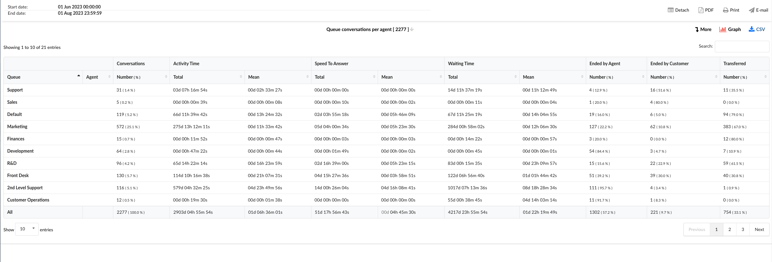
By using the "Queue Conversations per Agent" statistics table, agents can gain a deeper understanding of their performance and efficiency across different queues.
¶ Queue conversations per agent breakdown
The "Queue Conversations per Agent Breakdown" statistics table provides detailed information about each conversation an agent has handled. The table consists of fourteen columns, each offering specific insights about the conversation.
- Conversation ID: Lists the unique identifiers (either ticket or call ID) for each conversation.
- Date: Shows the date when each conversation took place.
- Channel: Indicates the communication channel used for each conversation, such as chat, email, or messaging.
- Customer: Lists the customers involved in each conversation.
- Queue: Shows the queue in which each conversation was handled.
- Assignee: Indicates the agent assigned to each conversation.
- Activity Time: Shows the total time the agent spent on each conversation.
- Speed To Answer: Represents the time taken by the agent to answer each conversation.
- Waiting Time: Displays the waiting time for each conversation before an agent responded.
- Entry: Indicates the time each conversation entered the queue.
- Exit: Shows the time each conversation exited the queue.
- Transferred: Indicates whether each conversation was transferred to another agent or queue.
- Last Action By: Shows who performed the last action in the conversation, whether it was the agent or the customer.
- Ended: Indicates how each conversation was concluded.
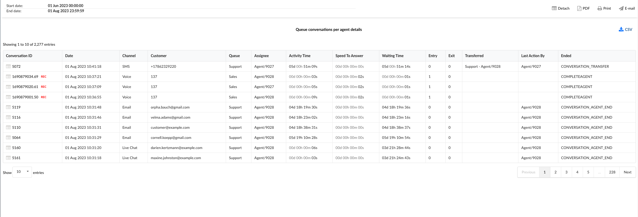
By using the "Queue Conversations per Agent Breakdown" statistics table, agents can gain a granular understanding of their performance and efficiency for each conversation they handle.
¶ Queue Conversations per Agent Graph
The "Queue Conversations per Agent Graph" provides a visual representation of the conversations handled by each agent across different queues. The graph is divided into three sections, each providing specific insights about the conversations.
-
Total Conversations/Agents Available per Queue: This section displays horizontal bars representing the total number of conversations per queue. Alongside these bars, a line graph (aligned with the left axis) shows the number of agents available for each queue. This combined visualization allows for a comparison between the volume of conversations and the availability of agents in each queue.
-
Queue Conversations per Agent: This section presents horizontal bars for each queue, with each bar divided into highlighted sections representing the number of conversations handled by each agent in that queue. This allows for a clear view of the distribution of conversations among agents within each queue.
-
Queue Mean Times: In this section, users can select specific metrics such as Activity Time, Speed To Answer, and Waiting Time, and view them in relation to all agents or any particular agent. This provides insights into the average time metrics for each agent, helping to identify areas for improvement and efficiency.
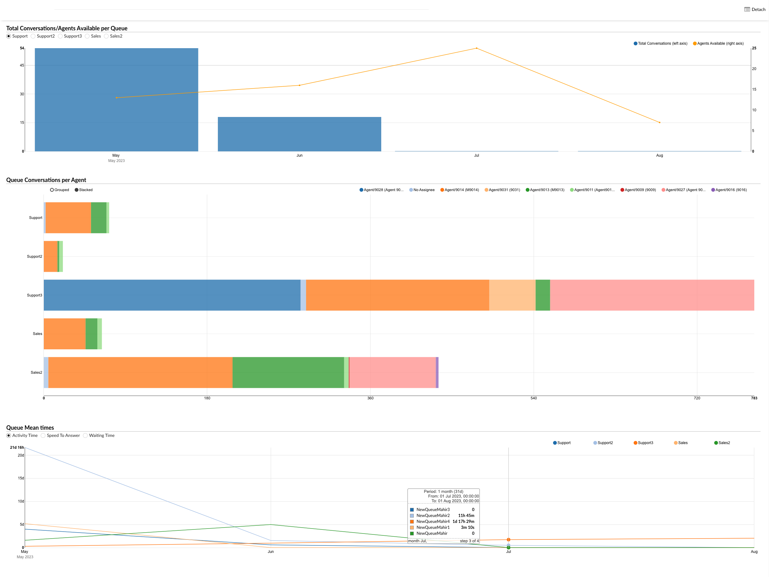
By using the "Queue Conversations per Agent Graph", agents and managers can visually analyze the distribution of conversations across agents and queues, identify trends, and implement strategies to improve performance and efficiency.
¶ Queue Survey per Agent
A "Queue Survey per Agent" report evaluates customer satisfaction based on the performance of each queue from the perspective of agents working in that queue. This report aggregates feedback from post-interaction surveys to assess how each queue impacts customer perceptions of agent performance. It highlights which queues contribute to higher or lower satisfaction ratings, helping to identify successful queues and areas that may require improvements to enhance overall service quality.
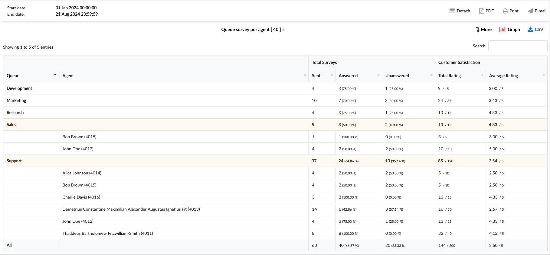
-
Queue: This column lists all queues on the system.
-
Agent: This column lists the agents' names in a specific queue.
-
Total Surveys: This column is divided into three sub-columns:
- Sent: Total number of surveys sent to customers after interacting with agents.
- Answered: Total number of surveys that the customer answered, including percentage of answers out of total.
- Unanswered: Total number of unanswered surveys by the customer, including the percentage of unanswered surveys out of the total.
-
Customer Satisfaction: This column is divided into two sub-columns:
- Total Rating: The cumulative score of all customer satisfaction ratings received from answered surveys.
- Average Rating: The average rating of all customer satisfaction ratings obtained from completed surveys.
¶ Queue Survey per Agent Breakdown
The "Queue Survey per Agent Breakdown" statistics table provides detailed information about each conversation across different communication channels that had the survey answered. The table consists of nine columns, each offering specific conversation insights.
-
Conversation ID: This column lists the unique identifiers for each conversation. In this column, besides the unique ID, we have two additional options:
- View Chat transcript: This option allows access to the complete conversation record, directly providing agent and customer interaction details from the GUI.
- Download Chat transcript: This option saves a copy of the entire conversation between the agent and the customer to a local disk.
-
Date: This column shows the date each conversation took place.
-
Channel: This column indicates the communication channel used for each conversation, such as facebook, whatsapp, livechat, email, or messaging.
-
Queue: This column shows the queue in which each conversation was handled.
-
Assignee: This column lists the agent assigned to each conversation.
-
Customer ID: This column comprises a distinctive identifier for each customer, including a Facebook or WhatsApp ID number, SMS number, or email address.
-
Customer Name: This column shows the customer's name if it's available.
-
Score: This column shows the customer's final rating after the conversation, indicating their overall satisfaction with the interaction.
-
Additional Feedback?: This column contains "Yes" when a customer has provided an additional comment along with their rating. To view left feedback, click on the View Chat transcript option under the Conversation ID column.

¶ Queue Survey per Agent Graph
The "Queue Survey per Agent graph" visually represents individual survey data for each queue. The graph is divided into two sections:
-
Average survey rating: This graph displays the average satisfaction rating for each queue, allowing for an easy comparison of performance across queues.
-
Total surveys sent: This pie chart illustrates the distribution of answered versus unanswered surveys, showing the percentage of each category for a clear understanding of response rates.
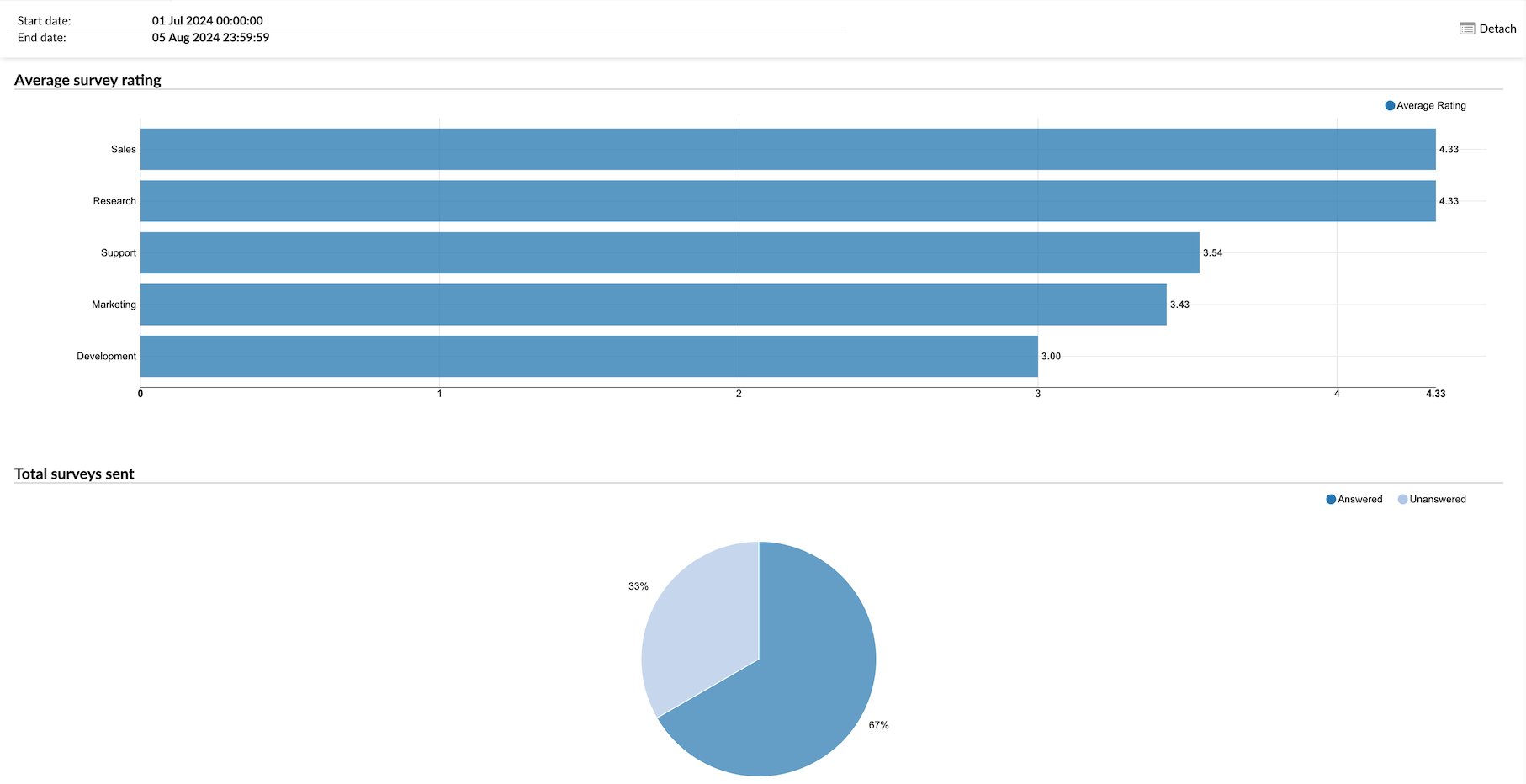
¶ Returnig Customers
The Returning Customers report is a business analytics document that provides insights and data about customers who have engaged with a company's services over multiple occasions. This report can help users understand their customers' behavior and preferences, allowing them to tailor their marketing, sales, and customer service strategies accordingly.
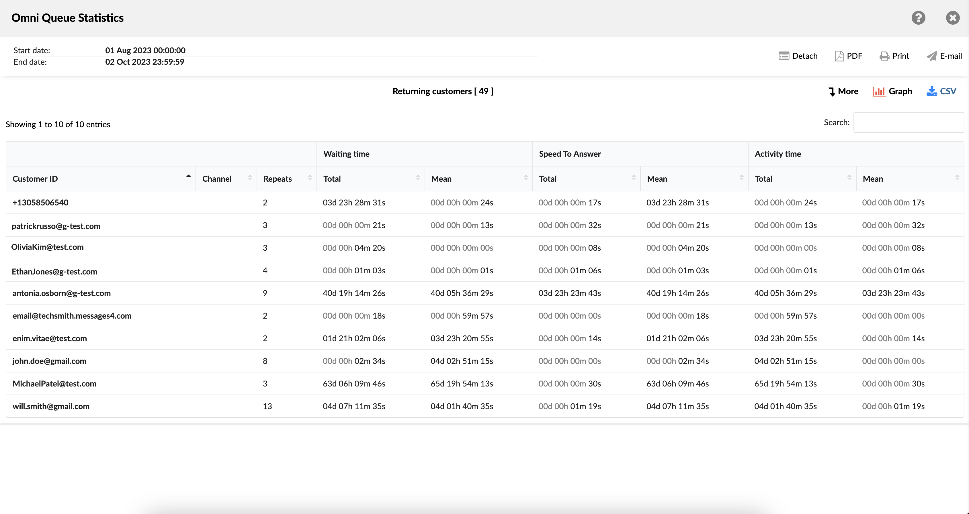
The report consists of information about the following:
- Customer ID - this field comprises a distinctive identifier for each customer, including an extension number, SMS number, or email address.
- Customer Name - this field displays a customer name.
- Channel - this category represents the specific communication channel used for each interaction, such as chat, email, or messaging.
- Repeats - this metric reflects the frequency with which a customer has initiated conversations through a particular channel.
- Waiting time - divided into two sub-columns, displays the total and average (mean) waiting time per customer for each channel.
- Speed To Answer - This segment offers insights into the time agents take to respond to each conversation, with details on the total and average durations.
- Activity time - This section is divided into "Total" and "Mean" sub-columns. The "Total" sub-column provides an overview of the combined time a customer has spent in conversations across various channels, while the "Mean" sub-column delivers information about the average time invested per channel.
¶ Service Level Agreement (SLA) Reports
The SLA report provides our customers with valuable insights into the timeliness and effectiveness of their support services. It centers around two key metrics:
-
First Response Time: This metric indicates how quickly agents acknowledge a customer's request after they've reached out for assistance. It measures the time between the moment a customer submits a request and the moment they receive initial response.
-
Resolution Time: This metric measures the total time it takes to fully address and resolve a customer's issue. It encompasses the time from when a customer initiates contact with the support team and ending with the delivery of a satisfactory solution.
¶ Service Level Agreement per Channel
The Channel-Specific SLA Report offers a complete insight into the timeliness and effectiveness of our customer support services tailored to different communication channels. This approach allows users to analyze and optimize support performance based on the unique attributes of each channel through which their valued customers interact with them.
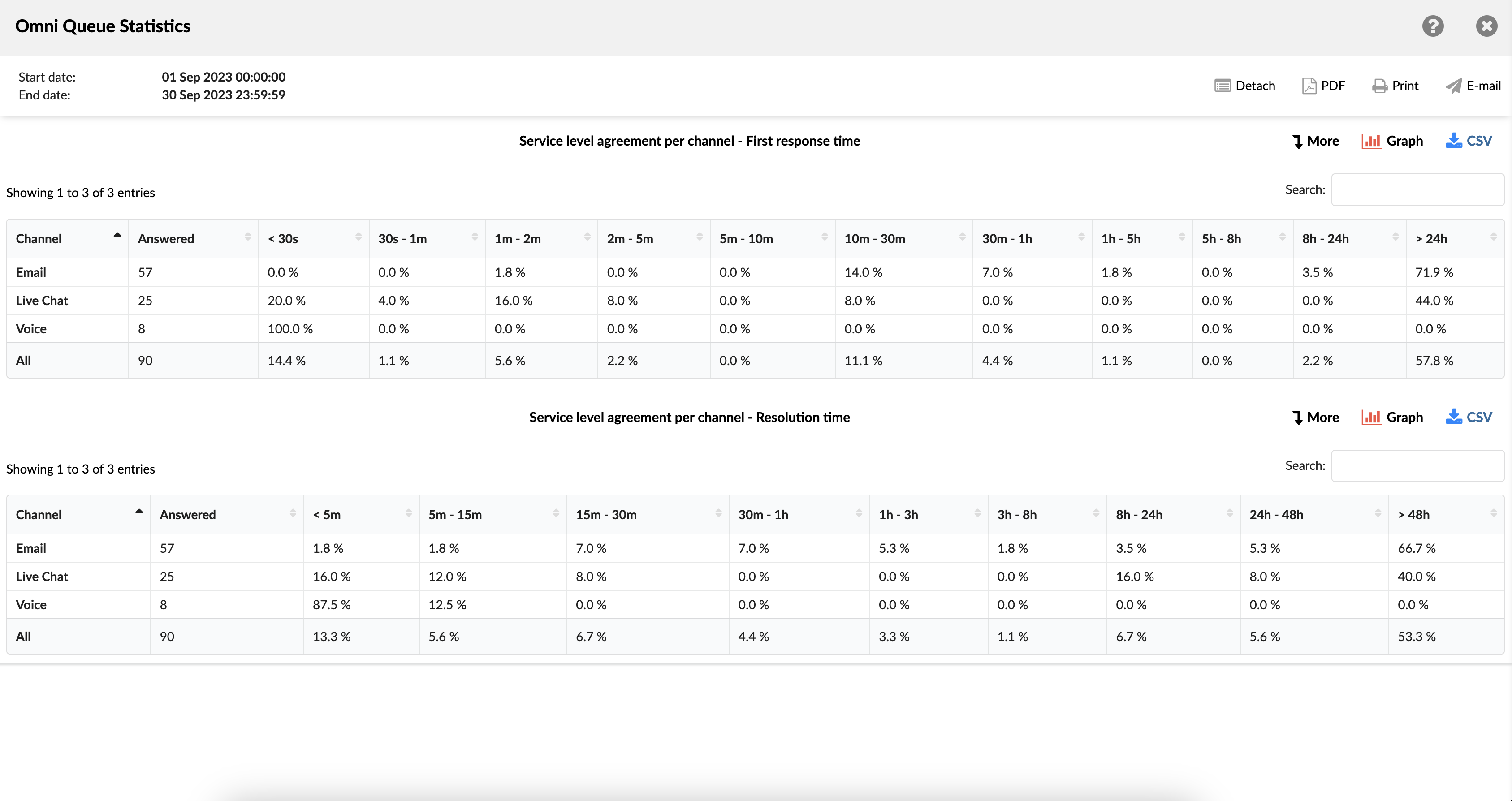
The SLA per Channel report contains two tables presenting data for "First Response Time" and "Resolution Time." Each table shows:
- Channel - indicates the communication channel used for each conversation, such as voice, chat, email, or messaging.
- Answered - shows the number of conversations that agents have successfully answered.
- Time interval (<30s - 1min - 24h> - refers to the duration taken to achieve each channel's designated metric (first response or resolution).
By selecting the "More" option, the report provides additional, in-depth information about the SLA report.
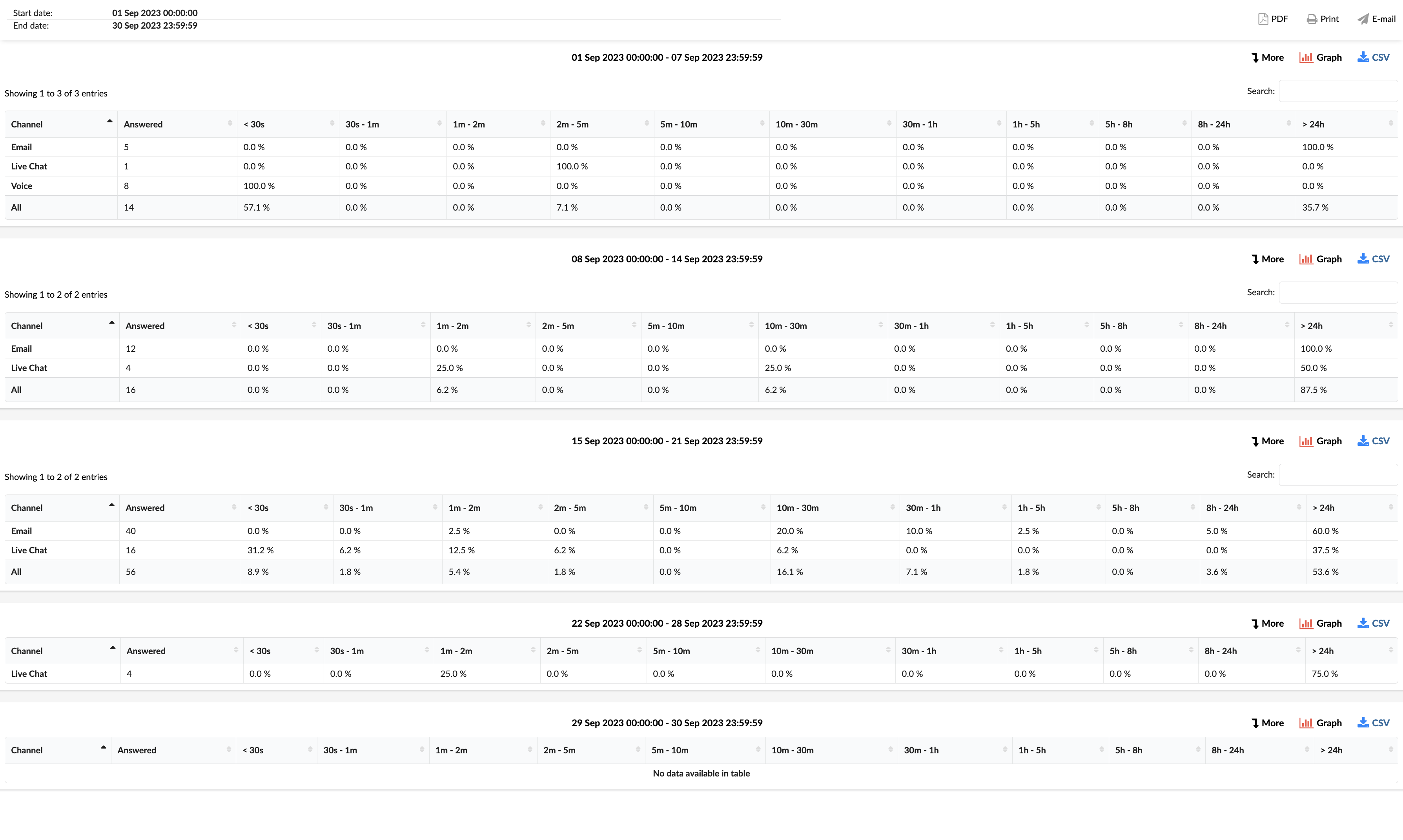
¶ Service Level Agreement per Channel - First Response Time Graph
This visual representation illustrates the per-channel SLA report, specifically highlighting individual First Response Time for each channel (Voice, Live Chat, SMS and Email).
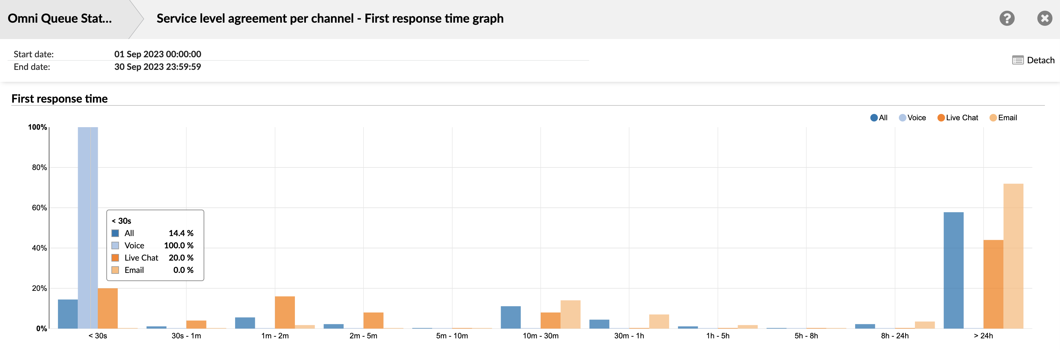
¶ Service Level Agreement per Channel - Resolution Time Graph
This visual representation displays the per-channel SLA report, emphasizing the Resolution time for each channel: Voice, Live Chat, SMS, and Email.
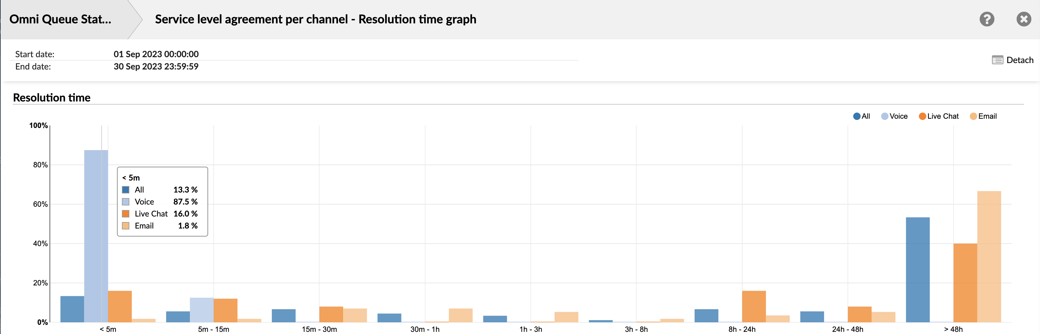
¶ Service Level Agreement per Queue
An SLA (Service Level Agreement) report per Queue provides essential details and measurements about how well support services perform for specific queues. The SLA report allows users to identify areas where they are doing well and areas where they need to improve.
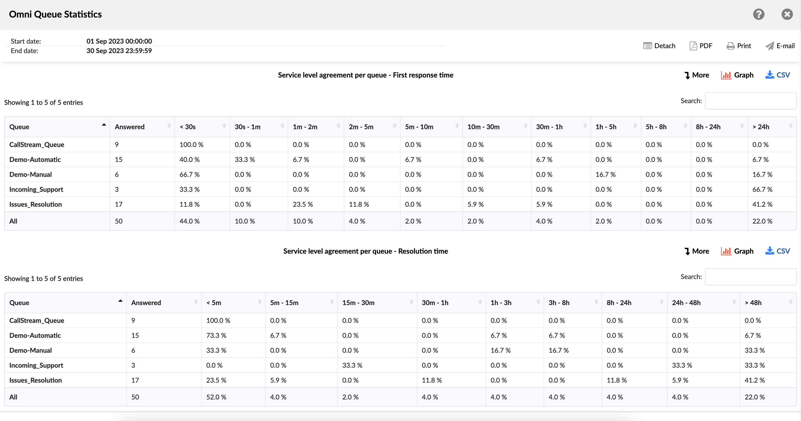
The SLA per Queue report contains two tables presenting data for "First Response Time" and "Resolution Time." Each table shows:
- Queue - indicates the queue within which each conversation was managed.
- Answered - shows the number of conversations agents have successfully answered.
- Time interval (<5m - 1h - 48h> - refers to the duration taken to achieve each queue's designated metric (first response or resolution).
By selecting the "More" option, the report provides additional, in-depth information about the SLA report.
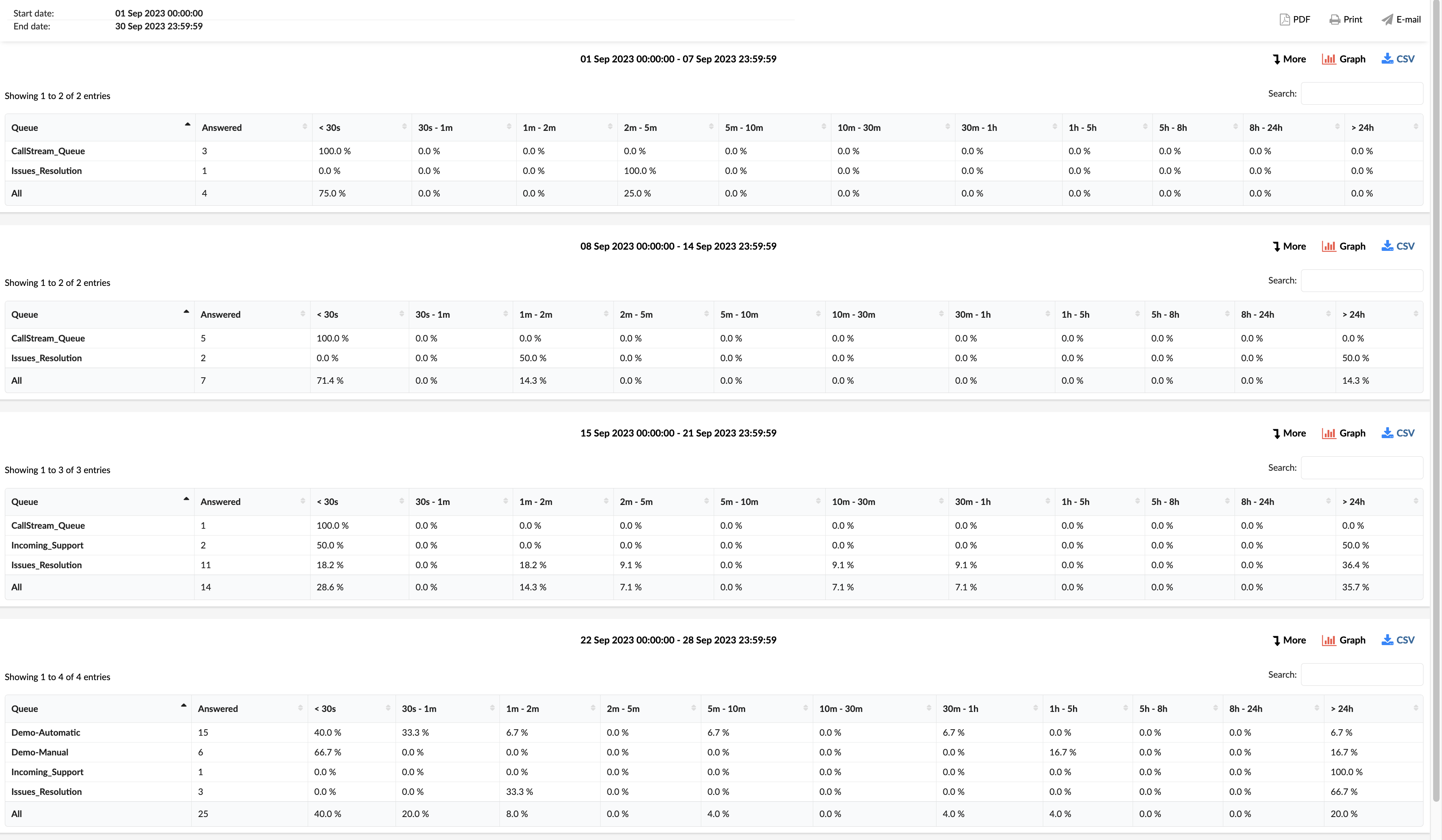
¶ Service Level Agreement per Queue - First Response Time Graph
This visual representation shows the per-queue SLA report, highlighting individual First Response Time for each queue.
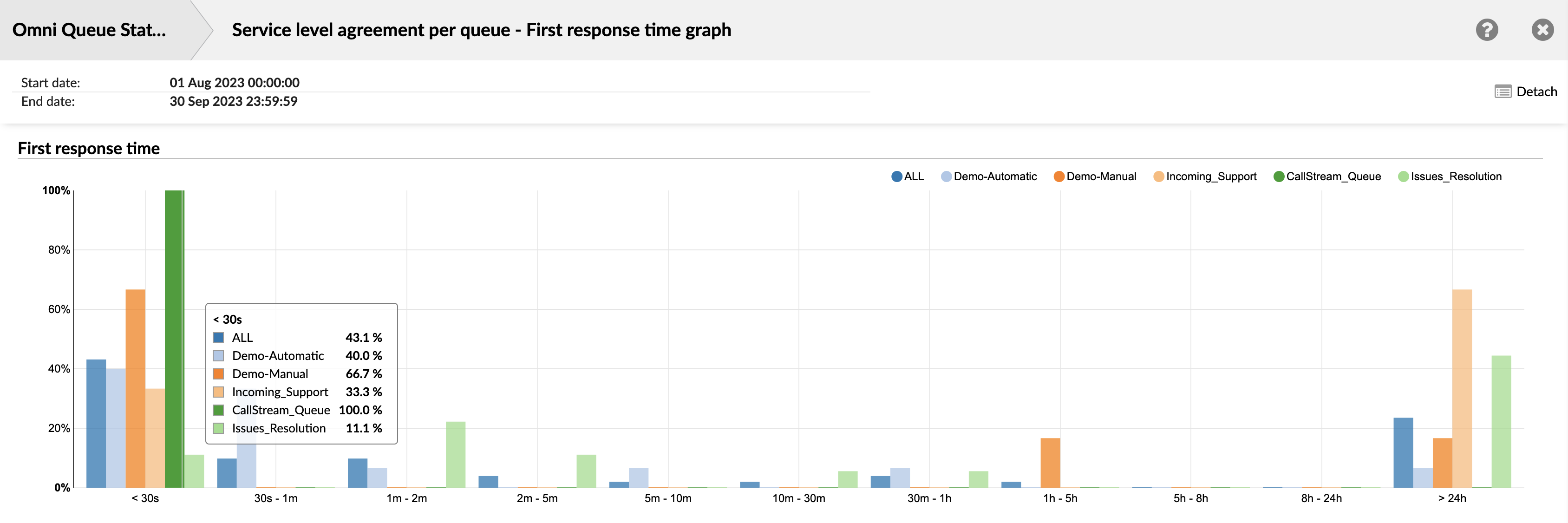
¶ Service Level Agreement per Queue - Resolution Time Graph
This visual representation shows the per-queue SLA report, highlighting the Resolution time for each queue.
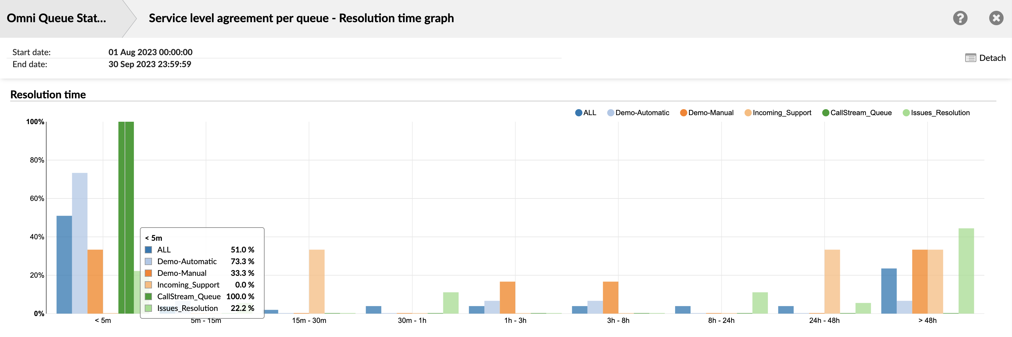
¶ Unanswered Conversations per Channel
The "Unanswered Conversations per Channel" section provides a detailed overview of the unanswered conversations across different communication channels. This section is organized into two main columns:
¶ Channel
This column lists the different communication channels, such as Email, Live Chat, SMS, Voice, and All. Each row represents a different channel, allowing you to view and compare the data for each channel separately.
¶ Waiting Time
This column provides detailed information about the waiting time for unanswered conversations in each channel. It is further divided into four subcolumns:
-
Total: This subcolumn shows the total waiting time for all unanswered conversations in the corresponding channel. This gives you an overall idea of how long customers are waiting before their conversations remain unanswered.
-
Min: This subcolumn shows the shortest waiting time among all unanswered conversations in the corresponding channel. This helps you understand the best-case scenario of waiting times in each channel.
-
Max: This subcolumn shows the longest waiting time among all unanswered conversations in the corresponding channel. This helps you understand the worst-case scenario of waiting times in each channel.
-
Mean: This subcolumn shows the average waiting time for all unanswered conversations in the corresponding channel. This gives you a general idea of the typical waiting time a customer might experience in each channel before their conversation remains unanswered.
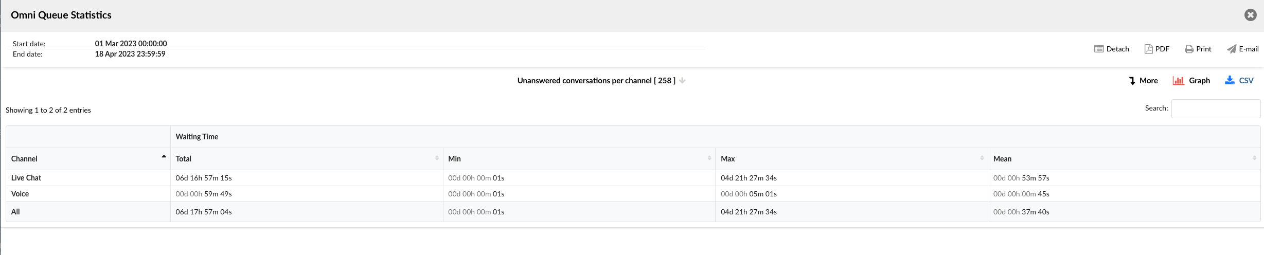
The "Unanswered Conversations per Channel" section serves as a powerful tool for understanding and improving the response times in different communication channels. It enables managers to identify trends, make informed decisions, and implement strategies to enhance customer service and efficiency.
¶ Unanswered Conversations per channel breakdown
The Unanswered Conversations Details section provides a comprehensive breakdown of each unanswered conversation. This section is organized into several columns, each providing specific details about the conversations:
-
Conversation ID: Displays the unique identifier for each conversation. This ID can be used to search for and track specific conversations.
-
Date: Shows the date when each conversation occurred. This allows you to view and sort conversations based on when they happened.
-
Channel: Indicates the communication channel through which each conversation took place. Channels could include Email, Live Chat, SMS, Voice, etc.
-
Customer: Displays the customer involved in each conversation. This could be a name, a customer ID, or any other identifier used to track customers.
-
Queue: Shows the queue in which each conversation was placed. This allows you to see which queues have the most unanswered conversations.
-
Assignee: Indicates the agent who was assigned to each conversation. If a conversation was not assigned to any agent, this field might be left blank or filled with a default value.
-
Activity Time: Shows the total time each conversation was active. This includes any time the conversation was open, regardless of whether any interaction took place.
-
Speed to Answer: Indicates how quickly an agent responded to each conversation. For unanswered conversations, this might be left blank or filled with a default value.
-
Waiting Time: Shows the total time each conversation was waiting for an agent response. This can help identify any delays in response times.
-
Entry: Displays the time each conversation entered the queue. This allows you to track the flow of conversations through your system.
-
Exit: Shows the time each conversation exited the queue. This can help identify any conversations that were in the queue for an unusually long time.
-
Transferred: Indicates whether each conversation was transferred to another agent or queue. This can help identify any patterns in conversation transfers.
-
Last Action By: Shows who performed the last action in each conversation. This could be an agent, a customer, or an automated system.
-
Ended: Indicates how each conversation ended. This could show whether the conversation was ended by an agent, a customer, or due to some other reason.
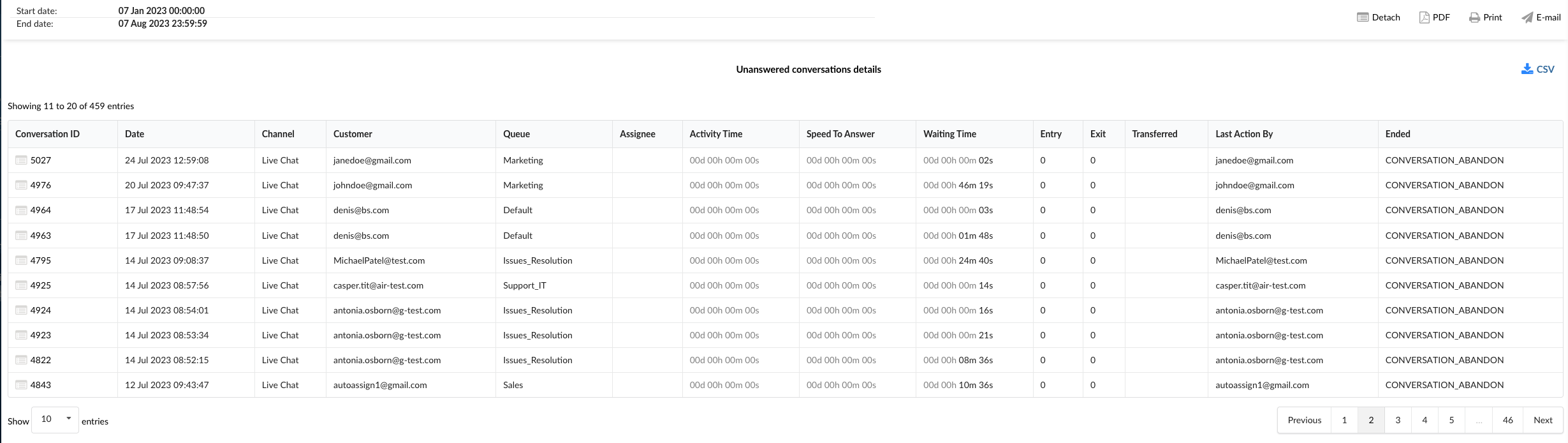
The Unanswered Conversations Details section serves as a powerful tool for understanding and analyzing each unanswered conversation. It enables managers to identify trends, make informed decisions, and implement strategies to enhance customer service and efficiency.
¶ Unanswered Conversations per Channel Graphs
The "Unanswered Conversations per Channel" section provides two insightful graphs that help visualize and analyze the waiting times for unanswered conversations across different channels.
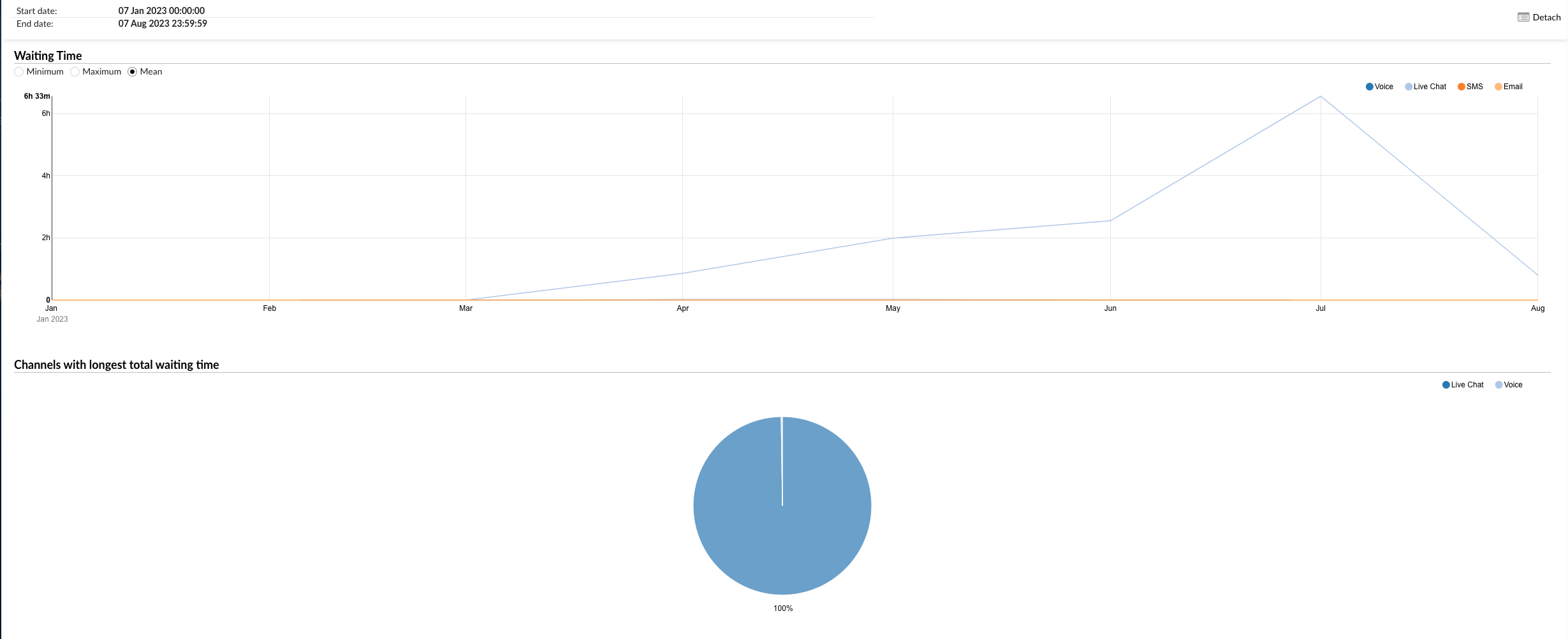
¶ Waiting Time Graph
The first graph represents the Waiting Time for each channel. It is a line graph where each line corresponds to a different channel such as Email, Live Chat, SMS, Voice, etc.
On the left side of the graph, you can filter the data by Minimum, Maximum, and Mean waiting times. This allows you to view the shortest, longest, and average waiting times for unanswered conversations per channel.
On the right side, you can select the channels you want to include in the graph. By hovering over the graph lines, you can see the exact waiting time data for each channel.
¶ Channels with Longest Total Waiting Time Pie Chart
The second graph is a pie chart that represents the Channels with the Longest Total Waiting Time. Each slice of the pie corresponds to a different channel.
On the right side of the chart, you can select the channels you want to include. This allows you to focus on specific channels and compare their total waiting times. The size of each slice corresponds to the total waiting time of the respective channel, allowing you to easily identify which channels have the longest waiting times for unanswered conversations.
These graphs provide a visual and intuitive way to understand the waiting times for unanswered conversations across different channels. They can be used to identify bottlenecks, improve resource allocation, and enhance customer service efficiency.
¶ Unanswered Conversations per Queue
The "Unanswered Conversations per Queue" section provides detailed insights into unanswered conversations, organized by queue and channel. This section is divided into two tables: "Unanswered Conversations per Queue" and "Unanswered Conversations Outcomes per Queue."
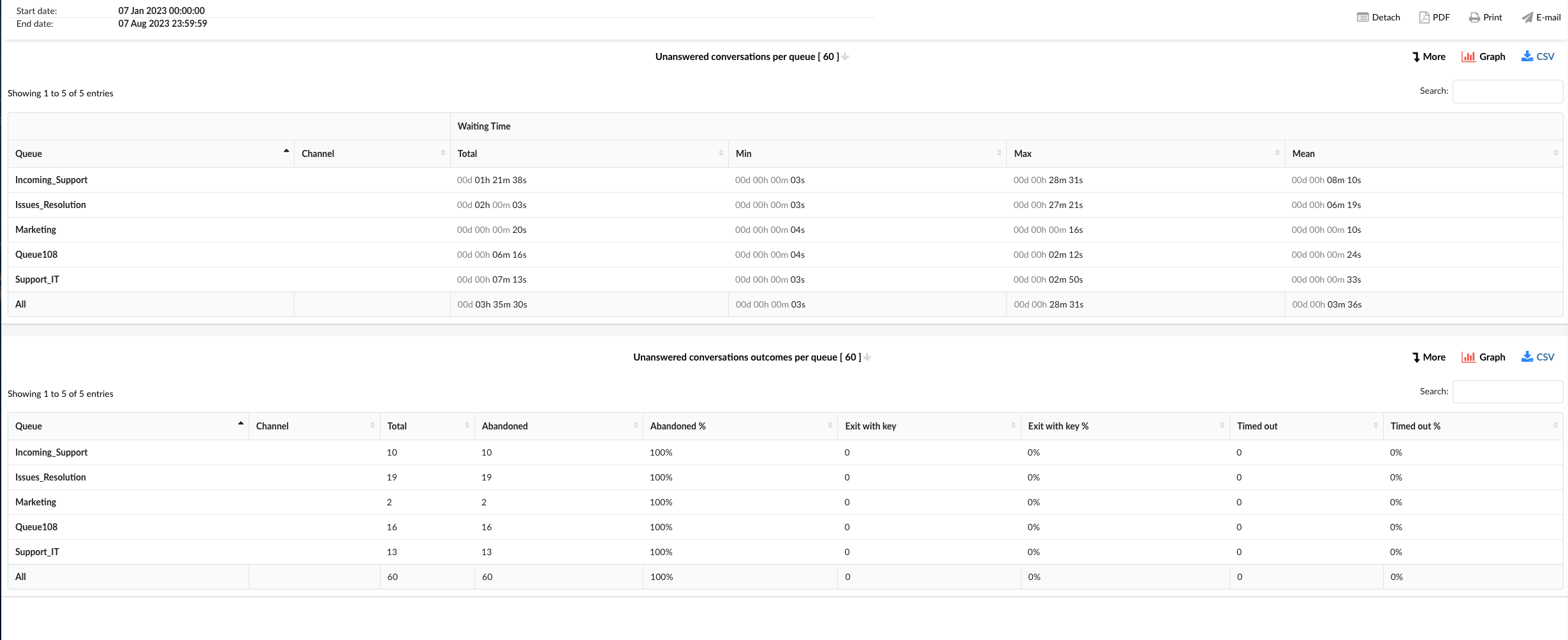
¶ Unanswered Conversations per Queue
This table provides a breakdown of unanswered conversations for each queue and channel. The columns in this table include:
-
Queue: This column lists all the queues in your system.
-
Channel: This column indicates the communication channel for the conversations in each queue. Channels could include Email, Live Chat, SMS, Voice, etc.
-
Waiting Time: This column is further divided into four subcolumns:
-
Total: The total waiting time for all unanswered conversations in each queue and channel.
-
Min: The shortest waiting time among all unanswered conversations in each queue and channel.
-
Max: The longest waiting time among all unanswered conversations in each queue and channel.
-
Mean: The average waiting time for all unanswered conversations in each queue and channel.
-
¶ Unanswered Conversations Outcomes per Queue
This table provides a detailed breakdown of the outcomes of unanswered conversations for each queue and channel. The columns in this table include:
-
Queue: This column lists all the queues in your system.
-
Channel: This column indicates the communication channel for the conversations in each queue. Channels could include Email, Live Chat, SMS, Voice, etc.
-
Total: The total number of unanswered conversations in each queue and channel.
-
Abandoned: The number of unanswered conversations that were abandoned by the customer.
-
Abandoned %: The percentage of unanswered conversations that were abandoned by the customer.
-
Exit with key: The number of unanswered conversations where the customer exited using a key.
-
Exit with key %: The percentage of unanswered conversations where the customer exited using a key.
-
Timed out: The number of unanswered conversations that timed out.
-
Timed out %: The percentage of unanswered conversations that timed out.
These tables provide a comprehensive view of unanswered conversations in each queue and channel, allowing you to identify trends, make informed decisions, and implement strategies to enhance customer service and efficiency.
¶ Unanswered Conversations per Queue Breakdown
The "Unanswered Conversations per Queue Breakdown" section provides a detailed view of each unanswered conversation, organized by queue. This breakdown is presented in a table format with the following columns:
-
Conversation ID: This column displays the unique identifier for each conversation.
-
Date: This column shows the date when the conversation took place.
-
Channel: This column indicates the communication channel for the conversation. Channels could include Email, Live Chat, SMS, Voice, etc.
-
Customer: This column lists the customer involved in the conversation.
-
Queue: This column indicates the queue where the conversation was routed.
-
Assignee: This column shows the agent who was assigned to the conversation.
-
Activity Time: This column displays the total time the conversation was active.
-
Speed To Answer: This column shows the time it took for an agent to respond to the conversation.
-
Waiting Time: This column indicates the total time the customer waited for a response.
-
Entry: This column shows the time when the conversation entered the queue.
-
Exit: This column indicates the time when the conversation exited the queue.
-
Transferred: This column shows whether the conversation was transferred to another agent or queue.
-
Last Action By: This column indicates who performed the last action in the conversation, whether it was the agent or the customer.
-
Ended: This column shows the time when the conversation ended.
This detailed breakdown allows you to analyze each unanswered conversation individually, providing insights into the performance of your queues and agents, and helping you identify areas for improvement.
¶ Unanswered Conversations per Queue Graph
The "Unanswered Conversations per Queue Graph" section provides a visual representation of unanswered conversations, organized by queue. This section is divided into two graphs: "Waiting Time" and "Queue with Longest Total Waiting Time."
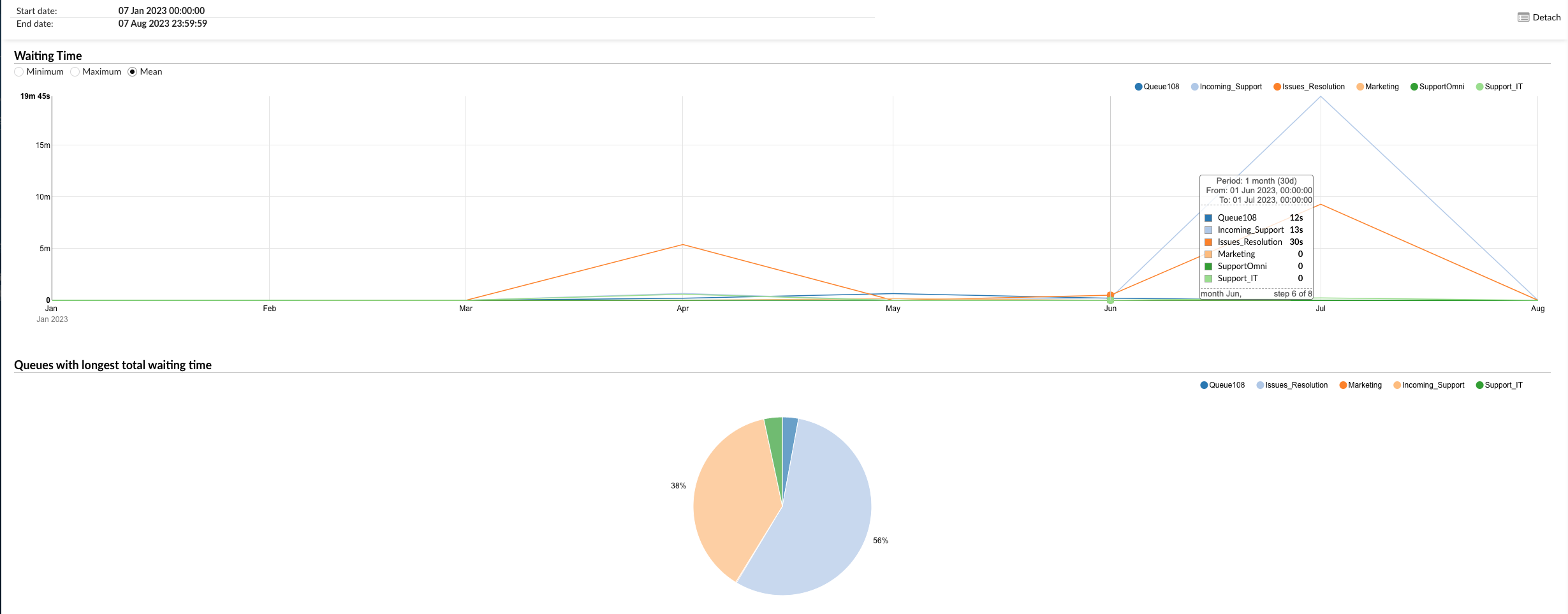
¶ Waiting Time
This graph illustrates the waiting time for unanswered conversations in each queue. The graph can be filtered using the following options on the left:
-
Minimum: This filter displays the shortest waiting time for unanswered conversations in each queue.
-
Maximum: This filter shows the longest waiting time for unanswered conversations in each queue.
-
Mean: This filter presents the average waiting time for unanswered conversations in each queue.
On the right, you can select specific queues to view their data. By hovering over the graph lines, you can see the exact waiting time data for each queue.
¶ Queue with Longest Total Waiting Time
This pie chart provides a visual representation of the queue with the longest total waiting time for unanswered conversations. You can filter the data by selecting specific queues on the right. Each slice of the pie chart represents a queue, and the size of the slice corresponds to the total waiting time of that queue.
These graphs provide a comprehensive view of the waiting time for unanswered conversations in each queue, allowing you to identify trends, make informed decisions, and implement strategies to enhance customer service and efficiency.
¶ Unanswered Conversations Outcomes per Queue Graph
The "Unanswered Conversations Outcomes per Queue Graph" section provides a visual representation of the outcomes of unanswered conversations, organized by queue. This section is divided into two graphs: "Number of Unanswered Conversations per Queue" and "Distribution of Unanswered Conversations - Abandoned, Exited with Key, or Timed Out per Queue."
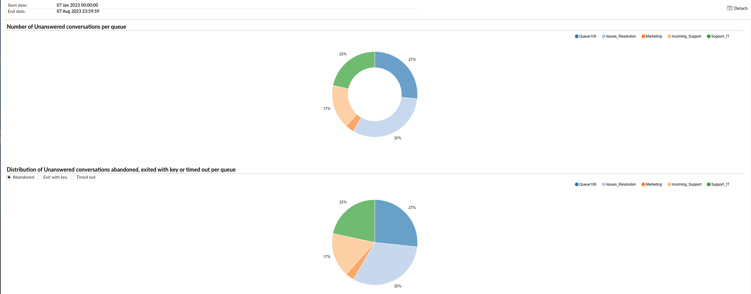
¶ Number of Unanswered Conversations per Queue
This pie chart illustrates the number of unanswered conversations for each queue. You can filter the data by selecting specific queues on the right. Each slice of the pie chart represents a queue, and the size of the slice corresponds to the number of unanswered conversations in that queue.
¶ Distribution of Unanswered Conversations - Abandoned, Exited with Key, or Timed Out per Queue
This graph provides a visual breakdown of the outcomes of unanswered conversations in each queue. You can filter the data using the following options on the left:
-
Abandoned: This filter displays the number of conversations that were abandoned by the customer before an agent could respond.
-
Exit with Key: This filter shows the number of conversations where the customer exited the queue using a key.
-
Timed Out: This filter presents the number of conversations that timed out before an agent could respond.
On the right, you can select specific queues to view their data. This graph allows you to see the distribution of these outcomes for each queue.
These graphs provide a comprehensive view of the outcomes of unanswered conversations in each queue, allowing you to identify trends, make informed decisions, and implement strategies to enhance customer service and efficiency.
¶ View Transcript and Customer Surveys
Users can view transcripts of customer surveys through the statistics reports. Most generated reports feature two icons on the left side: one for viewing the conversation transcript, including the customer survey, and another for downloading the complete transcript as a .txt file.
Users must generate the desired report and navigate to the report breakdown. These features can be found within the Conversation ID column of the report.
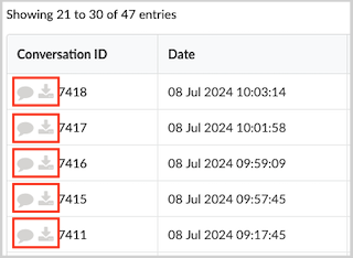
Here is an example of an Agent Availability Breakdown report showing how the chat transcript and customer survey appear for a LiveChat conversation.
¶ Benefits of Transcripts of Conversations and Customer Surveys
-
Quality Assurance: Ensures agents provide accurate and helpful information, maintaining high standards of customer service.
-
Performance Evaluation: Offers direct feedback on agent performance, highlighting strengths and areas for improvement.
-
Customer Insights: Provides valuable insights into customer satisfaction and expectations, guiding service improvements.
¶ Dialer Statistics
Dialer Statistics provides a comprehensive suite of analytical tools designed to offer deep insights into all outbound calling operations. The primary purpose of these statistics is to enable the measurement, monitoring, and thorough analysis of all activities initiated and processed by the Dialer. This covers everything: overall campaign success and agent performance, as well as the detailed information for each call attempt and its specific result.
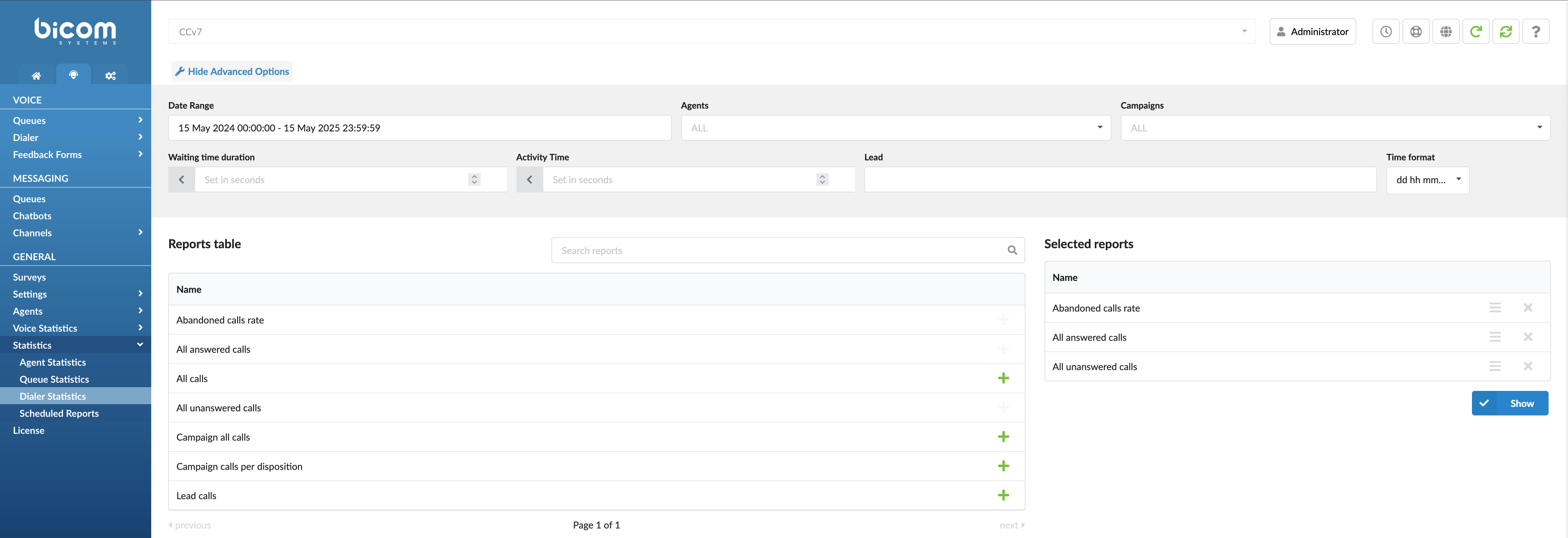
Dialer Statistics are vital because they turn all that raw data from your daily operations into valuable insights you can act on. When you can clearly see your leading key performance indicators (KPIs), notice patterns in how your calls are ending, and understand how well your dialing methods work, your team can make more effective decisions based on real facts. This is key to improving your outbound campaigns, reaching and converting more contacts, using your resources wisely, keeping quality high, and hitting your primary business goals for outbound calling.
Filters
This page offers several filters to help you refine the data displayed:
- Date Range: Select a custom date range to view data specific to that period.
- Agents: Filter results by individual agents to assess their performance and identify opportunities for improvement.
- Campaigns: Select a specific campaign to evaluate an agent's performance within that campaign, especially if the agent is part of multiple campaigns.
- Waiting time duration: Filter results by the duration a lead waited after answering before being connected to an agent.
- Activity Time: Track the duration an agent spends handling requests, from assignment until closure or transfer. This includes talk time for voice channels and handling time for messaging channels.
- Leads: Enter a comma-separated list of specific leads (phone numbers or lead IDs) to view all associated call attempts and activities only for those entries.
- Time Format Customization: Adjust the time display format to show durations in days, hours, minutes, or seconds based on reporting needs.
Search for Reports
The search feature lets you quickly find specific reports based on keywords or phrases. Enter your search term, and the system will display relevant reports in the results.
Adding Reports to the Show List
To create a customized report, you can add specific reports to your generation list by clicking the green plus button next to each report. This allows you to select only the metrics you're interested in, creating a focused and tailored report.
Once you have added the desired reports to your list, click the "Show" button to create a report based on your selected metrics. The generated report can be viewed, printed, or exported for further analysis.
With its versatile filters, customization options, and report generation capabilities, the Dialer Statistics landing page offers a powerful tool for analyzing and optimizing your organization's queue management processes.
¶ Abandoned Calls Rate
The "Abandoned Calls Rate" report gives you a clear overview of how effectively your Dialer connects with contacts. It presents the key figures you need: the total calls your Dialer attempted, how many were successfully answered, and the number of abandoned calls (e.g., calls disconnected by the lead before an agent could pick up). Crucially, the report also shows you the resulting abandonment percentage.
Monitoring this abandonment rate is very important. Think of it as an early indicator: if the rate is high, it might suggest that the Dialer's call pacing (how quickly calls are made) isn't quite aligned with your team's availability. It could also point to staffing considerations or other opportunities to optimize your dialer's setup. By addressing these areas, you can significantly improve the experience for your contacts (meaning fewer dropped calls) and boost your team's overall operational efficiency.
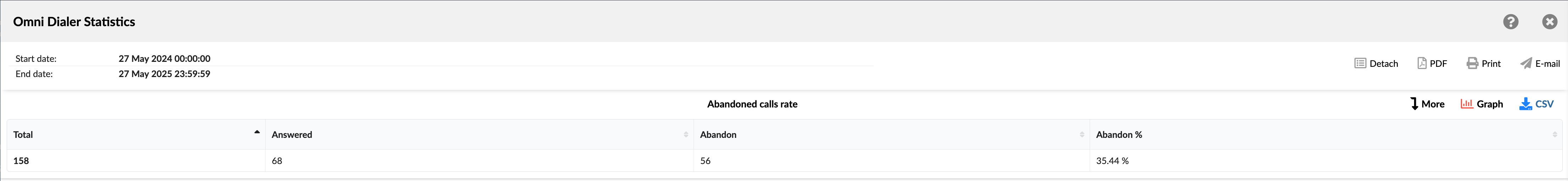
The generated report is divided into the following columns:
- Total: Displays the total number of dialer attempts made during the selected period.
- Answered: Shows the number of calls that were answered and successfully connected to an agent.
- Abandon: Shows the number of abandoned calls (e.g., disconnected by the lead before an agent could pick up).
- Abandon %: Shows the percentage of abandoned calls out of the total dialer calls.
¶ Abandoned Calls Rate Graph
The "Abandoned Calls Rate" graph is a pie chart that categorizes dialer call outcomes over the selected period into three segments—“Machine” (answered by an automated system), “Abandoned” (hung up before a call is connected to an agent), and “Other” (all remaining outcomes).
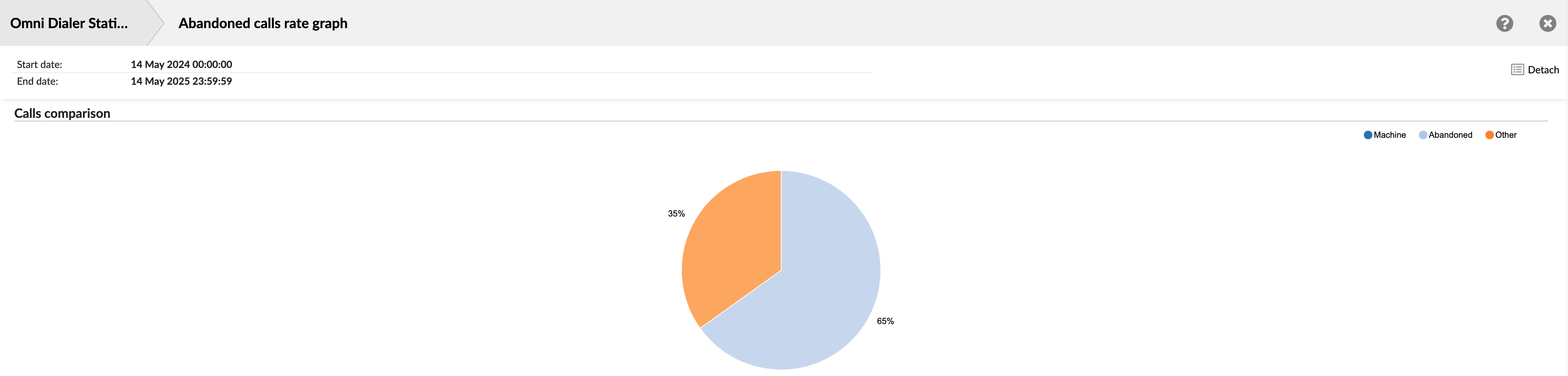
- Machine: Shows the total number of calls answered by an automated system (e.g., voicemail or IVR)
- Abandoned: Shows the number of calls that were abandoned.
- Other: Shows the number of calls that resulted in all other outcomes (calls not classified as Machine or Abandoned).
¶ All Answered Calls
The "All Answered Calls" report provides a detailed log of every call your Dialer successfully connected with an agent. It is broken down into two tables (All Answered Calls and All Answered Calls Dispositions), enabling you to analyze time metrics (Activity, Waiting, Dialing) alongside outcome dispositions (agent hangups, caller hangups, transfers, unqualified calls) so you can optimize agent performance and call‑handling workflows.

¶ All Answered Calls
This table provides a comprehensive overview of all calls successfully connected to agents.
- Activity time: This column is divided into four sub-columns:
- Total: Shows the total time spent on all answered calls.
- Min: Shows the shortest time spent on the answered call.
- Max: Shows the longest time spent on the answered call.
- Mean: Shows the average time spent on all answered calls.
- Waiting time: This column is divided into four sub-columns:
- Total: Shows the total waiting time for all answered calls.
- Min: Shows the shortest waiting time for an answered call.
- Max: Shows the longest waiting time for an answered call.
- Mean: Shows the average waiting time for all answered calls.
- Dialing time:
- Mean: Shows the average dialing time for all answered calls.
¶ All Answered Calls Dispositions
This table classifies each answered call by its outcome, showing raw counts and percentages for each disposition.
- Agent Hangups: Shows the total number of answered calls the agent ended.
- Caller Hangups: Shows the total number of answered calls that were ended by the lead.
- Transferred: Shows the total number of answered calls transferred to another destination.
- Unqualified: Shows the total number of answered calls marked as unqualified.
- Agent Hangups %: Shows the percentage of all answered calls the agent ended.
- Caller Hangups %: Shows the percentage of all answered calls that were ended by the lead.
- Transferred %: Shows the percentage of all answered calls that were transferred.
- Unqualified %: Shows the percentage of all answered calls marked as unqualified.
¶ All Answered Calls / All Answered Calls Dispositions Breakdown
The "All Answered Calls / All Answered Calls Dispositions Breakdown" statistics table provides a comprehensive and detailed log of all calls that were answered by a lead and handled by an agent within the specified reporting period. It allows an in-depth review of individual call-handling details, agent interactions, and campaign-specific outcomes for connected calls.
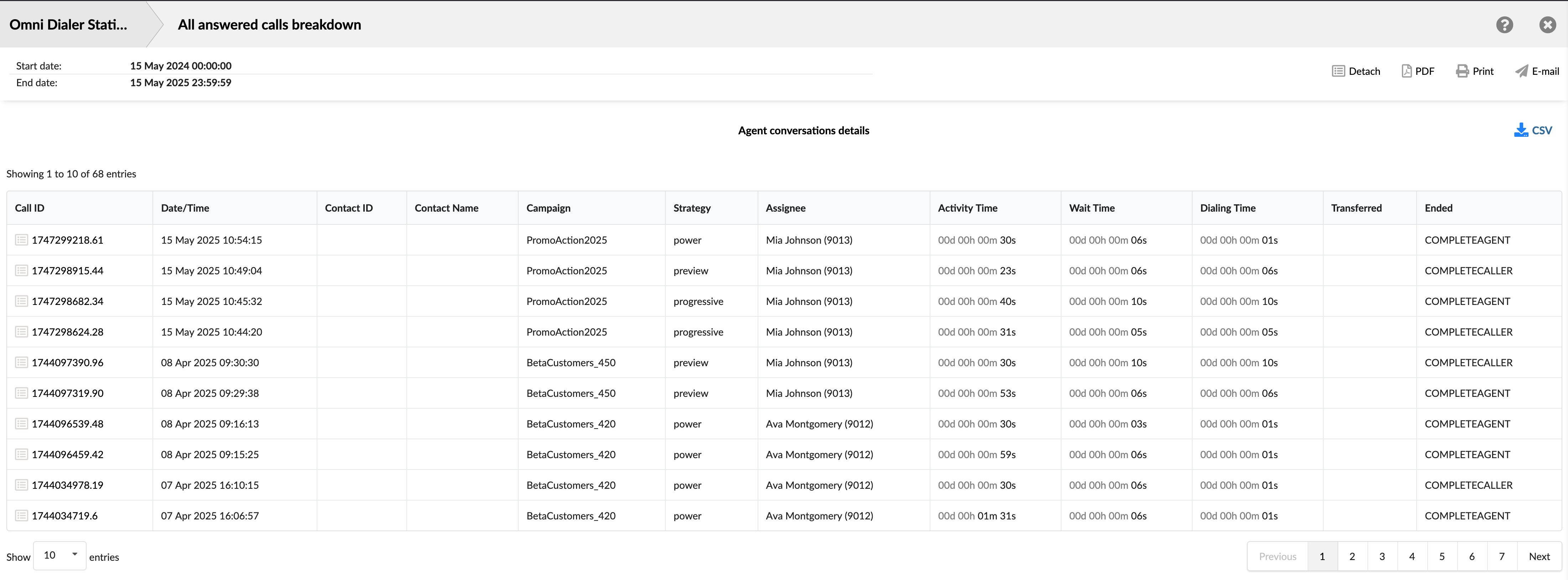
- Call ID: Shows the unique identifier for each call. This ID can be used to search for and track a specific call.
- Date/Time: Shows the date and time when each call occurred. This allows you to view and sort calls based on when they happened.
- Contact ID: Shows the unique identifier for the contact, if available.
- Contact Name: Shows the contact person's name, if available.
- Campaign: Shows the specific campaign associated with the call.
- Strategy: Shows the dialing strategy used for the call.
- Assignee: Shows the agent who handled the call.
- Activity Time: Shows the total duration the agent spent actively engaged with the call.
- Wait Time: Shows the time passed after the lead answered the call until the lead is connected to an agent.
- Dialing Time: Shows the time elapsed from when the Dialer or agent initiates a dial to the lead until the lead answers the call.
- Transferred: Indicates if the call was transferred and shows the destination of the transfer.
- Ended: Shows the outcome or status of the answered call.
¶ All Answered Calls Graph
These graphs provide a visual summary of key metrics related to all answered calls over a selected time period.
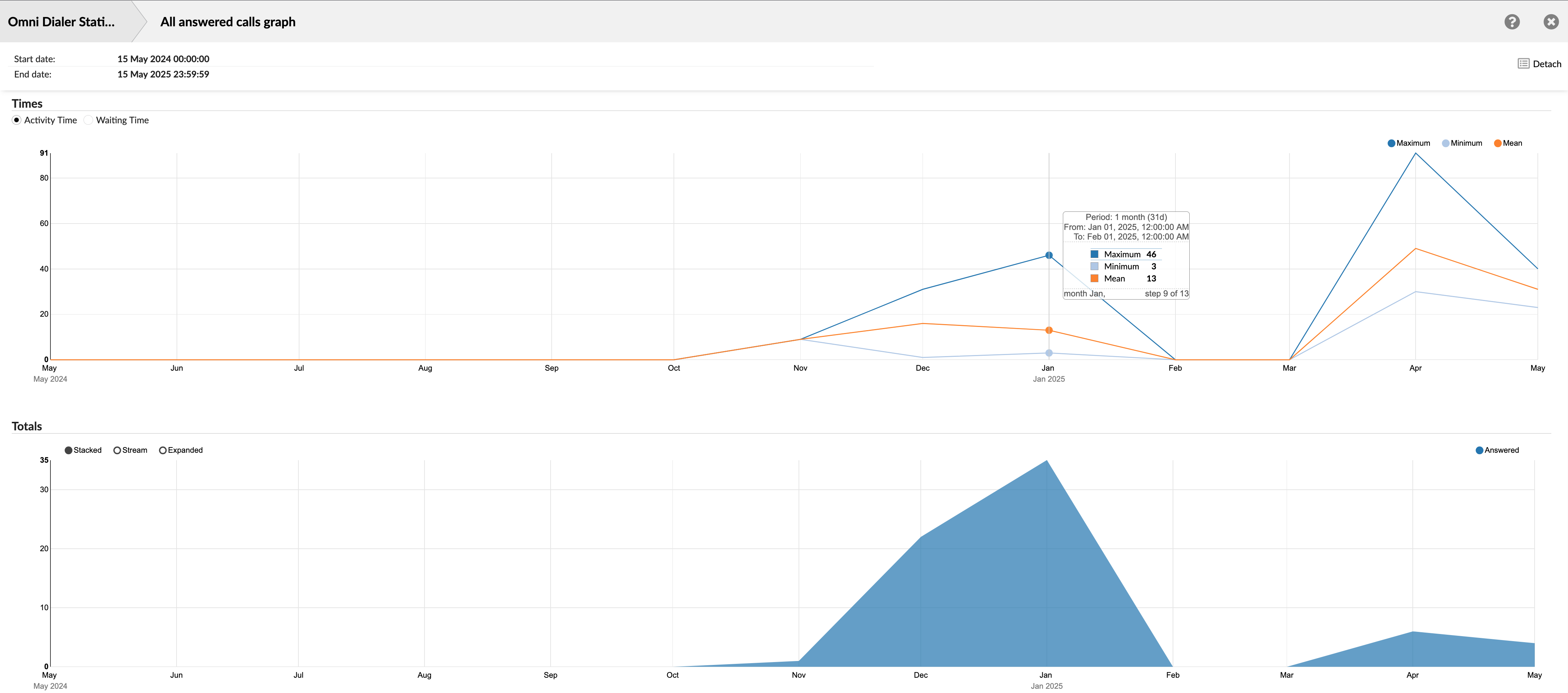
¶ Times
This graph visualizes statistical trends by plotting the Minimum, Maximum, and Mean values for key time-based metrics associated with answered calls. Users can select which specific metric's trends to display from the following options:
- Activity Time: This graph Displays trends related to the time agents spend actively engaged with calls. It will show the Minimum, Maximum, and Mean Activity Times for the calls within each interval on the x-axis.
- Waiting Time: Displays trends related to the time after the lead answered the call until the lead is connected to an agent. The graph will show the Minimum, Maximum, and Mean Waiting Times for the calls within each interval on the x-axis.
¶ Totals
This graph represents the trend of the total number of answered calls. It shows an area graph illustrating the total number of calls answered by agents distributed over the selected time period (x-axis). The y-axis indicates the count of calls.
¶ All Answered Calls Dispositions Graph
¶ Comparing Call Endings
This graph provides a clear visual breakdown of how all answered calls concluded within the selected time period. It is presented as a pie chart, offering an immediate understanding of the proportional distribution of different call-ending statuses.
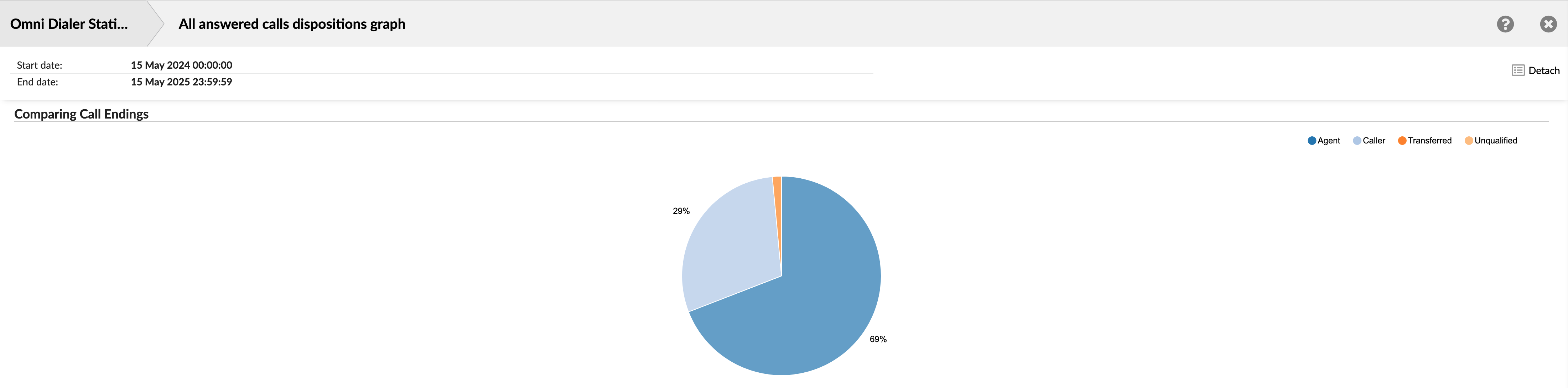
Each pie chart slice corresponds to a specific call ending type (Agent, Caller, Transferred, or Unqualified). The size of the slice is proportional to its percentage of the total answered calls. The rate for each ending type is typically displayed on or near its corresponding slice.
¶ All Calls
The "All Calls" report provides a comprehensive statistical overview of all outbound calls processed by the Dialer within the selected time period. Regardless of its outcome, this report encompasses every call attempt, offering insights into overall dialing activity, time metrics, and call dispositions. It is presented in two main summary tables: "All calls" and "All calls dispositions."
The "All Calls" report is crucial for understanding dialer performance overall, including how much time is spent on various call-related activities (for connected calls) and the effectiveness of campaigns in reaching contacts (answered vs. unanswered rates). It helps assess list quality and dialer efficiency and provides a high-level view of all outbound dialing efforts.
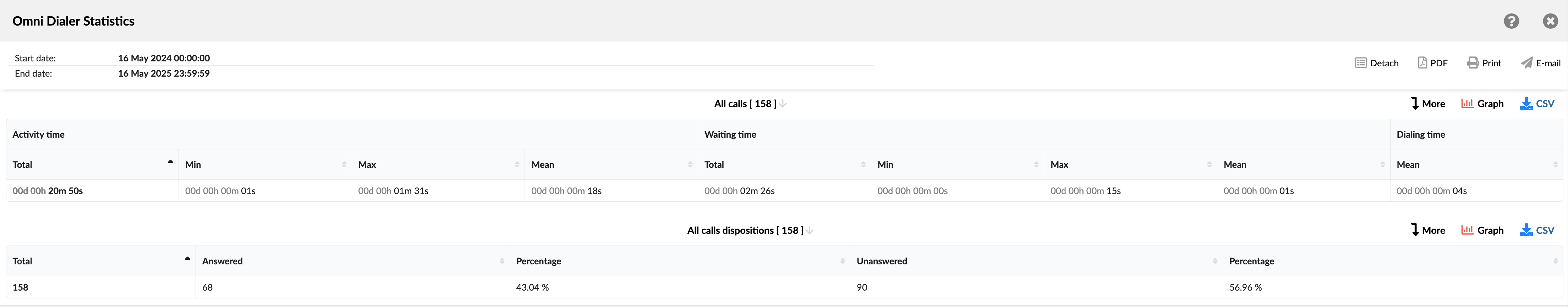
¶ All Calls
This table summarizes key time-based metrics and call attempt counts for all calls initiated by the Dialer.
- Activity time: This column is divided into four sub-columns:
- Total: Shows the total time spent on all active calls.
- Min: Shows the shortest time spent on an active call.
- Max: Shows the longest time spent on an active call.
- Mean: Shows the average time spent on all active calls.
- Waiting time: This column is divided into four sub-columns:
- Total: Shows the total waiting time for all calls.
- Min: Shows the shortest waiting time for a call.
- Max: Shows the longest waiting time for a call.
- Mean: Shows the average waiting time for all calls.
- Dialing time:
- Mean: Shows the average dialing time for all calls.
¶ All Calls Dispositions
This table provides a breakdown of the outcomes for all call attempts made by the Dialer, categorizing them into answered and unanswered calls and showing their respective proportions.
- Total: Shows the total number of call attempts made by the Dialer.
- Answered: Shows the total number of calls the contact successfully answered.
- Percentage: Shows the proportion of total answered calls.
- Unanswered: Shows the total number of calls that were not answered.
- Percentage: Shows the proportion of total calls that were not answered.
¶ All Calls / All Calls Dispositions Breakdown
The "All Calls / All Calls Dispositions Breakdown" statistics table provides a comprehensive and detailed log of all dialer calls within the specified reporting period. It allows for an in-depth review of individual call handling details, agent interactions, and dialer campaign-specific outcomes for all calls.
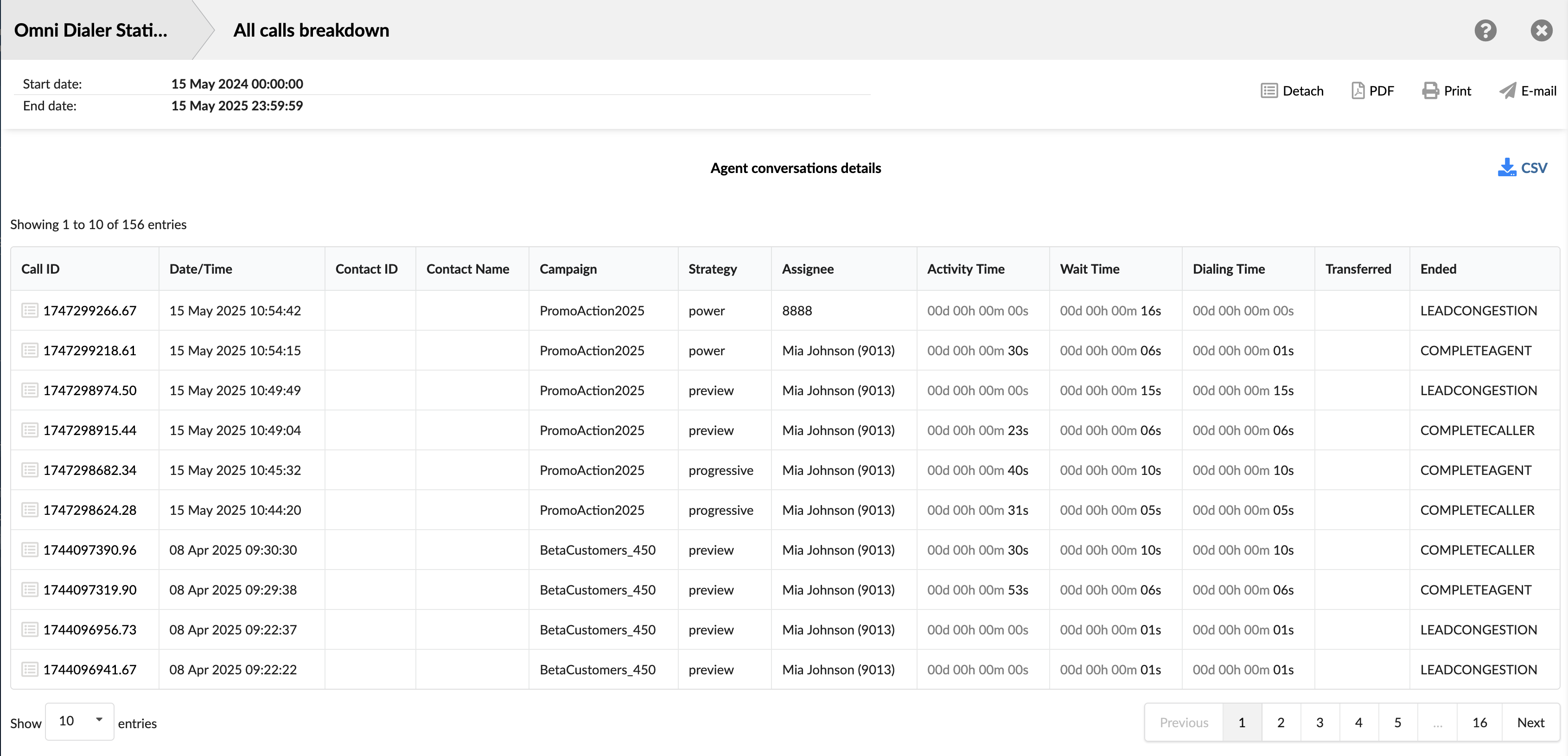
- Call ID: Shows the unique identifier for each call. This ID can be used to search for and track a specific call.
- Date/Time: Shows the date and time when each call occurred. This allows you to view and sort calls based on when they happened.
- Contact ID: Shows the unique identifier for the contact, if available.
- Contact Name: Shows the contact person's name, if available.
- Campaign: Shows the specific campaign associated with the call.
- Strategy: Shows the dialing strategy used for the call.
- Assignee: Shows the entity associated with the call attempt.
- Activity Time: Shows the total duration the agent spent actively engaged with the call.
- Wait Time: Shows the time passed after the lead answered the call until the lead is connected to an agent.
- Dialing Time: Shows the time elapsed from when the Dialer or agent initiates a dial to the lead until the lead answers the call.
- Transferred: Indicates if the call was transferred and shows the destination of the transfer.
- Ended: Shows each call attempt's outcome or status.
¶ All Calls Graph
These graphs provide a visual summary of key metrics from the "All Calls" report, illustrating trends in call handling times and call volumes over the selected time period.
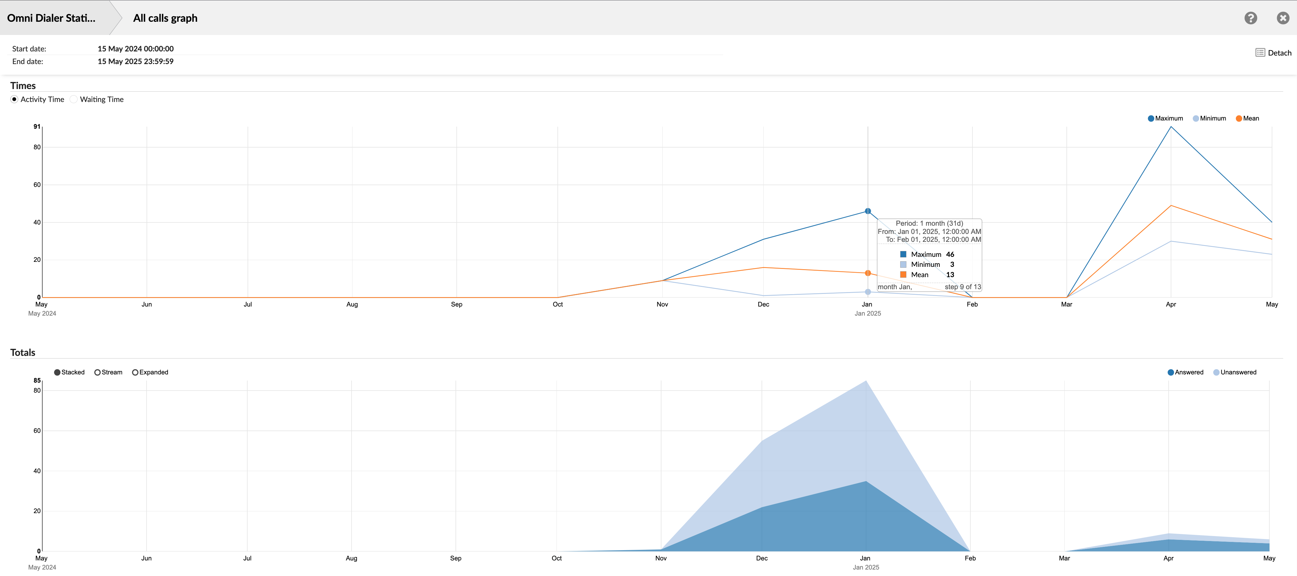
¶ Times
This line graph visualizes statistical trends (Minimum, Maximum, and Mean) for key time-based metrics associated with calls the Dialer handles. Users can switch the graph's focus between two distinct metrics by clicking the desired option:
- Activity Time: When selected, the graph displays trends related to the time agents actively engaged with calls.
- Waiting Time: When selected, the graph displays trends related to the time leads wait to be connected to an agent.
The x-axis represents the selected time period, and the y-axis represents the duration of the time chosen metric in seconds.
¶ Totals
This area graph illustrates the volume and relationship between answered and unanswered calls over the selected time period. It displays the quantities of answered and unanswered calls and allows the user to visualize this data differently (Stacked, Stream, or Expanded).
It provides a clear view of call outcome trends, showing the volume of answered versus unanswered calls. It helps understand overall contact rates, identify periods of high or low answer rates, and assess the general effectiveness of dialing efforts in reaching contacts. The relationship between the two (e.g., in a stacked view) also indicates the total call volume processed.
The x-axis represents the selected time period, and the y-axis indicates the count of calls.
¶ All Calls Dispositions Graph
¶ Answered vs. Unanswered
This graph provides a visual comparison of the two primary outcomes for all calls processed by the Dialer: calls that were answered and calls that were unanswered. It is presented as a pie chart, offering an immediate understanding of the overall contact success rate within the selected time period.
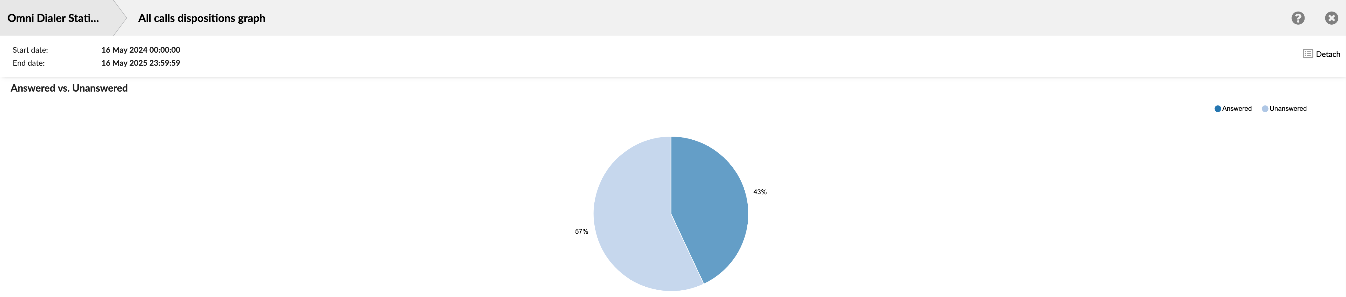
The pie chart is divided into two main slices: one representing the percentage of 'Answered' calls and the other showing the percentage of 'Unanswered' calls. The size of each slice corresponds to its proportion of the total calls, with the percentages clearly labeled.
It offers a quick and easily digestible view of the overall effectiveness of dialing efforts in reaching contacts. It helps supervisors and campaign managers track changes in answer rates over different periods.
¶ All Unanswered Calls
The "All Unanswered Calls" report provides a detailed statistical summary of all outbound calls processed by the Dialer that were not answered by a lead within the selected reporting period. This report is crucial for understanding the reasons behind unanswered calls, analyzing the effectiveness of dialing efforts, and identifying potential issues with call lists or campaign strategies. It is presented in two main summary tables: "All unanswered calls" and "All unanswered calls dispositions."
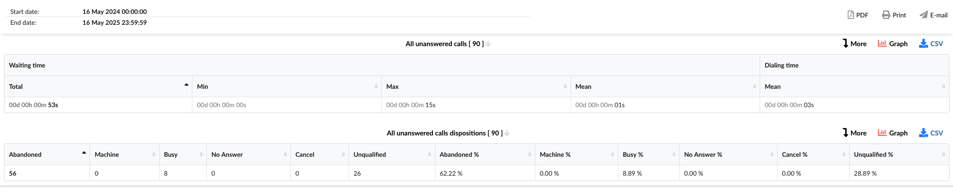
This report is vital for identifying and solving problems in your outbound campaigns. By giving managers clear insights into why calls go unanswered and which reasons occur most frequently, it empowers them to take targeted actions. These actions could include enhancing call list quality, modifying the dialer's pacing, optimizing calling schedules, or resolving technical issues. Such proactive steps are key to refining your strategies and boosting your success rate in reaching leads.
¶ All Unanswered Calls
This table summarizes key time-based metrics for calls initiated by the Dialer but unanswered.
- Waiting time: This column is divided into four sub-columns:
- Total: Shows the total waiting time for all unanswered calls.
- Min: Shows the shortest individual waiting time recorded for an unanswered call.
- Max: Shows the longest individual waiting time recorded for an unanswered call.
- Mean: Shows the average waiting time across unanswered calls.
- Dialing time:
- Mean: Shows the average dialing time for all unanswered calls.
¶ All Unanswered Calls Dispositions
This table provides a detailed breakdown of the specific reasons or statuses for all unanswered call attempts made by the Dialer, along with their counts and respective percentages.
- Abandoned: Shows the number of calls in which the lead hung up before a connection with the agent was established.
- Machine: Shows the number of calls detected by the system as an answering machine.
- Busy: Shows the number of calls that encountered a busy signal.
- No Answer: Shows the number of calls where leads were not picked up.
- Cancel: Shows the number of calls an agent or system cancels before completion.
- Unqualified: Shows the number of calls that were marked as unqualified.
- Abandoned %: Shows the proportion of total unanswered calls that resulted as abandoned.
- Machine %: Shows the proportion of total unanswered calls detected by the system as an answering machine.
- Busy %: Shows the proportion of total unanswered calls that resulted as busy.
- No Answer %: Shows the proportion of total unanswered calls that resulted in no answer.
- Cancel %: Shows the proportion of total unanswered calls that were canceled.
- Unqualified %: Shows the proportion of total unanswered calls marked as unqualified.
¶ All Unanswered Calls / All Unanswered Calls Dispositions Breakdown
The "All Unanswered Calls / All Unanswered Calls Dispositions Breakdown" statistics table provides a comprehensive and detailed log of all unanswered call attempts made by the Dialer within the specified reporting period. It allows for an in-depth review of individual call handling details, agent interactions, and dialer campaign-specific outcomes for all unanswered calls.
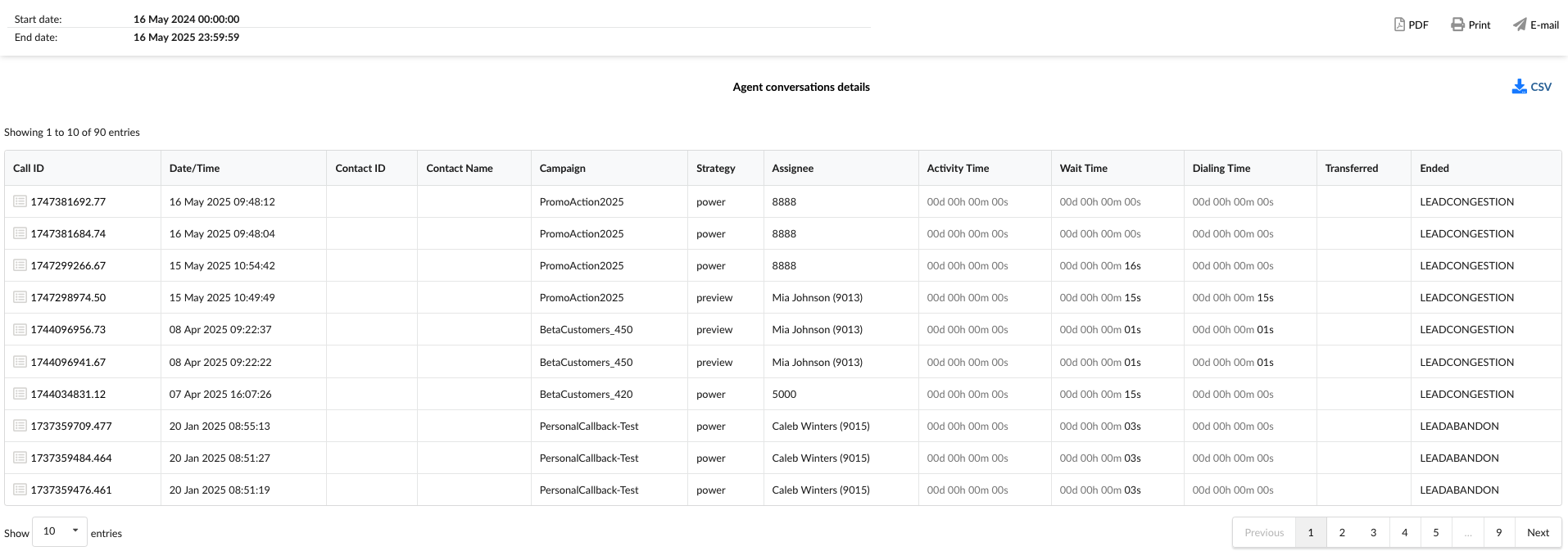
- Call ID: Shows the unique identifier for each call. This ID can be used to search for and track a specific call.
- Date/Time: Shows the date and time when each call occurred. This allows you to view and sort calls based on when they happened.
- Contact ID: Shows the unique identifier for the contact, if available.
- Contact Name: Shows the contact person's name, if available.
- Campaign: Shows the specific campaign associated with the call.
- Strategy: Shows the dialing strategy used for the call.
- Assignee: Shows the entity associated with the call attempt.
- Activity Time: Shows the total duration the agent spent actively engaged with the call. For this report, this will typically be 00:00:00 as the calls were unanswered.
- Wait Time: Shows the time passed after the lead answered the call until the lead is connected to an agent.
- Dialing Time: Shows the time elapsed from when the Dialer or agent initiates a dial to the lead until the lead answers the call.
- Transferred: Indicates if the call was transferred and shows the destination of the transfer. For unanswered calls, this field will typically be blank or not applicable.
- Ended: Shows the outcome or status of the unanswered call attempt.
¶ All Unanswered Calls Graph
These graphs provide a visual summary of key metrics specifically for unanswered calls, illustrating trends in relevant call times and the volume of unanswered calls over the selected time period. They are derived from the "All Unanswered Calls" report summary table.
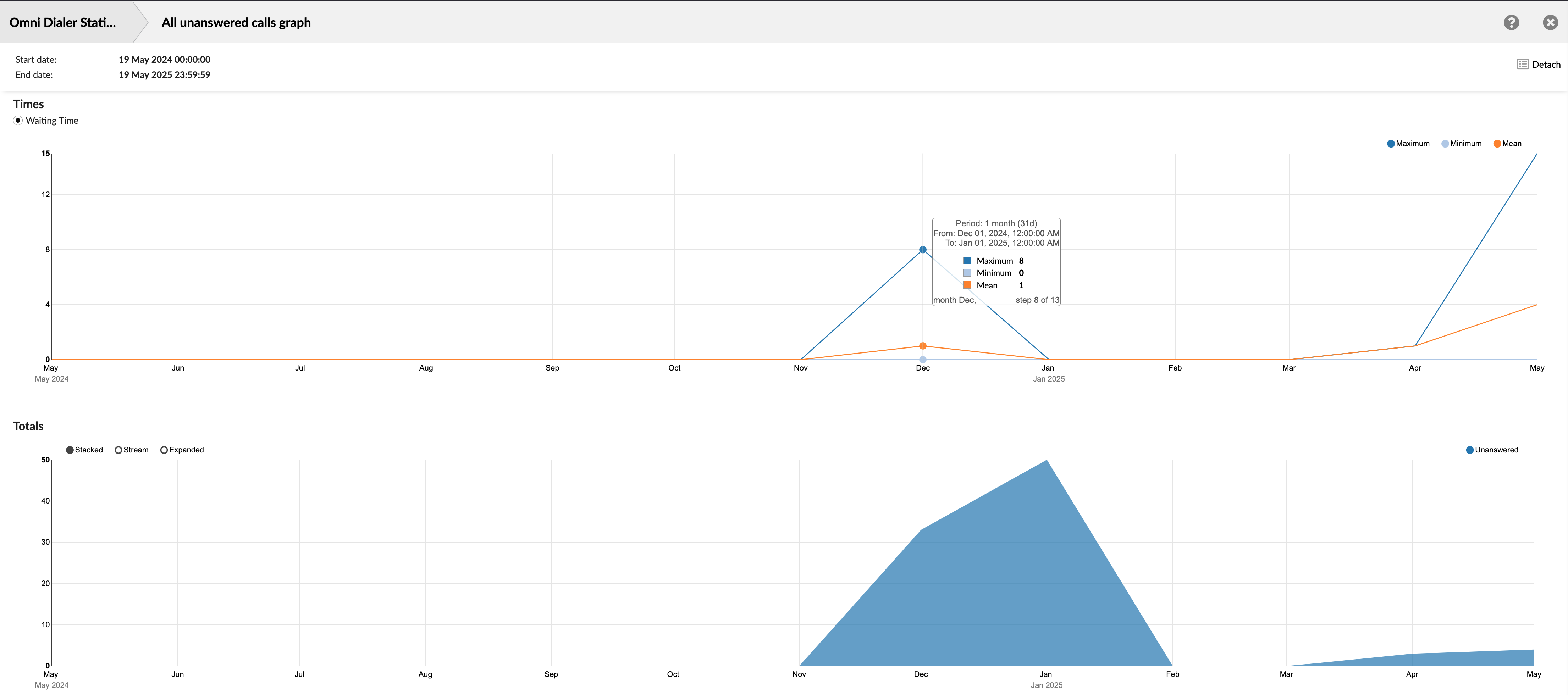
¶ Times
This line graph visualizes statistical trends (Minimum, Maximum, and Mean) for time-based metrics associated with unanswered call attempts. The graph exclusively displays these statistics for 'Waiting Time'.
- Waiting Time: Displays trends related to the time leads wait to be connected to an agent. The graph will show the Minimum, Maximum, and Mean Waiting Times for the calls within each interval on the x-axis.
¶ Totals
This area graph shows the trend in the total number of unanswered calls over time. Although it includes display options such as 'Stacked,' 'Stream,' and 'Expanded,' which offer different ways to visualize data when multiple categories are being compared, this specific graph concentrates on presenting the overall volume of unanswered calls.
The x-axis represents the selected time period, and the y-axis indicates the count of unanswered calls.
¶ All Unanswered Calls Dispositions Graph
This graph provides a visual breakdown of why outbound calls were not answered during the selected time period. Presented as a pie chart, it offers an immediate understanding of the proportional distribution of unanswered call dispositions.
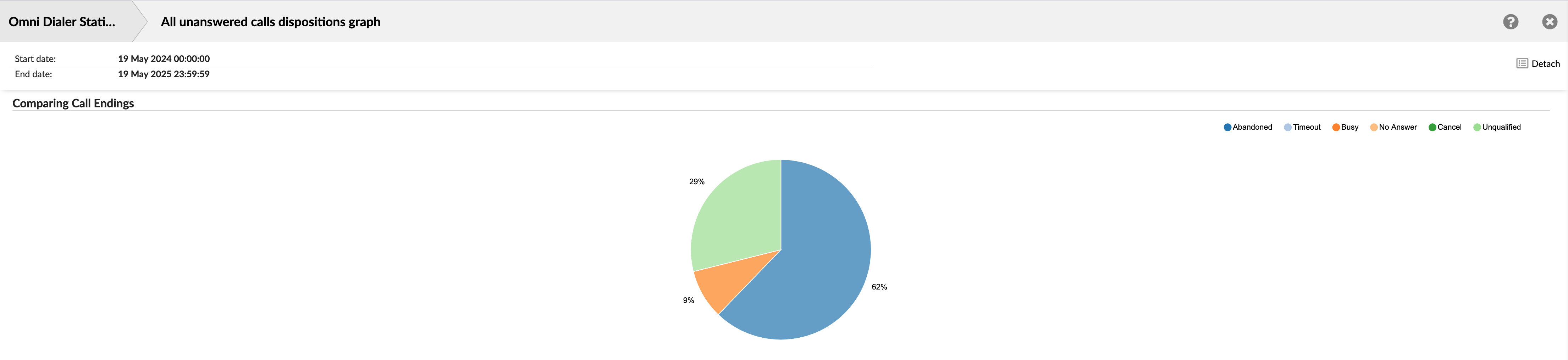
¶ Comparing Call Endings
The purpose of this graph is to clearly illustrate the percentage share of each specific disposition for all calls that were not answered by a lead. This helps identify the primary reasons for call failures and non-contacts.
The "Comparing Call Endings" pie chart for unanswered calls offers a concise, at-a-glance view of why calls are not connecting, highlighting the distribution of various unanswered dispositions. This is essential for optimizing campaign performance and improving lead success rates.
¶ Campaign All Calls
The "Campaign All Calls" report offers a comparative performance overview across different Dialer campaigns within the selected reporting period. It presents a table listing each campaign and its associated call metrics, allowing for an understanding of individual campaign activity levels and time-based statistics. This helps evaluate each campaign's performance relative to others and the overall dialing efforts.
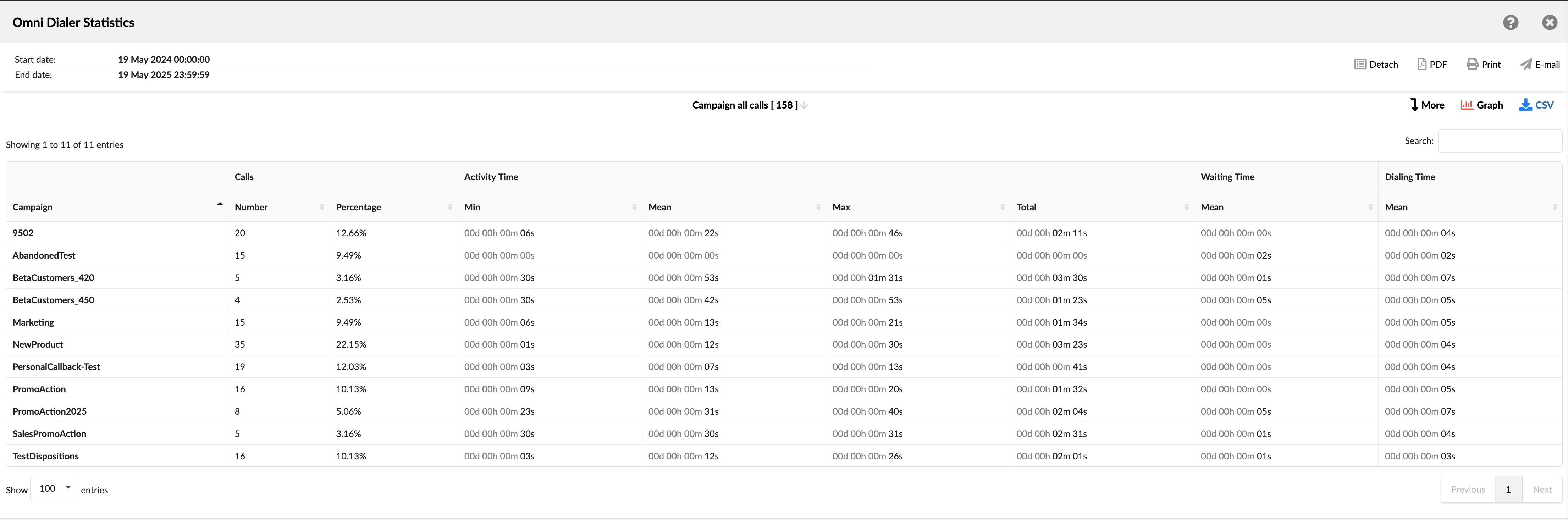
- Campaign: Shows the name or identifier of the Dialer campaign.
- Calls: This column is divided into two sub-columns:
- Number: Shows the total number of calls processed or initiated by the specific campaign during the reporting period.
- Percentage: Shows the proportion of the specific campaign's calls relative to the total number of calls made across all campaigns.
- Activity time: This column is divided into four sub-columns:
- Min: Shows the shortest time spent on an active call for the specific campaign.
- Mean: Shows the average time spent on all active calls for the specific campaign.
- Max: Shows the longest time spent on an active call for the specific campaign.
- Total: Shows the total time spent on all active calls for the specific campaign.
- Waiting time: This column has one sub-column:
- Mean: Shows the average waiting time for all calls for the specific campaign.
- Dialing time: This column has one sub-column:
- Mean: Shows the average dialing time for all calls for the specific campaign.
¶ Campaign All Calls Breakdown
The "Campaign All Calls Breakdown" report provides a granular, call-by-call log of all attempts made within specific Dialer campaigns during the selected reporting period. This detailed view allows for an in-depth analysis of individual call records that contribute to the summary statistics in the "Campaign All Calls" report.
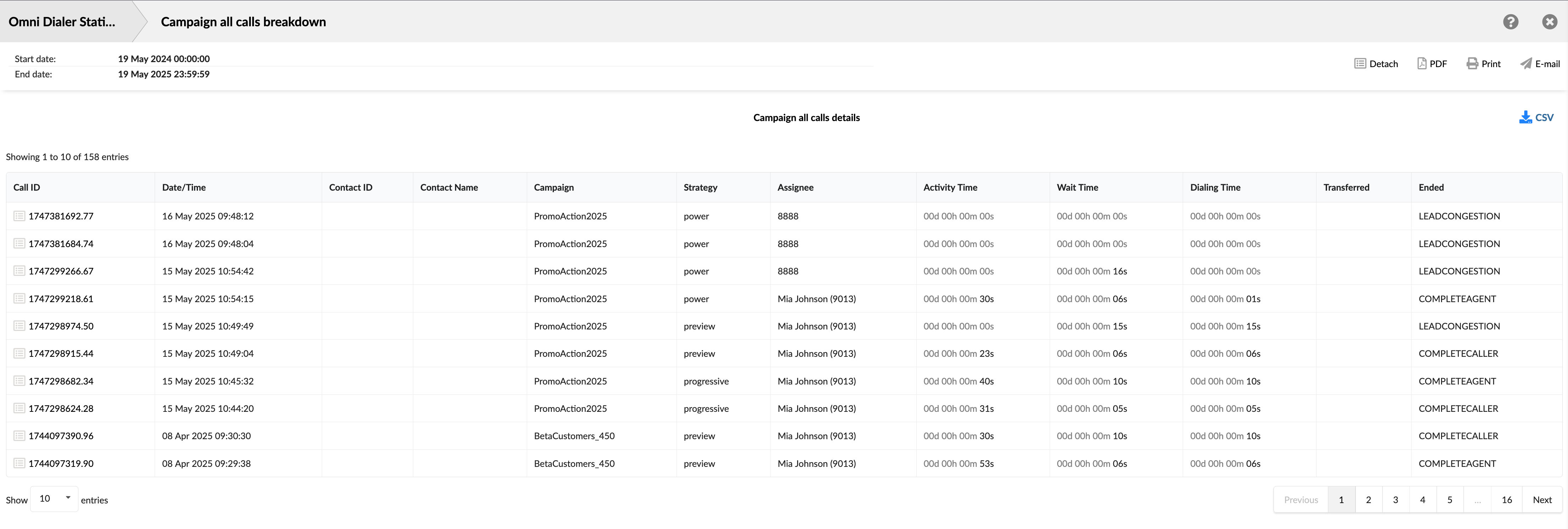
- Call ID: Shows the unique identifier for each call. This ID can be used to search for and track a specific call.
- Date/Time: Shows the date and time when each call occurred. This allows you to view and sort calls based on when they happened.
- Contact ID: Shows the unique identifier for the contact, if available.
- Contact Name: Shows the contact person's name, if available.
- Campaign: Shows the specific campaign associated with the call.
- Strategy: Shows the dialing strategy used for the call.
- Assignee: Shows the entity associated with the call attempt.
- Activity Time: Shows the total duration the agent spent actively engaged with the call.
- Wait Time: Shows the time passed after the lead answered the call until the lead is connected to an agent.
- Dialing Time: Shows the time elapsed from when the Dialer or agent initiates a dial to the lead until the lead answers the call.
- Transferred: Indicates if the call was transferred and shows the destination of the transfer.
- Ended: Shows the outcome or status of each call attempt.
¶ Campaign All Calls Graph
This graph visually represents the call volume distribution across all active Dialer campaigns within the selected time period. Presented as a pie chart, it offers an immediate understanding of each campaign's contribution to the total number of calls processed.
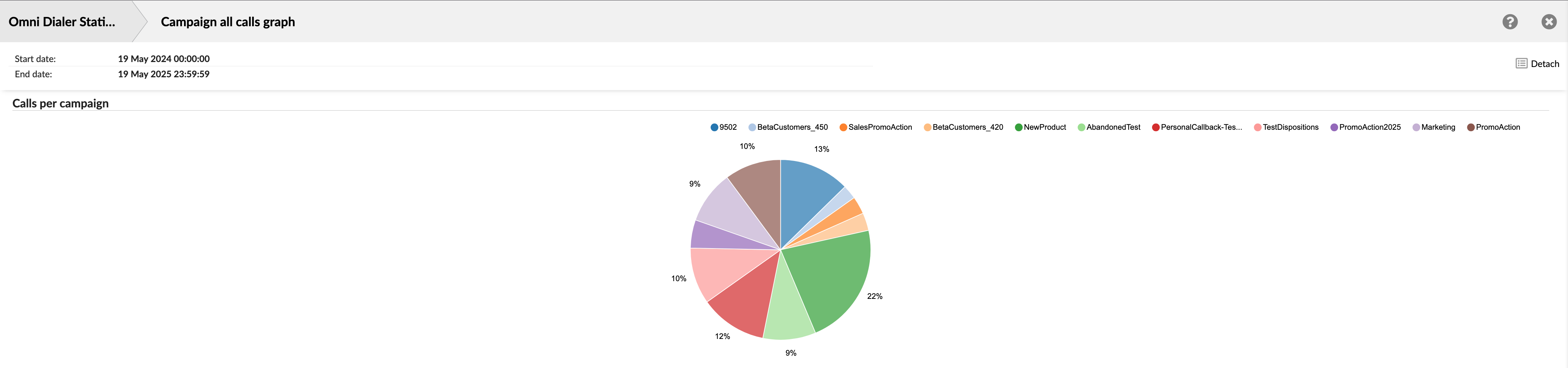
The graph illustrates the proportional share of total calls handled by each individual Dialer campaign. It helps quickly identify which campaigns generate the most (or least) call activity.
¶ Campaign Calls per Disposition
The "Campaign Calls per Disposition" report offers a granular analysis of call outcomes for each Dialer campaign, broken down by the specific dispositions assigned to the calls. It allows users to see how many calls within a campaign resulted in a particular disposition and the time-based metrics associated with calls that received that specific disposition. This report is crucial for understanding the most common dispositions within campaigns and how different call outcomes impact agent time and overall campaign performance.
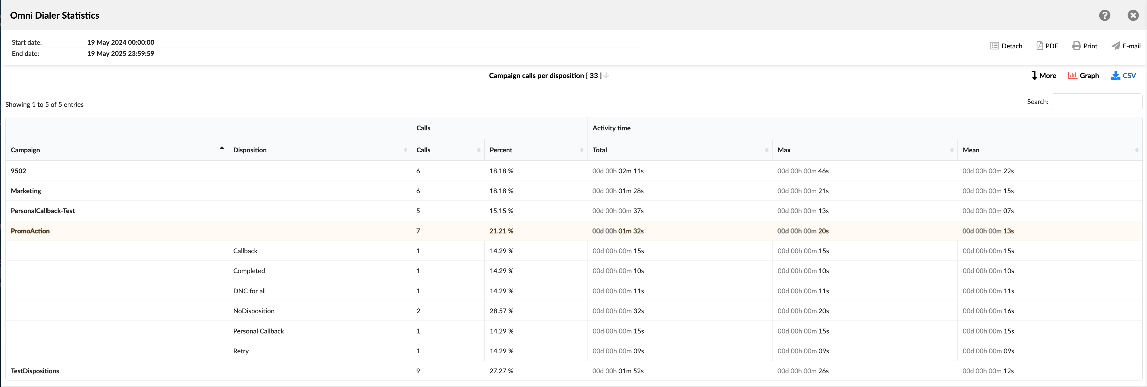
- Campaign: Shows the name or identifier of the Dialer campaign.
- Disposition: Shows the name of the specific disposition used for that call.
- Calls: This column is divided into two sub-columns:
- Calls: For a campaign row, shows the total calls with listed dispositions for that campaign. A disposition row shows the number of calls that received this specific disposition within that campaign.
- Percent: For a campaign row, the percentage of calls is shown relative to the report's total. A disposition row shows its percentage relative to the campaign's total calls.
- Activity time: This column is divided into three sub-columns:
- Total: Shows the total time spent on all active calls for the specific campaign.
- Max: Shows the longest time spent on an active call for the specific campaign.
- Mean: Shows the average time spent on all active calls for the specific campaign.
¶ Campaign Calls per Disposition Breakdown
The "Campaign Calls per Disposition Breakdown" report provides a granular, call-by-call log, focusing on calls assigned custom dispositions created explicitly within individual Dialer campaigns. This detailed view allows users to examine the individual call records and how they contribute to the statistics for these campaign-defined outcomes. It's designed to provide an in-depth analysis of calls that end with these particular results.
This table lists individual call attempts showing the specific custom disposition assigned to them from within one or more campaigns.
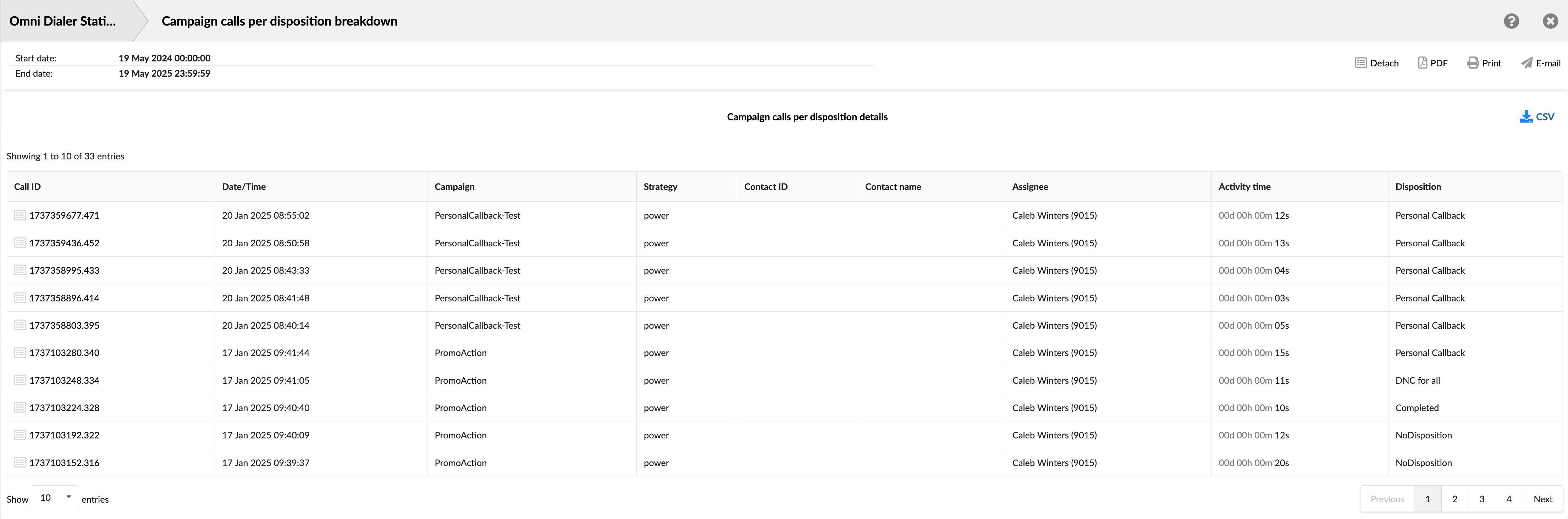
- Call ID: Shows the unique identifier for each call. This ID can be used to search for and track a specific call.
- Date/Time: Shows the date and time when each call occurred. This allows you to view and sort calls based on when they happened.
- Campaign: Shows the specific campaign associated with the call.
- Strategy: Shows the dialing strategy used for the call.
- Contact ID: Shows the unique identifier for the contact, if available.
- Contact Name: Shows the contact person's name, if available.
- Assignee: Shows the entity associated with the call attempt.
- Activity Time: Shows the total duration the agent spent actively engaged with the call.
- Disposition: Shows the name of the specific disposition used for that call.
¶ Campaign Calls per Disposition Graph
This graph offers a dynamic visualization of call outcomes by presenting a detailed breakdown of custom dispositions for a selected Dialer campaign. Users can easily switch between different campaigns to view each call disposition's specific distribution.
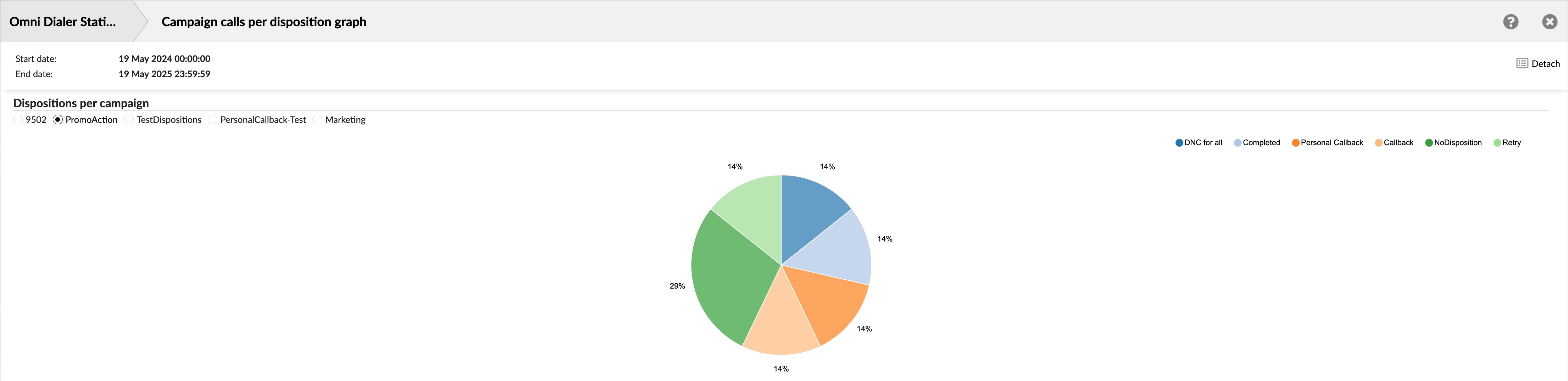
The interface provides options allowing users to select a specific Dialer campaign from a list by clicking on them. For the chosen campaign, the pie chart clearly illustrates the proportional share of each particular call disposition. This typically focuses on custom-created or key operational dispositions used within that campaign.
¶ Lead Calls
The "Lead Calls" report summarizes all outbound call attempts made by the Dialer, categorized by their final handling status or outcome. This report provides a high-level overview of how calls to leads are processed and the general results of these attempts (e.g., answered, failed, busy, abandoned). It helps understand the overall distribution of call outcomes across all dialing activities for the selected reporting period.
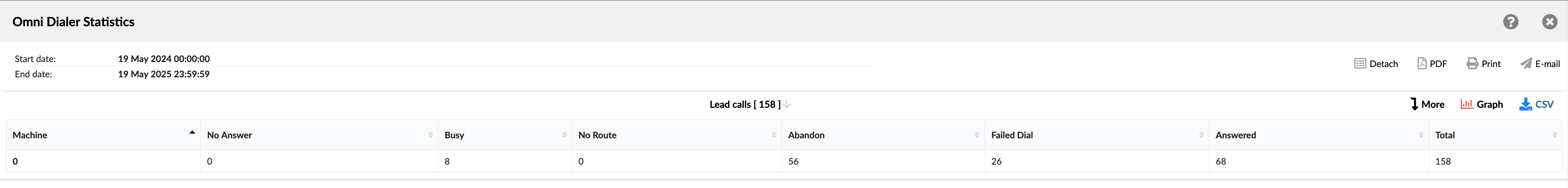
Each column in this table represents a specific category of call outcome or handling status, with the value in the row indicating the total number of calls that fall into that category for the specified period. These categories include:
- Machine: Shows the total number of calls detected as being answered by an answering machine.
- No Answer: Shows the total number of calls that were not picked up by a contact.
- Busy: Shows the total number of calls that encountered a busy signal from the contact's line.
- No Route: Shows the total number of calls that could not be completed because a valid routing destination was not found or available.
- Abandon: Shows the total number of abandoned calls.
- Failed Dial: Shows the total number of calls that failed to connect due to technical reasons or other dialing errors (e.g., invalid number, network issues, congestion not otherwise categorized)
- Answered: Shows the total number of calls successfully answered by a lead.
- Total: Shows the total of all call attempts across all listed categories.
¶ Lead Calls Breakdown
The "Lead Calls Breakdown" report provides a detailed, call-by-call log of every attempt the Dialer makes to contact leads within your selected reporting period. This allows for a thorough analysis of the individual call records behind the summary statistics in the 'Lead Calls' report. Use this report when you need to examine specific calls to leads closely, including how each was handled and its final outcome.
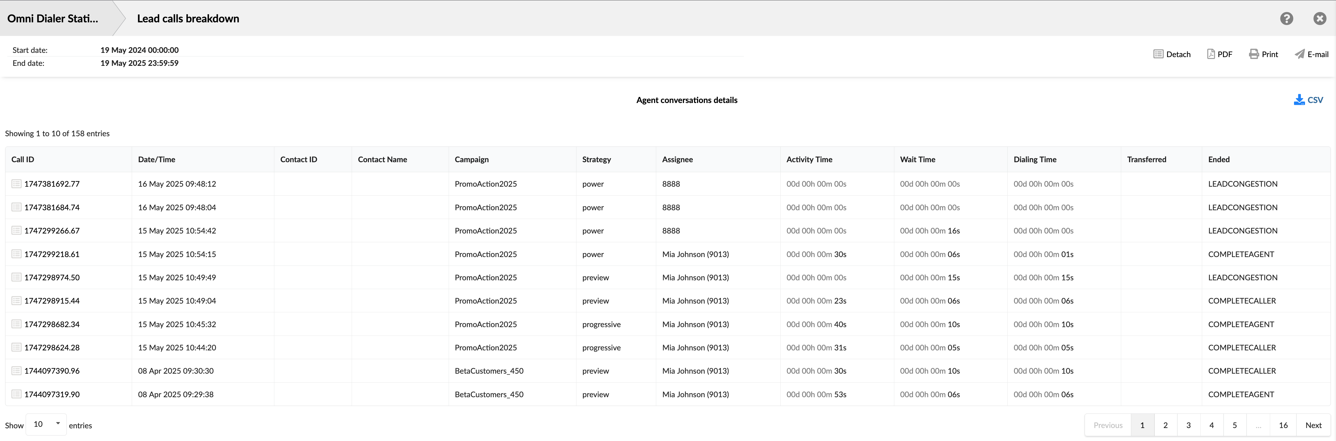
- Call ID: Shows the unique identifier for each call. This ID can be used to search for and track a specific call.
- Date/Time: Shows the date and time when each call occurred. This allows you to view and sort calls based on when they happened.
- Contact ID: Shows the unique identifier for the contact, if available.
- Contact Name: Shows the contact person's name, if available.
- Campaign: Shows the specific campaign associated with the call.
- Strategy: Shows the dialing strategy used for the call.
- Assignee: Shows the entity associated with the call attempt.
- Activity Time: Shows the total duration the agent spent actively engaged with the call.
- Wait Time: Shows the time passed after the lead answered the call until the lead is connected to an agent.
- Dialing Time: Shows the time elapsed from when the Dialer or agent initiates a dial to the lead until the lead answers the call.
- Transferred: Indicates if the call was transferred and shows the destination of the transfer.
- Ended: Shows the outcome or status of each call attempt.
¶ Lead Calls Graph
This graph provides a visual summary of the different outcomes for all calls made to leads by the Dialer within the selected reporting period. It is presented as a pie chart, offering an immediate understanding of how these call attempts were ultimately classified.
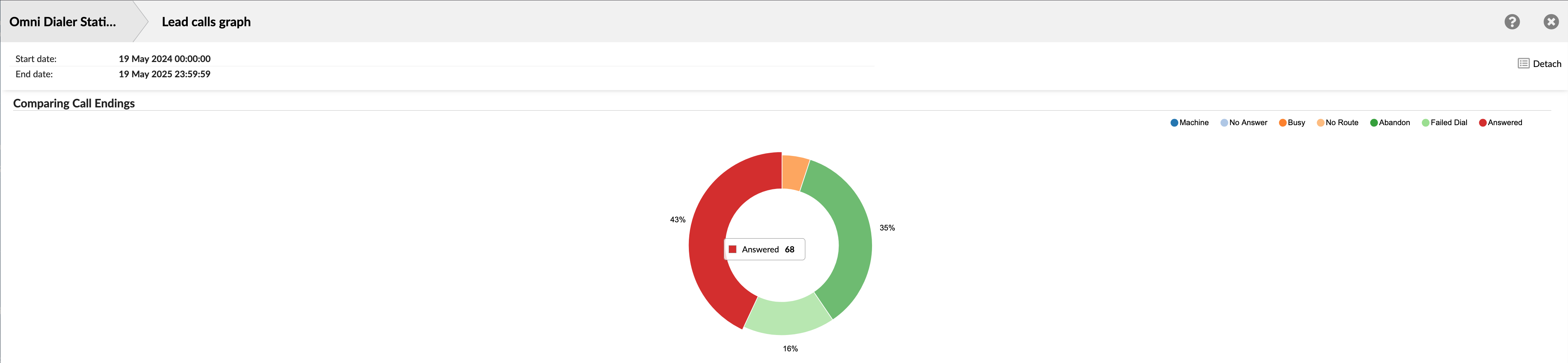
The graph clearly illustrates the proportional share of each specific call outcome or handling status for all calls directed at leads. This helps quickly grasp the overall distribution of call results.
¶ Scheduled Reports
Scheduled reports are valuable for monitoring and analyzing key performance metrics, activities, and trends over time. These reports are pre-configured to run at specific intervals, such as daily, weekly, or monthly. They are generated automatically without the need for manual intervention.
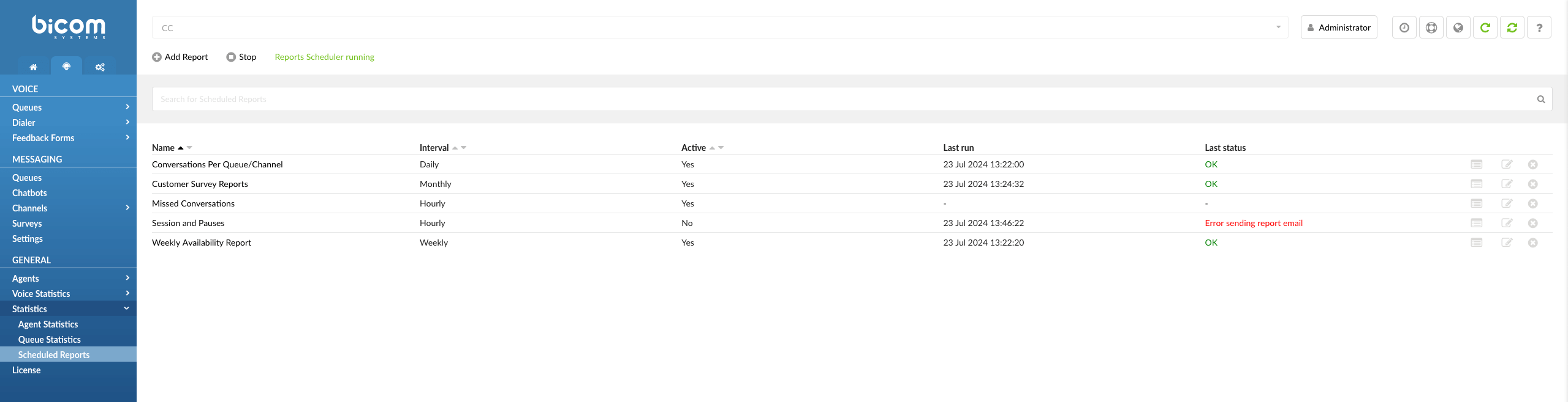
The top three key points about scheduled reports:
-
Scheduled reports eliminate the need for companies' staff to generate reports on a regular basis manually. Instead, reports are generated automatically at predetermined intervals, saving time and effort.
-
As companies deal with a vast amount of data, including call volumes, agent performance, customer satisfaction, and more, scheduled reports allow organizations to analyze this data systematically, making it easier to identify trends and areas for improvement.
-
Since scheduled reports are highly customizable, users can choose specific metrics, date ranges, and formats to create the reports to their unique needs.
Scheduled reports are extended from agent and queue reports, where each report template has different filters that can be applied while editing.
¶ Add Report
To add or create a new report within our system, users can initiate the process by selecting the  option. This action opens a new page where users can input additional parameters and settings for the report, including filters, report types, time intervals, and more.
¶ Run & Stop Report
Adjacent to the report configuration options, users will find the "Run" or "Stop" option, which depends on the current state of the report scheduler.
 If the scheduler is currently active and set to generate reports as scheduled, the "Stop" option will be displayed. This signifies that the system is actively generating reports based on the configured settings.
 In contrast, when the scheduler is paused or not running, users will see the "Run" option. This indicates that report generation is temporarily halted.
¶ Reports Scheduler Status
The status of the scheduler is conveniently displayed adjacent to the "Run" or "Stop" option. This status provides users with real-time information regarding the current state of report scheduling, ensuring clarity and ease of management.
 - Reports Scheduler is active and running.
 - Reports Scheduler is stopped.
¶ Search for Scheduled Reports
To find previously created scheduled reports based on their names, navigate to the Search bar and type the full name or just part of their name.
(For example, Monthly Performance Analysis, Daily, Snapshot)

The landing page provides essential information about scheduled reports, including the following details:
¶ Name
This field displays the Name or title of each scheduled report. It helps users easily identify and distinguish between different reports.

The next image displays the attributes of scheduled reports, including how often the report is set to run, whether the report scheduler is currently enabled or disabled, the date and time the report was last generated or executed, and the status of the report's most recent execution.
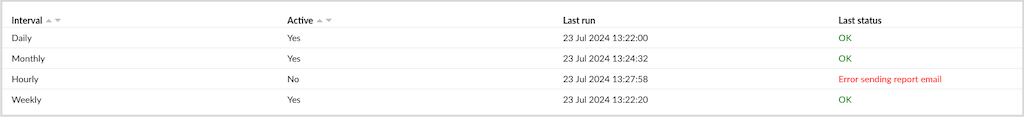
Schedule Reports Attributes
-
The Interval indicates how frequently the report is scheduled to run. It could be daily, weekly, monthly, or at custom intervals, depending on the report's configuration.
-
The Active status indicates whether the report scheduler is currently enabled or disabled. An active status means the report is set to run according to its schedule, while an inactive status means it's temporarily paused.
-
The Last Run field displays the Date and Time when the report was last generated or executed. It provides users with a timestamp for the most recent report activity.
-
The Last Status field summarizes the outcome or status of the report's last execution. It can indicate whether the report ran successfully, encountered errors, or experienced other issues.
¶ Show/Edit/Delete Report
Show
Users must locate and select the ![]() button associated with the report of interest to access more comprehensive information about a specific report. Upon clicking Show, they will be directed to a dedicated page providing in-depth information and details about the selected report.
button associated with the report of interest to access more comprehensive information about a specific report. Upon clicking Show, they will be directed to a dedicated page providing in-depth information and details about the selected report.
Edit
To make changes to the details of a scheduled report, users must locate and select the ![]() button corresponding to the report they wish to modify. After clicking Edit, they will be directed to an editing interface where they can adjust the settings and configuration of the selected report.
button corresponding to the report they wish to modify. After clicking Edit, they will be directed to an editing interface where they can adjust the settings and configuration of the selected report.
Delete
To delete a scheduled report, users must locate and select the ![]() button corresponding to the report they wish to remove. Upon clicking Delete, a warning message will be displayed and if clicked OK, the selected report will be permanently deleted from the system.
button corresponding to the report they wish to remove. Upon clicking Delete, a warning message will be displayed and if clicked OK, the selected report will be permanently deleted from the system.
¶ Scheduled Report Configuration
Upon selecting the Add Report button, a new page will open, allowing users to input additional parameters and configure settings for the report.
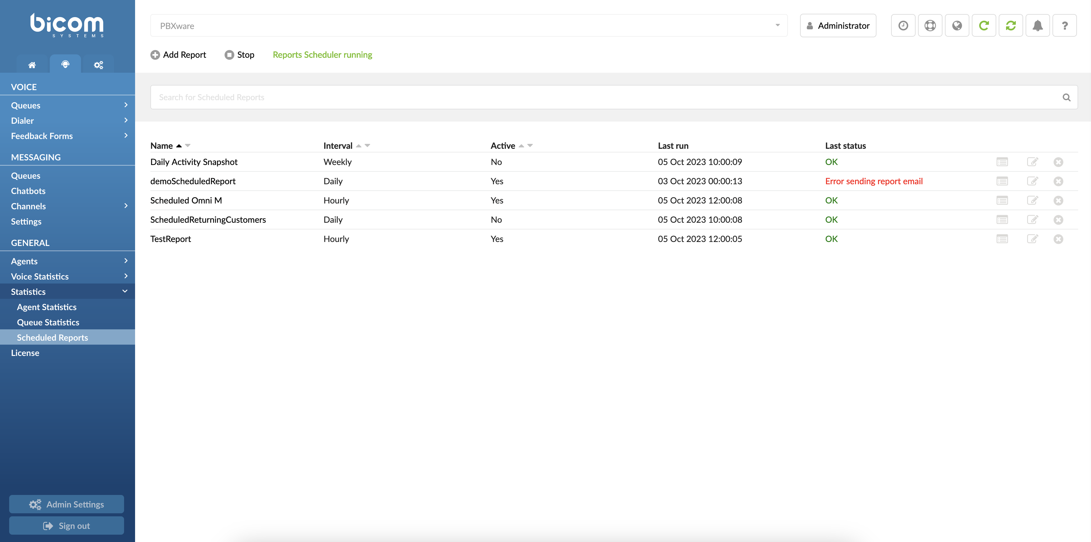
The landing page is devided into four sections:
¶ General
General settings ensure your scheduled reports are generated accurately and at the desired frequency, enhancing your reporting efficiency and organization.
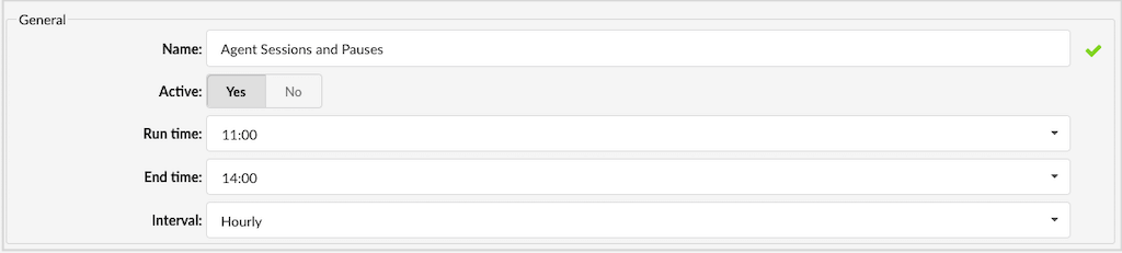
Name
Assign a descriptive name to each scheduled report. This name will help you easily identify and manage your reports on the main Scheduled Reports page. Examples include "Daily Activity Snapshot" or "ScheduledReturningCustomers".
Active
Toggle the active status of the report. If the report is set to 'No', it will not be generated even if the scheduler is running. Options are either 'Yes' (active) or 'No' (inactive).
Run Time
Define the specific time when the report should start generating. Use the time picker to select the start time, such as 09:00 AM, ensuring the report runs at your preferred time.
Interval
Set how frequently the report should run. Choose from various intervals, like "Weekly" to have the report run every Monday, aligning with your reporting needs.
¶ Notification
Notification settings ensure that the right people are notified with the appropriate report format, enhancing the overall efficiency and effectiveness of your reporting process.
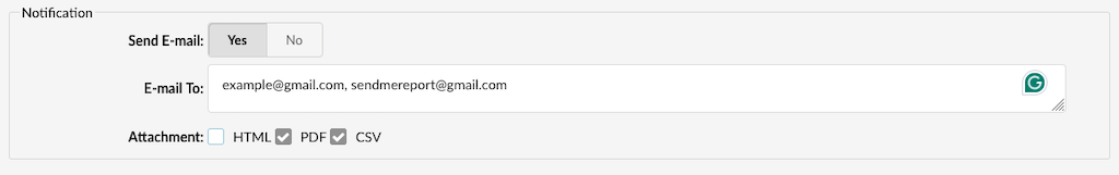
Send E-mail
This setting lets you specify whether an email should be sent each time a report is generated. If set to 'Yes', an email will be sent automatically upon report completion.
E-mail To
Here, you can enter one or more email addresses that should receive the generated reports. Multiple addresses can be separated by either a semicolon (";") or a comma (",") followed by a space. This ensures the reports are sent to the relevant recipients.
Attachment
This option allows you to choose the type of file to be attached to the email. You can select from HTML, PDF, or CSV formats. If CSV is selected, an additional CSV file containing a detailed breakdown of the report will be created automatically, zipped, and sent along with the email. This breakdown file provides further insights into the report's data.
If the report type selected is 'Agent Availability,' the zipped folder sent via email will include two CSV files: 'agentavailability.csv' and 'agentavailability_breakdown.CSV.'
¶ Types
**Types
The Types setting allows you to choose a specific conversation type from a drop-down menu. With a total of 14 different report types available, you can select the one that best fits your needs. This feature ensures that you can generate reports tailored to various types of conversations, providing more precise and relevant data for your analysis.

¶ Filters
The filters settings allow you to customize and refine your report data based on specific criteria
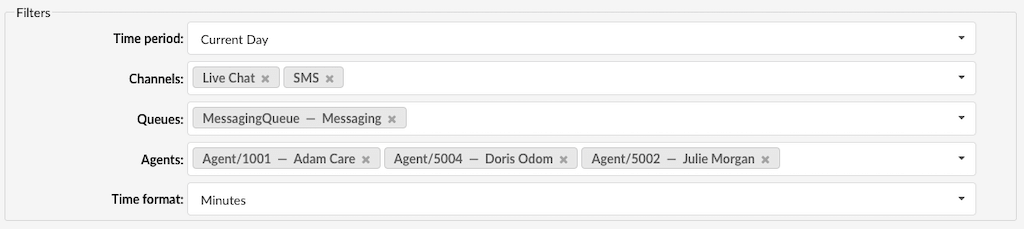
Time period
This setting lets you select the date range for the report, such as "Current Week" or "Last Month," helping you focus on relevant time frames.
Channels
Choose a specific channel to filter the report data. For instance, selecting "Email" will generate a report that focuses solely on email interactions.
Queues
Specify which queue's data should be included in the report. This filter can be applied to both Voice and Messaging queues, enabling you to concentrate on activities within a particular queue, such as the "Sales" queue.
Agents
Filter the report data by selecting specific agents. This allows you to analyze performance or activities related to chosen agents, such as "John" and "Sarah."
Waiting Time
Represents the time elapsed from when a call enters the queue until it begins ringing for an agent.
Speed to Answer
Measure the time from when a call starts ringing until an agent answers, reflecting response efficiency.
Activity Time
Track the duration an agent spends handling requests, from assignment until closure or transfer.
Time format
Customize how time data is displayed in the report. You can choose from various formats like days, hours, minutes, and seconds, ensuring the time information is presented in the most useful way for your analysis.